
XL1A: Graph Nominal Frequency Data Using Excel2013 3/10/2017 V0E Excel2013-Graph-Nominal0-Slides.pdf
1
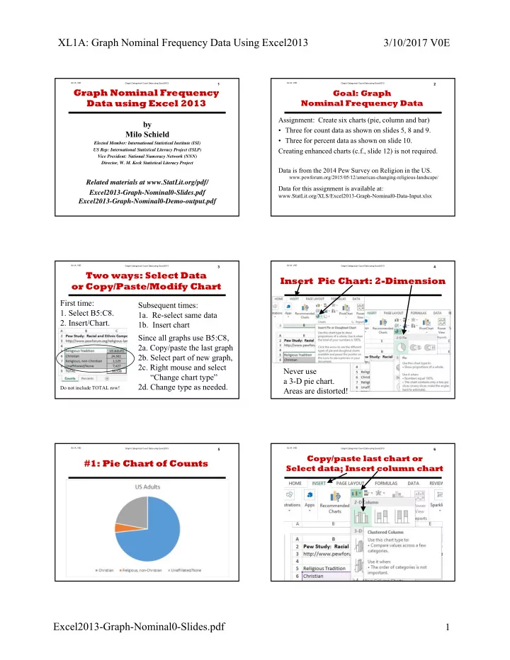
Graph Categorical Count Data using Excel2013 XL1A: V0E1
by Milo Schield
Elected Member: International Statistical Institute (ISI) US Rep: International Statistical Literacy Project (ISLP) Vice President: National Numeracy Network (NNN) Director, W. M. Keck Statistical Literacy Project
Related materials at www.StatLit.org/pdf/ Excel2013-Graph-Nominal0-Slides.pdf Excel2013-Graph-Nominal0-Demo-output.pdf
Graph Nominal Frequency Data using Excel 2013
Graph Categorical Count Data using Excel2013 XL1A: V0E2
Goal: Graph Nominal Frequency Data
Assignment: Create six charts (pie, column and bar)
- Three for count data as shown on slides 5, 8 and 9.
- Three for percent data as shown on slide 10.
Creating enhanced charts (c.f., slide 12) is not required.
Data is from the 2014 Pew Survey on Religion in the US.
www.pewforum.org/2015/05/12/americas-changing-religious-landscape/
Data for this assignment is available at:
www.StatLit.org/XLS/Excel2013-Graph-Nominal0-Data-Input.xlsx
Graph Categorical Count Data using Excel2013 XL1A: V0EFirst time:
- 1. Select B5:C8.
- 2. Insert/Chart.
Do not include TOTAL row!
Subsequent times:
- 1a. Re-select same data
- 1b. Insert chart
Since all graphs use B5:C8,
- 2a. Copy/paste the last graph
- 2b. Select part of new graph,
- 2c. Right mouse and select
“Change chart type”
- 2d. Change type as needed.
3
Two ways: Select Data
- r Copy/Paste/Modify Chart
4
Insert Pie Chart: 2-Dimension
Never use a 3-D pie chart. Areas are distorted!
Graph Categorical Count Data using Excel2013 XL1A: V0E5
#1: Pie Chart of Counts
.
Graph Categorical Count Data using Excel2013 XL1A: V0E6
Copy/paste last chart or Select data; Insert column chart
.