
XL1C: Graph Times-Series Using Ratio Display 3/9/2017 V0D Excel2013-Graph-Ratio-Display-Slides.pdf
1
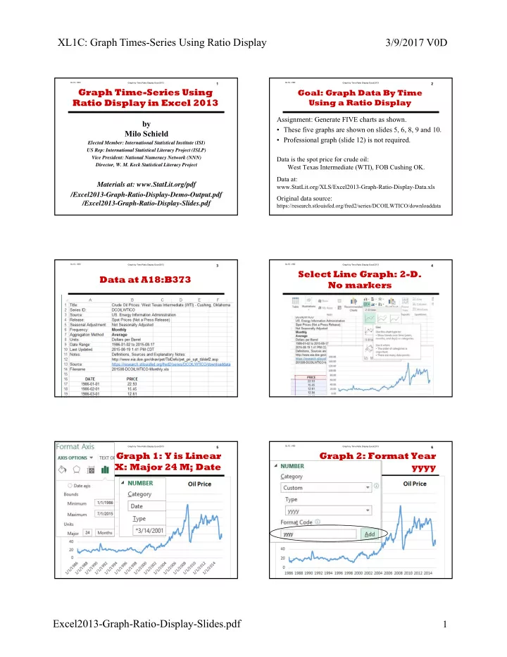
Graph by Time Ratio Display Excel2013 XL1C: V0D1
by Milo Schield
Elected Member: International Statistical Institute (ISI) US Rep: International Statistical Literacy Project (ISLP) Vice President: National Numeracy Network (NNN) Director, W. M. Keck Statistical Literacy Project
Materials at: www.StatLit.org/pdf /Excel2013-Graph-Ratio-Display-Demo-Output.pdf /Excel2013-Graph-Ratio-Display-Slides.pdf
Graph Time-Series Using Ratio Display in Excel 2013
Graph by Time Ratio Display Excel2013 XL1C: V0D2
Goal: Graph Data By Time Using a Ratio Display
Assignment: Generate FIVE charts as shown.
- These five graphs are shown on slides 5, 6, 8, 9 and 10.
- Professional graph (slide 12) is not required.
Data is the spot price for crude oil: West Texas Intermediate (WTI), FOB Cushing OK. Data at:
www.StatLit.org/XLS/Excel2013-Graph-Ratio-Display-Data.xls
Original data source:
https://research.stlouisfed.org/fred2/series/DCOILWTICO/downloaddata
Graph by Time Ratio Display Excel2013 XL1C: V0D3
Data at A18:B373
.
Graph by Time Ratio Display Excel2013 XL1C: V0D4
Select Line Graph: 2-D. No markers
.
Graph by Time Ratio Display Excel2013 XL1C: V0D5
Graph 1: Y is Linear X: Major 24 M; Date
.
Graph by Time Ratio Display Excel2013 XL1C: V0D6
Graph 2: Format Year yyyy
.