
SLIDE 1
Plotting Basics: Scatterplot
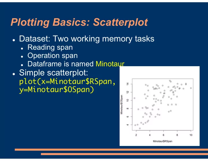
Dataset: Two working memory tasks
Reading span Operation span Dataframe is named Minotaur
Simple scatterplot:
Plotting Basics: Scatterplot Dataset: Two working memory tasks - - PowerPoint PPT Presentation
Plotting Basics: Scatterplot Dataset: Two working memory tasks Reading span Operation span Dataframe is named Minotaur Simple scatterplot: plot(x=Minotaur$RSpan, y=Minotaur$OSpan) Saving Plots In RStudio: Plots will
Dataset: Two working memory tasks
Reading span Operation span Dataframe is named Minotaur
Simple scatterplot:
In RStudio: Plots will appear in lower-right corner
Click the Export button
Can save in a variety
Or, copy to the clipboard
In R: Plot will appear in a separate window
File -> Save As…
Default axis labels are just the names of the
Let’s change them and add a title:
plot(x=Minotaur$RSpan,
To look at all of the options for plots and how to
These settings are listed in the help files for par
R usually figures out good axis scales on its own
Fit in all the observations Use nice round numbers
But, here, we might want to force the x-axis and
plot(x=Minotaur$RSpan,
Force the x-axis limits and the
Let’s make the plot more colorful (and patriotic!) Use ?par to see how to change the color of other
plot(x=Minotaur$RSpan,
We can also change the plotting character (shape) Use ?points to see the numerical codes that
plot(x=Minotaur$RSpan,
Sometimes, we want to superimpose more than
Example: The Reading Span and Operation Span
We use par(new=TRUE) to tell R to start a new plot
Important notes:
You probably want to use different colors and/or
Important to manually set the axis limits if you
Let’s add a legend to tell the M vs F points apart
legend(x=10, y=5, legend=c('Female', 'Male'),
x and y describe where
legend= is the text on
col and pch are the colors and
Can draw straight lines with abline() Reading span had a maximum score of 10; let’s
abline(v=10, lwd=5, lty=2) v=10 for a vertical line at x=10
lwd is line width / thickness
lty=2 for a dashed line rather
Other sample uses of abline():
We can also use abline() to draw a regression
abline(lm(OSpan ~ 1 + RSpan, data=Minotaur))
Or by specifying slope
abline(a=DesiredSlope,
Let’s label the vertical line we drew:
text(x=10.5, y=10, labels=c('Max Rspan'))
See ?text for more
Can give text() vectors of coordinates & labels:
text(x=Minotaur$RSpan, y=Minotaur$OSpan,
Labels each point
A lot more convenient
Useful for detecting or
Oops! That text was somewhat large; everything
text(x=Minotaur$RSpan, y=Minotaur$OSpan,
cex (“character
Default is 1 0.75 = 75% of the
Can also use cex as
axis() lets us draw new or additional axes on
Examples:
Two different y-axis labels—one on the left and one
Each x-axis position is a different sentence position,
See ?axis for all of the settings If we’re drawing our own axis, we might want to
plot(x=Minotaur$RSpan, y=Minotaur
Bar plots work slightly differently:
In a scatterplot, the points are individual observations In a bar plot, each bar is a mean or median
So, we first need to calculate and store the
GenderMeans <- tapply(Minotaur$RSpan,
Stored means can then be used with barplot():
Most of the same
For line plots, we’ll also often want to precalculate
TrialMeans <- tapply(Minotaur$RT,
Then, plot with plot() and type='l' for line
plot(TrialMeans,
Can set lwd (line
Can also do type='b' for both the points (at the
plot(TrialMeans, type='b', xlab='Trial
Another way to do visuals in R is with the add-on
Gaining in popularity Has a different syntax