SLIDE 1 Ch.6: Array computing and curve plotting (part 2)
Joakim Sundnes1,2
1Simula Research Laboratory 2University of Oslo, Dept. of Informatics
Sep 16, 2020
0.1 Updated plan 16 sept
Slides are mainly left as self study.
- Introduce plotting through exercises:
– 5.9, 5.10, 5.11, 5.13
– Plotting a discontinuous function – Making animations from plots – (Plotting a function from the command line)
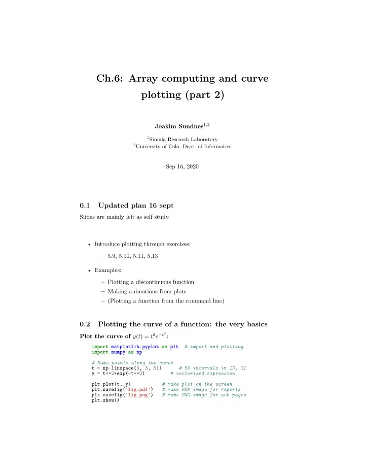
0.2 Plotting the curve of a function: the very basics
Plot the curve of y(t) = t2e−t2:
import matplotlib.pyplot as plt # import and plotting import numpy as np # Make points along the curve t = np.linspace(0, 3, 51) # 50 intervals in [0, 3] y = t**2*exp(-t**2) # vectorized expression plt.plot(t, y) # make plot on the screen plt.savefig('fig.pdf') # make PDF image for reports plt.savefig('fig.png') # make PNG image for web pages plt.show()
SLIDE 2 0.0 0.5 1.0 1.5 2.0 2.5 3.0 0.00 0.05 0.10 0.15 0.20 0.25 0.30 0.35 0.40
0.3 A plot should have labels on axis and a title
0.0 0.5 1.0 1.5 2.0 2.5 3.0 t 0.0 0.1 0.2 0.3 0.4 0.5 y
My First Matplotlib Demo t^2*exp(-t^2)
0.4 The code that makes the last plot
import matplotlib.pyplot as plt import numpy as np def f(t): return t**2*np.exp(-t**2)
2
SLIDE 3
t = np.linspace(0, 3, 51) # t coordinates y = f(t) # corresponding y values plt.plot(t, y,label="t^2*exp(-t^2)") plt.xlabel('t') # label on the x axis plt.ylabel('y') # label on the y axix plt.legend() # mark the curve plt.axis([0, 3, -0.05, 0.6]) # [tmin, tmax, ymin, ymax] plt.title('My First Matplotlib Demo') plt.show()
0.5 Plotting several curves in one plot
Plot t2e−t2 and t4e−t2 in the same plot:
import matplotlib.pyplot as plt import numpy as np def f1(t): return t**2*exp(-t**2) def f2(t): return t**2*f1(t) t = np.linspace(0, 3, 51) y1 = f1(t) y2 = f2(t) plt.plot(t, y1, 'r-', label = 't^2*exp(-t^2)') plt.plot(t, y2, 'bo', label = 't^4*exp(-t^2)') plt.xlabel('t') plt.ylabel('y') plt.legend() plt.title('Plotting two curves in the same plot') plt.savefig('tmp2.png') plt.show()
3
SLIDE 4 0.6 The resulting plot with two curves
0.0 0.5 1.0 1.5 2.0 2.5 3.0 t 0.0 0.1 0.2 0.3 0.4 0.5 y
Plotting two curves in the same plot t^2*exp(-t^2) t^4*exp(-t^2)
0.7 Controlling line styles
When plotting multiple curves in the same plot, the different lines (normally) look different. We can control the line type and color, if desired:
plot(t, y1, 'r-') # red (r) line (-) plot(t, y2, 'bo') # blue (b) circles (o) # or plot(t, y1, 'r-', t, y2, 'bo')
Documentation of colors and line styles, see the online Matplotlib documen- tation or
Unix> pydoc matplotlib.pyplot
0.8 Quick plotting with minimal typing
A lazy pro would do this:
t = np.linspace(0, 3, 51) plt.plot(t, t**2*exp(-t**2), t, t**4*exp(-t**2))
4
SLIDE 5 0.9 Example: plot a discontinuous function
The Heaviside function is frequently used in science and engineering: H(x) = 0, x < 0 1, x ≥ 0 Python implementation:
def H(x): if x < 0: return 0 else: return 1
4 3 2 1
1 2 3 4 0.0 0.2 0.4 0.6 0.8 1.0
0.10 Plotting the Heaviside function: first try
Standard approach:
x = np.linspace(-10, 10, 5) # few points (simple curve) y = H(x) plt.plot(x, y)
First problem: ValueError error in H(x) from if x < 0 Let us debug in an interactive shell:
>>> x = np.linspace(-10,10,5) >>> x array([-10.,
0., 5., 10.]) >>> b = x < 0 >>> b array([ True, True, False, False, False], dtype=bool) >>> bool(b) # evaluate b in a boolean context ... ValueError: The truth value of an array with more than
- ne element is ambiguous. Use a.any() or a.all()
5
SLIDE 6
0.11 if x < 0 does not work if x is array
Remedy 1: use a loop over x values.
def H_loop(x): r = zeros(len(x)) # or r = x.copy() for i in range(len(x)): r[i] = H(x[i]) return r n = 5 x = np.linspace(-5, 5, n+1) y = H_loop(x) #or loop over x and call the original function y = np.zeros_like(x) for i in range(len(x)): y[i] = H(x[i])
Downside: much to write, slow code if n is large
0.12 if x < 0 does not work if x is array
Remedy 2: use numpy.vectorize.
# Automatic vectorization of function H Hv = np.vectorize(H) # Hv(x) works with array x
Downside: The resulting function is as slow as Remedy 1
0.13 if x < 0 does not work if x is array
Remedy 3: code the if test differently.
def Hv(x): return np.where(x < 0, 0.0, 1.0)
More generally:
def f(x): if condition: x = <expression1> else: x = <expression2> return x def f_vectorized(x): x1 = <expression1> x2 = <expression2> r = np.where(condition, x1, x2) return r
6
SLIDE 7 0.14 Back to plotting the Heaviside function
With a vectorized Hv(x) function we can plot in the standard way
x = linspace(-10, 10, 5) # linspace(-10, 10, 50) y = Hv(x) plot(x, y, axis=[x[0], x[-1], -0.1, 1.1])
4 3 2 1
1 2 3 4 0.0 0.2 0.4 0.6 0.8 1.0
0.15 How to make the function look discontinuous in the plot?
We could use a lot of x points to make the curve look steeper, but it does still not really look like a discontinuous function. Question. How can we make the plot look like a proper discontinuous function?
0.16 Example: Plot function given on the command line
Task: plot function given on the command line.
Terminal> python plotf.py expression xmin xmax Terminal> python plotf.py "exp(-0.2*x)*sin(2*pi*x)" 0 4*pi
Should plot e−0.2x sin(2πx), x ∈ [0, 4π]. plotf.py should work for “any” mathe- matical expression.
0.17 Solution
Complete program:
import numpy as np import matplotlib.pyplot as plt import sys formula = sys.argv[1] xmin = eval(sys.argv[2])
7
SLIDE 8 xmax = eval(sys.argv[3]) x = np.linspace(xmin, xmax, 101) y = eval(formula) plt.plot(x, y) plt.title(formula) plt.show()
0.18 Let’s make a movie/animation
0.2 0.4 0.6 0.8 1 1.2 1.4 1.6 1.8 2
2 4 6 s=0.2 s=1 s=2
0.19 The Gaussian/bell function
f(x; m, s) = 1 √ 2π 1 s exp
2 x − m s 2
- m is the location of the peak
- s is a measure of the width of the function
- Make a movie (animation) of how f(x; m, s) changes shape as s goes from
2 to 0.2 8
SLIDE 9 0.2 0.4 0.6 0.8 1 1.2 1.4 1.6 1.8 2
2 4 6 s=0.2 s=1 s=2
0.20 Movies are made from a (large) set of individual plots
- Goal: make a movie showing how f(x) varies in shape as s decreases
- Idea: put many plots (for different s values) together
(exactly as a cartoon movie)
- Very important: fix the y axis! Otherwise, the y axis always adapts to the
peak of the function and the visual impression gets completely wrong
0.21 Three alternative recipes
- 1. Let the animation run live, without saving any files
- Not possible to pause, slow down etc
- 2. Loop over all data values, plot and make a hardcopy (file) for each value,
combine all hardcopies to a movie
- Requires separate software (for instance ImageMagick) to see the
animation
- 3. Use a ’FuncAnimation’ object from ’matplotlib’
- Plays the animation live
- Relies on external software to save a movie file
9
SLIDE 10 0.22
- Alt. 1: General idea
- Fix the axes!
- Use a ’for’-loop to loop over s-values
- Compute new y-values and update the plot for each run through the loop
0.23
import matplotlib.pyplot as plt import numpy as np def f(x, m, s): return (1.0/(np.sqrt(2*np.pi)*s))*np.exp(-0.5*((x-m)/s)**2) m = 0; s_start = 2; s_stop = 0.2 s_values = np.linspace(s_start, s_stop, 30) x = np.linspace(m -3*s_start, m + 3*s_start, 1000) # f is max for x=m (smaller s gives larger max value) max_f = f(m, m, s_stop) y = f(x,m,s_stop) lines = plt.plot(x,y) #Returns a list of line objects! plt.axis([x[0], x[-1], -0.1, max_f]) plt.xlabel('x') plt.ylabel('f') for s in s_values: y = f(x, m, s) lines[0].set_ydata(y) #update plot data and redraw plt.draw() plt.pause(0.1)
0.24
- Alt. 2: General idea
- Same ’for’-loop as alternative 1
- Use ’printf’-formatting to generate a unique file name for each plot
- Save file
10
SLIDE 11 0.25
import matplotlib.pyplot as plt import numpy as np def f(x, m, s): return (1.0/(np.sqrt(2*np.pi)*s))*np.exp(-0.5*((x-m)/s)**2) m = 0; s_start = 2; s_stop = 0.2 s_values = np.linspace(s_start, s_stop, 30) x = np.linspace(m -3*s_start, m + 3*s_start, 1000) # f is max for x=m (smaller s gives larger max value) max_f = f(m, m, s_stop) y = f(x,m,s_stop) lines = plt.plot(x,y) plt.axis([x[0], x[-1], -0.1, max_f]) plt.xlabel('x') plt.ylabel('f') frame_counter = 0 for s in s_values: y = f(x, m, s) lines[0].set_ydata(y) #update plot data and redraw plt.draw() plt.savefig(f'tmp_{frame_counter:04d}.png') #unique filename frame_counter += 1
0.26 How to combine plot files to a movie (video file)
We now have a lot of files:
tmp_0000.png tmp_0001.png tmp_0002.png ...
We use some program to combine these files to a video file:
- convert for animated GIF format (if just a few plot files)
- ffmpeg (or avconv) for MP4, WebM, Ogg, and Flash formats
0.27 Make and play animated GIF file
Tool: convert from the ImageMagick software suite. Unix command:
Terminal> convert -delay 20 tmp_*.png movie.gif
Delay: 30/100 s, i.e., 0.5 s between each frame. Play animated GIF file with animate from ImageMagick:
Terminal> animate movie.gif
- r open the file in a browser.
11
SLIDE 12 0.28
- Alt. 3: General idea
- Make a function to update the plot:
– Updates the plot by calculating values and calling set_ydata – (Optional function to initialize the plot)
- Make a list or array of the argument that changes (here s)
- Pass the function and the list as arguments to create a FuncAnimation
- bject
- Use functions in that object to animate, save a movie file etc.
0.29
import numpy as np import matplotlib.pyplot as plt from matplotlib.animation import FuncAnimation def f(x, m, s): return (1.0/(np.sqrt(2*np.pi)*s))*np.exp(-0.5*((x-m)/s)**2) m = 0; s_start = 2; s_stop = 0.2 s_values = np.linspace(s_start,s_stop,30) x = np.linspace(-3*s_start,3*s_start, 1000) max_f = f(m,m,s_stop) plt.axis([x[0],x[-1],0,max_f]) plt.xlabel('x') plt.ylabel('y') y = f(x,m,s_start) lines = plt.plot(x,y) #initial plot to create the lines object def next_frame(frame): y = f(x, m, frame) lines[0].set_ydata(y) return lines ani = FuncAnimation(plt.gcf(), next_frame, frames=s_values, interval=100) ani.save('movie.mp4',fps=20) plt.show()
0.30 Notes on making movies
- Making actual movie files require external software such as ImageMagick
- r ffmpeg
12
SLIDE 13
- The software may be tricky to install (simple recipes exist, but don’t always
work)
- For the animation assignments in this course, you do not have to make
movie files. You either: – Use Alt 1 or Alt 3 to make the animation run live – Use Alt 2 to create a lot of image files
- If you can also make the movie files this is great, but it will not be required
13