
SLIDE 1
Environmental Education Association
- f Oregon Sept 2016
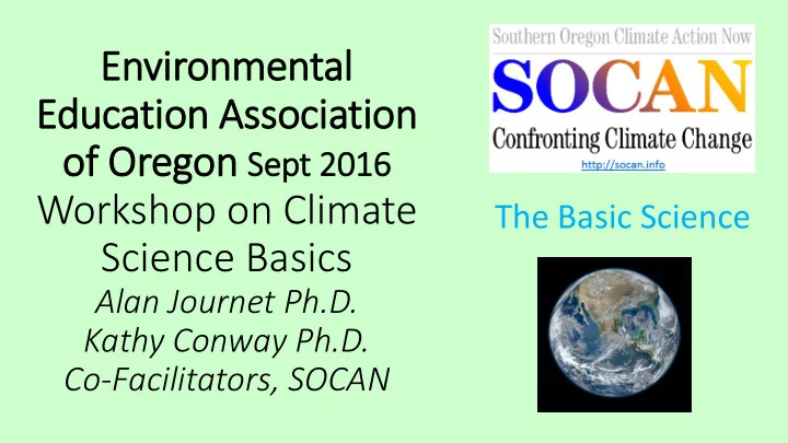
Education Association of Oregon Sept 2016 Workshop on Climate The - - PowerPoint PPT Presentation
Environmental Education Association of Oregon Sept 2016 Workshop on Climate The Basic Science Science Basics Alan Journet Ph.D. Kathy Conway Ph.D. Co-Facilitators, SOCAN Directions Basic Science 1. Examine the images; analyze and
warming (8 minutes)
High h energy ergy short
wave velen lengt gths hs Heat at long wave velen lengt gths hs Visibl ible e medium dium wave velen lengt gths hs
Microwaves TV/Radio FM-AM Depicts the wavelengths of incoming solar radiation reaching Earth, their relative energy intensity, and the proportion reaching the Earth’s surface. (black) (colors)
Transformation of Radiation at Earth’s Surface
Heat wavelengths Hot bodies emit radiation in shorter wavelength form = Visible and UV Light Energy Cooler bodies emit radiation in longer wavelength form = Heat Energy Depicts the transformation of incoming solar radiation from shortwave to outgoing longwave infra-red / heat radiation
Some infra-red / heat is absorbed by atmospheric gases
NOTE: Absorbency is in lower atmosphere – which is where we live
Incoming short wavelength visible radiation Outgoing long wavelength infra-red / heat radiation
Depicting the solar radiation transformation that causes atmospheric warming
If atmospheric gas density increases, more heat is retained by this ‘thermal blanket’ Surface - Lower Atmosphere
Less escapes into space
Depicting how increasing atmospheric Greenhouse Gas concentration causes atmospheric warming
http://data.giss.nasa.gov/gistemp/graphs_v3/Fig.A2.gif 0.36
0.72 .-0.72 1.08
⁰F
1.46 1.8
Depicting the pattern of global atmospheric temperature since records were first collected
Nitrous oxide Water Dihydrogen monoxide Longevity ≈ centuries Carbon dioxide 100 year GWP = 1 Methane 100 year GWP = 34 20 GWP = 86 Longevity ≈ decade Longevity ≈ century 100 year GWP = 298 Longevity ≈ 250 years CFC / HCFC 100 year GWP > 5,000 Longevity ≈ 10 Days The main greenhouse gases and their Global Warming Potential (GWP)
Depicting the pattern in atmospheric concentration of major greenhouse gases over this millennium Carbon dioxide Methane Nitrous oxide
the screen
screen anyway
http://data.giss.nasa.gov/gistemp/graphs_v3/Fig.A2.gif
the hypothesis on your global temperature history graph. Identify a spokesperson to share your analysis with the workshop participants (10 minutes)
conclusions with other workshop participants (10 minutes).
http://data.giss.nasa.gov/gistemp/graphs_v3/Fig.A2.gif
Depicting the pattern of solar radiation activity and global temperature from 1880 Hypothesis 1 – Solar Radiation
http://data.giss.nasa.gov/gistemp/graphs_v3/Fig.A2.gif
Depicting what happens to global temperature following major volcanic eruptions Hypothesis 2 – Volcanoes
http://blogs.edf.org/climate411/2007/05/21/volcanoes/
Depicting the impact of volcanic eruptions on the general atmospheric carbon dioxide trend
http://images.intellicast.com/App_Images/Article/175_16.jpg Depicting the impact of volcanic eruptions on the concentration of atmospheric aerosols reflecting incoming radiation
http://earthobservatory.nasa.gov/Features/Aerosols/page3.php Depicting the impact of volcanic eruptions on the atmospheric aerosol content and temperature
http://data.giss.nasa.gov/gistemp/graphs_v3/Fig.A2.gif
El Niño warming La Niña cooling Depicting the relationship between El Niño and La Niña (ENSO) phases and global atmospheric temperature; SST = Sea Surface (Atmospheric) Temperature Nino 3.4 is location where data were collected Hypothesis 3 – El Niño Southern Oscillation
http://data.giss.nasa.gov/gistemp/graphs_v3/Fig.A2.gif
Depicting the cycle in the shape of Earth’s orbit around the sun over a 100,000 year cycle Hypothesis 4 – Milankovitch Cycles
Depicting the cyclic pattern in the axis of the Earth’s tilt over a 41,000 year cycle
Depicting the cyclic rotation in the axis of the Earth’s tilt over an approximately 20,000 year cycle
Depicting the relationship between the Milankovitch Cycles and current temperature Glaciation Glaciation Glaciation Glaciation
http://data.giss.nasa.gov/gistemp/graphs_v3/Fig.A2.gif
http://www.global-greenhouse-warming.com/greenhouse-gas.html
Hypothesis 5 – Greenhouse Gases