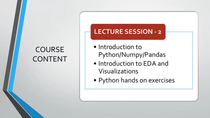
COURSE Python/Numpy/Pandas CONTENT Introduction to EDA and - - PowerPoint PPT Presentation

course
SMART_READER_LITE
LIVE PREVIEW

COURSE Python/Numpy/Pandas CONTENT Introduction to EDA and - - PowerPoint PPT Presentation

LECTURE SESSION - 2 Introduction to COURSE Python/Numpy/Pandas CONTENT Introduction to EDA and Visualizations Python hands on exercises Python Simple programming language to learn Yet very powerful. Used in the following


slide-1
SLIDE 1

COURSE CONTENT

  • Introduction to

Python/Numpy/Pandas

  • Introduction to EDA and

Visualizations

  • Python hands on exercises

LECTURE SESSION - 2

slide-2
SLIDE 2

Python

  • Simple programming language to learn
  • Yet very powerful. Used in the following industries:
  • Data Science, Machine learning and Deep learning
  • IoT, Arduino, etc.
  • Desktop application development
  • Web applications
  • Kept simple to avoid wasting time on cumbersome syntax

and language complexities like with Java, .NET, C++

  • Used by engineers and scientists to implement their

innovation quickly

  • Provides a rich set of libraries
  • Production ready application
slide-3
SLIDE 3

Installation of Python

  • Download Python 3.6 or higher from

python.org

  • Or Download Anaconda Framework

and install

  • Or Go to Google Colab and use the

notebook from your google account

slide-4
SLIDE 4

Common python libraries for Data Analytics

  • NumPy – handling multi-dimensional arrays
  • Pandas – Array Series & DataFrames
  • Matplotlib, Seaborn –Visualization
  • Scipy – Statistical package
slide-5
SLIDE 5

Primitive Data types

  • Integer

x = 100

  • Float

pi = 3.1415

  • String

msg = “Hello World”

  • Logical

isSuccess = True

slide-6
SLIDE 6

Structured Data Types in Python

  • Apart from data types like int, string, float Python has the below data types which are very useful

for data science

  • List

arr1 = [ ‘Red’, ‘Green’, ‘Orange’ ]

  • Tuples

stud = (1092, ‘Albert’, 86.8, ‘PASS’)

  • Dictionaries

planet = {

“planet”: “Mercury”, “moons”: 0, “diameter”: 4879

}

slide-7
SLIDE 7

INTRO TO NUMPY

Numpy is the basic package for scientific computing with Python. Salient features of numpy:

  • A powerful N-dimensional array object – ndarray
  • Helpful functions, that eases array operations
  • Faster than primitive array structure
  • Used in Linear algebra, Matrix, Fourier transform etc.
slide-8
SLIDE 8

PANDAS

  • A library in Python for data manipulation and analysis
  • It offers data structures and operations for manipulating numerical tables

and data frames

  • Contains two important classes:
  • Series
  • DataFrame
  • Meant for storing spreadsheet kind of data
slide-9
SLIDE 9

Case Study

  • Iris Flower Data Analysis

To identify the Iris flower species based on a few characteristics of the flower such as Sepal Length, Sepal Width, Petal Length and Petal Width

  • Dataset

The dataset contains the above said attributes and the target label is the Species type as a category

slide-10
SLIDE 10

EDA – Exploratory data analysis

  • Import numpy, pandas,matplotlib.pyplot, seaborn packages
  • Get the data and read it into a DataFrame
  • Perform Univariate analysis
  • Explore the data for non-null and extreme values
  • Populate the null values with interpolation and clean up
  • Find the skewness, frequency distribution
  • Perform Bivariate and Multivariate analysis
  • Find the correlation between columns with Pearson correlation coefficient
  • Do a pair plot to visualize the distribution
  • Remove the redundant columns and reduce the dimensionalty
slide-11
SLIDE 11

Example: Using DataFrame, Series & array on a data set

slide-12
SLIDE 12

Application of groupby( )

  • Similar to pivot tables in excel
  • What is the mean of the Sepal length,

width and Petal length, width for each Species of the flower?

  • What is the largest Sepal Length for

Setosa?

slide-13
SLIDE 13

Merge vs Join operations in DataFrame

  • Merge – Links two DFs matching by a unique column identifier
  • Join – Links two DFs by their matching index values
slide-14
SLIDE 14

Introduction to Visualization

Data visualization is an important skill in applied statistics and machine learning.

  • It provides an important suite of tools for gaining a qualitative understanding.

This can be helpful when exploring and getting to know a dataset and can help with identifying patterns, corrupt data, outliers, and much more.

  • Visualization is the most important aspect of exploratory data analysis (EDA)
slide-15
SLIDE 15

Matplotlib, Seaborn and Plotly

  • The matplotlib is a popular graphical subroutine and is used widely

for data visualization applications.

  • The matplotlib provides a context, one in which one or more plots

can be drawn before the image is shown or saved to file. The context can be accessed via functions on pyplot. There is some convention to import this context and alias it as plt. import matplotlib.pyplot as plt Matplotlib

slide-16
SLIDE 16

Seaborn

Seaborn is complementary to Matplotlib and it specifically targets statistical data visualization. But it goes even further than that: Seaborn extends Matplotlib and that’s why it can address the frustrations of working with Matplotlib. Matplotlib tries to make easy things easier and hard things

  • possible. Seaborn tries to make a well-defined set of hard

things easy too.

slide-17
SLIDE 17

Types of data

Categorical Continuous Numeric Discrete Counting process (How many) Measuring process (How much) Data types

slide-18
SLIDE 18

Different types of plots

  • Line Plot
  • Bar Chart
  • Histogram Plot
  • Box and Whisker Plot
  • Scatter Plot
slide-19
SLIDE 19

Practical use cases of various visualization techniques

A box plot helps in understanding the distribution of the data at hand. It gives us an understanding

  • f the skewness of the data and provides five-point summary of the data.

Box plot

slide-20
SLIDE 20

Practical use cases of various visualization techniques

Scatter plot

  • Relationship between customer age and average call duration in a telecom

customer churn dataset

  • How width of the petal changes with the length
slide-21
SLIDE 21

Bar plot

  • Population statistics between various groups
  • Count of different groups

Practical use cases of various visualization techniques

slide-22
SLIDE 22

CREDITS

  • 1. Great learning
  • 2. University of Texas at Austin