plotting data
play

Plotting Data March 5, 2010 Derek Ruths Why plot data - PowerPoint PPT Presentation

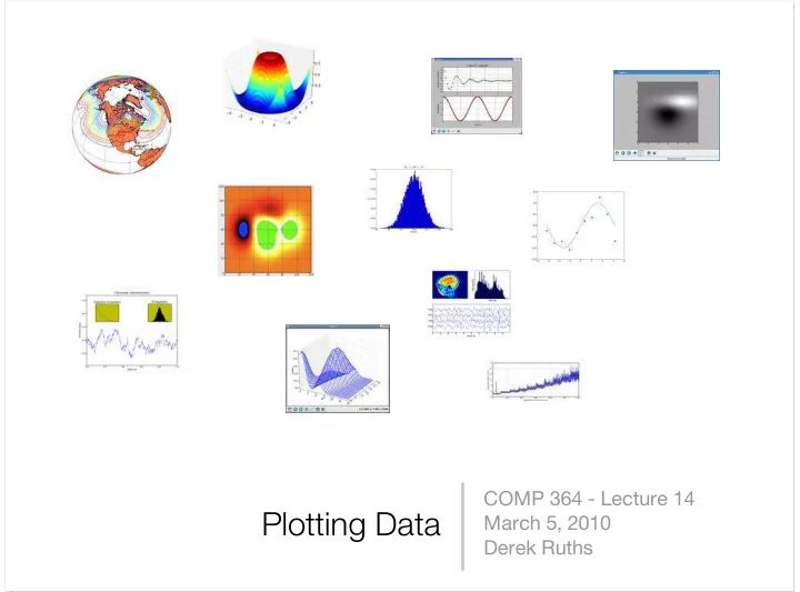
COMP 364 - Lecture 14 Plotting Data March 5, 2010 Derek Ruths Why plot data programmatically? Different kinds of plots... Line plot Scatter plot Histogram Heatmap Line and scatter plots Major considerations for line/scatter plotting


  1. COMP 364 - Lecture 14 Plotting Data March 5, 2010 Derek Ruths

  2. Why plot data programmatically?

  3. Different kinds of plots... Line plot Scatter plot Histogram Heatmap

  4. Line and scatter plots

  5. Major considerations for line/scatter plotting • Data consists of numbers • Each data point has an X and a Y value • Data is specified as two lists (X values and Y values) • Key issue: we read our data in as strings, but need it to be two lists of numbers.

  6. Manipulating lists • x.append(y) - add the object y into list x • x.remove(y) - remove the first occurrence of y in list x Exercise: Consider a file containing x-y datapoints - each line has two numbers, separated by a space. Read these points from the file into two lists.

  7. Line plots • matplotlib (pylab) is a 3rd party python library that provides MANY plotting functions (http://matplotlib.sourceforge.net) • pylab.figure() - creates a new blank figure • pylab.plot(X,Y) - draws a line plot using data points X,Y on the current figure • pylab.show() - displays the current figure on the screen Exercise: extend our previous code to plot the data points in a line graph.

  8. Stylizing our plot • pylab.plot(X,Y,fmt) - fmt is a string that tells pylab how our points should be drawn and connected. • plot(X,Y,’r’) - draw in red • plot(X,Y,’b’) - draw in blue • plot(X,Y,’--b’) - draw a dashed blue line • plot(X,Y,’g.’) - draw a scatterplot with green points pylab.hold(True) - tells pylab to combine future plots onto the current plot • (rather than replacing it) Exercise: modify our previous script to draw a scatter plot. It also should take a threshold. All data points with a y-value > threshold should be drawn in green, otherwise blue.

  9. Annotating a plot • pylab.title(s) - set the title of the current plot to s • pylab.xlabel(s) - set the label of the x axis to s • pylab.ylabel(s) - set the label of the y axis to s • pylab.legend([c1,c2,...]) - draw a legend on the figure labeling each curve Exercise: make the title of our plot the name of the data file, make a legend for the two colors.

  10. Sub plots pylab.subplot(# rows, # cols, plot #) pylab.subplot(2,1,1) pylab.subplot(2,1,2) Exercise: write a script that makes a figure with 2 subplots: one for sin, one for cos. (plot for x = [0,6])

  11. Histograms

  12. hist(...) hist(x,bins=10) Exercise: plot the distribution of gene lengths in a genome file Exercise: use subplot to plot (1) the distribution of gene lengths in a genome file and (2) the length of genes along the genome (in order)

Download Presentation
Download Policy: The content available on the website is offered to you 'AS IS' for your personal information and use only. It cannot be commercialized, licensed, or distributed on other websites without prior consent from the author. To download a presentation, simply click this link. If you encounter any difficulties during the download process, it's possible that the publisher has removed the file from their server.

Recommend


More recommend