Mapping Color to Meaning in Colormap Data Visualizations Karen B. - - PDF document

mapping color to meaning in colormap data visualizations
SMART_READER_LITE
LIVE PREVIEW

Mapping Color to Meaning in Colormap Data Visualizations Karen B. - - PDF document

Discovery, University of WisconsinMadison. Email: kschloss@wisc.edu. Karen B. Schloss, Department of Psychology and Wisconsin Institute for California Institute of Technology. Email: aswang@alumni.caltech.edu. udrey


slide-1
SLIDE 1

810 IEEE TRANSACTIONS ON VISUALIZATION AND COMPUTER GRAPHICS, VOL. 25, NO. 1, JANUARY 2019

Manuscript received 31 Mar. 2018; accepted 1 Aug. 2018. Date of publication 16 Aug. 2018; date of current version 21 Oct. 2018. For information on obtaining reprints of this article, please send e-mail to: reprints@ieee.org, and reference the Digital Object Identifier below. Digital Object Identifier no. 10.1109/TVCG.2018.2865147

Mapping Color to Meaning in Colormap Data Visualizations

Karen B. Schloss, Connor C. Gramazio, Allison T. Silverman, Madeline L. Parker, Audrey S. Wang

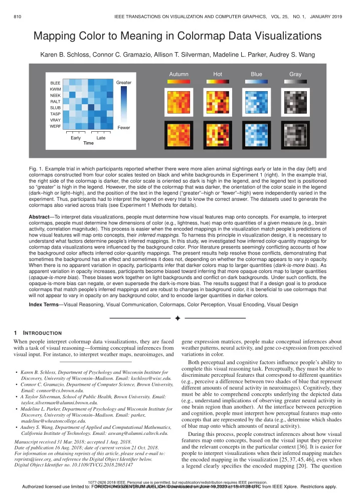
BLEE KWIM NEEK RALT SLUB TASP VRAY WERF

Greater Fewer Early Time Late

Autumn Gray Hot Blue

  • Fig. 1. Example trial in which participants reported whether there were more alien animal sightings early or late in the day (left) and

colormaps constructed from four color scales tested on black and white backgrounds in Experiment 1 (right). In the example trial, the right side of the colormap is darker, the color scale is oriented so dark is high in the legend, and the legend text is positioned so “greater” is high in the legend. However, the side of the colormap that was darker, the orientation of the color scale in the legend (dark–high or light–high), and the position of the text in the legend (“greater”–high or “fewer”–high) were independently varied in the

  • experiment. Thus, participants had to interpret the legend on every trial to know the correct answer. The datasets used to generate the

colormaps also varied across trials (see Experiment 1 Methods for details). Abstract—To interpret data visualizations, people must determine how visual features map onto concepts. For example, to interpret colormaps, people must determine how dimensions of color (e.g., lightness, hue) map onto quantities of a given measure (e.g., brain activity, correlation magnitude). This process is easier when the encoded mappings in the visualization match people’s predictions of how visual features will map onto concepts, their inferred mappings. To harness this principle in visualization design, it is necessary to understand what factors determine people’s inferred mappings. In this study, we investigated how inferred color-quantity mappings for colormap data visualizations were influenced by the background color. Prior literature presents seemingly conflicting accounts of how the background color affects inferred color-quantity mappings. The present results help resolve those conflicts, demonstrating that sometimes the background has an effect and sometimes it does not, depending on whether the colormap appears to vary in opacity. When there is no apparent variation in opacity, participants infer that darker colors map to larger quantities (dark-is-more bias). As apparent variation in opacity increases, participants become biased toward inferring that more opaque colors map to larger quantities (opaque-is-more bias). These biases work together on light backgrounds and conflict on dark backgrounds. Under such conflicts, the

  • paque-is-more bias can negate, or even supersede the dark-is-more bias. The results suggest that if a design goal is to produce

colormaps that match people’s inferred mappings and are robust to changes in background color, it is beneficial to use colormaps that will not appear to vary in opacity on any background color, and to encode larger quantities in darker colors. Index Terms—Visual Reasoning, Visual Communication, Colormaps, Color Perception, Visual Encoding, Visual Design

1 INTRODUCTION When people interpret colormap data visualizations, they are faced with a task of visual reasoning—forming conceptual inferences from visual input. For instance, to interpret weather maps, neuroimages, and

  • Karen B. Schloss, Department of Psychology and Wisconsin Institute for

Discovery, University of Wisconsin–Madison. Email: kschloss@wisc.edu.

  • Connor C. Gramazio, Department of Computer Science, Brown University,

Email: connor@cs.brown.edu.

  • ฀ Taylor Silverman, School of Public Health, Brown University. Email:

taylor silverman@alumni.brown.edu.

  • Madeline L. Parker, Department of Psychology and Wisconsin Institute for

Discovery, University of Wisconsin–Madison. Email: parker madeline@wheatoncollege.edu.

  • ฀udrey S. Wang, Department of ฀pplied and Computational Mathematics,

California Institute of Technology. Email: aswang@alumni.caltech.edu.

gene expression matrices, people make conceptual inferences about weather patterns, neural activity, and gene co-expression from perceived variations in color. Both perceptual and cognitive factors influence people’s ability to complete this visual reasoning task. Perceptually, they must be able to discriminate perceptual features that correspond to different quantities (e.g., perceive a difference between two shades of blue that represent different amounts of neural activity in neuroimages). Cognitively, they must be able to comprehend concepts underlying the depicted data (e.g., understand implications of observing greater neural activity in

  • ne brain region than another). At the interface between perception

and cognition, people must interpret how perceptual features map onto concepts that are represented by the data (e.g., determine which shades

  • f blue map onto which amounts of neural activity).

During this process, people construct inferences about how visual features map onto concepts, based on the visual input they perceive and the relevant concepts in the particular context [36]. It is easier for people to interpret visualizations when their inferred mapping matches the encoded mapping in the visualization [25,37,45,46], even when a legend clearly specifies the encoded mapping [20]. The question

  • 1077-2626 2018 IEEE. Personal use is permitted, but republication/redistribution requires IEEE permission.

See http://www.ieee.org/publications_standards/publications/rights/index.html for more information.

Authorized licensed use limited to: FORSCHUNGSZENTRUM JUELICH. Downloaded on June 19,2020 at 15:41:38 UTC from IEEE Xplore. Restrictions apply.

slide-2
SLIDE 2

SCHLOSS ET AL.: MAPPING COLOR TO MEANING IN COLORMAP DATA VISUALIZATIONS 811

  • Karen B. Schloss, Department of Psychology and Wisconsin Institute for

Discovery, University of Wisconsin–Madison. Email: kschloss@wisc.edu.

  • Connor C. Gramazio, Department of Computer Science, Brown University,

Email: connor@cs.brown.edu.

  • ฀ Taylor Silverman, School of Public Health, Brown University. Email:

taylor silverman@alumni.brown.edu.

  • Madeline L. Parker, Department of Psychology and Wisconsin Institute for

Discovery, University of Wisconsin–Madison. Email: parker madeline@wheatoncollege.edu.

  • ฀udrey S. Wang, Department of ฀pplied and Computational Mathematics,

California Institute of Technology. Email: aswang@alumni.caltech.edu.

is, what factors determine people’s inferred mappings? To address this question, we studied how inferred color-quantity mappings for colormap data visualizations were influenced by relations between colors within colormaps and colors of the background. From previous literature, it is unclear how varying the background influences people’s inferred mappings for colormap data visualizations (see Section 2.3.1). There are three types of biases that could deter- mine inferred mappings, which have different implications for the role

  • f the background. A dark-is-more bias [9, 26, 30] implies people

infer that darker colors map to larger quantities, regardless of the back- ground color. A contrast-is-more bias [22] implies people infer that higher-contrast colors map to larger quantities, which depends on the background (i.e., dark is more on light backgrounds; light is more on dark backgrounds). An opaque-is-more bias implies people infer that more opaque colors map to larger quantities, which depends on the background in the same manner as the contrast-is-more bias, but only when the colormap appears to vary in opacity. We tested for these biases by presenting participants with colormaps

  • f fictitious alien animal sightings (Figure 1), and evaluating their

response time to report whether there were more sightings early or late in the day. We varied the encoded color-quantity mapping in the legend (“dark-more” or “light-more” encoding), as well as the color scale used to construct the colormap and the color of the background. By determining which encoded mappings resulted in faster response times for different colormap and background combinations, we learned about the conditions under which inferred mappings were affected by the background. Our results demonstrate:

  • The role of the background differs depending on the kind of

color scale used to construct the colormap and its relation with the background. The background only matters if the colormap appears to vary in opacity.

  • When colormaps do not appear to vary in opacity, inferred map-

pings are dominated by a dark-is-more bias with no effect of the background. This finding challenges a pure version of the contrast-is-more bias.

  • When colormaps do appear to vary in opacity, inferred mappings

contain an opaque-is-more bias. The strength of the opaque-is- more bias depends on the strength of apparent opacity variation. The opaque-is-more bias is a nuanced version of the contrast- is-more bias because contrast with the background only matters when there is apparent variation in opacity. By distinguishing between dark-is-more, contrast-is-more, and

  • paque-is-more biases, our results unite prior results and illustrations

in the literature, and resolve seemingly conflicting claims. 2 RELATED WORK In this section, we first discuss related work on colormaps, followed by the motivation for our current approach. 2.1 Colormap Data Visualizations Previous work on colormap data visualizations can be grouped into three main types: (1) designing color scales for colormaps, (2) selecting color scales according to data and task, and (3) encoding semantics in colormap visualizations. We briefly touch on the first two types and then go into greater depth on encoding semantics, given that is the topic

  • f the present study.

2.1.1 Designing color scales for colormaps Extensive research has focused on defining the properties of color scales that result in effective colormaps. In a comprehensive review, Bujack et

  • al. [7] organized these properties into distinct categories, highlighting

three categories for which they defined mathematical formulations: discriminative power, uniformity, and order. Discriminative power relates to the amount of distinct colors ob- servers can perceive in a color scale. Bujack et al.’s mathematical formulation of discriminative power focused on distance in color space,

A C B D

  • Fig. 2. The top row shows value-by-alpha maps from Roth et al. [34] on

(A) white and (B) black backgrounds. The colormaps are different on the two backgrounds. The most saturated color is interpolated with the back- ground color, consistent with apparent variation in opacity. The bottom row shows approximations of the colormaps from McGranaghan [22], based on the color coordinates reported in the paper. The colormaps are the same on the (C) white and (D) black background. The most saturated color is in the middle of the color scale with lighter and darker colors that are less saturated, inconsistent with apparent opacity variation.

but perceptual discriminability also depends on additional factors, in- cluding trajectory in color space [21]. Uniformity relates to the consistency in perceived differences be- tween pairs of equidistant points that are sampled from different parts

  • f a color scale. In a uniform scale, pairs of points that are equidistant

should appear equally different. Order relates to the appearance that colors in the color scale follow a natural progression. For some color scales, the order is easy to perceive when viewed in scale format (e.g., in a legend), but the order is difficult to perceive when viewed in colormap format, especially when the positions of the colors are scrambled. Rainbow colormaps are notorious for this problem [4,7,24,32], but it has been argued that this issue should not preclude their use [6,28]. For thorough discussions on factors involved in designing color scales, see Bujack et al. [7], as well as [39,49], and references therein. 2.1.2 Selecting color scales according to data and task Different color scales are more or less effective, depending on the properties of data they represent and the tasks needed to interpret the data (see [29,39,49] for reviews). One important property of the data to consider is the format of the underlying numeric scale (e.g., sequential or diverging) [5]. It is widely held that sequential data—varying from low to high—should be represented by sequential color scales—varying from light to dark or dark to light. In contrast, diverging data with a meaningful midpoint (e.g., neutral or average), should be represented by diverging color scales with a clear perceptual midpoint (e.g., gradations of saturation with an achromatic midpoint) [5,33]. Another relevant property of the data is its spatial frequency com-

  • position. Rogowitz and Treinish [33] suggested using color scales that

vary in lightness to reveal high spatial frequency patterns (fine details) and using color scales that vary in hue and saturation to reveal low spatial frequency patterns (courser changes). However, recent evidence suggests that hue variation helps observers perceive gradients when there are high spatial frequencies [28]. People perform different kinds of tasks when interpreting colormaps, which include detecting surface structure and identifying specific quan-

  • tities. Researchers have suggested that people are better at detect-

ing surface structure of scalar field colormaps when color scales vary monotonically in lightness, compared to when color scales vary in hue [42,47]. In contrast, people are better at identifying specific quanti- ties when color scales vary in hue than when they vary only in light-

Authorized licensed use limited to: FORSCHUNGSZENTRUM JUELICH. Downloaded on June 19,2020 at 15:41:38 UTC from IEEE Xplore. Restrictions apply.

slide-3
SLIDE 3

812 IEEE TRANSACTIONS ON VISUALIZATION AND COMPUTER GRAPHICS, VOL. 25, NO. 1, JANUARY 2019

  • ness. [47]. Based on these findings, some suggested that “redundant”

color scales that vary in hue while also varying monotonically in light- ness are robust for different kinds of tasks [29, 39, 47]. Indeed, Liu and Heer reported that these kinds of scales were better for judging relative distances between colors sampled from the scale, compared with single-hue color scales varying monotonically in lightness and multi-hue color scales varying non-monotonically in lightness [21]. However, Reda, Nalawade, and Ansah-Koi reported that for perceiving spatial patterns in scalar field colormaps, multi-hue, divergent scales with non-monotonic lightness variation might be best [28]. 2.1.3 Encoding semantics in colormap visualizations Once one selects a well-designed scale that is appropriate for the task and data, one must decide how to map perceptual dimensions from the color scale onto conceptual dimensions represented by the data. Should larger quantities in the data be mapped to darker colors? To higher contrast colors? To more opaque colors? Dark-is-more bias Early empirical work in cartography reported a dark-is-more bias [9]. When presented with choropleth colormaps with no legend, participants inferred that darker regions represented larger quantities. A subsequent eye-tracking study found that participants fixated on the legend less often and were more accurate at answering questions for ‘conventional’ lightness-based choropleth maps with dark-more encoding, compared with ‘unconventional’ hue-based colormaps [1]. These results suggest ‘conventional’ lightness-based choropleth maps were easier to interpret. However, the authors did not test colormaps with light-more encoding, so it is unclear if these differences were because of a dark-is-more bias, or because it was easier to interpret the ordering among colors in the lightness-based scale than in the hue-based scale. Contrast-is-more bias McGranaghan [22] suggested the dark-is- more bias is a special case of a contrast-is-more bias, in which people infer that darker colors map to larger quantities on light backgrounds, but lighter colors map to larger quantities on dark backgrounds. Mc- Granaghan [22] tested this hypothesis by asking participants to interpret choropleth colormaps presented on white, gray, and black backgrounds when there was no legend to specify the encoded mapping. Participants inferred that darker colors represented larger quantities for all three background conditions, but this effect was significantly reduced on the black background. These results challenged the hypothesis that there is a contrast-is-more bias, but also challenged the notion that there is

  • nly a dark-is-more bias that is unaffected by the background. To this

point, Brewer [5] suggested that although higher values are usually represented by darker colors, this mapping can be reversed on dark backgrounds, as long as there is clear legend specifying the mapping. The role of opacity variation? Roth et al. [34] proposed using ‘value-by-alpha’ maps, in which larger quantities map onto the highest contrast colors (Figure 2A and B). Given McGranaghan’s [22] empiri- cal evidence challenging the contrast-is-more bias, one might think that the light-more encodings in value-by-alpha maps on dark backgrounds contradict people’s inferred mappings. However, that might not be the case if the key factor is actually apparent opacity given the background, rather than color contrast (or distance in color space) from the back-

  • ground. If so, people may have an opaque-is-more bias, which to our

knowledge, has not yet been empirically tested. A colormap should appear to vary in opacity when the color scale is constructed by linearly interpolating between a reference color and a perceptually distinct background color. In the resulting color scale, the reference color is the highest contrast, or most distinct color from the background. Parts of the image containing the reference color appear as opaque foregrounds, and parts containing intermediate colors appear as foregrounds with varying amount of opacity, overlaid on the

  • background. This is the basic principle for producing apparent variation

in opacity in graphics software by adjusting sliders that control opacity

  • r transparency [27].

In Roth et al.’s [34] value-by alpha maps shown in Figure 2A and B, there are two reference colors, saturated red and saturated blue.

Homogeneous Figure Heterogeneous Ground Heterogeneous Figure Homogeneous Ground Dark Figure Light Figure

  • Fig. 3. Illustrations of the conditions that produce apparent opacity

variation in value-by-alpha maps [34], in which the figural region is a heterogeneous translucent surface (varying amounts of opacity) on a homogenous ground (left) and traditional perceptual transparency, in which the figural region is a homogeneous surface (constant amount of

  • pacity) on a heterogeneous ground (right)

These colors are interpolated with the background color, which pro- duces intermediate colors that appear to vary in opacity. This can be interpreted as a divergent color scale with maximally opaque endpoints and a minimally opaque midpoint. In contrast, the color scale used in McGranaghan’s [22] study (ap- proximated in Figure 2C and D) curved in color space in a manner that would impede apparent variation in opacity on black or white

  • backgrounds. That is, the lightest and darkest colors were low in satu-

ration and the mid-level lightness colors were high in saturation, which would not occur if either endpoint was a reference color that varied in

  • pacity. This color scale is similar to ColorBrewer Blue [14], which

we studied in Experiment 1. This key difference could explain why light-more encoding on dark backgrounds may match people’s inferred mappings for value-by-alpha maps, but not for the colormaps tested in McGranaghan’s study. Figure 3 (left) illustrates conditions in the natural world that could produce the kind of apparent variation in opacity that is relevant to

  • colormaps. Here, a surface with heterogeneous levels of opacity is

superimposed on a homogeneous background. A similar percept might

  • ccur if discrete figural elements vary in density on a given background

(e.g., variation in density of chocolate powder on whipped cream or density of snow on asphalt). The percept of opacity variation in these displays depends on the way colors vary with respect to each other and the background, regardless of their spatial arrangement. As Roth et al. [34] discuss, apparent opacity variation in colormaps must not depend on colors appearing in specific spatial relations because spatial arrangements of colored regions will vary depending on the dataset. Research in perception has begun to work on understanding apparent variations in opacity on homogenous backgrounds [11], but these con- ditions differ from classic demonstrations of perceived opacity (more typically referred to as perceptual transparency) [3,23,40]. Figure 3 (right) illustrates the classic version, in which a homogenous surface of a constant level of opacity appears to be superimposed on a heteroge- neous background. Here, the percept of opacity variation depends on spatial relations between the colored regions in the configuration (i.e., x-junctions). 2.2 Motivating Our Approach We discuss three factors that motivated our approach for designing the experiments in this study. 2.2.1 Measuring inferred mappings Inferred mappings between perceptual features and concepts are typ- ically measured in one of two ways. In the direct report method, participants are asked to interpret the meaning of perceptual features in visualizations that do not have legends or labels to specify the correct

σ 2σ

Authorized licensed use limited to: FORSCHUNGSZENTRUM JUELICH. Downloaded on June 19,2020 at 15:41:38 UTC from IEEE Xplore. Restrictions apply.

slide-4
SLIDE 4

SCHLOSS ET AL.: MAPPING COLOR TO MEANING IN COLORMAP DATA VISUALIZATIONS 813

answer [37,48]. Without objectively correct answers, participants’ re- ported interpretations reveal their inferred mappings. In the response time method, participants are asked to accurately interpret the meaning

  • f perceptual features in visualizations that do have legends or labels to

specify the correct answer [20]. The response time method relies on the assumptions that (a) it is easier to interpret visualizations in which the encoding mapping matches the inferred mapping [25,45,46], and (b) ease of interpretation can be operationalized as faster RTs. It follows that we can learn about inferred mappings by evaluating which encoded mappings facilitate faster RTs. We chose the response time method, and compared RTs for col-

  • rmaps with legends that encoded different mappings. One reason for

this choice was our concern that if we explicitly asked participants to interpret unlabeled colormaps, they might try to be consistent across tri- als, even when we varied the background. Response time is an implicit measure that should be less subject to this sort of participant demand

  • characteristic. We considered that McGranaghan [22] might have found

that the dark-is-more bias weakened, but did not reverse on the black background because participants were trying to respond consistently across background conditions. However, given the results of our present study, we no longer have this concern about McGranaghan’s findings (see General Discussion). Another reason for choosing this method is that colormaps typically (though not always [8]) have legends or labels that specify the encoded mapping, and we sought to study colormaps under conditions in which they are typically observed. 2.2.2 Using synthetic data to construct visualizations Following prior literature [15,17,19], we used synthetic data to con- struct the data visualizations used as test stimuli, enabling tight control

  • ver the stimulus parameters. We also used a fictitious cover story,

explaining that the data were about alien animal sightings on Planet Sparl, to prevent participants from having preconceived notions about colors associated with the subject matter that ‘produced’ the data. 2.2.3 Specifying colors to produce colormaps In laboratory experiments where the goal is to display colors that other researchers can perfectly reproduce in their own labs, it is critical to use careful monitor calibration procedures and specify colors in a device-independent color space. Here, we aimed to study colormaps that people use for real data visualizations, which are specified in device-dependent coordinates (e.g. RGB), and are typically viewed

  • n personal computers or printed documents. Therefore, we chose to

use pre-made color scales from MATLAB and ColorBrewer [14] for Experiment 1, and we generated color scales based on Roth et al.’s [34] value-by-alpha maps in Experiment 2. When we converted the RGB values of these color scales to CIELAB coordinates, we made standard assumptions about the white point and monitor characteristics, using MATLAB’s rgb2lab function. The approach we used here is typical in the visualization literature, where the goal is to study visualizations that are robust to variations in viewing conditions [12,43,44]. However, we note that these are only approximations of CIELAB coordinates, and to render true CIELAB coordinates it is necessary to carefully calibrate the display screen and verify that color presentation is accurate using a color measurement device. 3 EXPERIMENT 1 In Experiment 1, we evaluated how the background color influenced inferred mappings when colormaps were constructed using various color scales that are standard for visualization (Figure 1). In the ex- periment, participants saw colormaps of alien animal sightings and reported whether there were more sightings early or late in the day. We varied the encoded mapping such that the legend specified that darker colors meant greater amounts of sightings (‘dark-more’ encoding) on half of the trials and lighter colors meant greater amounts of sightings (‘light-more’ encoding) on the other half. By identifying which en- coding conditions resulted in faster RTs, we learned about people’s inferred mappings.

0.0 0.2 0.4 0.6 0.8 1.0 Time Slot Alien Animal Sightings 1 2 3 4 5 6 7 8 σ 2σ

  • Fig. 4. Distribution used to sample values at each time point to generate

the data used to construct the colormap images (see text for details).

3.1 Methods 3.1.1 Participants There were 30 participants (mean age = 22), who were undergraduates

  • r members of the community at Brown University. They received

either partial course credit or $10 for their participation. All had normal color vision (screened using the HRR Pseudoisochromatic Plates [13]) and gave informed consent. The Brown University Institutional Review Board approved the experimental protocol. Data from three additional participants were excluded (not analyzed), due to experimenter error in giving the instructions. 3.1.2 Design and displays The display for each trial contained a colormap data visualization with a legend specifying the encoded mapping (dark-more or light-more) (Figure 1; left). The colormap visualization was an 8 × 8 grid (6.5 cm × 6.5 cm) centered on the screen. The rows represented fictitious alien animal species, the columns represented time of day, and the color of each cell corresponded to frequency of sightings of each animal at each time point. To help participants categorize the sightings as early vs. late in the day, the left four columns were labeled “early” and the right four columns were labeled “late.” A legend (5.5 cm tall × 0.5 cm wide) was displayed 2.25 cm to the right of the colormap. The colormap and legend appeared on either a white or black background (16.25 cm × 16.25 cm) centered on the screen. The surrounding monitor color was gray (RGB = [128, 128, 128]). The displays were presented on a ProArt PA246Q monitor (1920 × 1200 resolution, 67 cm diagonal). We generated the colormaps using four different color scales that var- ied monotonically in lightness: MATLAB Autumn, Hot, and Gray, and ColorBrewer Blue (Figure 1; right). We also included the MATLAB Jet color scale, which does not vary monotonically in lightness—both endpoints are dark. Given that our focus is on inferred mappings for color scales that vary monotonically in lightness, we reserved discus- sion of the Jet colormap for the Supplementary Material (Figure S4). The colormap images and summary data from the experiments can be found on our website (https://schlosslab.discovery.wisc.edu/resources). The data used to generate the colormaps were sampled from an arctangent curve with added normally-sampled noise (Figure 4). To generate the data for each row of the colormap, we discretized the arc tangent curve into eight bins, corresponding to the eight columns in the colormap display. We centered the arctangent curve between the fourth and fifth bins, such that half of the display was biased to have larger values than the other half. We then perturbed each arctangent value by sampling from a normal distribution with the mean equal to the arctangent value and the standard deviation equal to 0.25. When the values fell outside the [0,1] interval, we re-sampled until they were all within the correct range. For half of the datasets, the arctangent curve was oriented as shown in Figure 4, and for the other half, it was left/right reversed. This enabled a left/right balance of the darker region

Authorized licensed use limited to: FORSCHUNGSZENTRUM JUELICH. Downloaded on June 19,2020 at 15:41:38 UTC from IEEE Xplore. Restrictions apply.

slide-5
SLIDE 5

814 IEEE TRANSACTIONS ON VISUALIZATION AND COMPUTER GRAPHICS, VOL. 25, NO. 1, JANUARY 2019

(i.e., half of the colormaps contained the darker region on the left and the other half contained the darker region on the right). There were 20 colormap conditions (5 color scales × 2 background colors × 2 left/right balances). For each colormap condition, we created 20 different colormaps with unique datasets generated using the sam- pling procedure described above. This enabled us to repeat the same conditions 20 times without having participants see the same images, which helped prevent them from memorizing the patterns. Participants saw 400 unique colormap images. During the experiment, participants saw each of these 400 colormap images four times to accommodate four different legend conditions: 2 encoded lightness mappings (dark-more, light-more) × 2 legend text positions (“greater”–high, “fewer”–high). This was achieved by independently varying the orientation of the color scale in the legend (dark–high or light–high), and the position of the text in the legend (“greater”–high or “fewer”–high) (see Figure S1 in the Supplementary Material). This design ensured that participants read the legend on every trial and could not merely look at which color or label was at the top

  • r bottom of the legend to make a correct response. By showing each

colormap image four times, one for each legend condition, we ensured that any differences in response times due to the legend conditions were not due to variations in the underlying data used to construct the

  • colormaps. The combination of these 4 legend conditions x 400 unique

colormaps described above produced 1600 trials. 3.1.3 Procedure Participants were told that they would see colormaps representing the amount of animal sightings on a distant planet, Sparl. The x-axis would represent time of day and the y-axis would represent type of animal. Each map would have a legend, and sometimes the larger numbers would be on the top of the legend and other times larger numbers would be at the bottom (no numbers were explicitly shown, only the labels “greater” and “fewer”). Their task would be to indicate whether there were more animals early (left) or late (right) in the day by pressing the left or right arrow key. They were asked to respond as quickly as possible while maintaining their accuracy. They were told that a tone would play each time they made an error, and that they would be notified of their accuracy periodically. To help participants account for why they would see many colormaps

  • f the same kind of data during the experiment, they were told that

each map showed data measured from different locations on the planet, where different animals were visible different amounts at different times of day. On the instructions screen, there were eight different grayscale colormap data visualizations without legends so participants could see how the datasets could vary. Prior to beginning the experiment, there were 20 practice trials, which were randomly selected from the set of all possible conditions. Each trial began with a 500 ms blank gray screen, followed by an exper- imental display containing the colormap and legend. This experimental display remained on the screen until participants made their response. During the experiment, the colormaps were presented using a blocked randomized design: all 80 possible conditions (5 color scales × 2 backgrounds × 2 left/right balances × 2 encoded lightness map- pings × 2 legend text positioning) were displayed once in a random

  • rder within each block before beginning the next block. Participants

were given short breaks after each set of 20 trials. We recorded RT and accuracy. 3.2 Results and Discussion To prepare the RTs for analysis, we first eliminated trials with errors (mean accuracy was 97%; range of accuracy across participants was 91%-99%). We then calculated the mean and standard deviation across all remaining trials for each participant, and pruned any trials that were +/- 2 standard deviations from that participant’s mean. Next, we calculated the mean across the remaining trials (out of 20) within each of the 80 experiment conditions and averaged over the left/right positioning of the darker region in the colormap. Given that legend text position was not central to our research question, and we only varied it to ensure participants read the legend on each trial, we present results involving legend text position in the Supplementary Material (Figure S2). Figure 5A shows the mean RTs for dark-more and light-more en- coded mappings, separated by color scale and background, but averaged

  • ver legend text position. Overall, the RTs were faster for dark-more

encoding than light-more encoding and faster for the white background than the black background. RTs also varied across color scales (fastest for Autumn, slowest for Gray, with Hot and Blue in between). These observations were supported by a repeated-measures ANOVA with 2 encoded lightness mappings (dark-more, light-more) x 2 back- grounds (white, black) x 4 color scales (Autumn, Hot, Blue, and Gray) x 2 legend text positions (“greater”–high, “fewer”–high). There were main effects of encoded lightness mapping (F(1,29) = 32.50, p <.001, η2

p = .528), background (F(1,29) = 23.60, p <.001, η2 p = .449), and

color scale (F(3,87) = 20.49, p <.001, η2

p = .414). We compared RTs

for each pair of color scales using the Bonferroni correction (adjusted alpha = .008). RTs were faster for Autumn than Hot, Blue, and Gray (F(1,29) = 9.48, 20.23, 34.01 ps <.008, η2

p = .246, .411, .540, respec-

tively). RTs for Hot and Blue did not differ (F <1), but were faster for Hot than Gray and Blue than Gray (F(1,29) = 18.06, 19.43 ps <.008, η2

p = .384, .401).

Critical for our question of how inferred mappings depend on the background, there was a 3-way interaction between encoded lightness mapping, background, and color scale (F(3,87) = 13.94, p <.001, η2

p =

.325). As evident in Figure 5A, participants showed a dark-is-more bias for the Autumn, Hot, and Blue color scales, although it was reduced for the Blue color scale on the black background. The pattern was different for the Gray color scale, with faster RTs for dark-more encoding on the white background but no difference on the black background. These observations were supported by ANOVAs within each color scale (2 encoded lightness mappings × 2 backgrounds). For Autumn, Hot, and Blue, there were main effects of encoded lightness mapping, with dark-more encoding resulting in faster RTs (F(1,29) = 28.19, 41.62, 17.85, ps <.001, η2

p = .493, .589, .381, respectively). This effect did

not interact with the background for Autumn or Hot (Fs <1), but did interact with the background for Blue (F(1,29) = 7.58, p = .010, η2

p =

.207). Despite this interaction, RTs for Blue were faster for dark-more encoding on both white backgrounds (F(1,29) = 19.74, p <.001, η2

p

= .405) and black backgrounds (F(1,29) = 9.72, p = .004, η2

p = .251).

For Gray, RTs were overall faster for dark-more encoding (F(1,29) = 9.82, p = .004,η2

p = .253), but that was driven by the difference within

the white background condition (F(1,29) = 30.98, p <.001, η2

p = .516).

Encoded lightness mapping interacted with background (F(1,29) = 21.05, p <.001, η2

p = .421), with faster RTs for dark-more encoding

  • n the white background as stated above, but a trend toward faster RTs

for light-more encoding on the black background (F(1,29) = 3.31, p = .079, η2

p = .102).

Why did the background have different effects depending on the color scale? A possibility is that the color scales differed in their degree

  • f apparent opacity variation. By viewing the colormaps along the

x-axis in Figure 5A, it may be observed that the Gray colormaps appear to vary in opacity, the Blue colormaps somewhat appear to vary in

  • pacity, and the Autumn and Hot colormaps do not appear to vary in
  • pacity. As discussed in Section 2.1.3, apparent opacity variation arises

when a reference color is linearly interpolated with the background

  • color. This suggests that we can estimate the degree of apparent opacity

variation based on the degree to which the colors in the color scale deviate from the linear interpolation. Figure 5B-C illustrates the differences in the trajectories of each color scale (squares and thick gray line) and the linear interpolation between the color scale’s highest contrast color with the white back- ground (Figure 5B) and black background (Figure 5C) (circles and thin dashed line). Here, the color scales are plotted on the L* b* plane in CIELAB space. A version of this figure containing the L* a* plane of CIELAB space can be found in the Supplementary Material (Figure S5). Notice that the Gray color scale falls along this interpolated line, Blue follows a curve that deviates slightly from the line, and Autumn and Hot deviate substantially from the line (the deviation for Autumn

  • n the white background is more apparent on the L* a* plane).

Authorized licensed use limited to: FORSCHUNGSZENTRUM JUELICH. Downloaded on June 19,2020 at 15:41:38 UTC from IEEE Xplore. Restrictions apply.

slide-6
SLIDE 6

SCHLOSS ET AL.: MAPPING COLOR TO MEANING IN COLORMAP DATA VISUALIZATIONS 815

Blue

White Black Background Color

Autumn

White Black Background Color

0.9 1.0 1.1 1.2 1.3

Mean RT (s)

0.9 1.0 1.1 1.2 1.3

Mean RT (s)

0.9 1.0 1.1 1.2 1.3

Mean RT (s)

0.9 1.0 1.1 1.2 1.3

Mean RT (s)

Hot

White Black Background Color

Gray

White Black Background Color

Light-more Dark-more Light-more Dark-more Light-more Dark-more Light-more Dark-more

A B C

  • 100

100 100

  • 100

100 100

  • 100

100 100

  • 100

100 100

  • 100

100 100

  • 100

100 100

  • 100

100 100

  • 100

100 100 3.8 4.3 2.7 4.1 4.3 3.4

L* L* L* L* L* L* L* L* b* b* b* b* b* b* b* b*

  • Fig. 5. (A) Mean RTs for light-more encoding (light bars) and dark-more encoding (dark bars), separated by background color (x-axis) and color scale

(separate plots). The icons along x-axis represent example colormaps with each condition (note: the darker region is on the right in these examples, but the dark region was left/right balanced in the experiment). Error bars represent +/- standard errors of the means. (B) Plots of each color scale (squares) and interpolations between the highest contrast color and the white background (circles) in CIELAB space. (C) The corresponding plots from B for the black background. In B and C, the number above each plot is the Opacity Variation Index (see text for details).

We quantified these deviations in what we call an Opacity Variation Index defined as, log(z+1), where z is the root mean squared error (RMS) between each point in the color scale and the line between the highest-contrast color and the background. We used log RMS because we reasoned that small deviations from the line would strongly affect apparent variation in opacity, but the effect of further increasing the deviation should level off as apparent variation in opacity is broken. The Opacity Variation Index for each color scale on each background is displayed above each plot in Figures 5B and 5C. Smaller Opacity Variation Index values—less deviance from the line—indicate greater perceptual evidence for opacity variation. We examined whether the Opacity Variation Index could account for the relative difference in RTs for dark-more and light-more encodings across color scales. Figure 6 illustrates the mean RT difference (dark- more encoding – light-more encoding) for each color scale as a function

  • f the Opacity Variation Index for the white and black backgrounds.

Generally, the points are below zero, which reflects the dark-is-more bias reported above. However, if the only effect present was the dark- is-more bias, the points for each color scale would have the same shift below zero. Instead, the points fall along a line predicted by the Opacity Variation Index (white background: r = 0.969, p = .031; black background: r = -.999, p = .001). On the white background, RTs were especially faster for dark-more encoding when there was greater evidence for opacity variation (smaller Opacity Variation Indexes), which can be explained as cooperating dark-is-more and opaque-is- more biases. The opposite was true for the black background, which can be explained as conflicting dark-is-more and opaque-is-more biases. The Gray color scale was an anomaly in this experiment as the only condition in which RTs were not faster for dark-more encodings than light-more encodings when the background was black. However, we predicted that it should be possible to replicate and extend this effect for other color scales that follow linear interpolations between the highest contrast color and the background. We test this prediction in Experiment 2. In summary, Experiment 1 demonstrated that when color scales did not appear to vary in opacity, inferred mappings were dominated by a dark-is-more bias, regardless of the background. However, as evidence for opacity variation increased, inferred mappings became increasingly more influenced by an opaque-is-more bias. When the background was white, the opaque-is-more bias reinforced the dark-is-more bias (i.e., faster RTs for dark-more encoding). When the background was black, the opaque-is-more bias contradicted, and thereby dampened the dark-is-more bias. 4 EXPERIMENT 2 Experiment 2 directly tested our hypothesis that there is an opaque-is- more bias. Participants saw colormaps that were generated from three different color scales, which were linear interpolations between black– white (analogous to Gray in Experiment 1), black–blue, and blue–white. These colormaps were presented on three possible background colors:

Authorized licensed use limited to: FORSCHUNGSZENTRUM JUELICH. Downloaded on June 19,2020 at 15:41:38 UTC from IEEE Xplore. Restrictions apply.

slide-7
SLIDE 7

816 IEEE TRANSACTIONS ON VISUALIZATION AND COMPUTER GRAPHICS, VOL. 25, NO. 1, JANUARY 2019

  • .10
  • .05

.00 .05 RT Difference (s) White Background Gray Blue Autumn Hot Black Background Gray Blue Autumn Hot r = 0.969* r = -0.999** Opacity Variation Index Opactiy Variation Index Dark-more Faster Light-more Faster Stronger Weaker Stronger Weaker 1 2 3 4 5 1 2 3 4 5

  • Fig. 6. Difference in mean RTs (dark-more encoding – light-more encod-

ing) from Figure 5 for each color scale, plotted as a function of the log Opacity Variation Index for the white (left) and black (right) backgrounds. Negative differences scores indicate that RTs were faster for dark-more encoding, consistent with a dark-is-more bias, whereas positive differ- ence scores indicate that RTs were faster for light-more encoding. The slopes of the best-fit regression lines (black lines) are consistent with an opaque-is-more bias that operates in addition to the dark-is-more

  • bias. Greater evidence for variations in opacity results in relatively faster

RTs for dark-more encoding on white backgrounds (where dark is more

  • paque), and faster RTs for light-more encoding on black backgrounds

(where light is more opaque).

black, blue, and white. Therefore, for each color scale, there were two backgrounds on which the color scales appeared to vary in opacity,

  • ne dark and one light, and one color scale in which the color did not

appear to vary in opacity (see Figure 7). 4.1 Methods 4.1.1 Participants There were 36 participants (mean age = 18.9), who were undergraduates at the University of Wisconsin–Madison and received partial course credit for their participation. All had normal color vision (screened using the HRR Pseudoisochromatic Plates [13]) and gave informed

  • consent. The University of Wisconsin–Madison Institutional Review

Board approved the experimental protocol. Unlike Experiment 1, where all participants were highly accurate (range from 91%-99%), we noticed early on that some participants in Experiment 2 were far less accurate (75%-77%). To approximate the accuracy levels from Experiment 1, we set a criterion for Experiment 2 that to be included in further analysis, participants had to have an overall accuracy of greater than 90%. This criterion excluded 6 participants, and our final sample size was n = 30 to match Experiment 1. 4.1.2 Design and displays The design and displays in Experiment 2 were similar to Experiment 1, except we tested three different color scales (black–white, black– blue, and blue–white) presented on three possible backgrounds (black, white, and blue). The coordinates for blue were the same as in Roth et al.’s blue value-by-alpha map [34], derived from ColorBrewer.org [14] [RGB = (56, 126, 185)]. The coordinates for black were [RGB = (0, 0, 0)] and for white were [RGB = (255, 255, 255)]. We created each color scale by linearly interpolating in RGB color space between the two endpoints, which is analogous to varying the alpha level of the a reference color on a given background (see Section 2.1.3). The full design included 72 experimental conditions, from the or- thogonal combinations of 3 color scales × 3 background colors × 2 encoded lightness mappings × 2 legend text positions × 2 left/right

  • balances. As in Experiment 1, there were 20 replications of each condi-

tion, with different underlying datasets used to generate the colormaps in each replication, resulting in 1440 trials. 4.1.3 Procedure The procedure was the same as in Experiment 1, except there were 72 trials per block in the blocked randomized design. 4.2 Results and Discussion As in Experiment 1, we prepared the RTs for analysis by first elimi- nating trials with errors (mean accuracy was 97%; range of accuracy across participants was 92%-99% after excluding participants with mean accuracy that was not greater than 90%; see Participants section). We then calculated the mean and standard deviation across all remain- ing trials for each participant, and pruned any trials that were +/- 2 standard deviations from that participant’s mean. Next, we calculated the mean across the remaining trials (out of 20) within each of the 72 experiment conditions and averaged over the left/right positioning of the darker region in the colormap. The results regarding legend text position are in the Supplementary Material (Figure S3). Figure 8 shows the mean RTs for dark-more and light-more encoded lightness mapping, separated by color scale and background and aver- aged over legend text position. For each color scale, the backgrounds are ordered along the x-axis such that the two pairs of bars to the left

  • f the vertical divider are for color scales that should appear to vary

in opacity—dark is more opaque on the light background (left) and light is more opaque on the dark background (right). These conditions are analogous to Gray in Experiment 1. Both the dark-is-more and

  • paque-is-more biases should be in effect for these conditions, so we

expected faster RTs for dark-more encoded mappings on light back- ground and equal or faster RTs for light-more encoded mappings on dark backgrounds. The pair of bars to the right of the vertical divider is for color scales that should not appear to vary in opacity. Only the dark-is-more bias should be in effect, so we expected faster RTs for dark-more encoded mappings. RTs were overall faster for dark-more encoding than light-more en- coding, but this effect varied depending on the background. This obser- vation was supported by a repeated measures ANOVA with 2 encoded lightness mappings (dark-more, light-more) × 3 background/color scale relations (opacity variation light–background, opacity variation dark– background, no opacity variation) × 2 legend text positions (“greater”– high, “fewer”–high) × 3 color scales (black–white, black–blue, white– blue). There was a main effect of lightness mapping (F(1,29) = 6.43, p = .017, η2

p = .182) and a lightness mapping × background interaction

(F(2,58) = 50.47, p <.001, η2

p = .635). There was no 3-way interaction

between lightness mapping, background, and color scale (F(4,116) = 1.73, p = .149, η2

p = .056), which suggests that the general pattern in the

lightness mapping × background interaction was comparable across color scales. Therefore, for further tests to understand the lightness mapping × background interaction, we averaged over color scale.

A B

  • 100

100 100

L* b*

  • Fig. 7. (A) CIELAB coordinates of the three color scales and three back-

grounds tested in Experiment 2. The color scales are interpolations between the white and black, white and blue, and black and blue back- ground colors. (B) Example colormaps for generated from the three color scales and 3 backgrounds in A. Here, the same colormap is presented

  • n each background for direct comparison, but in the experiment partic-

ipants saw different colormaps generated from the same color scales

  • n different backgrounds. Each color scale appears on a background

that matches its lightest endpoint (darker should appear more opaque), darkest endpoint (lighter should appear more opaque), or neither end point (positive diagonal; should not appear to vary in opacity).

Authorized licensed use limited to: FORSCHUNGSZENTRUM JUELICH. Downloaded on June 19,2020 at 15:41:38 UTC from IEEE Xplore. Restrictions apply.

slide-8
SLIDE 8

SCHLOSS ET AL.: MAPPING COLOR TO MEANING IN COLORMAP DATA VISUALIZATIONS 817

0.9 1.0 1.1 1.2 1.3

Mean RT (s) Black-White

White Black Blue

Background Color Black-Blue

Blue Black White

Background Color Blue-White

White Blue Black

Background Color

0.9 1.0 1.1 1.2 1.3

Mean RT (s)

0.9 1.0 1.1 1.2 1.3

Mean RT (s)

Light-more Dark-more Light-more Dark-more Light-more Dark-more

  • Fig. 8. (A) Mean RTs for light-more encoding (light bars) and dark-more encoding (dark bars), separated by background color (x-axis) and color scale

(separate plots). The icons along x-axis represent example colormaps with each condition (note: the darker region is on the left in these examples, but the dark region was left/right balanced in the experiment). The order of the icons along the x-axis is: opacity variation–light background (left),

  • pacity variation–dark background (center), no opacity variation (right). Error bars represent +/– standard errors of the means.

For color scales that appeared to vary in opacity on light backgrounds (left pairs of bars in Figure 8), RTs were faster for dark-more encoding (F(1,29) = 41.13, p <.001, η2

p = .586). For color scales that appeared

to vary in opacity on dark backgrounds (center pairs of bars in Figure 8), RTs were faster for light-more encoding (F(1,29) = 21.25, p <.001, η2

p = .423). For colors that did not appear to vary in opacity given

their background (right pairs of bars in Figure 8), RTs were faster for dark-more encoding (F(1,29) = 15.00, p = .001, η2

p = .341).

Upon inspecting the data in Figure 8, there was one result that ap- peared to violate our predictions described above. There seemed to be no dark-is-more bias for the blue–white color scale on the black background, even though the blue–white color scale should not appear to vary in opacity on the black background. We believe this result may be due to carryover effects from the other trials with the black

  • background. On those other trials, the color scales did appear to vary

in opacity, with lighter colors appearing more opaque. This led to com- peting opaque-is-more and dark-is-more biases, which mitigated the dark-is-more bias on the black background. We suspect this suppressed dark-is-more bias on black backgrounds carried over to the blue–white color scale, even though it did not appear to vary in opacity. Further investigation is necessary to understand how such contextual influences might bias inferred mappings. In summary, the results of Experiment 2 supported the existence

  • f an opaque is more bias. When color scales appeared to vary in
  • pacity, RTs were faster for dark-more encoding on light backgrounds

and light-more encoding on dark backgrounds. When color scales did not appear to vary in opacity, RTs were generally faster for dark-more encoding, consistent with the dark-is-more bias. 5 GENERAL DISCUSSION The goal of this study was to understand the conditions under which people’s inferred color-quantity mappings for colormap data visualiza- tions were influenced by the background color. The existing literature paints a confusing, and sometimes conflicting, picture regarding the role of the background. For example, Cuff [9] provided evidence for a dark-is-more bias without considering the background color. McGranaghan [22] suggested there is a contrast- is-more bias, but when he varied the background color, the dark-is- more biased persisted, though was reduced on dark backgrounds. This result challenged the pure form of the contrast-is-more bias, but also suggested there is more to inferred color-quantity mappings than just a dark-is-more bias. Roth et al. [34] proposed the use of value-by-alpha maps, which encode larger quantities in higher contrast, more opaque

  • colors. This includes encoding larger quantities in lighter colors on dark
  • backgrounds. Based on McGranaghan’s findings one might believe this

light-more encoding on dark backgrounds would contradict people’s inferred mappings. Despite this, Roth et al.’s illustrations encoding larger quantities in lighter, more opaque colors on dark backgrounds appear compelling, though this was not empirically tested. The present results clarify this confusion. The degree to which the background color influenced people’s inferred color-quantity mappings depended on apparent variation in opacity. When color scales did not appear to vary in opacity, inferred mappings were dominated by a dark-is-more bias. As apparent opacity variation increased, inferred mappings became more influenced by an opaque-is-more bias. These results are relevant to interpreting choropleth maps typically used in cartography [5,22,34], as well as heat maps commonly used in a variety

  • f disciplines including genetics [2] and neuroscience [16].

The results from Experiment 1 explain why McGranaghan [22] found that the dark-is-more bias was reduced, but not reversed, on a black background. Similar to the ColorBrewer Blue scale tested in

  • ur study, McGranaghan’s color scale only weakly appeared to vary in
  • pacity (see Figure 2) so the opaque-is-more bias did not supersede the

dark-is-more bias. We were initially concerned that McGranaghan’s results were influenced by participants’ trying to maintain consistent responses on different backgrounds. However, we essentially replicated his result with a different, more implicit measure, which mitigated this concern. The results from Experiment 2 provide behavioral evidence support- ing the effectiveness of the value-by-alpha maps that were previously illustrated by Roth et al. [34] but not empirically tested. In general, when there was strong evidence that the color scales varied in opacity, participants inferred that higher-contrast/more-opaque colors mapped to larger quantities. From a practical perspective, our results suggest that it is easiest for people to interpret colormaps that are designed such that the dark-is- more and opaque-is-more bias result in congruent inferred mappings. This occurs when darker, more opaque colors map to larger quantities

  • n a light background. However, there might be cases in which de-

signers want to present the same colormap on different backgrounds (e.g., slides with a white or black background). In such cases, our results suggest using dark-more encoding and avoiding colormaps that appear to vary in opacity on any background. Colormaps that curve substantially through color space, such as Hot, should not appear to vary in opacity on any background because no background color would enable linear interpolation between all colors in the color scale and the background color. 5.1 Open questions We now consider open questions to be addressed in future research. 5.1.1 Explanation for dark-is-more and opaque-is-more biases A fundamental question is why there are dark-is-more and opaque-is- more biases. It has been suggested that the dark-is-more bias arises from changes in appearance as more ink is added to a page [10] and that contrast effects might arise from percepts of varying density of dark ele- ments on light backgrounds or light elements on dark backgrounds [22]. The relation between opacity and quantity can be observed in the way

Authorized licensed use limited to: FORSCHUNGSZENTRUM JUELICH. Downloaded on June 19,2020 at 15:41:38 UTC from IEEE Xplore. Restrictions apply.

slide-9
SLIDE 9

818 IEEE TRANSACTIONS ON VISUALIZATION AND COMPUTER GRAPHICS, VOL. 25, NO. 1, JANUARY 2019

pigmented chemicals appear to vary as their concentration increases in a clear solution (Beer-Lambert Law [31]). It is also possible that these biases are related to exposure to conventions in data visualization and map making, especially given that dark-is-more mappings became a standard for visualizing statistics in the early 1900s [26]. These exposure accounts are consistent with the Color Inference Framework [36], which proposes that people continually form color- concept associations based on their experiences of co-occurrences between colors and concepts in the world. To interpret the meanings of colors in color-coding systems, people draw on these associations to infer color-concept mappings in the particular context. To evaluate whether these biases are learned from visualization con- ventions, as opposed to experiences of how colors vary as element density varies in the natural world, it would be helpful to study a population that has not been exposed to abstract representations of

  • data. It would also be interesting to study experts in fields that con-

ventionally use light-more encodings in their data visualizations, such as neuroscientists [8] and radiologists [18]. It is possible they would infer light-more mappings for visualizations in their area of expertise, but would infer dark-more mappings for visualizations outside of that

  • domain. Alternatively, they might have learned light-more inferred

mappings that generalize across domains. If so, they might not show the dark-is-more bias observed in the present study, and dark-more en- codings would contract their inferred mappings, making visualizations harder for them to interpret. 5.1.2 Opacity Variation Index We defined the Opacity Variation Index for a given color scale and background as the deviation between each point in the color scale and the line between the highest-contrast endpoint of the color scale and the

  • background. This is a simple way to operationalize apparent variation

in opacity, but there are conditions under which it could be problematic. For the present color scales and background, it was straightforward to specify which endpoint contrasted most with the background (i.e., furthest distance in CIELAB space). However, it would be possible to have a color scale and background for which both endpoints equally contrasted with the background. Understanding how best to quantify apparent variation in opacity is an open question. Further, we defined the Opacity Variation Index with respect to metric properties in CIELAB color space, but empirical experiments are necessary to test whether this, or any other metric, corresponds to people’s perceived variation in opacity. If it turns out that people are not sensitive to these kinds of metrics, but the metrics still predict inferred mappings for visualizations, such information would still be a useful construct for anticipating conditions under which interpretations

  • f colormaps are influenced by the background.

5.1.3 Spatial configuration Another question concerns how inferred mappings are influenced by the spatial organization of the colored regions. In this study we used grids in which one side was biased to be light and the other side dark, but the spatial arrangement of the colors was otherwise random. Our goal was to avoid configural cues that indicated which region repre- sent ‘more.’ This kind of spatial layout is similar to those found in colormaps visualizations of correlation matrices and gene expression co-occurrences. However, colormaps are often used to visualize data that produce more concentric ‘hot spot’ configurations (e.g., EEG scalp topographies, fMRI bold signal images, and weather maps). Schott [38] suggested in that in such cases, the concentric layout might be a cue to the encoded mappings—the center of the configuration represents ‘more.’ He further suggested that in such cases, people’s interpretations of colormaps may be dominated by the spatial distribution of colors rather than the colors

  • themselves. It is unknown whether the dark-is-more and opaque-is-

more biases observed in the present study would influence inferred mappings for such ‘hot spot’ visualizations. 5.1.4 Semantic context In the present study, we explicitly used fictitious data about alien an- imals to prevent participants from using prior associations between colors and the subject matter (i.e., alien animals) to inform their judg-

  • ments. However, people do have strong color-concept associations for

particular objects, which influence their inferences about the meanings

  • f colors in information visualizations [20,36,37]. Based on this logic,

Samsel et al. [35] created color scales with intuitive color coding for environmental sciences (e.g., blue color scales for water, green color scales for vegetation, and brown/yellow/red color scales for earth). This point raises the question of whether the dark-is-more and

  • paque-is-more biases would hold if they directly conflict with color-

concept association for the subject matter. For example, if a data visual- ization illustrates amount of snow accumulation or sunshine, which are associated with light colors, would people infer light-more mappings? If so, would that only hold when the lighter color is associated with the concept (e.g., white for snow, and white/yellow for sunshine), or would it to generalize to any light colors? In Cuff’s [9] study on temperature maps he reported that the dark-is- more bias prevailed over color associations with temperature. However, to fully address these questions, it would be necessary to (a) obtain judgments about color-concept associations for the subject matter to ensure that the researchers know what those associations are, and (b) test a variety of subject matter (not just temperature). 5.1.5 Dark-is-more beyond colormaps The present work contributes to a body of evidence that there is a dark- is-more bias when interpreting colormap data visualizations. However, when participants were asked to map different lightnesses to different mouse sizes, Smith and Sera [41] reported that young children have a dark-is-more bias but adults have no systematic lightness-magnitude

  • mappings. Therefore, the question remains of whether the dark-is-more

bias in adults is confined to colormaps, or might generalize to some

  • ther aspects of cognition.

6 CONCLUSION We investigated how visual features in colormap data visualization in- fluence people’s inferred color-quantity mappings. We report evidence supporting two distinct types of inferred mappings: dark-is-more and

  • paque-is-more biases. The dark-is-more bias was established in the

literature long ago, but when and how inferred mappings are modu- lated by the background color has remained mysterious. We found that the role of the background increases as apparent variation in opacity

  • increases. When colormaps do not appear to vary in opacity, inferred

mappings are dominated by the dark-is-more bias and are unaffected by the background. When there is strong apparent variation in opacity, an

  • paque-is-more bias emerges and can limit, or even override, the dark-

is-more bias when colormaps are presented on dark backgrounds. Our results suggest that to understand how people interpret visualizations, it is necessary to understand both lower-level perceptual processing (e.g., conditions that support apparent variations in opacity), and how those percepts map onto cognitive constructs that are represented in visualizations. ACKNOWLEDGMENTS The authors thank Laurent Lessard, Morton Gersbacher, Stephen Palmer, Bas Rokers, David Laidlaw, Chris Racey, and anonymous reviewers for their valuable feedback on this work. The authors also thank Isobel Heck, Methma Udawatta, Charlotte Walmsley, Alexan- dra Lawton, Caroline Turner, Katie Foley, Shannon Sibrel, Charlie Goldring, Amanda Hoyer, Zachary Leggon, David Nelson, and Jacob Shaw for their help with data collection. Support for this research was provided by the Office of the Vice Chancellor for Research and Grad- uate Education at the University of Wisconsin-Madison with funding from the Wisconsin Alumni Research Foundation. It was also sup- ported in part by a grant from the Brown University Center for Vision Research in the Brown Institute for Brain Research.

Authorized licensed use limited to: FORSCHUNGSZENTRUM JUELICH. Downloaded on June 19,2020 at 15:41:38 UTC from IEEE Xplore. Restrictions apply.

slide-10
SLIDE 10

SCHLOSS ET AL.: MAPPING COLOR TO MEANING IN COLORMAP DATA VISUALIZATIONS 819

REFERENCES

[1] J. R. Antes and K.-T. Chang. An empirical analysis of the design principles for quantitative and qualitative area symbols. Cartography and Geographic Information Systems, 17(4):271–277, 1990. [2] J. Bayliss, P. Mukherjee, C. Lu, S. U. Jain, C. Chung, D. Martinez,

  • B. Sabari, A. S. Margol, P. Panwalkar, A. Parolia, et al. Lowered h3k27me3

and dna hypomethylation define poorly prognostic pediatric posterior fossa ependymomas. Science translational medicine, 8(366):366ra161– 366ra161, 2016. [3] J. Beck, K. Prazdny, and R. Ivry. The perception of transparency with achromatic colors. Perception & psychophysics, 35(5):407–422, 1984. [4] D. Borland and R. M. T. Ii. Rainbow color map (still) considered harmful. IEEE computer graphics and applications, 27(2), 2007. [5] C. A. Brewer. Color use guidelines for mapping and visualization. Visual- ization in modern cartography, pp. 123–148, 1994. [6] C. A. Brewer. Spectral schemes: Controversial color use on maps. Car- tography and Geographic Information Systems, 24(4):203–220, 1997. [7] R. Bujack, T. L. Turton, F. Samsel, C. Ware, D. H. Rogers, and J. Ahrens. The good, the bad, and the ugly: A theoretical framework for the assess- ment of continuous colormaps. IEEE transactions on visualization and computer graphics, 24(1):923–933, 2018. [8] M. Christen, D. A. Vitacco, L. Huber, J. Harboe, S. I. Fabrikant, and

  • P. Brugger. Colorful brains: 14 years of display practice in functional
  • neuroimaging. NeuroImage, 73:30–39, 2013.

[9] D. J. Cuff. Colour on temperature maps. The Cartographic Journal, 10(1):17–21, 1973. [10] D. J. CUFF. Impending conflict in color guidelines for maps of statisti- cal surfaces. Cartographica: The International Journal for Geographic Information and Geovisualization, 11(1):54–58, 1974. [11] V. Ekroll, F. Faul, and R. Nieder´

  • ee. The peculiar nature of simultaneous

colour contrast in uniform surrounds. Vision Research, 44(15):1765–1786, 2004. [12] C. C. Gramazio, D. H. Laidlaw, and K. B. Schloss. Colorgorical: Creating discriminable and preferable color palettes for information visualization. IEEE transactions on visualization and computer graphics, 23(1):521–530, 2017. [13] L. H. Hardy, G. Rand, M. C. Rittler, J. Neitz, and J. Bailey. HRR pseu- doisochromatic plates. Richmond Products, 2002. [14] M. Harrower and C. A. Brewer. Colorbrewer. org: an online tool for selecting colour schemes for maps. The Cartographic Journal, 40(1):27– 37, 2003. [15] J. Heer, N. Kong, and M. Agrawala. Sizing the horizon: the effects of chart size and layering on the graphical perception of time series visual-

  • izations. In Proceedings of the SIGCHI Conference on Human Factors in

Computing Systems, pp. 1303–1312. ACM, 2009. [16] L. Henriksson, S.-M. Khaligh-Razavi, K. Kay, and N. Kriegeskorte. Visual representations are dominated by intrinsic fluctuations correlated between

  • areas. NeuroImage, 114:275–286, 2015.

[17] W. Javed, B. McDonnel, and N. Elmqvist. Graphical perception of multiple time series. IEEE transactions on visualization and computer graphics, 16(6):927–934, 2010. [18] B. Kevles. Naked to the bone: Medical imaging in the twentieth century. Rutgers University Press, 1997. [19] H. Lam, T. Munzner, and R. Kincaid. Overview use in multiple visual information resolution interfaces. IEEE Transactions on Visualization and Computer Graphics, 13(6):1278–1285, 2007. [20] S. Lin, J. Fortuna, C. Kulkarni, M. Stone, and J. Heer. Selecting semantically-resonant colors for data visualization. In Computer Graphics Forum, vol. 32, pp. 401–410. Wiley Online Library, 2013. [21] Y. Liu and J. Heer. Somewhere over the rainbow: An empirical assessment

  • f quantitative colormaps. In Proceedings of the 2018 CHI Conference on

Human Factors in Computing Systems, p. 598. ACM, 2018. [22] M. McGranaghan. Ordering choropleth map symbols: The effect of

  • background. The American Cartographer, 16(4):279–285, 1989.

[23] F. Metelli. The perception of transparency. Scientific American, 230(4):90– 99, 1974. [24] K. Moreland. Diverging color maps for scientific visualization. In Inter- national Symposium on Visual Computing, pp. 92–103. Springer, 2009. [25] D. Norman. The design of everyday things: Revised and expanded edition. Basic Books (AZ), 2013. [26] G. Palsky. The debate on the standardization of statistical maps and diagrams (1857-1901). elements of the history of graphical semiotics. Cybergeo: European Journal of Geography, 1999. [27] T. Porter and T. Duff. Compositing digital images. In ACM Siggraph Computer Graphics, vol. 18, pp. 253–259. ACM, 1984. [28] K. Reda, P. Nalawade, and K. Ansah-Koi. Graphical perception of con- tinuous quantitative maps: the effects of spatial frequency and colormap

  • design. In Proceedings of the 2018 CHI Conference on Human Factors in

Computing Systems, p. 272. ACM, 2018. [29] P. L. Rheingans. Task-based color scale design. In 28th AIPR Workshop: 3D Visualization for Data Exploration and Decision Making, vol. 3905,

  • pp. 35–44. International Society for Optics and Photonics, 2000.

[30] A. H. Robinson. The Look of Maps. University of Wisconsin Press, Madison, 1952. [31] J. W. Robinson. Atomic spectroscopy. CRC Press, 1996. [32] B. E. Rogowitz and L. A. Treinish. Data visualization: the end of the

  • rainbow. IEEE spectrum, 35(12):52–59, 1998.

[33] B. E. Rogowitz, L. A. Treinish, and S. Bryson. How not to lie with

  • visualization. Computers in Physics, 10(3):268–273, 1996.

[34] R. E. Roth, A. W. Woodruff, and Z. F. Johnson. Value-by-alpha maps: An alternative technique to the cartogram. The Cartographic Journal, 47(2):130–140, 2010. [35] F. Samsel, T. L. Turton, P. Wolfram, and R. Bujack. Intuitive colormaps for environmental visualization. 2017. [36] K. B. Schloss. A color inference framework. [37] K. B. Schloss, L. Lessard, C. S. Walmsley, and K. Foley. Color inference in visual communication: the meaning of colors in recycling. Cognitive research: principles and implications, 3(1):5, 2018. [38] G. D. Schott. Colored illustrations of the brain: some conceptual and contextual issues. The Neuroscientist, 16(5):508–518, 2010. [39] S. Silva, B. S. Santos, and J. Madeira. Using color in visualization: A

  • survey. Computers & Graphics, 35(2):320–333, 2011.

[40] M. Singh and B. L. Anderson. Toward a perceptual theory of transparency. Psychological review, 109(3):492, 2002. [41] L. B. Smith and M. D. Sera. A developmental analysis of the polar structure of dimensions. Cognitive Psychology, 24(1):99–142, 1992. [42] I. Spence, N. Kutlesa, and D. L. Rose. Using color to code quantity in spatial displays. Journal of Experimental Psychology: Applied, 5(4):393, 1999. [43] M. Stone, D. A. Szafir, and V. Setlur. An engineering model for color difference as a function of size. In Color and Imaging Conference, vol. 2014, pp. 253–258. Society for Imaging Science and Technology, 2014. [44] D. A. Szafir. Modeling color difference for visualization design. IEEE transactions on visualization and computer graphics, 24(1):392–401, 2018. [45] B. Tversky. Visualizing thought. Topics in Cognitive Science, pp. 499 – 535, 2011. [46] B. Tversky, J. B. Morrison, and M. Betrancourt. Animation: can it facilitate? International journal of human-computer studies, 57(4):247– 262, 2002. [47] C. Ware. Color sequences for univariate maps: Theory, experiments and

  • principles. IEEE Computer Graphics and Applications, 8(5):41–49, 1988.

[48] J. Zacks and B. Tversky. Bars and lines: A study of graphic communica-

  • tion. Memory & Cognition, 27(6):1073–1079, 1999.

[49] L. Zhou and C. D. Hansen. A survey of colormaps in visualization. IEEE transactions on visualization and computer graphics, 22(8):2051–2069, 2016.

Authorized licensed use limited to: FORSCHUNGSZENTRUM JUELICH. Downloaded on June 19,2020 at 15:41:38 UTC from IEEE Xplore. Restrictions apply.