
SLIDE 1
1/16/2017 1
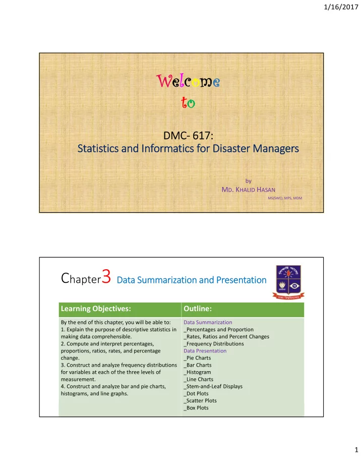
DMC- 617: Statistics and Informatics for Disaster Managers
by
- MD. KHALID HASAN
MS(SWE), MPS, MDM
Welcome to
Chapter3 Data Summarization and Presentation
- Md. Khalid Hasan
khalidhasan@du.ac.bd Institute of Disaster Management and Vulnerability Studies University of Dhaka
Learning Objectives: Outline:
By the end of this chapter, you will be able to:
- 1. Explain the purpose of descriptive statistics in
making data comprehensible.
- 2. Compute and interpret percentages,
proportions, ratios, rates, and percentage change.
- 3. Construct and analyze frequency distributions
for variables at each of the three levels of measurement.
- 4. Construct and analyze bar and pie charts,
histograms, and line graphs. Data Summarization _Percentages and Proportion _Rates, Ratios and Percent Changes _Frequency Distributions Data Presentation _Pie Charts _Bar Charts _Histogram _Line Charts _Stem-and-Leaf Displays _Dot Plots _Scatter Plots _Box Plots