basic charts outline
play

? ? ? ? Basic Charts Outline - Distributions & Histograms - PowerPoint PPT Presentation

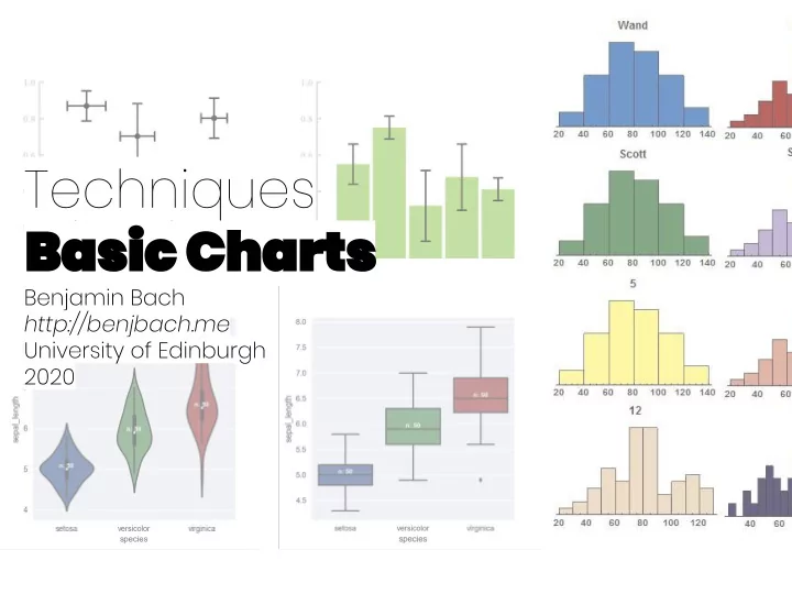
Basic Charts ? ? ? ? Basic Charts Outline - Distributions & Histograms - Mean, Mode, Average - Chart types - Uncertainty - Pie Charts Distributions Distributions: Binning Distributions: Binning Bin Distributions Distributions


  1. Basic Charts ? ? ? ?

  2. Basic Charts

  3. Outline - Distributions & Histograms - Mean, Mode, Average - Chart types - Uncertainty - Pie Charts

  4. Distributions

  5. Distributions: Binning

  6. Distributions: Binning Bin

  7. Distributions

  8. Distributions

  9. Distributions

  10. Distributions

  11. Histogram Binning

  12. Histogram Binning

  13. Histogram Binning

  14. Descriptive Statistics Mode: Median: Mean:

  15. Descriptive Statistics Mode: Median: Mean:

  16. Descriptive Statistics Mode: Median: Mean:

  17. Descriptive Statistics Mode Median Mean

  18. Standard deviation High Low

  19. Visualizing Distributions

  20. Plotting Distributions Bar charts + Box plots Dot plot/ Violin plots error bars Beeswarm plot

  21. Violin plots

  22. Violin plots: measures

  23. Violin plots: measures

  24. Violin plots: measures

  25. Violin plots: example shapes

  26. Violin plots for comparison

  27. Box plots http://www.stat.cmu.edu/~rnugent/PCMI2016/ papers/ViolinPlots.pdf

  28. Bar plots + Error bars = ?

  29. Uncertainty

  30. Uncertainty

  31. Comparing plots ! !

  32. A word on pie charts...

  33. Bad Pie Charts - Too many values - Differences hard to understand - Distribution? - (Confusing colors)

  34. Bad Pie Charts - Too many values - Not adding up to 100% - Differences hard to understand - Distribution? - (Confusing colors)

  35. Pie Charts

  36. Pie Charts

  37. Alternatives? Stacked bars Bar chart Pie chart Wilke, Claus O. Fundamentals of data visualization: a primer on making informative and compelling figures . O'Reilly Media, 2019.

  38. Pie Chart Alternatives Wilke, Claus O. Fundamentals of data visualization: a primer on making informative and compelling figures . O'Reilly Media, 2019. Wilke, Claus O. Fundamentals of data visualization: a primer on making informative and compelling figures . O'Reilly Media, 2019.

  39. Pie Chart Alternatives Wilke, Claus O. Fundamentals of data visualization: a primer on making informative and compelling figures . O'Reilly Media, 2019. Wilke, Claus O. Fundamentals of data visualization: a primer on making informative and compelling figures . O'Reilly Media, 2019.

  40. Pie Chart Alternatives Wilke, Claus O. Fundamentals of data visualization: a primer on making informative and compelling figures . O'Reilly Media, 2019. Wilke, Claus O. Fundamentals of data visualization: a primer on making informative and compelling figures . O'Reilly Media, 2019.

  41. Pie Chart Alternatives Wilke, Claus O. Fundamentals of data visualization: a primer on making informative and compelling figures . O'Reilly Media, 2019. Wilke, Claus O. Fundamentals of data visualization: a primer on making informative and compelling figures . O'Reilly Media, 2019.

  42. Pie Chart Alternatives Wilke, Claus O. Fundamentals of data visualization: a primer on making informative and compelling figures . O'Reilly Media, 2019. Wilke, Claus O. Fundamentals of data visualization: a primer on making informative and compelling figures . O'Reilly Media, 2019.

  43. Pie Chart Alternatives Wilke, Claus O. Fundamentals of data visualization: a primer on making informative and compelling figures . O'Reilly Media, 2019. Wilke, Claus O. Fundamentals of data visualization: a primer on making informative and compelling figures . O'Reilly Media, 2019.

  44. Line Charts vs. Bar Charts

  45. Line Charts vs. Bar Charts? Continuous values Discrete values https://online-behavior.com/analytics/data-visualization

  46. Wrap up - Choose appropriate bin-sizes - violin plots for compare distributions - Label error bars - Don't confound box plots and error bars - Avoid pie charts - Line charts for continuous data

  47. Further Readings Fundamentals of data visualization: a primer on making informative and compelling figures Hypothetical outcome plots outperform error bars and violin plots for inferences about reliability of variable ordering Arcs, angles, or areas: Individual data encodings in pie and donut charts The truthful art: data, charts, and maps for communication

Download Presentation
Download Policy: The content available on the website is offered to you 'AS IS' for your personal information and use only. It cannot be commercialized, licensed, or distributed on other websites without prior consent from the author. To download a presentation, simply click this link. If you encounter any difficulties during the download process, it's possible that the publisher has removed the file from their server.

Recommend


More recommend