
SLIDE 1
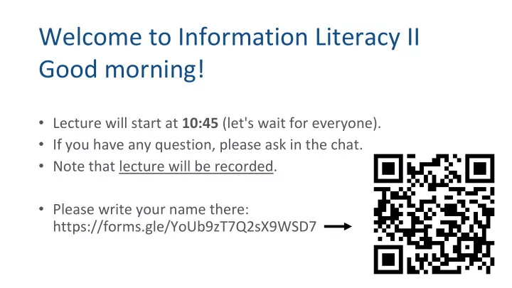
Welcome to Information Literacy II Good morning!
- Lecture will start at 10:45 (let's wait for everyone).
- If you have any question, please ask in the chat.
- Note that lecture will be recorded.
- Please write your name there: