
SLIDE 1
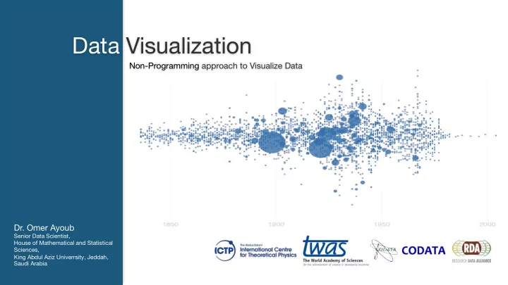
Data Visualization
Non-Programming approach to Visualize Data- Dr. Omer Ayoub
Data Visualization Non-Programming approach to Visualize Data Dr. - - PowerPoint PPT Presentation
Data Visualization Non-Programming approach to Visualize Data Dr. Omer Ayoub Senior Data Scientist, House of Mathematical and Statistical Sciences, King Abdul Aziz Univerrsity, Jeddah, Saudi Arabia Dr. Omer er Ayoub ub Ph. h.D in n
Data Visualization
Non-Programming approach to Visualize Data er Ayoub ub
Ph. h.D in n Comput uter er Sci cience ence (USA) ICTP TP Associ ciate Seni enior Data Sci cient entist Hous use e of Mathem hematica cal Sci ciences ences, Cons nsul ulting ng Firm King ng Abdul ul Aziz Uni niver ersity, Jed eddah, h, Saud udi Arabia Em Email: omer erayoub ub@ho hotmail.co com omer er@statistica calview ew.co com CoDATA-RDA Applied Workshops, ICTP Content
35
Your contribution to your society …
5 CoDATA-RDA Applied Workshops, ICTP Feedback and Suggestion
6 CoDATA-RDA Applied Workshops, ICTP Visualization
7 CoDATA-RDA Applied Workshops, ICTP Visualization
6 CoDATA-RDA Applied Workshops, ICTP Finding the Story in your Data
7 TRENDS CORRELATIONS OUTLIERS Ice Cream sales Data Types
1KNOW YOUR DATA
Before understanding visualizations, you must understand the types of data that can be visualized and their relationships to each other. Here are some of the most common you are likely to encounter. QUANTITATIVE Data tha hat ca can n be e co count unted ed or mea easur ured ed; all values ues are e num numer erica cal. DISCRETE Num umer erica cal Data tha hat ha has a fini nite e num number er of possible e values Data Relationships
1 1 NOMINAL COMPARISON Thi This is a simple e co comparison n of the he qua uant ntitative e values ues Chart Types
12 This section addresses about most common chart types that are usually used for Visualization. Furthermore, we will discuss about the best practices to use these chart types: Bar Chart Pie Chart Line Chart Area Chart Scatterplot Bubble Chart Heat Map CoDATA-RDA Applied Workshops, ICTP Bar Charts Variations
13Bar Charts
Bar charts are very versatile. They are best used to show change over time, compare different categories, or compare parts of a whole. Common Bar chart variations include Stacked, 100% stacked versions. Usually these variations are used to compare multiple part-to-whole Bar Charts Design Best Practices
14Bar Charts
Bes est Pract ctices ces Use Horizontal Labels Avoid steep diagonal or vertical type, as it can be difficult to read Space Bars Appropriately Space between the bars should be at least ½ bar width Start the y-axis value at Zero Starting at a value above zero truncates the bars and doesn’t accurately reflect the full value. Use Consistent Colors Use one color for bar charts. You may use an accent color to highlight a significant data point. Order Data Appropriately Order the categories alphabetically, sequentially or by the values. CoDATA-RDA Applied Workshops, ICTP Pie Chart
Pie Chart Variations
Pie charts are best used for making portion to whole comparisons with discrete or continuous data. They are most impactful with a small data set. STANDARD It is used to show part-to-whole relationships. DONUT A stylistic variation of the original pie chart with an inclusion of a total value Pie Charts Design Best Practices
16Pie Charts
Bes est Pract ctices ces Visualize no more than 5 Categories per Chart It is difficult to differentiate between the small values; depicting to many slices makes it complex and decreases the visualization impact. If needed, multiple small slices may be categorized as “Miscellaneous” or “Other” Don’t use Multiple Pie charts for Comparison Sliced sizes are very complex to compare side by Line Chart
Line Chart Variations
Line charts are used to show time- series relationships with continuous Line Charts Design Best Practices
18Line Charts
Bes est Pract ctices ces Inclusion of Zero Baseline Although a Line chart doesn’t have to start with a 0 value; it should be included whenever possible. Don’t plot more than 4 lines If you need to display more than 4 lines, break them into separate charts for better comparison Solid Lines ONLY Use of dashed and dotted lines can be distracting Label Directly This allows readers quickly identify lines. Use the right Height Plot all lines so that the line chart takes approximately two-thirds of the y-axis’s total scale. CoDATA-RDA Applied Workshops, ICTP Area Chart
Area Chart Variations
Area charts depict a time-series relationship, but they are different than line charts in that they can represent volume Area Chart Used to show or compare quantitative progression over time Stacked Area Chart Best used to visualize part-to-whole relationship Area Charts Design Best Practices
20Area Chart
Bes est Pract ctices ces It should be easy to read In stacked area charts, arrange data to position categories with highly variable data on the top of chart and low variability on the bottom. Start y-axis value at 0 Starting above zero truncates the visualization of values. Don’t display more than 4 categories It will result in a complex cluster visual Use Transparent Colors Use of transparency must be ensured for clear visibility Don’t use for Discrete Data The connected lines imply intermediate values, which only exist in continuous data CoDATA-RDA Applied Workshops, ICTP Scatterplot Chart
Scatterplot Chart Variations
Scatter plots show the relationship between items based on two sets of Scatterplot Charts Design Best Practices
22 Start with y-axis value at 0 Include more Variables Use size and dot color to encode additional data variables Use Trend Lines These lines help draw correlation between the trending variables Don’t Compare more than 2 Trend Lines Too many lines make it difficult to interpretScatterplot Chart
Bes est Pract ctices ces CoDATA-RDA Applied Workshops, ICTP Bubble Chart
Bubble Chart Variations
Bubble charts are good for displaying nominal comparisons or ranking relationships. Bubble Plot is a scatterplot with bubbles best used to display an additional variable. Bubble map is best used to visualize values for specific geographic regions. CoDATA-RDA Applied Workshops, ICTP Bubble Chart Design Best Practices
24 Label Visibility must be ensured Make sure the labels are visible, easily identifiable and unobstructed Size the Bubbles Appropriately Bubbles should be scaled according to the area and not the diameter. Avoid using Odd shapes Avoid adding too much details or using shapes that are not entirely circular, this can lead to inaccuracies.Bubble Chart
Bes est Pract ctices ces CoDATA-RDA Applied Workshops, ICTP Heat maps
Heat Map Variations
Heat maps are used to display categorical data, using intensity of color to represent values of geographic areas or data tables. STATES WITH NEW SERVICE CONTRACTS CoDATA-RDA Applied Workshops, ICTP Heat Map Design Best Practices
26 Use a simple Map outline These lines are meant to frame the data Appropriate Choice of Colors Use a single color with varying shades. This will not only make it soothing and appealing visually but also present the results correctly.. Use of Patterns Use patterns to indicate second variable. But using multiple patterns is overwhelming and distracting Appropriate Date Ranges Select 3 to 5 numerical ranges that enable fairly dataHeat Map
Bes est Pract ctices ces Do’s and Don’ts in DATA DESIGN & VISUALIZATION
References
CoDATA-RDA Applied Workshops, ICTP 28