Creating a Panel January 2015 by Graham Robinson Agenda What a - - PowerPoint PPT Presentation

creating a panel
SMART_READER_LITE
LIVE PREVIEW

Creating a Panel January 2015 by Graham Robinson Agenda What a - - PowerPoint PPT Presentation

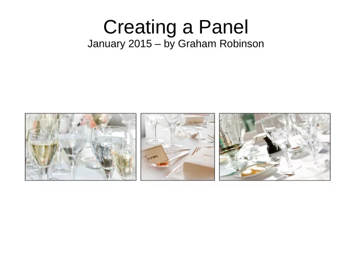
Creating a Panel January 2015 by Graham Robinson Agenda What a Panel is Rules for the Digital Panel Competition Choosing Images Composition and Visual Flow Plan Layouts, Sizing and Borders Key Methods Making the


slide-1
SLIDE 1

Creating a Panel

January 2015 – by Graham Robinson

slide-2
SLIDE 2

Agenda

  • What a Panel is
  • Rules for the Digital Panel Competition
  • Choosing Images
  • Composition and Visual Flow
  • Plan Layouts, Sizing and Borders
  • Key Methods
  • Making the Panel
slide-3
SLIDE 3

What a Panel is

  • A panel is a set of of images presented as a whole
  • Typically this could be a set of mounted prints presented on racks

according to a 'hanging plan'

  • Each image should be successful in its own right
  • The whole panel should be coherent visually;

and possibly thematically

  • Some panels (e.g. for LRPS) can show a range of styles and

themes

  • Others (e.g. photo essay) might explore different aspects of the

same subject

  • Whatever way: the panel must be more than the sum of its parts
slide-4
SLIDE 4

Rules for This Year's Competition

  • Each panel must be prepared as a single digital image. All

the usual rules about the number of, size of, etcetera apply.

  • Hence you may submit up to 4 panels in the normal manner.
  • Rules for each panel:

– Prepared as single image (max 1400w x 1050h). – Presented as 3 separate pictures arranged horizontally on a black

background.

  • These rules are to provide a level playing field for all

members.

  • Panels not meeting these requirements will not be included
slide-5
SLIDE 5

Choosing Images

  • For this competition there must be some kind of theme,

harmony or coherence across each set of images.

  • This might be:

– an essay on one subject; – relation through

  • Theme or Mood
  • Shape
  • Colour
  • Texture
  • The panel must express something as a whole.
slide-6
SLIDE 6

Visual Flow and Composition

  • A well composed picture guides the viewer through

the picture and directs and returns attention to the main subject.

  • A badly composed picture fails to direct attention to

the main subject, has competing subjects, has distractions or allows attention to fall out of the image.

  • Likewise: a well constructed panel will encourage the

attention to travel amongst and be maintained within the panel.

slide-7
SLIDE 7
slide-8
SLIDE 8
slide-9
SLIDE 9
slide-10
SLIDE 10

Layout and Sizing (1)

three tall @ 450 wide (? equal height ~600) three squares @ 450x450 three wide @ 450 wide (? equal height ~300) Three equal widths of 450 pixels (450x3=1350 gives two gaps of 25 pixels)

slide-11
SLIDE 11

square (388x388), wide (582x388), square (388x388) tall (388x~600), wide (582x388), tall (388x~600)

Layout and Sizing (2)

tall (388x~600), square (582x582), tall (388x~600) Two narrow (388) and one wide (582) [2x388+582=1358 leaves two gaps of 21]

slide-12
SLIDE 12

Layout and Sizing (3)

Two wide (510) and one narrow (340) [2x510+340=1360 leaves two gaps of 20] wide (510x340), square (340x340), wide (510x340) wide (510x340), tall (340x~510), wide (510x340) square (510x510), tall (340x510), square (510x510)

slide-13
SLIDE 13

Layout and Sizing (4)

  • Consider tall, wide and square crops.
  • Choose a layout that matches the balance and visual flow of your 3

pictures.

  • Consider the impact of the relative sizes of each of the pictures.
  • Plan the aspect, crop and actual sizes so that total width of the

three pictures comes to about 1350 or 1360 pixels to allow two 20- 25 pixel gaps

  • Perhaps use one of the following width plans:

– 450, 450, 450 – 388, 582, 388 – 510, 340, 510

slide-14
SLIDE 14

Borders

  • Think about the borders, if any, it would be best to apply to

each of the three pictures

– An overall light image may not need any border on the black

background

– A picture with a dark area on the edge will get 'lost' on a black

background and so would benefit from a 2 pixel wide white or light grey border

– If there are also light areas on the edge these will 'bleed' into the

border so a single pixel black 'key line' will help hold the picture together.

  • It would probably be best to apply the same style of border to

all of the pictures on the same panel

slide-15
SLIDE 15

Key Methods

These are not the most 'power-user' or efficient methods. They are designed so that they can be done in simple stages saving files as you go. A set of notes (Creating a Panel) have been prepared. They been created and tested in Elements 10 and should work similarly in later versions and full PhotoShop.

  • Prepare each of the individual pictures

– Crop and/or re-size using the Crop Tool – Apply any required border – Save with a helpful name

  • Make up the Panel

– create a correctly sized black backdrop – add guides to ensure correct placement of the three pictures – place the 3 pre-prepared pictures – save as an appropriately named JPG