SLIDE 1
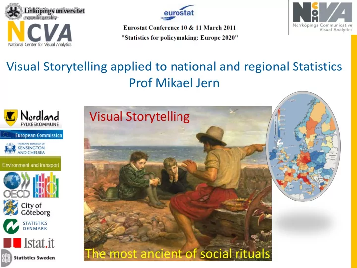
Visual Storytelling applied to national and regional Statistics Prof Mikael Jern The most ancient of social rituals Visual Storytelling
SLIDE 2 The Story about ageing population in Sweden
290 regions 9000 regions
SLIDE 3
The Story about ageing population in Sweden
and how we financially can support this population at regional municipality level until 2040
SLIDE 4 Innovative Statistics Visualization with Storytelling
http://ncomva.com/
SLIDE 5 Innovative Statistics Visualization with Storytelling
http://ncomva.com/
SLIDE 6
The Storytelling Loop
select data - make discoveries through trends and patterns and derive insight
SLIDE 7
The Storytelling Loop
important and relevant discoveries are captured into snapshots together with your descriptive metadata
SLIDE 8
The Storytelling Loop
share story with colleagues and reach consensus and trust for your discoveries
SLIDE 9
The Storytelling Loop
deploy your story based on pleasant interactive “Vislets” embedded in html
SLIDE 10
Why is Storytelling about Statistics important?
Mechanism to save relevant insight and trends from an
exploration process and highlight important discoveries;
Transfer an expert’s understanding into knowledge; Present discoveries that engagingly draw us into
reflections about the knowledge;
Invite the reader to dynamically participate in this visual
statistics discovery process;
Educate citizens and in particular the young generations
knowledge and understanding of a variety in national demographics, healthcare, educational, environment and economic structures;
SLIDE 11
Great Storytelling by ISTAT
SLIDE 12
Statistics eXplorer – analytic and authoring tool
Step 1
Select regions and indicators to be analysed – here OECD eXplorer
SLIDE 13
Statistics eXplorer – analytic and authoring tool
Step 2
Use pre-loaded data and import additional indicators
SLIDE 14
Statistics eXplorer – analytic and authoring tool
Analyse , gain insight and understanding with suitable visual methods
Step 3
SLIDE 15 Statistics eXplorer – analytic and authoring tool
Story Editor
metadata hyperlinks to snapshots
Start writing your Story - Story Editor
Step 4
SLIDE 16
Statistics eXplorer – analytic and authoring tool
Start writing your Story – use snapshots to highlight (capture) special interesting insights, time steps and regions
Step 4
SLIDE 17
Statistics eXplorer – analytic and authoring tool
Step 4
use snapshots to capture interesting insight, time step and a region
SLIDE 18 Share the Story with expert colleagues and reach consensus and trust
Returned comments “Wrong data 2006 for 2 Italian TL2 regions – here is new data”
Step 5
Returned comments “added a new Snapshot highlighting London age group15-64 ”
Statistics eXplorer – analytic and authoring tool
SLIDE 19
Statistics Publisher – Publish the Story
Import Story - Select visualization methods for Vislet
Step 6
SLIDE 20
Statistics Publisher – Publish the Story
Preview Vislet
Step 6a
SLIDE 21
Statistics Publisher – Publish the Story
Produce the HTML code
HTML code
Step 6b
SLIDE 22
Web site or Blog – Publish the Story
Embed (drop) the HTML code in a Blog (or any Web site)
HTML code
Step 7
SLIDE 23
A Vislet with Metadata is now Published in our Blog
Step 8
Web Site or Blog – Publish the Story
SLIDE 24
and here with Histogram and Scatter Plot
All OECD TL2 regions
Step 8
Web Site or Blog – Publish the Story
SLIDE 25
and here html code is inserted into a Web page
Step 8
HTML code
Web Site or Blog – Publish the Story
SLIDE 26
From Numbers to Knowledge and Understanding
SLIDE 27
Statistical data is simultaneously explored through multiple-linked and coordinated views and Screen space usage is optimized for visualization no unnecessary visible GUI panels;
Innovative motion Statistics Analytics Visualization
SLIDE 28 Migration Net Flows in TL3 European regions
Apply perception techniques that support faster insight and better understanding .
SLIDE 29
Innovative Statistics Analytics Visualization
Arrows that show migration from a Region in Focus - Stockholm
SLIDE 30
Innovative Statistics Analytics Visualization
Visual inquiry and conditioned statistics filter mechanism that help detecting outliers for OECD TL3 regions with negative Migration Net Flow
SLIDE 31
Innovative Statistics Analytics Visualization
Dynamic Histogram “Focus & Context”
SLIDE 32
Innovative Statistics Analytics Visualization
Regional Distribution Plot “age 65+” for NUTS2 regions
SLIDE 33
Innovative Statistics Analytics Visualization
each line represents a European TL2 region each axis represents an indicator compare two profiles Berlin and London against 6 indicators and mean
age 0-14 age 65+ GDP per capita unemploym. labor prod tertiary edu.
SLIDE 34
Innovative Statistics Analytics Visualization scatter matrix linked to scatter plot
SLIDE 35
Evaluating Statistics 3D Visualization
SLIDE 36
Visual Storytelling is the mechanism that can provide teachers and students enthusiasm to learn about development in our Global world
SLIDE 37
http://NComVA.com
Thank you......
Evaluation is now performed with children age 10-12 with a positive result