
SLIDE 1
The Great Slump.
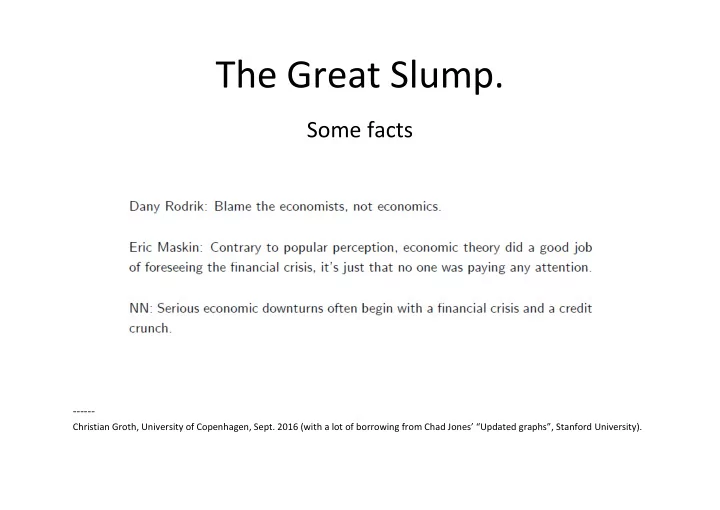
Some facts
- Christian Groth, University of Copenhagen, Sept. 2016 (with a lot of borrowing from Chad Jones’ “Updated graphs”, Stanford University).