
SLIDE 1
1
Emotive motion: Analysis of Expressive Timing and Body Movement in the Performance of an Expert Violinist
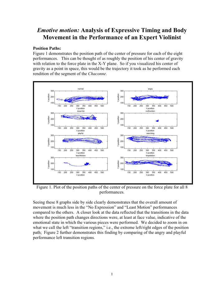
Position Paths: Figure 1 demonstrates the position path of the center of pressure for each of the eight
- performances. This can be thought of as roughly the position of his center of gravity