
SLIDE 1
1
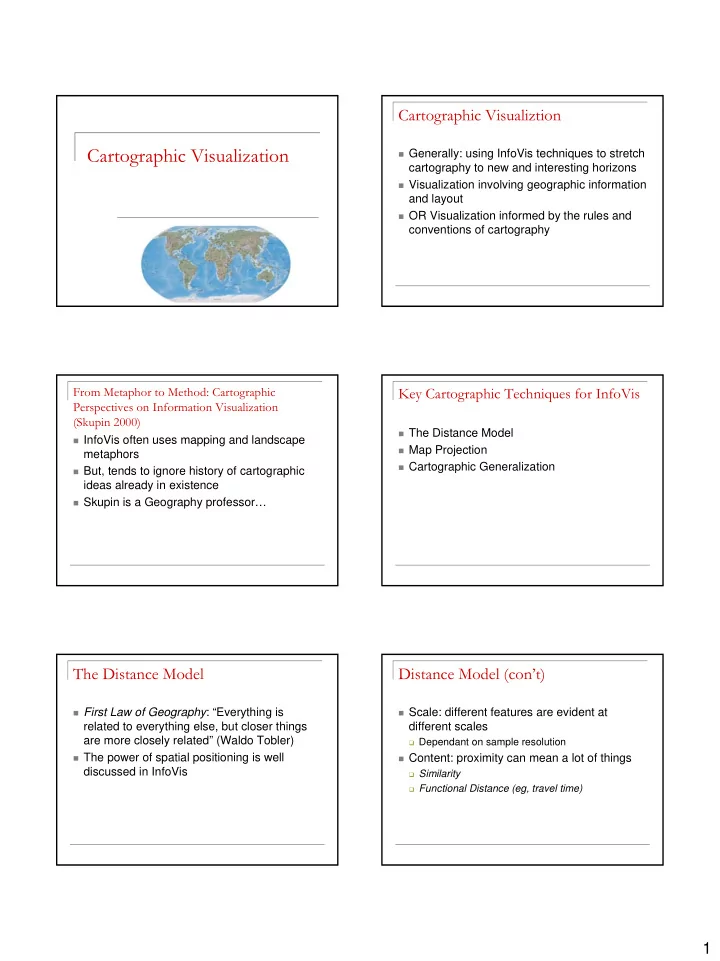
Cartographic Visualization
Cartographic Visualiztion
Generally: using InfoVis techniques to stretch
cartography to new and interesting horizons
Visualization involving geographic information
and layout
OR Visualization informed by the rules and
conventions of cartography
From Metaphor to Method: Cartographic Perspectives on Information Visualization (Skupin 2000)
InfoVis often uses mapping and landscape
metaphors
But, tends to ignore history of cartographic
ideas already in existence
Skupin is a Geography professor…
Key Cartographic Techniques for InfoVis
The Distance Model Map Projection Cartographic Generalization
The Distance Model
First Law of Geography: “Everything is
related to everything else, but closer things are more closely related” (Waldo Tobler)
The power of spatial positioning is well
discussed in InfoVis
Distance Model (con’t)
Scale: different features are evident at
different scales
Dependant on sample resolution
Content: proximity can mean a lot of things
Similarity Functional Distance (eg, travel time)