
SLIDE 1
- According to “The Non-Designers Design Book” by Robin Williams
THE 4 BASIC PRINCIPLES
THE
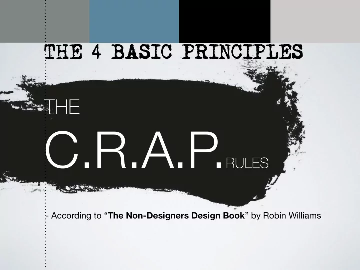
C.R.A.P . RULES - According to The Non-Designers Design Book by - - PowerPoint PPT Presentation
THE 4 BASIC PRINCIPLES THE C.R.A.P . RULES - According to The Non-Designers Design Book by Robin Williams What to do before design? What to do before design? Target group Sitemap Research Wireframes Sender Paper prototyping Test
THE 4 BASIC PRINCIPLES
THE
What to do before design?
Target group Research Sender Message Communication
Sitemap Wireframes Paper prototyping Test wireframes Usability testing
What to do before design?
And then Design…
Anatomy of website
Jason Beaird - The principles of beautiful webdesign
THE 4 BASIC PRINCIPLES
THE
Contrast Repetition Alignment Proximity
UK DK Agronym /abbreviation
Headlines and subheads need to be repeated and consistent. Make the look stronger in contrast. The typeface has to be stronger.
If the elements on the page are not the same, them make them very different
Contrast,Alignment Repetition & Proximity
TYPE / SIZE PLACEMENT (VERTICAL/HORIZONTAL) GRAPHICS/FORM COLOR TEXTURE WEIGHT
Contrast
Contrast
Contrast
Contrast - using texture
GOOD or BAD?
http://victorydesign.deviantart.com/art/Web-design-Irrigation-162449898
FORM AND GRAPHICS
Contrast
Two different fonts/shapes makes contrast
PROXIMITY
Contrast
SIZE AND SHAPE
Contrast by color
http://lifelab.com.au/ Contrast
CONTRAST BY COLOR
Elements that aren’t the same should be very different so they stand out
By SencerBugrahanContrast
CONTRAST & PROXIMITY
EXAMPLE OF CONTRAST & PROXIMITY
CONTRAST PHOTO AND ILLUSTRATION
Gary Nock
CONTRAST PHOTO AND ILLUSTRATION
REPETITION
Being consistent HEADLINES - the same style and size Repeat visual elements of the design strengthens the UNITY
FLOW - also important
REPETITION
http://www.pablo-costa.com/dsn_southland.html
Contrast & Repetition
REPETITION REPETITION
Contrast & Repetition
REPETITION REPETITION
ALIGNMENT
Nothing should be placed randomly Every element has to be placed in a visual connection with each other
ALIGNMENT
ALIGNMENT
http://960.gs
CONTRAST BY 3D AND COLOR
IN PHOTOSHOP
If you want to repeat an object like a rectangle Hold down the Alt + shift and it copies and keeps alignment
The longing we have for structure, grids, and ideal proportion is deeply ingrained in human nature. A layout that “doesn’t look quite right” can often be fixed by moving elements and resizing them
http://960.gs guideguide.me 1200px.com thisisdallas.github.io unsemantic.com elliotjaystocks.com/blog lemonade.im
GRIDSYSTEMS
PLACEMENT
ALIGNMENT/TILPASNING
ALIGNMENT/TILPASNING
Flush left
ALIGNMENT/TILPASNING
Justified
J Kyrnin.
ALIGNMENT/TILPASNING
Centered
ALIGNMENT/TILPASNING
ALIGNMENT
Flush right & flow
ALIGNMENT
Which direction does it lead you to go?
ALIGNMENT/TILPASNING ALIGNMENT/TILPASNING
ALIGNMENT/TILPASNING
Placement and direction Vertical/horizontal
PROXIMITY/NÆRHED
Group related items Separate items that are NOT related Nearness in place, order, occurrence or relocation
Creates an organized Design http://www.articulate.com/rapid-elearning/heres-why-contrast-is-an-essential-part-of-e-learning-design/
The principle of proximity calls for related items to be grouped visually, creating less clutter and making for a more organized layout. Items unrelated to each other should be placed further apart, to emphasize their lack
PROXIMITY/NÆRHED
“The Non-Designers Design Book” by Robin Williams
Assignment:
Create a website or a poster design Using the C.R.A.P . rules Just a paper prototype
Fresh eggs
Sender: A personal Blog