SLIDE 1 An introduction to interactive visualisation
Christophe 20 novembre 2013
“ In summary, the most important thing about computer visualisation is interaction and you can add interaction to anything” Alan Dix and Geoffrey Ellis (1998)
1 Interactivit´ e vs graphiques dynamiques ?
Les graphiques dynamiques ont le vent en poupe parce qu’ils permettent d’ajouter un degr´ e de libert´ e dans la visualization. L’oeil humain est en effet fait pour visualiser rapidement des mouvement, d´ etecter des changements, des
- disparitions. Toutefois, la plupart des graphiques ”dynamiques” proposent des
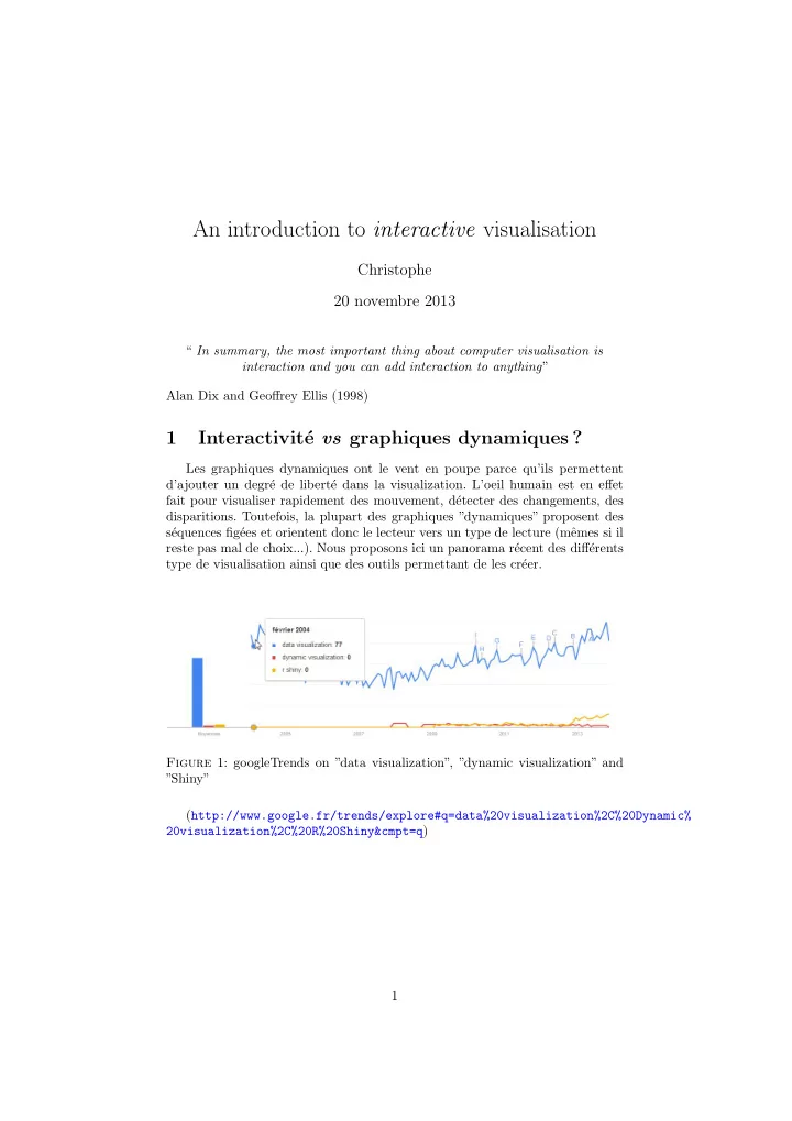
s´ equences fig´ ees et orientent donc le lecteur vers un type de lecture (mˆ emes si il reste pas mal de choix...). Nous proposons ici un panorama r´ ecent des diff´ erents type de visualisation ainsi que des outils permettant de les cr´ eer. Figure 1: googleTrends on ”data visualization”, ”dynamic visualization” and ”Shiny” (http://www.google.fr/trends/explore#q=data%20visualization%2C%20Dynamic% 20visualization%2C%20R%20Shiny&cmpt=q) 1
SLIDE 2 Les graphiques interactifs, permettent ` a l’utilisateur de voir des s´ equences que le concepteur n’a pas forc´ ement pr´ evues ou d’identifier des ´ el´ ements sur diff´ erents jeux de donn´
- ees. L’utilisateur peut alors ”jouer” avec des donn´
ees plus librement que dans une s´ equence pr´ evue par un graphique dynamique. Tout ceci reste relatif, et les outils pour les diff´ erents types de repr´ esentation sont proches. Un exemple de calcul individuel sur le site de l’office nationale de la statis- tique Britannique : Figure 2: Personal Inflation Calculator in UK (http://www.neighbourhood.statistics.gov.uk/HTMLDocs/dvc14/) 2
SLIDE 3
Un autre exemple venu d’Allemagne o` u l’on repr´ esente un kal´ eidoscope des prix qui donne un aper¸ cu de l’importance des groupes de biens et de leurs ´ evolutions de prix. On peut obtenir une image tr` es d´ etaill´ ee de l’´ evolution des prix dans certains domaines : Figure 3: Kaleidoscope des prix (Office de la statitique publique Allemande)) (https://www.destatis.de/Voronoi/PreisKaleidoskop.svg) Et un autre venu d’Australie : Figure 4: Population by sex and age (Australian Bureau of Statistics) (http://www.abs.gov.au/websitedbs/d3310114.nsf/home/Population%20Pyramid% 20-%20Australia) 3
SLIDE 4 1.1 Alan Dix pedagogical example
Jane Greystoke is marketing director at Floppy Banana International the world’s leading fresh fruit supplier. She is reviewing sales trends over recent
- years. She can see that overall sales have changed only marginally, but there
are obviously some trends. Apple sales had been increasing until 1995, but are now on the decline. But what is on the increase ? Clementines look good, but are their sales any higher in 1997 than they were in 1995 ? And what about bananas, it isn’t clear whether their sales have been increasing, decreasing or simply keeping steady ? see http://www.meandeviation.com/dancing-histograms/hist.html and look at dates when clementines are selected ; Was here a deacrease in the sales
- f dates in 1996 ? No, now click on dates and you’ll see !
Figure 5: A. Dix example of Interactive bar chart
(a) Apples (b) Bananas (c) Clementines (d) Dates
4
SLIDE 5 1.2 d3.js javascript examples
Apart from R, one nice way of doing interactive is to use either html5 and/or
- javascript. Mots of examples here : https://github.com/mbostock/d3/wiki/
Gallery Figure 6: Interactive graph using D3.js javascript language 5
SLIDE 6 1.3 la dynamique ne fait pas tout...
If one wish to visualise the complex relationships of all of Victor Hugo’s characters of ”les Miserables”on may do a graph http://bl.ocks.org/mbostock/ 4062045 But it is much more interesting to do an adjacent matrix plot. A net- work can be represented by an adjacency matrix, where each cell ij repre- sents an edge from vertex i to vertex j. Here, vertices represent characters in a book, while edges represent co-occurrence in a chapter. http://bost.ocks.
- rg/mike/miserables/. One option is to order them by cluster
Figure 7: Victor hugo’s characters of ”les Miserables”
(a) Graph (b) Adjacent matrix (c) Adjacent matrix (sorted by cluster)
6
SLIDE 7 1.4 En r´ esum´ e
“Il faut percevoir le monde pour interagir Il faut interagir avec le monde pour le percevoir”
- J. D. Feteke (Aviz) : Interactive Information Visualization 2012-2013 (http:
//www.aviz.fr/Teaching2012/InteractiveInfoVis2012)
2 Outils
2.1 Dynamic exploration with GoogleVis
Google is keen on writing tools for data visualisation, it has launched a lab
- n that topic http://code.google.com/p/google-motion-charts-with-r/
After creating a data.frame (MyBigData), we can simply use the package on
- ur data. We first create an object (M.big) using the gvisMotionChart command.
That object is then plotted (plot(M.big)). That’s it. Only 2 lines of code ! > M.big <- gvisMotionChart(MyBigdata, idvar="carrier", timevar="year", xvar="K", yvar="Y", + colorvar="Region", sizevar="L", +
- ptions=list(width=400, height=420))
> # la visualisation se fait dans le navigateur !! > # Personalisation de la page > M.big$html$caption = " Big Airline Database (MyBigData)" > # Creation de la page > plot(M.big) 7
SLIDE 8
Figure 8: 2-D Dynamic and interactive scatter plot 8
SLIDE 9
Figure 9: 2-D Dynamic and interactive barchart 9
SLIDE 10
Figure 10: 2-D interactive line plot 10
SLIDE 11 One can also use the geographic information and draw an interactive map
> # On cree une planisphere > Map.big<-gvisGeoChart(MyBigdata, "country", "Y", +
- ptions=list(displayMode="Markers",
+ colorAxis="{colors:[✬purple✬, ✬red✬, ✬orange✬, ✬grey✬]}", + backgroundColor="lightblue")) > plot(Map.big) Figure 11: Interactive map 11
SLIDE 12
Finally, one can merge the two graphs. note that there are no interaction between the 2 graphs (yet ?) > MGT <- gvisMerge(Map.big, M.big,horizontal=TRUE, tableOptions="bgcolor=\"#CCCCCC\" cellsp > # Final graph > > plot(MGT) Figure 12: Interactive map and Dynamic and interactive scatter plot
2.2 The manipulate package
The following example is drawn from a nonparametric pedagogical tool writ- ten by Jeffrey Racine. First one need to write a function that do plotting ans specify the arguments of the plot > rm(list=ls()) > require(manipulate) > require(np) > ## Write a function to do plotting and accept arguments... doing so > ## allows multiple plot calls (e.g. overlay histogram etc.) which > ## cannot otherwise be done with the manipulate function. > > density.plot <- function(n,df,sf,nn,bwtype,ckertype,ckerorder,hist,rug) { + + if(nn >= n) { + warning(paste("Knn bandwidth must be less than",n)) + nn <- n-1 + } + + set.seed(42) + x <- rchisq(n,df=df) + x.eval <- seq(min(x)-0.5*sd(x),max(x)+0.5*sd(x),length=100) + f.dgp <- dchisq(ifelse(x.eval<0,0,x.eval),df=df) 12
SLIDE 13
+ + hist.max <- 0 + if(hist) hist.max <- max(hist(x,breaks=25,plot=FALSE)$density) + + f.kernel <- npksum(txdat=x,exdat=x.eval, + bws=ifelse(bwtype=="fixed",sf,nn), + bwscaling=TRUE, + bandwidth.divide=TRUE, + bwtype=bwtype, + ckertype=ckertype, + ckerorder=ckerorder)$ksum/n + + ylim <- c(0,max(hist.max,f.kernel,f.dgp)) + + plot(x.eval,f.kernel, # <---PLOT FUNCTION HERE + ylim=ylim, + type="l", + ylab="Density", + xlab="Data", + main="My first plot with manipulate (Inge-Stat, 11-2013)", + sub=paste("Bandwidth = ",ifelse(bwtype=="fixed",formatC(sf*sd(x)*n^{-1/(2*ckerorde + lty=1, + col=1) + + lines(x.eval,f.dgp,lty=2,col=2) + + legend("topright", + c("Kernel Estimate",paste("Chi-square (df = ",df,")",sep="")), + lty=c(1,2), + col=c(1,2), + bty="n", + cex=0.75) + + if(hist) hist(x,breaks=25,freq=FALSE,add=TRUE,lty=3) + + if(rug) rug(x) + } > Then the Manipulate package allow you easily to create an interactive plot. > manipulate(density.plot(n,df,sf,nn,bwtype,ckertype,ckerorder,hist,rug), # <-- + n=slider(100,1000,500,step=100,label="Number of observations"), # <-- + df=slider(10,120,10,step=10,label="Chi-square degrees of freedom"), + ckertype=picker("gaussian","epanechnikov","uniform",label="Kernel function"), + ckerorder=picker(2,4,6,8,label="Kernel order"), + bwtype=picker("fixed","adaptive_nn","generalized_nn",label="Bandwidth type"), + sf=slider(0.1,5,1,label="Scale factor (bwtype=\"fixed\")",step=0.1,ticks=TRUE) + nn=slider(2,1000,50,label="Kth nn (bwtype=*_nn)",step=1,ticks=TRUE), + hist=checkbox(FALSE, "Show histogram"), + rug=checkbox(FALSE, "Show rug")) 13
SLIDE 14 Figure 13: Interactive R graph using Manipulate
2.3 The Shiny package
Le package shiny Semble faire la mˆ eme chose. Je n’ai pas beaucoup investi (voir l’exemple ci-dessous tout de mˆ eme) mais un exemple en ligne est disponible sur la page de Rstudiohttp://www.rstudio.com/shiny/ > library(shiny) > runExample() > runExample("01_hello") > runExample("03_reactivity") Un petit exemple construit en 2 minutes. Il y a 2 programmes ui.R (user- interface definition) et server.R (le ”script” ou la ”logique” du graphique) qui doivent ˆ etre dans un r´
evidement modifier la fonction ` a sa guise du moment que l’output est bien un graphique.
14
SLIDE 15
Figure 14: Interactive R graph using Shiny Figure 15: Interactive R graph using Shiny 15
SLIDE 16
Voici un exemple cr´ e´ e ` a partir des exemples et arrang´ e ` a ma sauce : Un exemple moins simple : 1) On d´ efinit l’interface utilisateur. Ici on cr´ eera 4 onglets dans l’interface. > ################## SninyNp :UI ################ > library(shiny) > # Define UI for random distribution application > shinyUI(pageWithSidebar( + + # Application title + headerPanel("Options"), + + # Sidebar with controls to select the random distribution type + # and number of observations to generate. Note the use of the br() + # element to introduce extra vertical spacing + sidebarPanel( + radioButtons("dist", "Distribution type:", + list("Normal" = "norm", + "Uniform" = "unif", + "Log-normal" = "lnorm", + "Exponential" = "exp")), + br(), + + sliderInput("n", + "Taille de l✬echantillon:", + value = 500, + min = 1, + max = 1000) + ), + + # Show a tabset that includes a plot, summary, and table view + # of the generated distribution + mainPanel( + tabsetPanel( + tabPanel("Plot", plotOutput("plot")), + tabPanel("Summary", verbatimTextOutput("summary")), + tabPanel("Table", tableOutput("table")), + tabPanel("NP", plotOutput("NP")) + ) + ) + )) > 2) Puis les fonctions cr´ ees pour chacun des onglets. > ################## SninyNp>server.R ################ > > library(shiny) > library(np) > # Define server logic for random distribution application > shinyServer(function(input, output) { 16
SLIDE 17 + + # Reactive expression to generate the requested distribution. This is + # called whenever the inputs change. The renderers defined + # below then all use the value computed from this expression + data <- reactive({ + dist <- switch(input$dist, + norm = rnorm, + unif = runif, + lnorm = rlnorm, + exp = rexp, + rnorm) + + dist(input$n) + }) + + # Generate a plot of the data. Also uses the inputs to build the + # plot label. Note that the dependencies on both the inputs and + # the ✬data✬ reactive expression are both tracked, and all expressions + # are called in the sequence implied by the dependency graph +
- utput$plot <- renderPlot({
+ dist <- input$dist + n <- input$n + + hist(data(), + main=paste(✬r✬, dist, ✬(✬, n, ✬)✬, sep=✬✬)) + rug(data(), col = "grey" ) + abline(v=mean(data()), col="red") + }) + + # Generate a summary of the data +
- utput$summary <- renderPrint({
+ summary(data()) + }) + + # Generate an HTML table view of the data +
- utput$table <- renderTable({
+ data.frame(x=data()) + }) + + # Generate an NP view of the data +
+ dist <- input$dist + n <- input$n + bw <- npudensbw(dat=data()) + plot(bw) + }) + }) > 3) On appelle l’application cr´ e´ ee... 17
SLIDE 18
> library(shiny) > setwd("Z:/Chris/Articles2012/DataVizualization/DynamicVizualisation") > runApp("ShinyNp") Au final cela donne ¸ ca : Figure 16: Interactive R graph constructed here with Shiny Il y a mˆ eme un site web qui permet de consulter les r´ esultats des finances et d´ epenses des pensions du fond ”Commonwealth of Massachusetts” pour la p´ eriode 1985-2012 (http://glimmer.rstudio.com/pioneer/pensions/) Figure 17: Complete Website with data presentation using Shiny 18
SLIDE 19 2.4 Ggobi
D´ ecouvert tout ` a fait r´ ecemment, cet utilitaire permet l’interaction avec des donn´ ees afin d’en faciliter l’exploration. C’est donc pour la ”fouille de don- n´ ees” multi-dimensionnelle que ce package est destin´
statmethods.net/advgraphs/interactive.html. A suivre.... Figure 18: Interactive graph constructed with Ggoby
2.5 Autres outils
On trouve de plus en plus de pages de statistiques publiques mises en lignes et dont l’interaction est mise en sc` ene via une interface graphique. Le site http: //www.citedeleconomie.fr/-Stats-faciles recense une bonne liste de sites int´ eressants par leurs interfaces mais aussi par le contenu qu’elles proposent. On y retrouve Gapminder bien-sˆ ur ainsi que le site de l’OCDE, mais aussi WorldShapin permettant de comparer via une sorte de radar plot diff´ erents pays et continents en fonction d’indicateurs tels que la sant´ e, les ´ emissions carbone, l’´ egalit´ e au travail (H/F), le niveau de vie, la population et l’´
choisir les pays ` a comparer ainsi que faire ´ evoluer au cours du temps grace ` a des donn´ ees d’un programme de l’ONU. Le tout est cod´ e en Html5. 19
SLIDE 20
Figure 19: Un exemple issu de WorldShapin
3 Conclusion
todo 20
SLIDE 21 R´ ef´ erences
Bertin, J. : 2005, S´ emiologie graphique : Les diagrammes, les r´ eseaux, les cartes, Les R´ eimpressions des ´ Editions de l’´ Ecole des Hautes ´ Etudes en Sciences Sociales, ´ Editions de l’´ Ecole des Hautes ´ Etudes en Sciences Sociales. URL: http://books.google.fr/books?id=MIn0PAAACAAJ Cairo, A. : 2012, The Functional Art : An introduction to information graphics and visualization, Voices That Matter, Pearson Education. URL: http://books.google.fr/books?id=xwjhh6Wu-VUC Card, S., Mackinlay, J. and Shneiderman, B. : 1999, Readings in Information Visualization : Using Vision to Think, Interactive Technologies Series, Mor- gan Kaufmann Publishers. URL: http://books.google.fr/books?id=wdh2gqWfQmgC Clark, W. and Gantt, H. : 1922, The Gantt chart, a working tool of management, Ronald Press, New York. Cleveland, W. S. : 1994, The Elements of Graphing Data, 2 edn, Hobart Press, Summit : NJ. de l’´ economie, C. : n.d., Statistiques faciles. URL: http://www.citedeleconomie.fr/-Stats-faciles Dix, A. and Ellis, G. : 1998, Starting simple - adding value to static visualisation through simple interaction, in G. S. Eds. T. Catarci, M. F. Costabile and
- L. Tarantino (eds), Proceedings of Advanced Visual Interfaces, L’Aquila,
Italy, ACM Press., pp. 124–134. URL: http://alandix.com/academic/papers/simple98/ Fekete, J. : 2013, Interactive visualization, in U. A. (INRIA➦ (ed.), INRIA. URL: http://www.aviz.fr/Teaching2013/InteractiveInfoVis2013 Few, S. : 2009, Now you see it : Simple visualization techniques for quantitative Analysis, 1 edn, Analytics Press, Oakland. Few, S. : 2012, Show me the numbers : Designing tables and graphs to enlighten, 2 edn, Analytics Press, Burlingame. Førsund, F. R., Kittelsen, S. A. and Krivonozhko, V. E. : 2007, Farrell revisi- ted : Visualising the dea production frontier, Memorandum 15/2007, Oslo University, Department of Economics. URL: http://ideas.repec.org/p/hhs/osloec/2007_015.html Gesmann, M. and de Castillo, D. : 2011, googleVis : Interface between r and the google visualisation api, The R Journal 3(2), 40–44. URL: http://journal.r-project.org/archive/2011-2/RJournal_ 2011-2_Gesmann+de~Castillo.pdf Guen, M. L. : 2003, Tableaux crois´ es et diagrammes en mosa¨ ıque, pour visualiser les probabilit´ es marginales et conditionnelles, Universit´ e Paris1 Panth´ eon- Sorbonne (Post-Print and Working Papers) halshs-00287195, HAL. URL: http://ideas.repec.org/p/hal/cesptp/halshs-00287195.html Kumasaka, N. and Shibata, R. : 2008, High-dimensional data visualisation : The textile plot, Computational Statistics & Data Analysis 52(7), 3616 – 3644. URL: http://www.sciencedirect.com/science/article/pii/ S0167947307004513 21
SLIDE 22 R Core Team : 2013, R : A Language and Environment for Statistical Computing, R Foundation for Statistical Computing, Vienna, Austria. URL: http://www.R-project.org/ Resources, A. L. A., Division, T. S., Tufte, E. and for Library Collections & Tech- nical Services, A. : 1993, Library Resources & Technical Services, number
a 4, Graphics Press. URL: http://books.google.fr/books?id=BHazAAAAIAAJ Rinker, T. W. : 2013, reports : Package to asssist in report writing, University at Buffalo/SUNY, Buffalo, New York. version 0.1.3. URL: http://github.com/trinker/reports Rosenberg, D. and Grafton, A. : 2013, Cartographies of Time : A History of the Timeline, Princeton Architectural Press. URL: http://books.google.fr/books?id=DqWqKVzipToC Rosling, H. : n.d., Gapminder. URL: http://www.gapminder.org/ Segaran, T. and Hammerbacher, J. : 2009, Beautiful Data : The Stories Behind Elegant Data Solutions, Theory in practice, O’Reilly Media. URL: http://books.google.fr/books?id=zxNglqU1FKgC Steele, J. and Iliinsky, N. : 2010, Beautiful Visualization, Theory in practice series, O’Reilly Media. URL: http://books.google.fr/books?id=TKh6fdlKwfMC Tufte, E. : 1990, Envisioning Information, Graphics Press. URL: http://books.google.fr/books?id=Or5pAAAAMAAJ Tufte, E. : 1997, Visual and Statistical Thinking : Displays of Evidence for Making Decisions, Graphics Press. URL: http://books.google.fr/books?id=ZlJnQgAACAAJ Tufte, E. : 1998, Visual explanations : images and quantities, evidence and nar- rative, Graphics Press. URL: http://books.google.fr/books?id=q4dAAQAAIAAJ Tufte, E. : 2003, The cognitive style of PowerPoint, Graphics Press. URL: http://books.google.fr/books?id=3oNRAAAAMAAJ Tufte, E. : 2006, Beautiful Evidence, Graphics Press. URL: http://books.google.fr/books?id=v302PAAACAAJ Tufte, E. R. : 2001, The Visual Display of Quantitative Information, 2 edn, Graphics Press. Vaidyanathan, R. : 2012, slidify : Generate reproducible html5 slides from R
- markdown. R package version 0.3.51.
URL: http://ramnathv.github.com/slidify/ Vaidyanathan, R. and Reinholdsson, T. : 2013, rCharts : Interactive Charts using Polycharts.js. R package version 0.2.32. Vul, E. and Frank, M. : 2009, Res.9-0002 statistics and visualization for data analysis and inference, (MIT OpenCourseWare : Massachusetts Institute
URL: http://ocw.mit.edu/resources/res-9-0002-statistics-and-visualization-for-data-ana Wickham, H. : 2009, ggplot2 : Elegant graphics for data analysis, Springer New York. URL: http://had.co.nz/ggplot2/book 22
SLIDE 23
Xie, Y. : 2013a, animation : A gallery of animations in statistics and utilities to create animations. R package version 2.2. URL: http://CRAN.R-project.org/package=animation Xie, Y. : 2013b, knitr : A general-purpose package for dynamic report generation in R. R package version 1.1. URL: http://yihui.name/knitr/ Yau, N. : 2011, Visualize This : The FlowingData Guide to Design, Visualiza- tion, and Statistics, Wiley. URL: http://books.google.fr/books?id=G1Z3EEuOTroC Yau, N. : 2013, Data Points : Visualization That Means Something, Wiley. URL: http://books.google.fr/books?id=uD6g_xbJ3sgC Yau, N. : n.d., Flowingdata. URL: http://flowingdata.com/ Zapponi, C. : n.d., Making use. URL: http://www.makinguse.com/ 23