visualizing algorithms
play

Visualizing algorithms Simple Netwon raphson method How does the - PowerPoint PPT Presentation

dataset current visualization current visualization drawbacks: visualizing crime impossible to see the past trends, beyond 2 years in the past doesnt allow choosing a period of time of interest drawbacks: cant view


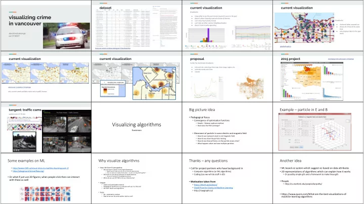
  1. dataset current visualization current visualization drawbacks: visualizing crime ● impossible to see the past trends, beyond 2 years in the past ● doesn’t allow choosing a period of time of interest drawbacks: ● can’t view hourly/daily trends in vancouver ● can’t look at other context (neighbourhoods) ● cluttered when zoomed out doesn’t look visually appealing ● ● shows all crimes at the same time only displays data for the past ● alex kim & amon ge week oct 17 2017 geodash.vpd.ca data.vancouver.ca/datacatalogue/crime-data.htm current visualization current visualization proposal 2015 project rexchang.com/vancouver-crimemap tackle the mentioned drawbacks: ● interactivity: selecting crime type, time range, region, etc. animate trends over time ● ● cleaner vancouver.ca/police/crimemaps only current week available, exists only in pdf(!) format Big picture idea Example – particle in E and B tangent: traffic cams update every 2~15 min • Pedagogical focus • Convergence of optimization functions Visualizing algorithms • Simple – Netwon raphson method • How does the PSO converge? Gursimran • Movement of particle in some electric and magnetic field • How do we represent electric and magnetic field • How do we show the particle moving • How do we show all forces on the particle at any time? • What happens when we have multiple particles. Some examples on ML Why visualize algorithms Thanks – any questions Another idea • http://www.r2d3.us/visual-intro-to-machine-learning-part-1/ • Very rich from IV perspective • Call for project partners who have background in • ML based viz system which suggest viz based on data attributes • We will have to work in very high dimentions • http://playground.tensorflow.org/ • Computer algorithms (or ML algorithms) • 2D representations of algorithms which can explain how it works • Really have to make sure we use our channels appropriately • How to represent complex fields/ data – say elec and mag field together? • Coding (cos we will do stuff in d3) • Or possibly simple gifs and a framework to make these gifs • Will have to care about principal of expressiveness • Or what if just use 2D figures; when people click then can interact • As we are making it for pedagogical purposes • When do we use 3D? When to use interactivity? with these as well • People • Motivation taken from • Impact • http://cs.stanford.edu/people/karpathy/ • https://distill.pub/about/ • Useful and publishable material • Pedagogical significance so someone will use it at the end • Distill Prize for Clarity in Machine Learning • We learn about cool algorithms • http://rawgraphs.io/ • Tools • https://www.quora.com/What-are-the-best-visualizations-of- • D3 – explanatory analysis machine-learning-algorithms • May be we can try some python tools as well

  2. Machine Learning Linear Algebra Intuitive explanations Statistics Halldor Thorhallsson Distill.pub Sample topics Storytelling ● Covariance matrix ● CLT “Maybe stories are just data ● Bayes rule with a soul.” - Brené Brown ● PCA What is Data Integration Visualization What you will learn ● Data Integration is the process of combining data from different data sources. ● Task: visualize the process of integration between 2 or more datasets ● Data Integration research domain ○ Example: ● Dataset: multiple datasets taken from the Bioinformatics domain. ● Bioinformatics: learn what data do systems biologists use in their research. ○ Dataset 1 contains all human genes available since 1975, ○ Example: Reactome, Ensembl, Chembl, BioModels ● A variant of SQL: SPARQL. This is the language used to generate integrated CPSC547 Pitch ○ Dataset 2 contains all primate genes discovered using the Next Generation Sequencing ○ All these datasets are already stored in a common format: RDF data from multiple data sources method. ○ Data are tabular, well-curated, and cleaned ○ We want to integrate them to create a more complete dataset for the human genome. ● Idiom: encode a number of attributes as node-link diagrams ● What problems does it have? Data might be stored in different formats. ○ Example: ○ Example: ○ Dataset 1 stores date in the format of 2017/10/16, and ○ Dataset 2 stores in the format of October 16, 2017. ● What solutions are out there? Apply transformations to each dataset to convert values in each dataset to a conventional form, and then integrate. ○ Example: convert both 2017/10/16 and October 16, 2017 to 20171016 how are macronutrients measured? Canadian Nutrient File (CNF) macronutrients are needed in protein • over 5600 foods large amounts fats to provide what are carbohydrates • over 150 nutrients calories Meal Planning by Macronutrients • nutrient values per 100 g of food macronutrients? macronutrients have a calculate the grams of consistent amount of each macronutrient based micronutrients calculate calorie intake calories per gram on ratios of calories vitamins are needed in based on total daily energy Hayley Guillou smaller amounts minerals to maintain •1 gram protein = 4 calories •ex. ketogenic diet (5% carb, 20% expenditure water healthy bodily protein, 70% fat) •1 gram carbohydrate = 4 calories functions •1 gram fat = 9 calories

  3. Data what kind of visualization would be best suited for Motivation and Data Source 5, 6 collection 4 daily meal planning based on macronutrients? Visualizing Eye-tracking data Course Project for 539 (with Xinhong Liu): 1. Gaze location (in pixel) what filtering, sorting, and visual features can be Detection of future self-distractions during reading using gaze patterns 2. Target sentence added to speed up meal planning? 2 from reading tasks 3. Scroll level 4. Zoom level Custom built application that collects information about the document, what trends in personal nutrition can be mapped 5. App focus / blur 1 Jan Pilzer active windows, and eye tracking data during reading of PDF 6. Active window 3 over time? documents. Further collection or refinement possible if Application exists in beta, and is actively being developed. Changes necessary. possible. possible research questions Dozens of Pre-reqs Data Sample Initial Analysis EECE 320 • Many pre-reqs (especially in undergrad course) Visualization of UBC Courses • Pre-reqs of pre-reqs CPSC 221 • All of / one of relationship Jiahong Chen (Department of Mechanical Engineering) • Overlap-pre-reqs Siyuan He (Department of Computer Science) CPSC 210 CPSC 121 https://cs.ubc.ca/~pilzer/projects/547 Dozens of Pre-reqs Where to get data? Vis Techs Why is useful? Channel • Curriculum Overview • Size: credits • Saturation: level of course • Determine which path you want to go • Color: different faculty • Determine if you have a breadth of knowledge Web Crawling! • Some other interesting questions such as • Determine fundamental courses that applies to all disciplines. • Determine which course combines most of the knowledge Marks HTML source page of the course page • Points: courses • Clustering all courses. • Lines: links between courses Motivations Survey: Data mining Figure data mining definition [1] • Development of IoT (internet of things) and Big data and information system Thank you • Higher requirement for visualization of different visualization types of data • The interrelationship between applications and information visualization technology CPSC-547 KAIYUAN LI

Download Presentation
Download Policy: The content available on the website is offered to you 'AS IS' for your personal information and use only. It cannot be commercialized, licensed, or distributed on other websites without prior consent from the author. To download a presentation, simply click this link. If you encounter any difficulties during the download process, it's possible that the publisher has removed the file from their server.

Recommend


More recommend