
SLIDE 1
Contrast Repetition Alignment Proximity Contrast Repetition Alignment Proximity The four design principles
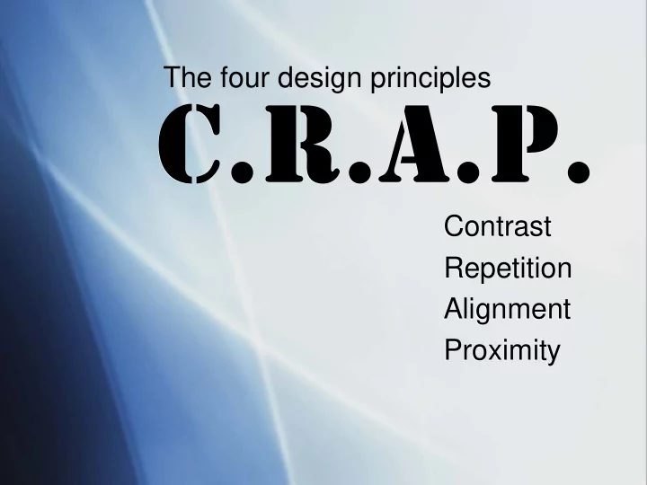
The four design principles Contrast Contrast Repetition - - PowerPoint PPT Presentation
The four design principles Contrast Contrast Repetition Repetition Alignment Alignment Proximity Proximity If two items are not exactly If two items are not exactly the same, then make them the same, then make them different.
Contrast Repetition Alignment Proximity Contrast Repetition Alignment Proximity The four design principles
“If two items are not exactly the same, then make them
“If two items are not exactly the same, then make them
Contrast focuses on visual interest. Match items exactly or make them entirely unique from one another. Contrast creates an interest on the page and simplifies the organizational structure. Use different fonts, colors, shapes and images
The key is to be aggressive and make the contrast stand out.
Which of the two examples is more visually striking?
There is no set rule for how to create contrast. The goal is just to make a visual splash where parts of the page stand out.
“Repeat some aspect of the design throughout the entire piece.” “Repeat some aspect of the design throughout the entire piece.”
Repetition focuses on consistency. Repetition comes through unity and consistency in font, alignment, headings, etc. Look for existing repetition to strengthen, while also seeking to create repetition through various aspects of layout.
Repetition can come through fonts, spacing
example shows repetition in layout.
Repetition does not require that everything appear exactly the
font but variation in color and
remains consistent throughout, providing a uniform look that is visually appealing.
“Nothing should be placed on the page arbitrarily. Every item should have a visual connection with something else on the page.” “Nothing should be placed on the page arbitrarily. Every item should have a visual connection with something else on the page.”
Alignment focuses on unity. There needs to be something that ties together all of the elements of the page visually. Strong alignment organizes the page in a sophisticated look that is more visually appealing to the reader. Consciously look whenever you place something on the page to see what else can be aligned with the new object.
Alignment can be varied if it features contrast. Which example is most visually appealing?
The left example features no real alignment
center-aligned, while the example on the right shows a right alignment. Which one is more attractive?
“Group related items together… so the related items are seen as one cohesive group rather than a bunch of unrelated bits.” “Group related items together… so the related items are seen as one cohesive group rather than a bunch of unrelated bits.”
Proximity focuses on clarity in organization. Related items placed in close proximity to each other appear as one visual unit, rather than several unique items. Simply placing related items together on a page creates a stronger organization that is more visually appealing and helps the reader remember the information.
Which page is easier to follow and more attractive to the eye?
The example to the left is random and chaotic, with words strewn about all over the page without any sense of order. This makes it confusing to look at and almost gives you a headache trying to comprehend all the information. In the example on the right, each of the dance styles is grouped into common genres of dance. This structure makes the card much easier to read and
to find the information they are looking for.
Robin Williams: The Non-Designer’s Design Book, Third Edition.