Oral and Multimedia Presentation Impacts of Society Student Name: - - PDF document

oral and multimedia presentation impacts of society
SMART_READER_LITE
LIVE PREVIEW

Oral and Multimedia Presentation Impacts of Society Student Name: - - PDF document

Oral and Multimedia Presentation Impacts of Society Student Name: __Gavin S. ___________ Mark of Teahcer 27/40 Oral 4 3 2 1 Speaks Clearly Speaks clearly and Speaks clearly and Speaks clearly and


slide-1
SLIDE 1

Oral and Multimedia Presentation Impacts of Society

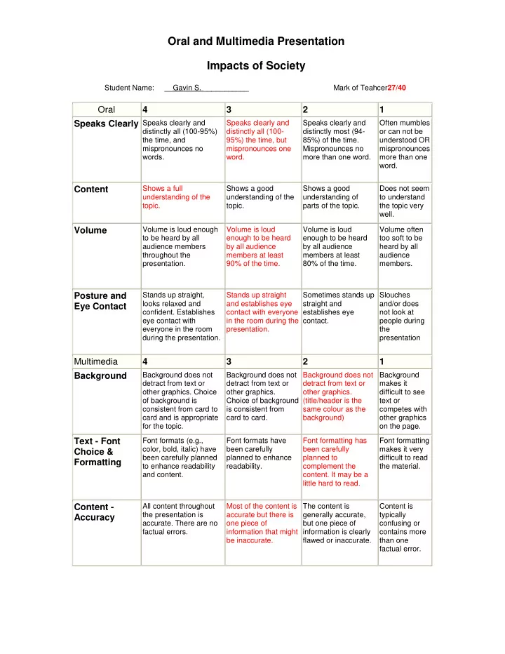
Student Name: __Gavin S. ___________ Mark of Teahcer27/40

Oral 4 3 2 1 Speaks Clearly

Speaks clearly and distinctly all (100-95%) the time, and mispronounces no words. Speaks clearly and distinctly all (100- 95%) the time, but mispronounces one word. Speaks clearly and distinctly most (94- 85%) of the time. Mispronounces no more than one word. Often mumbles

  • r can not be

understood OR mispronounces more than one word.

Content

Shows a full understanding of the topic. Shows a good understanding of the topic. Shows a good understanding of parts of the topic. Does not seem to understand the topic very well.

Volume

Volume is loud enough to be heard by all audience members throughout the presentation. Volume is loud enough to be heard by all audience members at least 90% of the time. Volume is loud enough to be heard by all audience members at least 80% of the time. Volume often too soft to be heard by all audience members.

Posture and Eye Contact

Stands up straight, looks relaxed and

  • confident. Establishes

eye contact with everyone in the room during the presentation. Stands up straight and establishes eye contact with everyone in the room during the presentation. Sometimes stands up straight and establishes eye contact. Slouches and/or does not look at people during the presentation

Multimedia 4 3 2 1 Background

Background does not detract from text or

  • ther graphics. Choice
  • f background is

consistent from card to card and is appropriate for the topic. Background does not detract from text or

  • ther graphics.

Choice of background is consistent from card to card. Background does not detract from text or

  • ther graphics.

(title/header is the same colour as the background) Background makes it difficult to see text or competes with

  • ther graphics
  • n the page.

Text - Font Choice & Formatting

Font formats (e.g., color, bold, italic) have been carefully planned to enhance readability and content. Font formats have been carefully planned to enhance readability. Font formatting has been carefully planned to complement the

  • content. It may be a

little hard to read. Font formatting makes it very difficult to read the material.

Content - Accuracy

All content throughout the presentation is

  • accurate. There are no

factual errors. Most of the content is accurate but there is

  • ne piece of

information that might be inaccurate. The content is generally accurate, but one piece of information is clearly flawed or inaccurate. Content is typically confusing or contains more than one factual error.

slide-2
SLIDE 2

Originality

Presentation shows considerable originality and inventiveness. The content and ideas are presented in a unique and interesting way. Presentation shows some originality and

  • inventiveness. The

content and ideas are presented in an interesting way. Presentation shows an attempt at

  • riginality and

inventiveness on 1-2 cards. Presentation is a rehash of

  • ther people\'s

ideas and/or graphics and shows very little attempt at

  • riginal

thought.

Sequencing of Information

Information is organized in a clear, logical way. It is easy to anticipate the type of material that might be on the next card. Most information is

  • rganized in a clear,

logical way. One card

  • r item of information

seems out of place. Some information is logically sequenced. An occasional card or item of information seems out of place. There is no clear plan for the

  • rganization of

information.

Use of Graphics

All graphics are attractive (size and colors) and support the theme/content of the presentation. A few graphics are not attractive but all support the theme/content of the presentation. All graphics are attractive but a few do not seem to support the theme/content of the presentation. Several graphics are unattractive AND detract from the content of the presentation.

Constructive Comments (how to improve the presentation) Most likely, the individual did not get a perfect score. Answer the questions below to provide helpful comments on how to improve the presentation.

  • 1. What parts of the rubric do they need to improve on? (ie perhaps they got low

marks in Volume or Speaks Clearly) One of the slides seemed to have too much information, making the text really small; therefore making the viewers unable to read it. Slides don’t contain images necessary for the topic, or any images at all; therefor making it more boring. Some of the heading font texts match the colour of the background, making it harder to read the text. A very loud voice, which is clear, but sometimes the presenter has his back facing to a portion of the audience.

  • 2. What could they have done to improve the presentation? (give specific examples,

ie they could have added graphs to improve understanding of the statistics) Could’ve improved the presentation, by having more colour, images, videos, and animations on the slides that don’t contain anything but information.

  • 3. How effective was the presentation in teaching you the information? What would

have helped you to understand the content in the presentation more? (ie some people learn more from repetition of information, while others need the information to be presented in a more visual way)

slide-3
SLIDE 3

In my opinion the presentation offered a lot of the information, but it was dull and boring, because it lacked images to the subject being presented. The videos that were shown in different proportions for the subject being offered made the video less gloomy.

  • 4. How effective was the presenter at supplying additional relevant information not

found on the presentation screen? The presenter was fairly effective in supplying additional relevant information, by talking about the topic a bit more, with his knowledge of it and sometimes even gave examples and details of the topic being mentioned, that wasn’t found on the presentation.

  • 5. How well did the presenter answer any questions asked?

No questions/very few questions were asked at the end of the presentations, or during the presentation, because the presenter did not include a portion where he allowed the audience to ask question about the topics.