
3
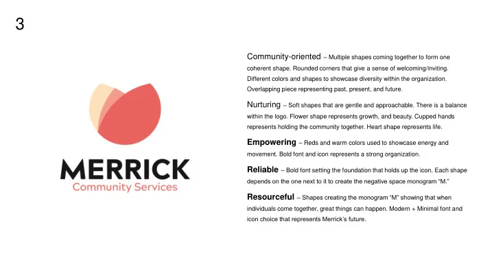
Community-oriented – Multiple shapes coming together to form one
coherent shape. Rounded corners that give a sense of welcoming/inviting. Different colors and shapes to showcase diversity within the organization. Overlapping piece representing past, present, and future.
Nurturing – Soft shapes that are gentle and approachable. There is a balance
within the logo. Flower shape represents growth, and beauty. Cupped hands represents holding the community together. Heart shape represents life.
Empowering – Reds and warm colors used to showcase energy and
- movement. Bold font and icon represents a strong organization.
Reliable – Bold font setting the foundation that holds up the icon. Each shape
depends on the one next to it to create the negative space monogram “M.”
Resourceful – Shapes creating the monogram “M” showing that when
individuals come together, great things can happen. Modern + Minimal font and icon choice that represents Merrick’s future.