Lesson 4 Graphical User Interfaces Victor Matos Cleveland State - - PDF document

lesson 4 graphical user interfaces
SMART_READER_LITE
LIVE PREVIEW

Lesson 4 Graphical User Interfaces Victor Matos Cleveland State - - PDF document

Lesson 4 Lesson 4 Graphical User Interfaces Victor Matos Cleveland State University Portions of this page are reproduced from work created and shared by Google and used according to terms described in the Creative Commons 3.0 Attribution


slide-1
SLIDE 1

Lesson 4

Lesson 4

Victor Matos Cleveland State University

Graphical User Interfaces

Portions of this page are reproduced from work created and shared by Google and used according to terms described in the Creative Commons 3.0 Attribution License.

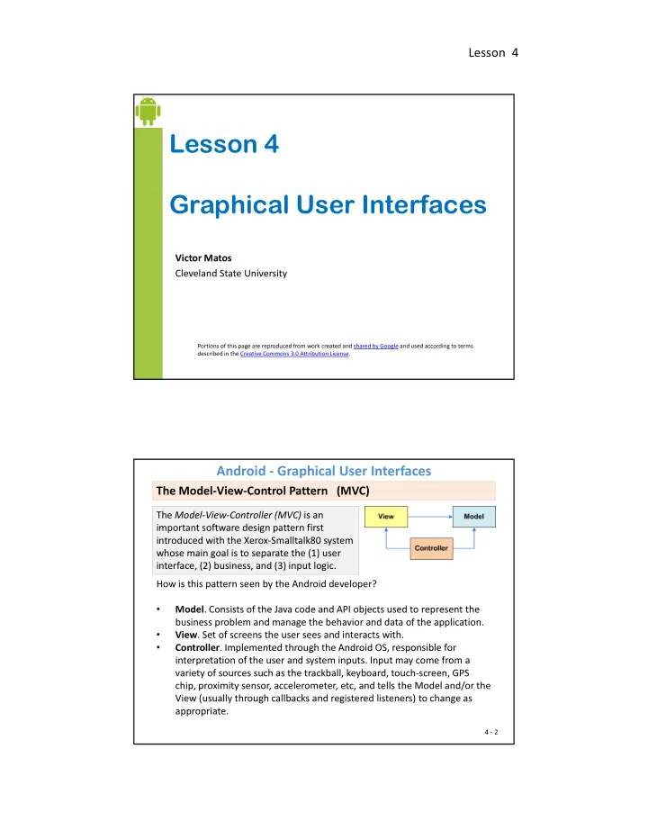
The Model-View-Controller (MVC) is an important software design pattern first introduced with the Xerox-Smalltalk80 system whose main goal is to separate the (1) user

The Model-View-Control Pattern (MVC)

Android - Graphical User Interfaces

whose main goal is to separate the (1) user interface, (2) business, and (3) input logic. How is this pattern seen by the Android developer?

  • Model. Consists of the Java code and API objects used to represent the

business problem and manage the behavior and data of the application.

  • View. Set of screens the user sees and interacts with.
  • Controller Implemented through the Android OS responsible for
  • Controller. Implemented through the Android OS, responsible for

interpretation of the user and system inputs. Input may come from a variety of sources such as the trackball, keyboard, touch-screen, GPS chip, proximity sensor, accelerometer, etc, and tells the Model and/or the View (usually through callbacks and registered listeners) to change as appropriate.

4 - 2

slide-2
SLIDE 2

Lesson 4

The Android developer should be aware of

  • Inputs could be sent to the application from various physical/logical
  • components. Reacting to those signals is typically handled by callback

Getting ready to create MVC conforming solutions

Android - Graphical User Interfaces

  • methods. Usually there are many of them, you want to learn how to

choose the appropriate one.

  • Moving to states in the lifecycle is tied to logic in the model. For instance,

if forced to Pause you may want to save uncommitted data.

  • A notification mechanism is used to inform the user of important events

happening outside the current application (such as arrival of a text happening outside the current application (such as arrival of a text message or email, low battery, fluctuations of the stock market, etc) and consequently choose how to proceed.

  • Views are unlimited in terms of aesthetic and functionality. However

physical constraints such as size, and hardware acceleration (or lack of) may affect how graphical components are managed.

4 - 3

Android graphical interfaces are usually implemented as XML files (although they could also be dynamically created from Java code). An Android UI is conceptually similar to a common HTML page

Android - Graphical User Interfaces

MVC Pattern: The View - User Interfaces (GUis)

p y p g

  • In a manner similar to a web page interaction, when the Android user

touches the screen, the controller interprets the input and determines what specific portion of the screen and gestures were involved. Based on this information it tells the model about the interaction in such a way that the appropriate “callback listener” or lifecycle state could be called into action.

  • Unlike a web application (which refreshes its pages after explicit

requests from the user) an asynchronous Android background service could quietly notify the controller about some change of state (such as reaching a given coordinate on a map) and in turn a change of the view’s state could be triggered; all of these without user intervention.

4 - 4

slide-3
SLIDE 3

Lesson 4

For a discussion of the newest Android UI Design Patterns (2013) see video: https://www.youtube.com/watch?v=Jl3-lzlzOJI

Android - Graphical User Interfaces

Android UI Design Patterns

4 - 5

A collection of weekly instructional videos made by the same presenters can be

  • btained from the page (visited on Sept 6, 2014)

https://www.youtube.com/results?search_query=android+design+in+action

  • A View occupies a rectangular area on the screen
  • The View class is the Android’s most basic component from which users

interfaces can be created. It acts as a container of displayable elements.

Android - Graphical User Interfaces

The VIEW Class

and is responsible for drawing and event handling.

  • Widgets are subclasses of View. They are used to

create interactive UI components such as buttons, checkboxes, labels, text fields, etc.

  • Layouts are invisible structured containers used for

holding other Views and nested layouts holding other Views and nested layouts.

4 - 6

slide-4
SLIDE 4

Lesson 4

Using XML to represent UIs

Android - Graphical User Interfaces

<RelativeLayout xmlns:android="http://schemas.android.com/apk/res/android" xmlns:tools="http://schemas.android.com/tools" android:layout_width="match_parent" android:layout_height="match_parent" android:paddingBottom="@dimen/activity_vertical_margin" android:paddingLeft="@dimen/activity_horizontal_margin" android:paddingRight="@dimen/activity horizontal margin" android:paddingRight @dimen/activity_horizontal_margin android:paddingTop="@dimen/activity_vertical_margin" tools:context="csu.matos.gui_demo.MainActivity" > <EditText android:id="@+id/editText1" android:layout_width="wrap_content" android:layout_height="wrap_content" android:layout_alignParentTop="true" android:layout_centerHorizontal="true" android:layout_marginTop="36dp" android:text="@string/edit_user_name" android:ems="12" > <requestFocus />

Actual UI displayed by the app Text version: activity_main.xml file ⟶

<requestFocus /> </EditText> <Button android:id="@+id/button1" android:layout_width="wrap_content" android:layout_height="wrap_content" android:layout_below="@+id/editText1" android:layout_centerHorizontal="true" android:layout_marginTop="48dp" android:text="@string/btn_go" /> </RelativeLayout>

4 - 7

  • An Android’s XML view file consists of a layout design holding a

hierarchical arrangement of its contained elements.

  • The inner elements could be basic widgets or user-defined nested

layouts holding their own viewgroups.

Nesting XML Layouts

Android - Graphical User Interfaces

  • An Activity uses the setContentView(R.layout.xmlfilename)

method to render a view on the device’s screen.

<LinearLayout xmlns:android="http://schemas.android.com/apk/res/android" android:layout_width="match_parent" android:layout_height="wrap_content" android:orientation="horizontal" > </LinearLayout>

Widgets and other nested layouts

4 - 8

slide-5
SLIDE 5

Lesson 4

Dealing with widgets & layouts typically involves the following operations 1. Set properties: For instance, when working with a TextView you set the background color text font alignment size padding margin

Setting Views to Work

Android - Graphical User Interfaces

the background color, text, font, alignment, size, padding, margin, etc. 2. Set up listeners: For example, an image could be programmed to respond to various events such as: click, long-tap, mouse-over, etc. 3. Set focus: To set focus on a specific view, you call the method .requestFocus() or use XML tag <requestFocus /> 4. Set visibility: You can hide or show views using setVisibility(…).

4 - 9

A Sample of Common Android LAYOUTS

Android - Graphical User Interfaces

Linear Layout

A LinearLayout places its inner views either in horizontal or vertical disposition.

Relative Layout

A RelativeLayout is a ViewGroup that allows you to position elements relative to each other.

Table Layout

A TableLayout is a ViewGroup that places elements using a row & column disposition.

Reference: http://developer.android.com/guide/topics/ui/layout-objects.html

4 - 10

slide-6
SLIDE 6

Lesson 4

GalleryView

A Sample of Common Android WIDGETS

Android - Graphical User Interfaces

TimePicker Form Controls TabWidget Spinner TimePicker AnalogClock DatePicker

A DatePicke is a widget that allows the user to select a month, day and year.

Form Controls

Includes a variety of typical form widgets, like: image buttons, text fields, checkboxes and radio buttons.

Reference: http://developer.android.com/guide/topics/ui/layout-objects.html

4 - 11

WebView

A Sample of Common Android WIDGETS

Android - Graphical User Interfaces

AutoCompleteTextView

It is a version of the EditText

ListView

A ListView is a View that

MapView

widget that will provide auto-complete suggestions as the user types. The suggestions are extracted from a collection of strings. shows items in a vertically scrolling list. The items are acquired from a ListAdapter.

Reference: http://developer.android.com/guide/topics/ui/layout-objects.html

4 - 12

slide-7
SLIDE 7

Lesson 4

Android considers XML-based layouts to be resources, consequently layout files are stored in the res/layout directory inside your Android project.

GUI Editing: XML Version

Android - Graphical User Interfaces

Package Explorer Resource folder

XML version

  • f a window

4 - 13

Android considers XML-based layouts to be resources, consequently layout files are stored in the res/layout directory inside your Android project.

GUI Editing: XML Version

Android - Graphical User Interfaces

App explorer Resource folder

XML version

  • f a window

4 - 14

slide-8
SLIDE 8

Lesson 4

The Screen Designer Tool included in Eclipse+ADT allows you to operate each screen using either a WYSIWIG or XML editor.

Android - Graphical User Interfaces

GUI Editing: WYSIWYG Version

Screen’s Outline GUI Palette Select WYSIWYG or XML view Widget’s properties WYSIWYG screen 4 - 15

Alternative tools for creating Android apps and GUIs:

  • Android Studio. Based on IntelliJ IDEA IDE. Functionally equivalent to Eclipse

with the ADT Plugin. http://developer android com/sdk/installing/studio html

Android - Graphical User Interfaces

Aside… Tools you can use to create an Android GUI

http://developer.android.com/sdk/installing/studio.html

  • Android SDK. Streamlined workbench based on Eclipse+ADT in a simpler to

install package. http://developer.android.com/sdk/index.html

  • NBAndroid. Workbench based on NetBeans+ADT.

http://www.nbandroid.org/2014/07/android-plugin-for-gradle-011012.html

  • DroidDraw Very simple GUI designer, incomplete, not integrated to the

Eclipse IDE, aging! http://www.droiddraw.org/

  • App Inventor (educational, very promising & ambitious, ‘hides’ coding …)

http://appinventor.mit.edu/

4 - 16

slide-9
SLIDE 9

Lesson 4

  • Android GUI Layouts are containers having a predefined structure and

placement policy such as relative, linear horizontal, grid-like, etc.

  • Layouts can be nested, therefore a cell, row, or column of a given layout

Android - Graphical User Interfaces

GUI Elements: The LAYOUT

y , , , g y could be another layout.

  • The Eclipse+ADT workbench offers the following base types:

4 - 17

  • The FrameLayout is the simplest type of GUI container.
  • It is useful as an outermost container holding a window.

Android - Graphical User Interfaces

FrameLayout

  • Allows you to define how much of the screen (high,

width) is to be used.

  • All its children elements are aligned to the top left corner
  • f the screen.;

4 - 18

slide-10
SLIDE 10

Lesson 4

  • The LinearLayout supports a filling strategy in which new elements are

stacked either in a horizontal or vertical fashion.

  • If the layout has a vertical orientation new rows are placed one on top of

Android - Graphical User Interfaces

LinearLayout

the other.

  • A horizontal layout uses a side-by-side column placement policy.

4 - 19

Setting Attributes

Configuring a LinearLayout usually requires you to set the following attributes:

Android - Graphical User Interfaces

LinearLayout

  • rientation

(vertical, horizontal)

  • fill model

(match_parent, wrap_contents)

  • weight

(0, 1, 2, …n )

  • gravity

(top, bottom, center,…)

  • padding

( dp – dev. independent pixels )

  • margin

( dp – dev. independent pixels )

4 - 20

slide-11
SLIDE 11

Lesson 4

The android:orientation property can be set to: horizontal for columns, or vertical for rows. Use setOrientation() for runtime

Android - Graphical User Interfaces

LinearLayout : Orientation

<LinearLayout xmlns:android="http://schemas.android.com/ap k/res/android" android:id="@+id/myLinearLayout" android:layout_width="match_parent" android:layout_height="match_parent" android:orientation="horizontal" android:padding="4dp" > t i

horizontal v e

changes.

<TextView android:id="@+id/labelUserName" android:layout_width="wrap_content" android:layout_height="wrap_content" android:background="#ffff0000" android:text=" User Name " android:textColor="#ffffffff" android:textSize="16sp" android:textStyle="bold" /> <EditText android:id="@+id/ediName" android:layout_width="wrap_content" 21

e r t i c a l

android:layout_height="wrap_content" android:text="Maria Macarena" android:textSize="18sp" /> <Button android:id="@+id/btnGo" android:layout_width="wrap_content" android:layout_height="wrap_content" android:text="Go" android:textStyle="bold" /> </LinearLayout>

Shown on a Kitkat device

4 - 21

  • Widgets have a "natural size“ based on their included text (rubber band

effect).

  • On occasions you may want your widget to have a specific space

allocation (height, width) even if no text is initially provided (as is the

Android - Graphical User Interfaces

LinearLayout : Fill Model

case of the empty text box shown below).

empty screen space natural sizes 4 - 22

Shown on a Gingerbread device

slide-12
SLIDE 12

Lesson 4

All widgets inside a LinearLayout must include ‘width’ and ‘height’ attributes. android:layout_width android:layout height

Android - Graphical User Interfaces

LinearLayout : Fill Model

y _ g Values used in defining height and width can be: 1. A specific dimension such as 125dp (device independent pixels dip ) 2. wrap_content indicates the widget should just fill up its natural space. 3. match_parent (previously called ‘fill_parent’) indicates the widget wants to be as big as the enclosing parent.

4 - 23

125 dp entire row (320 dp on medium resolution screens)

Android - Graphical User Interfaces

LinearLayout : Fill Model

<LinearLayout xmlns:android="http://schemas.android.com/apk/res/android" android:id="@+id/myLinearLayout" android:layout_width="match_parent" android:layout_height="match_parent" android:background="#ff0033cc" android:orientation="vertical" android:padding="6dp" > Row-wise android:padding= 6dp > <TextView android:id="@+id/labelUserName" android:layout_width="match_parent" android:layout_height="wrap_content" android:background="#ffff0066" android:text="User Name" android:textColor="#ff000000" android:textSize="16sp" android:textStyle="bold" /> <EditText android:id="@+id/ediName" Use all the row Medium resolution is: 320 x 480 dpi. Shown on a Gingerbread device

4 - 24

android:id @+id/ediName android:layout_width="match_parent" android:layout_height="wrap_content" android:textSize="18sp" /> <Button android:id="@+id/btnGo" android:layout_width="125dp" android:layout_height="wrap_content" android:text="Go" android:textStyle="bold" /> </LinearLayout> Specific size: 125dp

slide-13
SLIDE 13

Lesson 4

Android - Graphical User Interfaces

Warning ! Same XML different rendition…

Since the introduction of Android 4.x, changes in the SDK make layouts to be more uniformly displayed in all 4.x and newer p y devices (the intention is to provide a seamless Android experience independent from provider, hardware, and developer). The XML spec used in the previous example looks different when di l d 4 d ld

4 - 25

displayed on a 4.x and older devices (see figures on the right, please also notice the color bleeding occurring on top of the GO button, more on this issue in the Appendix)

Same XML layout shown on a Gingerbread (left) and Kitkat (right) device.

The extra space left unclaimed in a layout could be assigned to any of its inner components by setting its Weight attribute. Use 0 if the view should not be stretched. The bigger the weight the larger the extra space given to that widget.

Android - Graphical User Interfaces

LinearLayout : Weight

g p g g

Example The XML specification for this window is similar to the previous example. The TextView and Button controls have the additional property d id l t i ht "1"

Takes: 2 /(1+1+2) f h Kitkat

android:layout_weight="1" whereas the EditText control has android:layout_weight="2" Remember, default value is 0

  • f the screen space

4 - 26 Gingerbread

slide-14
SLIDE 14

Lesson 4

  • Gravity is used to indicate how a control will align on the screen.
  • By default, widgets are left- and top-aligned.
  • You may use the XML property android:layout_gravity="…"

to set other possible arrangements: left, center, right, top, bottom, etc.

Android - Graphical User Interfaces

LinearLayout : Gravity

p g f , , g , p, ,

Button has right layout_gravity

4 - 27

CAUTION: There is a difference between the alignment attributes:

android:gravity indicates how to place an object within a container In the example

Android - Graphical User Interfaces

LinearLayout : Gravity vs. Layout_Gravity

indicates how to place an object within a container. In the example the text is centered, and the TextView is top-left aligned (default). android:gravity="center" android:layout_gravity positions the TextView with respect to its enclosing layout. android:layout_gravity="center"

4 - 28

slide-15
SLIDE 15

Lesson 4

  • The padding attribute specifies the widget’s internal margin (in dp units).
  • The internal margin is the extra space between the borders of the widget's

Android - Graphical User Interfaces

LinearLayout : Padding

"cell" and the actual widget contents.

  • Either use
  • android:padding property
  • r call method setPadding() at runtime.

Hello world

The ‘blue’ surrounding space around the text represents the inner view’s padding

4 - 29

Padding and Margin represent the internal and external spacing between a widget and its included and surrounding context (respectively).

Android - Graphical User Interfaces

LinearLayout : Padding and Margin

4 - 30

slide-16
SLIDE 16

Lesson 4

Example: The EditText box has been changed to include 30dp of padding all around

Android - Graphical User Interfaces

LinearLayout : Set Internal Margins Using Padding

<EditText d id id "@ id/ diN " android:id="@+id/ediName" android:layout_width="match_parent" android:layout_height="wrap_content" android:textSize="18sp" android:padding="30dp" /> ... 4 - 31

  • Widgets –by default– are closely displayed next to each other.
  • To increase space between them use the android:layout_margin

attribute

Android - Graphical User Interfaces

LinearLayout : Set External Margins

Increased inter-widget space

<EditText android:id="@+id/ediName" / android:layout_width="match_parent" android:layout_height="wrap_content" android:textSize="18sp" android:layout_margin="6dp" > </EditText> ...

Using default spacing between widgets 4 - 32

slide-17
SLIDE 17

Lesson 4

The placement of a widget in a RelativeLayout is based on its positional relationship to other widgets in the container as well as the parent container.

Android - Graphical User Interfaces

Relative Layout

A C B

Example: A is by the parent’s top C is below A, to its right B is below A, to the left of C

4 - 33

Android - Graphical User Interfaces

Relative Layout - Example: Using Eclipse+ADT WYSIWYG Editor

Location of the button is expressed in reference to its relative position with respect to the EditText box.

4 - 34

slide-18
SLIDE 18

Lesson 4

Below there is a sample of various positioning XML boolean properties (true/false) which are useful for collocating a widget based on the location of its parent container.

Android - Graphical User Interfaces

Relative Layout - Referring to the container

android:layout_alignParentTop android:layout_alignParentBottom android:layout_alignParentLeft android:layout_alignParentRight android:layout_centerInParent android:layout_centerVertical android:layout_centerHorizontal

4 - 35

wid1 wid2 android:layout_alignTop=“@+id/wid1”

Android - Graphical User Interfaces

Relative Layout - Referring to Other Widgets

wid1 wid2 android:layout_alignBottom =“@+id/wid1” wid1 android:layout_alignLeft=“@+id/wid1” wid2 wid1 wid2 android:layout_alignRight=“@+id/wid1”

4 - 36

slide-19
SLIDE 19

Lesson 4

Example1: The image shows a screen designed with the WYSIWYG Editor. We are trying to collocate the button identified as wid2. Observe that its placement is visually described

Android - Graphical User Interfaces

Relative Layout - Referring to Other Widgets – WYSIWYG Editor

p y using (green) lines referencing the already drawn wid1 view. Both views have same bottom, same right, but wig2 has an elevation of 36 dps respect wid1.

<Button android:id="@+id/wid2" android:id @ id/wid2 android:layout_width="wrap_content" android:layout_height="wrap_content" android:layout_alignBottom="@+id/wid1" android:layout_alignRight="@+id/wid1" android:layout_marginBottom="36dp" android:text="@string/wid2" />

4 - 37

When using relative positioning you need to: 1. Use identifiers ( android:id attributes ) on all elements that you will be referring to

Android - Graphical User Interfaces

Relative Layout - Referring to Other Widgets – WYSIWYG Editor

be referring to. 2. XML elements are named using the prefix: @+id/... For instance an EditText box could be called: android:id="@+id/txtUserName" 3. You must refer only to widgets that have been already defined. For instance a new control to be positioned below the txtUserName EditText box could refer to it using: g android:layout_below="@+id/txtUserName"

4 - 38

slide-20
SLIDE 20

Lesson 4

<RelativeLayout xmlns:android="http://schemas.android.com/apk/r es/android" android:id="@+id/myRelativeLayout" android:layout_width="match_parent" android:layout_height="match_parent" android:background="#ff000099" > <EditText android:id="@+id/txtUserName" android:layout_width="match_parent" android:layout_height="wrap_content" android:layout_alignParentLeft="true" android:layout below="@+id/lblUserName"

Android - Graphical User Interfaces

Relative Layout - Example2

g ff <TextView android:id="@+id/lblUserName" android:layout_width="match_parent" android:layout_height="wrap_content" android:layout_alignParentLeft="true" android:layout_alignParentTop="true" android:background="#ffff0066" android:text="User Name" android:textColor="#ff000000" android:textStyle="bold" > </TextView> y _ @ / android:padding="20dp" > </EditText> <Button android:id="@+id/btnGo" android:layout_width="wrap_content" android:layout_height="wrap_content" android:layout_alignRight="@+id/txtUserName" android:layout_below="@+id/txtUserName" android:text="Go" android:textStyle="bold" > </Button> 39 </Button> <Button android:id="@+id/btnCancel" android:layout_width="wrap_content" android:layout_height="wrap_content" android:layout_below="@+id/txtUserName" android:layout_toLeftOf="@+id/btnGo" android:text="Cancel" android:textStyle="bold" > </Button> </RelativeLayout>

4 - 39

1. Android's TableLayout uses a grid template to position your widgets. 2. Like in a 2D matrix, cells in the grid are identified by rows and columns. 3. Columns are flexible, they could shrink or stretch to accommodate their contents

Android - Graphical User Interfaces

Table Layout

contents. 4. The element TableRow is used to define a new row in which widgets can be allocated. 5. The number of columns in a TableRow is determined by the total of side- by-side widgets placed on the row.

4 - 40

slide-21
SLIDE 21

Lesson 4

The final number of columns in a table is determined by Android.

Example:

Android - Graphical User Interfaces

Table Layout – Setting Number of Columns

Example: If your TableLayout have three rows

  • one row with two widgets,
  • one with three widgets, and
  • one final row with four widgets,

there will be at least four columns in the table, with column indices: 0, 1, 2, 3.

1 1 2 1 2 3

4 - 41

Table Layout – Example 3

The screen shows various items from a McDonald’s restaurant menu [*]. The TableLayout has four TableRows

Android - Graphical User Interfaces

The TableLayout has four TableRows, with three columns in the first row (labels) and four cells in each of the

  • ther three rows (item, Calories,

Price, and Buy button).

4 - 42

[*] Reference: Pages visited on Sept 8, 2014 http://nutrition.mcdonalds.com/getnutrition/nutritionfacts.pdf http://hackthemenu.com/mcdonalds/menu-prices/

slide-22
SLIDE 22

Lesson 4

<TableLayout xmlns:android="http://schemas.android.com/apk/r es/android" android:id="@+id/myTableLayout" android:layout_width="match_parent" android:layout height "match parent" <TableRow> <TextView android:text="Big Mac" /> <TextView android:gravity "center"

Table Layout – Example 3 continuation

Android - Graphical User Interfaces

android:layout_height= match_parent android:orientation="vertical" android:padding="6dp" > <TableRow> <TextView android:background="#FF33B5E5" android:text="Item " /> <TextView android:layout_marginLeft="5dp" android:background="#FF33B5E5" android:text="Calories " /> android:gravity= center android:text="530" /> <TextView android:gravity="center" android:text="3.99" /> <Button android:id="@+id/btnBuyBigMac" android:gravity="center" android:text="Buy" /> </TableRow> <View android:layout_height="1dp" <TextView android:layout_marginLeft="5dp" android:background="#FF33B5E5" android:text="Price $ " /> </TableRow> <View android:layout_height="1dp" android:background="#FF33B5E5" /> y _ g p android:background="#FF33B5E5" /> <!-- other TableRows ommitted --!> </TableLayout>

4 - 43

  • A single widget in a TableLayout can occupy more than one column.
  • The android:layout_span property indicates the number of columns

the widget is allowed to expand

Android - Graphical User Interfaces

Table Layout – Stretching a Column

the widget is allowed to expand. <TableRow> <TextView android:text="URL:" /> <EditText android:id="@+id/txtData" d id l t " " / android:layout_span="3" /> </TableRow>

4 - 44

slide-23
SLIDE 23

Lesson 4

Widgets on a table’s row are placed lexicographically from left to right, beginning with the first available column. Each column in the table stretches as needed to accommodate its occupants.

Android - Graphical User Interfaces

Table Layout – Stretching a Column

Example 4:

  • The table shown below has four columns (indices: 0,1,2,3).
  • The label (“ISBN”) goes in the first column (index 0).
  • The EditText to the right of the label uses the layout_span attribute to

be placed into a spanned set of three columns (columns 1 through 3). android:layout_span="3"

Label (ISBN) EditText EditText-span EditText-span Column 0 Column 1 Column 2 Button Cancel Column 3 Button OK

android:layout_column="2"

4 - 45

<?xml version="1.0" encoding="utf-8"?> <TableLayout xmlns:android="http://schemas.android.com/apk/res/android" android:id="@+id/myTableLayout" android:layout width="match parent"

Android - Graphical User Interfaces

Table Layout – Example 4 continuation

android:layout_width match_parent android:layout_height="match_parent" android:padding="6dp" android:orientation="vertical" > <TableRow> <TextView android:text="ISBN:" /> <EditText android:id="@+id/ediISBN" android:layout_span="3" /> </TableRow> <TableRow> <Button d id id "@ id/ l"

Occupy 3 columns

Note to the reader: Experiment changing layout_span to 1, 2, 3

android:id="@+id/cancel" android:layout_column="2" android:text="Cancel" /> <Button android:id="@+id/ok" android:text="OK" /> </TableRow> </TableLayout>

Skip columns 0, 1

4 - 46

slide-24
SLIDE 24

Lesson 4

  • By default, a column is as wide as the “natural’ size of the widest widget

collocated in this column (e.g. a column holding a button showing the caption “Go” is narrower than other column holding a button with the caption “Cancel”).

Android - Graphical User Interfaces

Table Layout – Stretching the Entire Table

p )

  • A table does not necessarily take all the horizontal space available.
  • If you want the table to (horizontally) match its container use the

property: android:stretchColumns=“column(s)” Where ‘column(s)’ is the column-index (or comma-separated column indices) to be stretched to take up any space still available on the row. For example, to stretch columns 0, and 2 of a table you set android:stretchColumns=“0,2”

4 - 47

In Example 4 we created a table with four columns. We may elongate its columns 2, 3 to force the TableLayout to horizontally occupy the empty rest of the screen. Observe the use of the clause ‘:strechColumns’

...

Android - Graphical User Interfaces

Table Layout – Stretching the Entire Table

... <TableLayout

xmlns:android="http://schemas.android.com/apk/res/android" android:id="@+id/myTableLayout" android:layout_width="match_parent" android:layout_height="match_parent" android:orientation="vertical" android:stretchColumns="2,3"

>

Screens shown before and after using the android:stretchColumns clause.

4 - 48

slide-25
SLIDE 25

Lesson 4

  • The ScrollView control is useful

in situations in which we have more data to show than what a single screen could display.

Android - Graphical User Interfaces

ScrollView Layout (Vertical & Horizontal)

Scroller indicator

g p y

  • ScrollViews provide a vertical

sliding (up/down) access to the data.

  • The HorizontalScrollView

provides a similar left/right lidi h i ) sliding mechanism)

  • Only a portion of the user’s data

can be seen at one time, however the rest is available for viewing.

4 - 49

<ScrollView xmlns:android= "http://schemas.android.com/apk/res/android" android:id="@+id/myVerticalScrollView1" android:layout width "match parent" <TextView android:id="@+id/textView2" android:layout_width="match_parent" android:layout_height="wrap_content" android:text="Item2" android:textSize="150sp" />

Android - Graphical User Interfaces

Example 5. Vertical ScrollView Layout

android:layout_width= match_parent android:layout_height="match_parent" > <LinearLayout android:id="@+id/myLinearLayoutVertical" android:layout_width="match_parent" android:layout_height="match_parent" android:orientation="vertical" > <TextView android:id="@+id/textView1" android:layout_width="match_parent" android:layout_height="wrap_content" <View android:layout_width="match_parent" android:layout_height="6dp" android:background="#ffff0000" /> <TextView android:id="@+id/textView3" android:layout_width="match_parent" android:layout_height="wrap_content" android:text="Item3" android:textSize="150sp" /> y _ g p_ android:text="Item1" android:textSize="150sp" /> <View android:layout_width="match_parent" android:layout_height="6dp" android:background="#ffff0000" /> </LinearLayout> </ScrollView>

4 - 50

slide-26
SLIDE 26

Lesson 4

<HorizontalScrollView xmlns:android="http://schemas.android.com/apk/r es/android" android:id="@+id/myHorizontalScrollView1" android:layout width "match parent" <TextView android:id="@+id/textView2" android:layout_width="match_parent" android:layout_height="wrap_content" android:text="Item2" android:textSize="75sp" />

Android - Graphical User Interfaces

Example 6. HorizontalScrollView Layout

android:layout_width= match_parent android:layout_height="wrap_content" > <LinearLayout android:id="@+id/myLinearLayoutVertical" android:layout_width="match_parent" android:layout_height="match_parent" android:orientation="horizontal" > <TextView android:id="@+id/textView1" android:layout_width="match_parent" android:layout_height="wrap_content" <View android:layout_width="6dp" android:layout_height="match_parent" android:background="#ffff0000" /> <TextView android:id="@+id/textView3" android:layout_width="match_parent" android:layout_height="wrap_content" android:text="Item3" android:textSize="75sp" /> </LinearLayout> y _ g p_ android:text="Item1" android:textSize="75sp" /> <View android:layout_width="6dp" android:layout_height="match_parent" android:background="#ffff0000" /> y </HorizontalScrollView>

4 - 51

  • This layout lets you specify exact

locations (x/y coordinates) of its children.

Android - Graphical User Interfaces

Miscellaneous: Absolute Layout (Deprecated)

  • Absolute layouts are less flexible

and harder to maintain than

  • ther types of layouts without

absolute positioning.

  • They DO NOT migrate well from
  • ne device to the other; not even
  • ne device to the other; not even

from portrait to landscape modes in the same device!

4 - 52

slide-27
SLIDE 27

Lesson 4

<?xml version="1.0" encoding="utf-8"?> <AbsoluteLayout android:id="@+id/myLinearLayout" android:layout_width="match_parent" android:layout_height="match_parent" android:background="#ff0033cc" </TextView> <EditText android:id="@+id/etName" android:layout width="match parent"

Android - Graphical User Interfaces

Example 7. Absolute Layout (Deprecated)

android:background= #ff0033cc android:padding="4dp" xmlns:android="http://schemas.android.co m/apk/res/android" > <TextView android:id="@+id/tvUserName" android:layout_width="match_parent" android:layout_height="wrap_content" android:background="#ffff0066" android:text="User Name" android:layout_width= match_parent android:layout_height="wrap_content" android:textSize="18sp" android:layout_x="0dp" android:layout_y="38dp" > </EditText> <Button android:layout_width="120dp" android:text="Go" android:layout_height="wrap_content" android:textSize="16sp" android:textStyle="bold" android:textColor="#ff000000" android:layout_x="0dp" android:layout_y="10dp" > android:textStyle="bold" android:id="@+id/btnGo" android:layout_x="100dp" android:layout_y="170dp" /> </AbsoluteLayout>

4 - 53

PLUMBING. You must ‘connect’ functional XML elements –such as buttons, text boxes, check boxes- with their equivalent Java objects. This is typically done in the

  • nCreate(…) method of your main activity. After all the connections are

Android - Graphical User Interfaces

Connecting Layouts to Java Code

( ) y y made and programmed, your app should be ready to interact with the user.

XLM Layout <xml…. . . . . . . </xml> JAVA code public class ... { ... ... }

4 - 54

slide-28
SLIDE 28

Lesson 4

Android - Graphical User Interfaces

Connecting Layouts to Java Code

package csu.matos.gui_demo; import android…;

Java code

public class MainActivity extends Activity { EditText edtUserName; Button btnGo; @Override protected void onCreate(Bundle savedInstanceState) { super.onCreate(savedInstanceState); setContentView(R.layout.activity_main); edtUserName = (EditText) findViewById(R id edtUserName); <!– XML LAYOUT --> <LinearLayout android:id="@+id/myLinearLayout" ... > <TextView android:text="ACME Login Screen" ... />

4 - 55

edtUserName = (EditText) findViewById(R.id.edtUserName); btnGo = (Button) findViewById(R.id.btnGo); ... } ... } <EditText android:id="@+id/edtUserName" ... /> <Button android:id="@+id/btnGo" ... /> </LinearLayout>

An Aside

On Android, a Context defines a logical workspace on which an app can load and access resources.

Android - Graphical User Interfaces

What is the meaning of an Android Context?

  • When a widget is created, it is attached to a particular Context. By means
  • f its affiliation to that environment, it then could access other members
  • f the hierarchy on which it has been collocated.
  • For a simple ‘one activity app’ -say MainActivity- the method

getApplicationContext() and the reference MainActivity.this return the l same result.

  • An application could have several activities. Therefore, for a multi-

activity app we have one app context, and a context for each of its activities, each good for accessing what is available in that context.

4 - 56

slide-29
SLIDE 29

Lesson 4

Assume the UI in res/layout/activity_main.xml has been created. This layout could be called by an application using the statement setContentView(R.layout.activity main);

Android - Graphical User Interfaces

Connecting Layouts to Java Code

setContentView(R.layout.activity_main); Individual XML defined widgets, such as btnGo is later associated to the Java application using the statement findViewByID(...) as in Button btnGo= (Button) findViewById(R.id.btnGo); Where R is a class automatically generated to keep track of resources l bl h l l id h ll f d available to the application. In particular R.id... is the collection of widgets defined in the XML layout (Use Eclipse’s Package Explorer, look at your /gen/package/R.java contents).

4 - 57

A Suggestion: The widget’s identifiers used in the XML layout and Java code could be the

  • same. It is convenient to add a prefix to each identifier indicating its nature. Some options are

txt, btn, edt, rad, chk, etc. Try to be consistent.

Attaching Listeners to Widgets

Consider the screen on the right. To make its ‘Go’ button widget be responsive to the

Android - Graphical User Interfaces

Connecting Layouts to Java Code

Go button widget be responsive to the user’s pushing of that button, we may add a listener for the click event.

Button btnGo = (Button) findViewById(R.id.btnGo); btnGo.setOnClickListener(new OnClickListener() { @Override bli id Cli k(Vi ) { public void onClick(View v) { // get userName and validate against some database // put some more logic here... } }); Note: Other common ‘listeners’ watch for events such as: textChanged, tap, long-press, select, focus, etc.

4 - 58

slide-30
SLIDE 30

Lesson 4

  • In Android a label or text-box is called

a TextView.

  • A TextView is typically used for showing

Android - Graphical User Interfaces

Basic Widgets: TextViews

yp y g a caption or a text message.

  • TextViews are not editable, therefore

they take no input.

  • The text to be shown may include the

\n formatting character (newLine)

  • You may also use HTML formatting by

y g y setting the text to:

Html.fromHtml("<b>bold</b> string") For a ‘colorful’ rendition of the ‘99 Bottles of Beer’ song see: https://www.youtube.com/watch?v=3KnpZYkTWno

Android - Graphical User Interfaces

Basic Widgets: Example 8 - TextViews

<LinearLayout xmlns:android="http://schemas.android.com/apk/res/android" android:layout_width="match_parent" android:layout_height="match_parent" android:orientation="vertical" android:padding="6dp" > <TextView <TextView android:id="@+id/textView1" android:layout_width="match_parent" android:layout_height="wrap_content" android:background="@color/holo_blue_bright" android:text="(Lyrics) 99 Bottles of Beer" android:textAppearance="?android:attr/textAppearanceLarge" /> <TextView android:id="@+id/textView2" android:layout_width="match_parent" android:layout_height="wrap_content" android:layout_marginTop="6dp" y _ g p p android:background="@color/gray_light" android:text="\n\t99 bottles of beer on the wall, 99 bottles of beer.Take one down and pass it around, 98 bottles of beer on the wall.\n\n\t98 bottles of beer on the wall, 98 bottles

  • f beer.Take one down and pass it around, 97 bottles of beer on the wall. \n\n\t97 bottles of

beer on the wall, 97 bottles of beer.Take one down and pass it around, 96 bottles of beer on the wall... " android:textSize="14sp" /> </LinearLayout>

4 - 60

slide-31
SLIDE 31

Lesson 4

  • A Button widget allows the simulation of a GUI clicking action.
  • Button is a subclass of TextView. Therefore formatting a button’s face is

similar to the setting of a TextView.

  • You may alter the default behavior of a button by providing a custom

Android - Graphical User Interfaces

Basic Widgets: Buttons

y y p g drawable.xml specification to be applied as background. In those specs you indicate the shape, color, border, corners, gradient, and behavior based on states (pressed, focused). More on this issue in the appendix.

<Button android:id="@+id/btnClickMeNow" android:layout_width="120dp" android:layout_height="wrap_content" android:layout gravity="center" android:layout_gravity= center android:layout_marginTop="5dp“ android:gravity="center" android:padding="5dp" android:text="Click Me Now!" android:textColor="#ffff0000" android:textSize="20sp" android:textStyle="bold" /> 4 - 61

public class MainActivity extends Activity implements OnClickListener { TextView txtMsg; Button btnBegin; Button btnExit; @Override

Android - Graphical User Interfaces

Example9: Connecting Multiple Buttons

This example shows an alternative way of wiring-up multiple

  • buttons. Observe how

the main activity implements the O Cli kLi t

public void onCreate(Bundle savedInstanceState) { super.onCreate(savedInstanceState); setContentView(R.layout.activity_main ); txtMsg = (TextView) findViewById(R.id.txtMsg); btnBegin = (Button) findViewById(R.id.btnBegin); btnExit = (Button) findViewById(R.id.btnExit); btnBegin.setOnClickListener(this); btnExit.setOnClickListener(this); }//onCreate

OnClickListener interface. The mandatory onClick method checks which of the many buttons sent the signal and proceeds from there.

@Override public void onClick(View v) { if (v.getId() == btnBegin.getId()) { txtMsg.setText("1-You clicked the 'BEGIN' button"); } if (v.getId() == btnExit.getId()) { txtMsg.setText("2-You clicked the 'EXIT' button"); } }//onClick }

4 - 62

slide-32
SLIDE 32

Lesson 4

<LinearLayout xmlns:android="http://schemas.android.com/apk/res/android" xmlns:tools="http://schemas.android.com/tools" android:layout_width="match_parent" android:layout_height="match_parent" android:orientation="vertical" android:padding="6dp" >

Android - Graphical User Interfaces

Example9: Connecting Multiple Buttons [Layout]

<TextView android:id="@+id/txtMsg" android:layout_width="match_parent" android:layout_height="wrap_content" android:background="#88eed0d0" /> <Button android:id="@+id/btnBegin" android:layout_width="wrap_content" android:layout_height="wrap_content" android:ems="5" android:text="Begin" /> android:text= Begin /> <Button android:id="@+id/btnExit" android:layout_width="wrap_content" android:layout_height="wrap_content" android:ems="5" android:text="Exit" /> </LinearLayout>

4 - 63

  • ImageView and ImageButton allow the embedding
  • f images in your applications ( gif, jpg, png, etc).
  • Analogue to TextView and Button controls

Android - Graphical User Interfaces

Basic Widgets: ImageView & ImageButton

g (respectively).

  • Each widget takes an

android:src or android:background attribute (in an XML layout) to specify what picture to use.

  • Pictures are stored in the res/drawable folder

(optionally a medium, high, x-high, xx-high, and xxx- high respectively definition version of the same image could be stored for later usage with different types of screens). Details available at:

http://developer.android.com/design/style/iconography.html

slide-33
SLIDE 33

Lesson 4

<LinearLayout

xmlns:android="http://schemas.android.com/apk/res/android"

android:layout_width="match_parent" android:layout_height="match_parent"

Android - Graphical User Interfaces

Basic Widgets: ImageView & ImageButton

android:padding="6dp" android:orientation="vertical" > <ImageButton android:id="@+id/imgButton1" android:layout_width="wrap_content" android:layout_height="wrap_content" android:src="@drawable/ic_launcher" > </ImageButton> <ImageView g android:id="@+id/imgView1" android:layout_width="200dp" android:layout_height="150dp" android:scaleType="fitXY" android:src="@drawable/flowers1" > </ImageView> </LinearLayout> 4 - 65 <LinearLayout

A common Button widget could display text and a simple image as shown below

Android - Graphical User Interfaces

Basic Widgets: Buttons - Combining Images & Text

. . . <Button android:layout_width="wrap_content" android:layout_height="wrap_content" android:drawableLeft="@drawable/ic_launcher" android:gravity="left|center_vertical" android:padding="15dp" android:text="Click me" /> </LinearLayout> 4 - 66

slide-34
SLIDE 34

Lesson 4

Icons are small images used to graphically represent your application and/or parts of it. They may appear in different parts of your app including:

Android - Graphical User Interfaces

Basic Widgets: How icons are used in Android?

mdpi (761 bytes) 1x = 48 x 48 pixels BaseLine hdpi (1.15KB) 1.5x = 72 x 72 px

  • Home screen
  • Launcher window.
  • Options menu
  • Action Bar
  • Status bar
  • Multi-tab interface.
  • Pop-up dialog boxes
  • List view

D t il d i f ti A d id’ i h i il bl

p x-hdpi (1.52KB) 2x = 96 x 96 px xx-hdpi (2.47KB) 3x = 144 x 144 px

Detailed information on Android’s iconography is available at: http://developer.android.com/design/style/iconography.html HINT: Several websites allow you to convert for free your pictures to image-files under a variety of formats and sizes such as png, .jpg, .gif, etc. For instance try: http://www.prodraw.net/favicon/index.php http://converticon.com/

4 - 67

3x = 144 x 144 px

  • The EditText widget is an extension of

TextView that allows user’s input.

  • In addition to plain text, this widget

Android - Graphical User Interfaces

Basic Widgets: EditText Boxes

In addition to plain text, this widget can display editable text formatted with HTML-styles such as bold, italics, underline, etc ). This is done with Html.fromHtml(html_text)

  • Moving data in and out of an EditText

box is usually done in Java through the f ll i h d following methods: txtBox.setText(“someValue”) txtBox.getText().toString()

4 - 68

slide-35
SLIDE 35

Lesson 4

Input Type Formats

An EditText box could be set to accept input strings satisfying a particular pattern such as: numbers (with and without decimals or sign) phones dates

Android - Graphical User Interfaces

Basic Widgets: EditText Boxes

(with and without decimals or sign), phones, dates, times, uris, etc. Setting the EditText box to accept a particular choice of data-type, is done through the XML clause android:inputType=“choices” where choices include any of the single values shown in the figure. You may combine types, for instance: textCapWords|textAutoCorrect Accepts text that capitalizes every word, incorrect words are automatically changed (for instance ‘teh‘ is converted into ‘the’, and so on.

4 - 69

In this example we will create a simple login screen holding a label (TexView), a textBox (EditText), and a Button. When the EditTex box gains focus, the system provides a virtual keyboard customized to the input-type given to the entry box (capitals & spelling). Clicking the button displays a Toast-message that echoes the li d

Android - Graphical User Interfaces

Example10: Login-Screen

supplied user-name.

Hint Setting text Capitals & spelling Disable b A brief message box button

4 - 70 Images from an HTC-One device

slide-36
SLIDE 36

Lesson 4

Android - Graphical User Interfaces

Example10: Login-Screen

<LinearLayout xmlns:android="http://schemas.android.com/apk/res/android" android:layout_width="match_parent" android:layout_height="match_parent" android:orientation="vertical" android:padding "6dp" >

LAYOUT 1 of 2

android:padding= 6dp > <TextView android:id="@+id/txtLogin" android:layout_width="match_parent" android:layout_height="wrap_content" android:background="@android:color/holo_blue_light" android:text="@string/ACME_Login_Screen" android:textSize="20sp" android:textStyle="bold" /> <EditText android:id="@+id/edtUserName"

4 - 71

@ android:layout_width="match_parent" android:layout_height="wrap_content" android:layout_marginTop="2dp" android:hint="@string/Enter_your_First_and_Last_name" android:inputType="textCapWords|textAutoCorrect" android:textSize="18sp" > <requestFocus /> </EditText>

Android - Graphical User Interfaces

Example10: Login-Screen

<Button android:id="@+id/btnLogin" android:layout_width="82dp" android:layout height "wrap content"

LAYOUT 2 of 2

android:layout_height= wrap_content android:layout_marginTop="2dp" android:text="@string/login" /> </LinearLayout> <?xml version="1.0" encoding="utf-8"?> <!-- this is the res/values/strings.xml file --> <resources>

res/values/strings.xml

4 - 72

<string name="app_name">GuiDemo</string> <string name="action_settings">Settings</string> <string name="login">login</string> <string name="ACME_Login_Screen">ACME Login Screen</string> <string name="Enter_your_First_and_Last_name">Enter your First and Last name</string> </resources>

slide-37
SLIDE 37

Lesson 4

Android - Graphical User Interfaces

Example10: Login-Screen - MainActivity

1 of 3

public class MainActivity extends ActionBarActivity { // class variables representing UI controls to be controlled from the Java program TextView txtLogin; EditText edtUserName; Button btnLogin; Button btnLogin; // variables used with the Toast message class private Context context; private int duration = Toast.LENGTH_SHORT; @Override public void onCreate(Bundle savedInstanceState) { super.onCreate(savedInstanceState); // show the login screen setContentView(R.layout.activity_main); context = getApplicationContext();

4 - 73

g pp (); // binding the UI's controls defined in "main.xml" to Java code txtLogin = (TextView) findViewById(R.id.txtLogin); edtUserName = (EditText) findViewById(R.id.edtUserName); btnLogin = (Button) findViewById(R.id.btnLogin);

Android - Graphical User Interfaces

Example10: Login-Screen - MainActivity

2 of 3

// LISTENER: allowing the button widget to react to user interaction btnLogin.setOnClickListener(new OnClickListener() { @Override public void onClick(View v) { String userName edtUserName getText() toString();

Log e used for

String userName = edtUserName.getText().toString(); Log.e("onClick ", "duration= " + duration); Log.e("onClick ", "context= " + context.toString()); Log.e("onClick ", "userName= " + userName); if (userName.equals("Maria Macarena")) { txtLogin.setText("OK, please wait..."); Toast.makeText(getApplicationContext(), "Welcome " + userName, duration).show(); btnLogin.setEnabled(false); } else {

Log.e used for debugging – remove later!!!

4 - 74

} { Toast.makeText(context, userName + " is not a valid USER", duration).show(); } } });// onClick }// onCreate

slide-38
SLIDE 38

Lesson 4

Android - Graphical User Interfaces

Example10: Login-Screen - MainActivity

3 of 3

@Override public boolean onCreateOptionsMenu(Menu menu) { // Inflate the menu; this adds items to the action bar if it is present. getMenuInflater().inflate(R.menu.main, menu); return true; return true; } @Override public boolean onOptionsItemSelected(MenuItem item) { // Handle action bar item clicks here. The action bar will // automatically handle clicks on the Home/Up button, so long // as you specify a parent activity in AndroidManifest.xml. int id = item.getItemId(); if (id == R.id.action_settings) { return true; } return super.onOptionsItemSelected(item);

4 - 75

p p ( ); } }

Your turn!

(working as a minimalist developer) Android - Graphical User Interfaces

Programming …

(working as a minimalist developer)

Implement any/all of the following projects using simple UI controls (EditText, TextView, buttons)

  • 1. Currency Exchange calculator
  • 1. Currency Exchange calculator
  • 2. Tip Calculator
  • 3. Simple Flashlight

4 - 76

slide-39
SLIDE 39

Lesson 4

Basic Widgets: CheckBoxes

A checkbox is a special two-states button which can be either checked or unchecked. A screen may include any number of mutually

Android - Graphical User Interfaces

A screen may include any number of mutually inclusive (independent) CheckBoxes. At any time, more than one CheckBox in the GUI could be checked. In our “CaféApp” example, the screen on the right displays two CheckBox controls, they are used for selecting ‘Cream’ and ‘Sugar’ options. In this image both boxes are ‘checked’. When the user pushes the ‘Pay’ button a Toast-message is issue echoing the current combination of choices held by the checkboxes.

4 - 77 <?xml version="1.0" encoding="utf-8"?> <LinearLayout xmlns:android="http://schemas.android.com/apk/res/android" android:layout_width="match_parent" android:layout_height="match_parent" android:padding="6dp"

Example11: CheckBoxes – CaféApp [Layout 1 of 2]

Android - Graphical User Interfaces

android:padding= 6dp android:orientation="vertical" > <TextView android:id="@+id/labelCoffee" android:layout_width="match_parent" android:layout_height="wrap_content" android:background="#ff993300" android:text="@string/coffee_addons" android:textColor="@android:color/white" android:textStyle="bold" />

78

<CheckBox android:id="@+id/chkCream" android:layout_width="wrap_content" android:layout_height="wrap_content" android:text="@string/cream" android:textStyle="bold" /> 4 - 78

slide-40
SLIDE 40

Lesson 4

<CheckBox android:id="@+id/chkSugar" android:layout_width="wrap_content" android:layout_height="wrap_content" android:text="@string/sugar"

Example11: CheckBoxes – CaféApp [Layout 2 of 2]

Android - Graphical User Interfaces

android:text= @string/sugar android:textStyle="bold" /> <Button android:id="@+id/btnPay" android:layout_width="153dp" android:layout_height="wrap_content" android:text="@string/pay" android:textStyle="bold" /> </LinearLayout> 4 - 79 <?xml version="1.0" encoding="utf-8"?> <resources>

Resources: res/values/strings Example11: CheckBoxes – CaféApp [@string/… ]

Android - Graphical User Interfaces

<string name="app_name">GuiDemo</string> <string name="action_settings">Settings</string> <string name="click_me">Click Me</string> <string name="sugar">Sugar</string> <string name="cream">Cream</string> <string name="coffee_addons">What else in your coffee?</string> <string name="pay">Pay</string> </resources> 4 - 80

slide-41
SLIDE 41

Lesson 4

public class MainActivity extends Activity { CheckBox chkCream; CheckBox chkSugar; Button btnPay;

Example11: CheckBoxes – CaféApp [Code 1 of 2]

Android - Graphical User Interfaces

@Override public void onCreate(Bundle savedInstanceState) { super.onCreate(savedInstanceState); setContentView(R.layout.activity_main); //binding XMl controls with Java code chkCream = (CheckBox)findViewById(R.id.chkCream); chkSugar = (CheckBox)findViewById(R.id.chkSugar); btnPay = (Button) findViewById(R.id.btnPay); 4 - 81 //LISTENER: wiring button-events-&-code btnPay.setOnClickListener(new OnClickListener() { @Override

Example11: CheckBoxes – CaféApp [Code 2 of 2]

Android - Graphical User Interfaces

public void onClick(View v) { String msg = "Coffee "; if (chkCream.isChecked()) { msg += " & cream "; } if (chkSugar.isChecked()){ msg += " & Sugar"; } Toast.makeText(getApplicationContext(), msg, Toast.LENGTH_SHORT).show(); //go now and compute cost... //g p }//onClick }); }//onCreate }//class 4 - 82

slide-42
SLIDE 42

Lesson 4

  • A radio button (like a CheckBox) is a two-states button that

can be either checked or unchecked.

  • Logically related radio buttons are normally put together in a RadioGroup

Basic Widgets: CheckBoxes

Android - Graphical User Interfaces

Logically related radio buttons are normally put together in a RadioGroup

  • container. The container forces the enclosed radio buttons to behave as

mutually exclusive selectors. That is, the checking of one radio button unchecks all the others.

  • Properties for font face, style, color, etc. are managed in a way similar to

setting a TextView.

  • You may call the method isChecked() to see if a specific RadioButton is

selected, or change its state by calling toggle().

4 - 83

Example

We extend the previous CaféApp example by adding R di G t l

Example12: CheckBoxes – CaféApp [Layout]

Android - Graphical User Interfaces

a RadioGroup control that allows the user to pick

  • ne type of coffee from

three available options.

RadioGroup Summary of choices 4 - 84

slide-43
SLIDE 43

Lesson 4

Based on Example11 - Only new XML and Java code is shown

<TextView android:id="@+id/textView1" android:layout_width="match_parent" android:layout_height="wrap_content" d id b k d "#ff993300" <RadioGroup android:id="@+id/radioGroupCoffeeType" android:layout_width="match_parent" android:layout height "wrap content" >

Example12: CheckBoxes – CaféApp [Layout]

Android - Graphical User Interfaces

android:background="#ff993300" android:text="@string/kind_of_coffee" android:textColor="#ffffff" android:textStyle="bold" /> android:layout_height= wrap_content > <RadioButton android:id="@+id/radDecaf" android:layout_width="wrap_content" android:layout_height="wrap_content" android:text="@string/decaf" /> <RadioButton android:id="@+id/radExpresso" android:layout_width="wrap_content" android:layout_height="wrap_content" android:text="@string/expresso" /> 85 85 @ g p <RadioButton android:id="@+id/radColombian" android:layout_width="wrap_content" android:layout_height="wrap_content" android:checked="true" android:text="@string/colombian" /> </RadioGroup>

4 - 85 public class MainActivity extends Activity { CheckBox chkCream; CheckBox chkSugar; Button btnPay;

Example12: CheckBoxes – CaféApp [MainActivity]

Android - Graphical User Interfaces

RadioGroup radCoffeeType; RadioButton radDecaf; RadioButton radExpresso; RadioButton radColombian; @Override public void onCreate(Bundle savedInstanceState) { super.onCreate(savedInstanceState); setContentView(R.layout.main); chkCream = (CheckBox) findViewById(R id chkCream); chkCream = (CheckBox) findViewById(R.id.chkCream); chkSugar = (CheckBox) findViewById(R.id.chkSugar); btnPay = (Button) findViewById(R.id.btnPay); radCoffeeType = (RadioGroup) findViewById(R.id.radioGroupCoffeeType); radDecaf = (RadioButton) findViewById(R.id.radDecaf); radExpresso = (RadioButton) findViewById(R.id.radExpresso); radColombian = (RadioButton) findViewById(R.id.radColombian); 4 - 86

slide-44
SLIDE 44

Lesson 4

// LISTENER: wiring button-events-&-code btnPay.setOnClickListener(new OnClickListener() { @Override public void onClick(View v) { String msg = "Coffee "; if (chkCream.isChecked()) msg + " & cream ";

Example12: CheckBoxes – CaféApp [MainActivity]

Android - Graphical User Interfaces

msg += & cream ; if (chkSugar.isChecked()) msg += " & Sugar"; // get selected radio button ID number int radioId = radCoffeeType.getCheckedRadioButtonId(); // compare selected's Id with individual RadioButtons ID if (radColombian.getId() == radioId) msg = "Colombian " + msg; // similarly you may use .isChecked() on each RadioButton if (radExpresso.isChecked()) msg = "Expresso " + msg; 87 87 g p g; // similarly you may use .isChecked() on each RadioButton if (radDecaf.isChecked()) msg = "Decaf " + msg; Toast.makeText(getApplicationContext(), msg, 1).show(); // go now and compute cost... }// onClick }); }// onCreate }// class

4 - 87

radGroupradioId = (RadioGroup)findViewById(R.id.radioGroup1);

Example12: CheckBoxes – CaféApp [MainActivity]

Android - Graphical User Interfaces

Programming Note

p ( p) y ( p ); int radioId = radGroupradioId.getCheckedRadioButtonId(); switch (radioId) { case R.id.radColombian: msg += " Colombian "; break; case R.id.radExpresso: msg += " Expresso "; break; case R.id.radDecaf: msg += " Decaf "; break; }

Alternative you may also manage a RadioGroup as follows (this is simpler because you don’t need to define the individual RadioButtons

88 88

4 - 88

slide-45
SLIDE 45

Lesson 4

XML Controls the focus sequence: android:visibility true/false set visibility android:background color, image, drawable

Miscellaneous: Useful UI Attributes & Java Methods

Android - Graphical User Interfaces

g , g , <requestFocus /> react to user’s interaction Java methods myButton.requestFocus() myTextBox.isFocused() myWidget.setEnabled() myWidget.isEnabled()

4 - 89

User Interfaces

This image was made using the Device Frame Generator, which is part of the Android Asset Studio tool

http://romannurik.github.io/AndroidAssetStudio/

4 - 90

slide-46
SLIDE 46

Lesson 4

Appendix A. Using the @string resource

A good programming practice in Android is NOT to directly enter literal strings as immediate values for attribute inside xml files. For example, if you are defining a TextView to show a company headquarter’s location, a clause such as android:text="Cleveland" should not be used (observe it produces a Warning [I18N] Hardcoded string “Cleveland”, should use @string resource ) Instead you should apply a two steps procedure in which 1. You write the literal string –say headquarter – in res/values/string.xml. Enter <string name="headquarter">Cleveland</string> 2. Whenever the string is needed provide a reference to the string using the notation @string/headquarter. For instance in our example you should enter d id t t "@ t i /h d t " android:text="@string/headquarter" WHY? If the string is used in many places and its actual value changes we just update the resource file entry once. It also provides some support for internationalization -easy to change a resource string from one language to another.

4 - 91

Appendix B. DroidDraw

A simple (but aging) GUI generator LINK: www.droidDraw.org

4 - 92

slide-47
SLIDE 47

Lesson 4

Appendix C. Android Asset Studio

LINK: http://romannurik.github.io/AndroidAssetStudio/ [Visited on 9/14/2014] This tool offers a number of options to craft high-quality icons and other displayed elements typically found in Android apps.

Icon Generators

Other Generators Community Tools Launcher icons Action bar and tab icons Notification icons Navigation drawer indicator Generic icons Device frame generator Simple nine-patch gen. Android Action Bar Style Generator Android Holo Colors Generator

4 - 93

Appendix D. Measuring Graphic Elements

  • Q. What is dpi (also know as dp and ppi) ?

Stands for dots per inch. It suggests a measure of screen quality. You can compute it using the following formula:

dpi = sqrt (width_pixels^2 + height_pixels^2) / diagonal_inchesches

diagonalIn ls heightPixe s widthPixel dpi /

2 2 +

=

G1 (base device 320x480) 155.92 dpi (3.7 in diagonally) Nexus (480x800) 252.15 dpi HTC One (1080x1920) 468 dpi (4.7 in) Samsung S4 (1080x1920) 441 dpi (5.5 in)

  • Q. What is the difference between dp, dip and sp units in Android?

dp Density-independent Pixels – is an abstract unit based on the physical density f h Th i l i 160 d i d i i l

ches diagonalIn ls heightPixe s widthPixel dpi / +

  • f the screen. These units are relative to a 160 dpi screen, so one dp is one pixel
  • n a 160 dpi screen. Use it for measuring anything but fonts.

sp Scale-independent Pixels – similar to the relative density dp unit, but used for font size preference.

4 - 94

slide-48
SLIDE 48

Lesson 4

How Android deals with screen resolutions? Illustration of how the Android platform maps actual screen densities and sizes to generalized density and size configurations.

Appendix D. Measuring Graphic Elements

A set of four generalized screen sizes xlarge screens are at least 960dp x 720dp large screens are at least 640dp x 480dp A set of six generalized densities: large screens are at least 640dp x 480dp normal screens are at least 470dp x 320dp small screens are at least 426dp x 320dp ldpi ~120dpi (low) mdpi ~160dpi (medium) hdpi ~240dpi (high) xhdpi ~320dpi (extra-high) xxhdpi ~480dpi (extra-extra-high) Xxxhdpi ~640dpi (extra-extra-extra-high)

Taken from: http://developer.android.com/guide/practices/screens_support.html

4 - 95

  • Q. Give me an example on how to use dp units.

Assume you design your interface for a G1 phone having 320x480 pixels (Abstracted density is 160 – See your AVD entry, the actual pixeling is defined as: [2*160] x [3*160] ) Assume you want a 120dp button to be placed in the middle of the screen. On portrait mode you could allocate the 320 horizontal pixels as [ 100 + 120 + 100 ]. On Landscape mode you could allocate 480 pixels as [ 180 + 120 + 180 ]

Appendix D. Measuring Graphic Elements

On Landscape mode you could allocate 480 pixels as [ 180 + 120 + 180 ]. The XML would be

<Button android:id="@+id/button1" android:layout_height="wrap_content" android:layout_width="120dp" android:layout_gravity="center" d id t t "@ id/ ti " /

180 120 180 480

android:text="@+id/go_caption" />

If the application is deployed on devices having a higher resolution the button is still mapped to the middle of the screen.

4 - 96

slide-49
SLIDE 49

Lesson 4

The HierarchyViewer Tool allows exploration of a displayed UI. Use DDMS > Click on Devices > Click on HierarchyViewer icon (next to camera)

Appendix E. Hierarchy Viewer Tool

4 - 97

Appendix F. Customizing Widgets

1. The appearance of a widget can be adjusted by the user. For example a button widget could be modified by changing its shape, border, color, margins, etc. 2. Basic shapes include: rectangle, oval, line, and ring. 3. In addition to visual changes, the widget’s reaction to user interaction could be adjusted for events such as: Focused, Clicked, etc. 4. The figure shows and EditText and Button widgets as normally displayed by a device i SDK4 3 (I C ) Th b running SDK4.3 (Ice Cream). The bottom two widgets (a TextView and a Button) are custom made versions of those two controls respectively.

4 - 98

slide-50
SLIDE 50

Lesson 4

The image shows visual feedback provided to the user during the clicking of a standard and a custom Button widget. Assume the device runs under SDK4.3. Standard

Appendix F. Customizing Widgets

behavior – buttons turns blue when it is pressed. Custom behavior – buttons turns dark grey with an orange border when it is pressed.

4 - 99

Observe the transient response of the standard and custom made EditText boxes when the user touches the widgets provoking the ‘Focused’ event.

When focused the standard box

Appendix F. Customizing Widgets

the standard box shows a blue bottom line A focused custom box shows an orange all-around frame

4 - 100

slide-51
SLIDE 51

Lesson 4

When the user taps on the custom made EditText box a gradient is applied to the box to flash a visual feedback reassuring the user of her selection.

Appendix F. Customizing Widgets

  • 1. Non-focused custom

EditText widget, grey border

  • 2. Clicked EditText widget

showing a yellow colored linear gradient and orange border

  • 3. Focused custom

EditText widget showing an orange border 4 - 101

Appendix F. Customizing Widgets

Organizing the application

Definition of the custom templates for Button and EditText widgets Layout referencing standard and custom made widgets g

4 - 102

slide-52
SLIDE 52

Lesson 4

Activity Layout 1 of 2

<?xml version="1.0" encoding="utf-8"?> <LinearLayout xmlns:android="http://schemas.android.com/apk/res/android" android:layout_width="match_parent" android:layout_height="match_parent" android:orientation="vertical" android:padding="5dp" >

Appendix F. Customizing Widgets

android:padding= 5dp > <EditText android:id="@+id/editText1" android:layout_width="match_parent" android:layout_height="wrap_content" android:layout_marginBottom="5dp" android:ems="10" android:inputType="text" android:text="@string/standard_edittext" > <requestFocus /> </EditText> <Button android:id="@+id/button1" android:layout_width="120dp" android:layout_height="wrap_content" android:layout_marginBottom="15dp" android:text="@string/standard_button" />

4 - 103

Activity Layout (2 of 2) and Resource: res/values/strings

<EditText android:id="@+id/editText2" android:layout_width="match_parent" android:layout_height="wrap_content" android:layout_marginBottom="5dp" android:background="@drawable/custom edittext"

Appendix F. Customizing Widgets

android:background= @drawable/custom_edittext android:ems="10" android:inputType="text" android:text="@string/custom_edittext" /> <Button android:id="@+id/button2" android:layout_width="120dp" android:layout_height="wrap_content" android:background="@drawable/custom_button" android:text="@string/custom_button" /> </LinearLayout> <?xml version="1.0" encoding="utf-8"?> <resources> <string name="app_name">GuiDemo</string> <string name="action_settings">Settings</string> <string name="standard_button">Standard Button</string> <string name="standard_edittext">Standard EditText Box</string> <string name="custom_button">Custom Button</string> <string name="custom_edittext">Custom EditText Box</string> </resources>

4 - 104

slide-53
SLIDE 53

Lesson 4

Resource: res/drawable/custom_button.xml

<?xml version="1.0" encoding="utf-8"?> < l t l d id "htt // h d id / k/ / d id" >

The custom Button widget has two faces based on the event state_pressed (true, false). The Shape attribute specifies its solid color, padding, border (stroke) and corners (rounded corners have radius > 0 )

Appendix F. Customizing Widgets

<selector xmlns:android="http://schemas.android.com/apk/res/android" > <item android:state_pressed="true"> <shape android:shape="rectangle"> <corners android:radius="10dp"/> <solid android:color="#ffc0c0c0" /> <padding android:left="10dp" android:top="10dp" android:right="10dp" android:bottom="10dp"/> <stroke android:width="1dp" android:color="#ffFF6600"/> </shape> </item> <item android:state pressed="false"> _p f <shape android:shape="rectangle"> <corners android:radius="10dp"/> <solid android:color="#ffE0E6FF"/> <padding android:left="10dp" android:top="10dp" android:right="10dp" android:bottom="10dp"/> <stroke android:width="2dp" android:color="#ff777B88"/> </shape> </item> </selector>

4 - 105

Resource: res/drawable/custom_edittext.xml

<?xml version="1.0" encoding="utf-8"?> < l t l d id "htt // h d id / k/ / d id">

The rendition of the custom made EditText widget is based on three states: normal, state_focused, state_pressed.

Appendix F. Customizing Widgets

<selector xmlns:android="http://schemas.android.com/apk/res/android"> <item android:state_pressed="true"> <shape android:shape="rectangle"> <gradient android:angle="90" android:centerColor="#FFffffff" android:endColor="#FFffcc00" android:startColor="#FFffffff" android:type="linear" /> <stroke android:width="2dp" android:color="#FFff6600" /> ff / <corners android:radius="0dp" /> <padding android:left="10dp" android:top="6dp" android:right="10dp" android:bottom="6dp" /> </shape> </item>

4 - 106

slide-54
SLIDE 54

Lesson 4

Resource: res/drawable/custom_edittext.xml

<item android:state_focused="true"> <shape> <solid android:color="#FFffffff" />

The rendition of the custom made EditText widget is based on three states: normal, state focused, state_pressed.

Appendix F. Customizing Widgets

<solid android:color #FFffffff /> <stroke android:width="2dp" android:color="#FFff6600" /> <corners android:radius="0dp" /> <padding android:left="10dp" android:top="6dp" android:right="10dp" android:bottom="6dp" /> </shape> </item> <item> <!-- state: "normal" not-pressed & not-focused --> <shape> <stroke android:width="1dp" android:color="#ff777777" /> <solid android:color="#ffffffff" /> <corners android:radius="0dp" /> <padding android:left="10dp" android:top="6dp" android:right="10dp" android:bottom="6dp" /> </shape> </item> </selector>

4 - 107

You may change a layout’s color by simply adding in the XML layout the clause android:background="#44ff0000" (color is set to semi-transparent red). The problem is that the layout color appears to be placed on top of the other controls making them look ‘smeared’ as show in the figure below (right). Although tedious, a solution is to reassert the smeared widgets’ appearance by

Appendix G: Fixing Bleeding Background Color

explicitly setting a value in their corresponding android:background XML attributes. The figure on the left includes explicit assignments to the widgets’ background. 1

  • 1. android:background="@android:drawable/edit_text"
  • 2. android:background="@android:drawable/editbox_dropdown_light_frame"
  • 3. android:background="@android:drawable/btn_default"

2 3

4 - 108

slide-55
SLIDE 55

Lesson 4

The screen shows color included in Android’s Holo-Theme. The Holo-Theme color set provides a palette of harmonious colors recommended for all your applications. Benefits: uniform design, homogeneous user-experience beauty(?)

Appendix H: Useful Color Theme (Android Holo)

user-experience, beauty(?)… You may want to add the following entries to your res/values/colors.xml file. Example of usage:

android:background="@color/holo_blue_light"

<?xml version="1.0" encoding="utf-8"?> <resources> <color name="holo_blue_light">#ff33b5e5</color> <color name "holo blue dark">#ff0099cc</color> <color name= holo_blue_dark >#ff0099cc</color> <color name="holo_blue_bright">#ff00ddff</color> <color name="gray_light">#fff0f0f0</color> <color name="gray_dark">#ff313131</color> <color name="gray_bright">#ffd0d0d0</color> </resources>

For a long list of HEX colors to be copied in your res/values/colors.xml resource file see http://stackoverflow.com/questions/3769762/android-color-xml-resource-file