
@tamaramunzner www.cs.ubc.ca/~tmm/courses/mds-viz2-17
Lecture 7/8: Design & Justification Exercises, Beyond R
Tamara Munzner Department of Computer Science University of British Columbia
DSCI 532, Data Visualization 2 Week 4, Jan 23 / Jan 25 2018
Viz theory
- block feedback: many people not seeing value of lecture material
- module covers both visualization tooling/code and visualization theory
–lectures: teach theory (assessed with both viz and reasoning)
- are you coding the right thing?
–tutorials: teach tooling/code
- how to code it
–lab 1: 25% mechanics, 49% code, 21% theory, 5% writing –milestone 1: 5% mechanics, 65% theory, 30% writing –milestone 2: 15% mechanics, 45% code, 38% theory, 2% writing –milestone 3: 5+11=15% mechanics, 10% code, 75% theory
- today: in-class practice on theory to help you do well on milestone 3
–bar is set considerably higher for milestone 3 than for milestones 1 & 2
- now that more theory has been covered in class
2
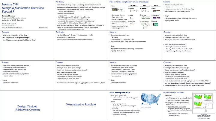
How to handle complexity: 4 families of strategies
3
Manipulate Facet Reduce Change Select Navigate Juxtapose Partition Superimpose Filter Aggregate Embed Derive
- derive new data to
show within view
- change view over time
- facet across multiple
views
- reduce items/attributes
within single view
Scenario
- data: room occupancy rates
–1 room –occupancy measured every 5 min, duration 1 day
- task: characterize space usage pattern
- design
- propose idioms (visual encoding, interaction)
- justify idiom choice
4
Consider
- what’s the cardinality of the data?
- is a single static chart good enough?
- should you derive any useful additional data?
5
Cardinality
- Marshall: 68 cities * 40 years * 4 crime types = 10,880
- Wine: 130K * 4 = 650,000
–spatial (hierarchical), quantitative, categorical, free-form text
6
Scenario
- data: room occupancy rates
–20 rooms –measured every 5 min, duration 1 day
- task: compare space usage patterns between rooms
- design
- propose idioms (visual encoding, interaction)
- justify idiom choice
7
Consider
- what’s the cardinality of the data?
- is a single static chart good enough?
- should you derive any useful additional data?
- what are trade-offs between
–filtering to see one chart at a time –showing all side by side with small multiples –superimposing all on top of each other
8
Scenario
- data: room occupancy rates in building
–1 building: 200 rooms across 4 floors –measured every 5 min, duration 1 day –time series + floor plans
- task: characterize space usage patterns
–trends, outliers
- design
–propose & justify idioms
9
Consider
- what’s the cardinality of the data?
- is a single static chart good enough?
- should you derive any useful additional data?
- what are trade-offs between
–filtering to see one chart at a time –showing side by side with small multiples –superimposing on top of each other
- multi-scale structure to exploit? aggregate, zoom, slice/dice, filter?
10
Scenario
- data: room occupancy rates in building
–1 building: 200 rooms across 4 floors –measured every 5 min, duration 1 year –time series + floor plans + room sizes
- task: characterize space usage patterns
–trends, outliers
- design
–propose & justify idioms
11
Consider
- what’s the cardinality of the data?
- is a single static chart good enough?
- should you derive any useful additional data?
- what are trade-offs between
–filtering to see one chart at a time –showing side by side with small multiples –superimposing on top of each other
- multi-scale structure to exploit? aggregate, zoom, slice/dice, filter?
- can you normalize the data? should you - always vs on demand?
- how to handle multi-scale space and multi-scale time?
12
Design Choices (Additional Context)
13
Normalized vs Absolute
14
Idiom: choropleth map
- use given spatial data
–when central task is understanding spatial relationships
- data
–geographic geometry –table with 1 quant attribute per region
- encoding
–use given geometry for area mark boundaries –sequential segmented colormap [more later] –(geographic heat map)
15
http://bl.ocks.org/mbostock/4060606
Population maps trickiness
- beware!
- absolute/counts vs normalized/relative
- population density vs per capita
- investigate with Ben Jones Tableau
Public demo
- http://public.tableau.com/profile/
ben.jones#!/vizhome/PopVsFin/PopVsFin Are Maps of Financial Variables just Population Maps?
- yes, unless you look at per capita
(relative) numbers
16
[ https://xkcd.com/1138 ]