
SLIDE 1
ARMY
EMERGENCY RELIEF
- EST. 1942
G U I D E L I N E S 2019 ARMY EMERGENCY RELIEF EST. 1942 AER - - PowerPoint PPT Presentation
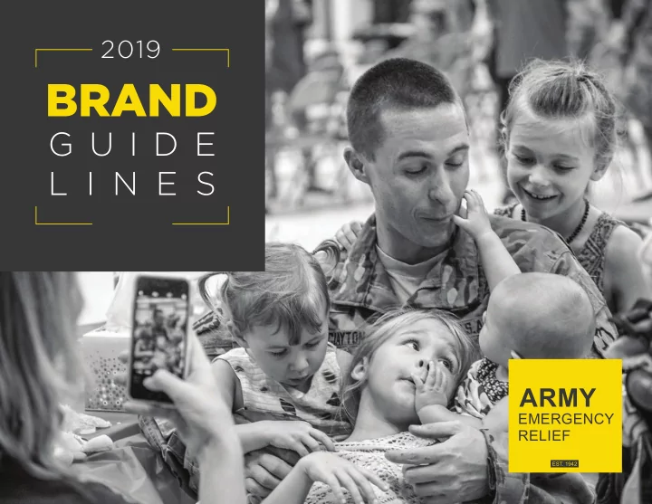
G U I D E L I N E S 2019 ARMY EMERGENCY RELIEF EST. 1942 AER BRAND GUIDELINES CONTENTS 02 LOGO STYLES 03 LOGO TREATMENT 04 LOGO PLACEMENT 05 TYPOGRAPHY 06 COLORS 07 PHOTOGRAPHY 08 APPLICATIONS 09 CONTACT US 1 STYLES AER BRAND GUIDELINES
EMERGENCY RELIEF
1 AER BRAND GUIDELINES
2 AER BRAND GUIDELINES
PRIMARY LOGO Our primary logo will be used as a critical element of identifjcation for all visual
the standard, setting the tone for AER’s visual identity and should be used in most instances for both digital and print.
EMERGENCY RELIEF
SECONDARY (HORIZONTAL) LOGO The gold square is still the focal point. When the space is too narrow for the primary logo and the application calls for a horizontal version of the logo, we will use the secondary logo, formatted specifjcally for linear spaces. GOLD ICON The gold square icon can be used as an independent visual element. It is distinctive and simple - serving as a shorthand version of both the primary and secondary logos. GOLD SQUARE The gold square is used across all visual branding elements, from the primary logo to the smaller icon. No matter the application, the gold square iconography should be used to reference AER — establishing a bright, distinctive and memorable brand identity. SEAL LOGO The seal should only be used for offjcial / legal documentation, and only when accompanied by
3 AER BRAND GUIDELINES
ARMY
EMERGENCY RELIEF
ARMY
EMERGENCY RELIEF
ARMY
EMERGENCY RELIEF
PRIMARY LOGO
EMERGENCY RELIEF
EMERGENCY RELIEF
HORIZONTAL LOGO ICON LOGO The primary gold square logo should be used in most instances for both digital and print materials. However, additional variations are available for the rare occurrences that require one-color logos (all gray), or busy, bright backgrounds that call for an all-white version.
GOLD (with border)
Only for gold backgrounds
ALL-WHITE GRAY
Only for gold backgrounds
4 AER BRAND GUIDELINES
WHITE SPACE To keep the AER logo free from visual
must be maintained around its perimeter. No graphic or text should ever appear inside this exclusion zone.
EMERGENCY RELIEF
ARMY
EMERGENCY RELIEF
1 inch 1 inch
SIZE LIMITATIONS Both the primary and horizontal logos should never appear smaller than one inch in width. If you need to use a smaller logo, please use the icon version. INCORRECT USE OF THE LOGO Our logo is the company’s visual identity, it’s essential that we apply it correctly and to the exact specifjcations. The logo must never be altered or amended.
ARMY
EMERGENCY RELIEF
Don’t change the color
ARMY
EMERGENCY RELIEF
Don’t stretch the logo
ARMY
EMERGENCY RELIEF
Don’t angle the logo Don’t use JPEG versions with a white background
LOGOS WITH BORDER Only use the versions below on a gold background.
ARMY
EMERGENCY RELIEF
5 AER BRAND GUIDELINES
GOTHAM AND ARIAL
are the primary fonts for print and web uses. If you do not have access to the Gotham font family, you can use ARIAL BOLD for the main headline and ARIAL REGULAR for the subheadline.
HEADLINE EXAMPLE GOTHAM BLACK
SUBHEADLINE EXAMPLE GOTHAM BOOK
Body text example Arial Regular No. 11. Lorem ipsum dolor sit amet, consectetur adipiscing elit, sed do eiusmod tempor incididunt ut labore et dolore magna aliqua. Duis aute irure dolor in reprehenderit in voluptate velit esse cillum dolore eu fugiat nulla pariatur. Excepteur sint occaecat cupidatat non proident, sunt in culpa qui offjcia deserunt mollit anim id est laborum.
GOTHAM BLACK GOTHAM BOOK ARIAL BOLD ARIAL REGULAR
BODY FONT COLOR
The body text should always be AER’s dark gray.
GOTHAM BLACK ARIAL BOLD & REG
6 AER BRAND GUIDELINES
Consistency in color is important in building a strong brand. While there may be uncontrollable variations in the appearance of color across different mediums, particularly
ways in which we can keep those variations limited.
PRIMARY ACCENT SUPPORTING
GOLD
PANTONE 109PC CMYK 2, 11, 100, 0 RGB 254, 218, 0 HEX# FFDD00
DARK GRAY
PANTONE Cool Gray 11C CMYK 68, 61, 60, 49 RGB 62, 62, 62 HEX# 3D3D3D
TURQUOISE
PANTONE 319 PC CMYK 66, 16, 36, 0 RGB 88, 168, 168 HEX# 58A8A8
LIGHT GRAY
PANTONE Cool Gray 2 PC CMYK 0, 0, 0, 10 RGB 230, 231, 232 HEX# E6E7E8
RED
PANTONE 200 PC CMYK 21, 96, 86, 12 RGB 174, 44, 50 HEX# B32C32
7 AER BRAND GUIDELINES
Photographs are an important component of our visual style. When executed correctly, they can showcase our brand through effective composition and subjects.
COMPOSITION
This is how the photo is framed and constructed, including what should be in the frame and what should be excluded.
SUBJECT
The focal point of an image, this dictates who or what should be highlighted. COMPOSITION
Socks and shoe are in the foreground.
SUBJECT
AER Gold sock pops amidst an earth-tone background.
COMPOSITION
Soldiers fjll up the frame and are centered.
SUBJECT
Smiling Soldiers remind
COMPOSITION
Multiple Soldiers reading the annual report.
SUBJECT
Soldier with profjle of face visible to camera.
COMPOSITION
No need to include camera operator on left.
SUBJECT
Eyes are squinting due to sunlight.
COMPOSITION
Too many distractions and empty space.
SUBJECT
No clear subject.
COMPOSITION
Too much empty space on the table.
SUBJECT
No clear subject.
IMAGE SIZING
Images for print should be at least 300dpi at full size. Images for electronic or digital communications should be 72 dpi at full size.
8 AER BRAND GUIDELINES
LETTERHEAD TEMPLATE (SAMPLES) POWERPOINT TEMPLATE (SAMPLES)
1 2 3 1 2 3
9 AER BRAND GUIDELINES
For logos, templates or questions related to the AER brand guidelines, please reach out to the communications department: communications@aerhq.org