SLIDE 1
SLIDE 2
Frank Lloyd Wright He was an American architect who rejected the reliance on historical design and pioneered a philosophy of “organic architecture.”
SLIDE 3
Frank Lloyd Wright Known for his “prairie style” designs, Wright’s architectural spaces were designed with functional spaces for living.
SLIDE 4
Frank Lloyd Wright was the inspiration for designers evolving away from curvilinear art nouveau with his emphasis on rectangular shapes and asymmetrical spatial organization.
SLIDE 5
Frank Lloyd Wright The American architect influenced the trend toward a rectilinear approach to design.
SLIDE 6
Frank Lloyd Wright In 1906-07, he helped design a publication devoted to home building.
SLIDE 7
By the late 1800s, works by British artist Aubrey Beardsley and the Dutch artist Jan Toorop began to influence a young group of art students in Scotland.
Aubrey Beardsley, Venus Between Terminal Gods, 1895
SLIDE 8
Their flowing art nouveau designs gradually moved into the mainstream through prints, publications, and advertising.
Jan Toorop, Delft Salad Oil, 1893
SLIDE 9
The Glasgow Four Charles Rennie Macintosh and J. Herbert McNair were studying as architectural apprentices at the Glascow School of Art. Margaret and Frances Macdonald were sisters and art students at the school. They began to collaborate and were soon christened “The Four.”
Charles Rennie Mackintosh, 1896
SLIDE 10 The Glasgow Four Originating at a design school during the Arts & Crafts era, they created a decorative style that was more geometric and linear by design.
SLIDE 11 The Glasgow Four The Macdonald sisters embraced symbolism mixed with mystical ideas. Like Bearsdley’s sensuous and erotic art, this work bothered the Victorian era Britons.
Margaret Macdonald
SLIDE 12 The Glasgow Four Their work found greater acceptance in Europe, especially in Vienna, where new art styles were welcomed
mainstream art nouveau.
Frances Macdonald
SLIDE 13 The Glasgow Four Friendship led to marriage and in 1899, McNair married Frances
Macintosh married Margaret. Together, their work used bold, straight lines rising vertically, often with subtle curves where they met with the horizontals.
Margaret and Frances Macdonald, with J. H. McNair, Exhibition Poster, 1895
SLIDE 14 The Glascow Four Floral and curving elements were
a rectangular structure.
Margaret Macdonald, reproduced in the periodical Ver Sacrum (Sacred Spring), 1901
SLIDE 15
Talwin Morris was inspired by the Glasgow Four with his designs made as art director for Blackie’s, a Glasgow publishing firm.
SLIDE 16
The Vienna Secession was formed in 1897 after a split by younger members of the Künstlerhaus, the Viennese Creative Artists’ Assoc. They designed and built the Vienna School for Applied Art.
SLIDE 17
The Vienna Secession Painter Gustav Klimt was the guiding spirit who led the revolt against the prevailing authorities on art during this time.
Gustav Klimt
SLIDE 18
The Vienna Secession encouraged all art mediums, including Impressionists, Art Nouveau and artists- craftsmen in their exhibitions.
Josef Hoffman
SLIDE 19
The Vienna Secession The first Vienna Secession exhibition was held in 1899. Gustav Klimt design the exhibition poster.
SLIDE 20 Ver Sacrum (Sacred Spring) The Sezessionstil (Secession Style) had its
Ver Sacrum. Alfred Roller designed its first cover in 1898 depicting a tree which had outgrown its pot –symbolizing the Sezessionstil movement.
SLIDE 21
Ver Sacrum (Sacred Spring) The magazine had a changing editorial staff, designed by a rotation of artists and unpaid contributors. Koloman Moses designed this cover printed in a metallic gold bronze ink with an olive background on yellow paper.
SLIDE 22
Ver Sacrum (Sacred Spring) The inside pages featured poetry and essays elaborately designed.
Josef Hoffman and Koloman Moser
SLIDE 23
Ver Sacrum (Sacred Spring)
Koloman Moser
SLIDE 24 The Vienna School for Applied Art Both Koloman Moser and Josef Hoffmann joined the faculty at the school and stripped away all Glasgow influences of symbolic roses, mystical
designers had their own personal monograms.
SLIDE 25
The Vienna School for Applied Art Koloman Moser and Alfred Roller developed exhibition posters to promote the Vienna Secession and the work of avant garde artists.
SLIDE 26
The Vienna School for Applied Art Berthold Löffler predated Cubism and Art Deco with his reductive symbolic images which relied on thick contours and simple geometric features. Cabaret poster for Fleidermaus, c. 1907
SLIDE 27
Wiener Werkstatte (Vienna Workshops) With financing from industrialist Fritz Warndorfer, Hoffmann and Moser launched the Vienna Workshops to produce quality goods based on Sezessionstil designs.
SLIDE 28
Wiener Werkstatte (Vienna Workshops) They worked with master carpenters, bookbinders, metalsmiths and leatherworkers to elevate the crafts to the standards of fine art.
Josef Hoffman
SLIDE 29
Peter Behrens A German artist, architect and designer recognized for his manufactured products such as streetlamps and teapots.
SLIDE 30
Peter Behrens Called “the first industrial designer,” Behrens created the first visual identification program for AEG, a German electrical company.
SLIDE 31
Berthold Type Foundry Developed the sans serif font Akzidenz Grotesque in ten variations and four weights.
SLIDE 32
Akzidenz Grotesque Compositors now had one family of typefaces to achieve contrast and emphasis.
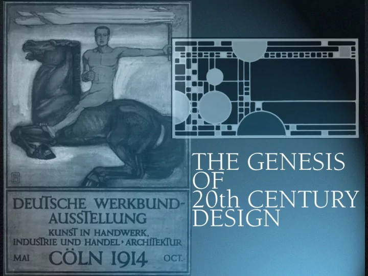
SLIDE 33
Deutsche Werkbund (German Association of Craftsmen) An organization devoted to the value of machines and using design to give form and meaning to man- made things.
SLIDE 34
Lauweriks Developed design grids that began with a square circumscribed by a circle.
SLIDE 35
Lauweriks The geometric patterns were used to determine proportions and spatial divisions in the design of everything from chairs to buildings.
SLIDE 36
Peter Behrens Lauweriks’ teachings transformed the designs of Peter Behrens, an avid follower.
SLIDE 37
Peter Behrens In this AEG lamp poster, electric elements structure the space and symbolize the radiant energy of illumination.
SLIDE 38
Edward Johnston Designed the typeface and signage for the new electric railway system: the London Underground.
SLIDE 39 Railway Type Is a sans serif type with strokes
weight and the basic proportions
Roman inscriptions.
SLIDE 40
Edward Johnston Designed the London Underground typeface and signage for the new electric railway.
SLIDE 41