SLIDE 8 Prepared by Pawel Tulin Approved by Process Presentation Process Date 12/2/09 Date [00/00/00] Page 8 of 11 Client CDM
Annotations
Step Three – choose in page navigation for your content branches
On Off Off Tabs Tabs are used to divide content of similar subject into a separate screens. Do not exceed more than five tabs. If you require more space you might want to consider sliders or accordion control. User moves between tabs by clicking on them Sliders Sliders are used in similar fashion as tabs. User slides the selector to a different position to access different areas of content. Sliders can also be used in the vertical position. User moves the slider to
User clicks on tabs A
B
C D E
1 2
- 1. Tabs (suggested use – for representing different content groupings. Tabs
functionality can be represented by buttons, icons, etc.)
- 2. Slider (suggested use – for representing a progress or a path through a
presentation, e.g. timeline, dosage, etc.)
- 3. Accordion (suggested use – to show a TOC and than showing one item at
the time, especially when not having enough real estate on the screen)
- 4. Carousel (suggested use – a catalog of items, requires user interaction to
see item details)
- 5. Vertical magnifier (suggested use – when having a long TOC and not
enough real estate on the screen. Item selected is magnified and corresponding content is displayed on click)
- 6. I-Tray (suggested use - supporting links to the other branches of the
presentation, open a link in the popup window) Notes: Consistency!!!! Step Three Process:
First Item Second Item Third Item Accordion This control is used when change of the partial page content is needed. User clicks on the header and the underlying content gets revealed. Usually only one item can be opened at the time Static copy and/or art Image Image Image Image Image
3 4
Carousel Typically used to represent a catalog of items via a series of images. User navigates either via slider or clicking on images. Each clicks brings image to the center.
Selected Item
Additional Item Additional Item Additional Item Additional Item Additional Item Additional Item Additional Item User moves the slider to
Content changes based on the slider selection Lorem ipsum dolor sit amet, consectetaur adipisicing elit, sed do eiusmod tempor incididunt ut labore et dolore magna aliqua. Ut enim ad minimveniam, quis nostrud exercitation ullamco laboris nisi ut aliquip ex ea commodo consequat. Duis aute irure dolor in reprehenderit in voluptate velitesse cillum dolore eu fugiat nulla pariatur. Excepteur sint occaecat cupidatat non proident, sunt in culpa qui officia deserunt mollit anim id estlaborum Et harumd und lookum like Greek to me, dereud facilis est er expedit distinct. Nam liber te conscient to factor tum poen legum
User moves the slider to
Selected Safety Information Consectetuer adipiscing elit, sed diam nonummy nibh euismod tincidunt ut laoreet dolore magna aliquam erat volutpat. Ut wisi enim ad minim veniam, quis nostrud exerci tation ullamcorper suscipit lobortis nisl ut aliquip ex ea commodo
- consequat. Duis autem vel eum
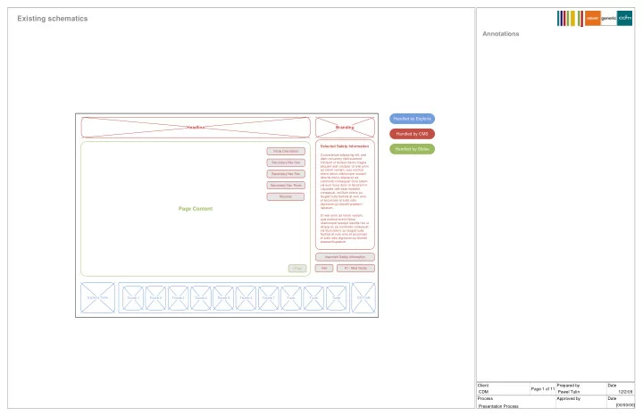
iriure dolor in hendrerit in vulputate velit esse molestie consequat, vel illum dolore eu feugiat nulla facilisis at vero eros et accumsan et iusto odio dignissim qui blandit praesent luptatum. Ut wisi enim ad minim veniam, quis nostrud exerci tation ullamcorper suscipit lobortis nisl ut aliquip ex ea commodo consequat. Ref PI – Med Guide Gloss Study Description Thumb 1 Thumb 2 Thumb 3 Thumb 4 Thumb 5 Thumb 6 Thumb 7 Tumb Tumb Tumb Exploria Tools OS Tools Important Safety Information Headline Secondary Nav Secondary Nav Secondary Nav Secondary Nav Secondary Nav Page Content I-Tray
Supporting link one Supporting link two Supporting link three Supporting link four Supporting link five
5 6