designing an effective presentation for your next project
play

DESIGNING AN EFFECTIVE PRESENTATION FOR YOUR NEXT PROJECT How to - PDF document

DESIGNING AN EFFECTIVE PRESENTATION FOR YOUR NEXT PROJECT How to translate your story in a meaningful and credible way Consulting is as much about visual communication as it is about the core management expertise. One cannot exist without the


  1. DESIGNING AN EFFECTIVE PRESENTATION FOR YOUR NEXT PROJECT How to translate your story in a meaningful and credible way Consulting is as much about visual communication as it is about the core management expertise. One cannot exist without the other. There are several tools available today that help consultants in communicating their next big business strategy to their clients. However, many consultants face a variety of challenges that hinder them from creating meaningful presentations that convey their recommendations in the most effective way. Some of these challenges are listed below: • Lack of time • Not an expert of the tool used • Reduced utilization of core consulting skills • Big part of the day is spent on analyzing and developing storyline • Communicating to a non-technical audience Thomas R. Hahn, a fellow a-connect IP and a long-term independent consultant has generously shared some of his wisdom to help all a-connect IPs learn (or refresh) and apply some of the best practices for slide design, and become even more effective with client presentations. Below are four key takeaways that you could immediately apply to your next project. 
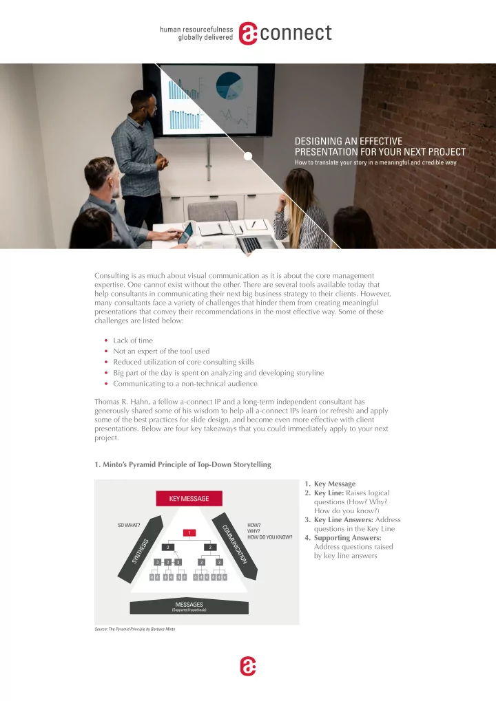
1. Minto’s Pyramid Principle of Top-Down Storytelling 1. Key Message 2. Key Line: Raises logical questions (How? Why? How do you know?) 3. Key Line Answers: Address questions in the Key Line 1 4. Supporting Answers: Address questions raised 2 2 by key line answers 3 3 3 3 3 4 4 4 4 4 4 4 4 4 4 4 4 Source: The Pyramid Principle by Barbara Minto

  2. The pyramid principle is a top-down approach to storytelling, primarily used in business documents and presentations. The principle is a technique for writing clear and compelling documents that produce action. Some over-arching guidelines include; state major ideas before minor supporting details, group like ideas together, and order ideas to show relationship. In the pyramid, ideas relate horizontally either by GROUPING (often inductive argument) or ARGUMENT (often deductive). Grouping is best used when you present a list of “equivalent” items, list reasons or actions, and/or when you have a receptive audience. Argument is best used to provide detailed reasoning, explain need for action, and/or when you have a resistant audience. 2. Introducing Your Story The pyramid can easily be transformed into linear structure which would be made of three sections: Introduction, Body of the Pyramid, and Wrap-Up. The goal is to structure your introduction to effectively captivate different audiences. Typically the introduction would include the situation, complication, and questions. However, there are other ways to structure the introduction as listed below: • Answer: (Solution – Situation – Complication). Provide your audience with the answer or recommendation fjrst, followed by the situation and the problem. This approach works with audience that likes to get straight to the point. • Appeal: Call your audience’s attention to values, emotions, or visions that are important to them. • Chronology: ( Complication – Situation – Question). Start with the problem statement and situation, and end with a thought provoking question that is answered in your following slides. This approach is used to create a sense of urgency. • Shock Tactics: (Situation – Question – Solution). Describe situation by using shocking facts or numbers that immediately grab the attention of resistant audiences. • Story: Use a relevant, short, and clear storyline (personal, business, fjctional, etc.) that will draw your audience into your subject. This allows to build rapport with the audience and gain their interest. 3. Insightful Data Visualization Tools With the enormous amount of data generated every day by businesses around the world; capturing, analyzing, structuring, and presenting this data in a meaningful way has become more important than ever before. One of the most important benefjts of visualization is that it allows us visual access to huge amounts of data in easily digestible visuals. Well designed data graphics are usually the simplest and at the same time, the most powerful. Storytelling with data visualization creates an impactful response from the user with numbers to back it up. Consider the below chart types to expand your current portfolio of data visualization tools. Chord Diagram: Ideal for comparing similarities within a data set. Sunburst Chart: Ideal for displaying hierarchical data Radial Bar Chart: Ideal for displaying comparisons among categories Nightingale Rose Chart: Ideal for displaying cyclical data Parallel Coordinates Plot: Ideal for comparing many variables together

  3. 4. Key Components of a Well Organized Slide Often times when consultants are designing slides for a presentation, they are very close to the data and hence fall in the trap of packing too much information on a single slide. In the process, some of the key components that make the presentation visually appealing, are overlooked. Here are some of the basic guidelines for a well-designed slide that helps make it a stand-alone document. • Good Composition: Use visual frameworks, view slide as Recommendation/Observation/Action Title Sticker an image, not only text, use appealing arrangements Subtitle describing the chart • Clear Message: One key [Units used in the chart] message per slide, message Additional Elements aligned with slide content, have Supporting the Data Legend DATA a crisp action title • Context • Uniform Style: Stick to an 5 • Background overall style guide, similar 4 • Interpretation visualizations should be 3 formatted the same way. • Implications 2 • Recognizable Authorship 1 • Process (BRAND): Create a unique 0 identifjcation/brand for yourself 2015 2016 2017 2018 and your team through unique Footnotes to address discrepancies and outliers in data Sources used to collect the data slide design element Do you have everything covered? As you begin to wrap-up and fjnalize your presentation which may have 10, 50, or even 100 slides, it is critical to make sure you have covered everything. To help you get to that stage of complete satisfaction with the end-product, for which you worked hard and put in several hours, here is a comprehensive checklist to ensure your slides are in the best possible shape. Remember, a great slide is: Beautiful: well-designed, aesthetically pleasing, state-of-the-craft Enlightening: reduces complexity, easy to understand Truthful: best data, not misleading Insightful: enables audience to draw conclusions Actionable: provides solid guidance on immediate actions and next steps • All checked? Great! Does the slide have a clear, easy to understand message? • No? Take the effort and fjx the Does this message contribute directly to the story? slide, particularly for high- Is this message clearly visualised based on the audience’s profjle presentation needs and the purpose of the presentation? One key message only? Appropriate level of complexity? (Pre-read vs. Presentation) Great visualization of data? Creative visualization of concepts? Aesthetic composition? Is the slide in-line with style requirements? Is it overall with our professional standards?

  4. About Thomas Thomas R. Hahn has been an IP with a-connect for the last 10 years and has completed 19 projects focused mainly on Life Sciences. An ex-McKinsey consultant, Thomas is currently an independent consultant and professor of applied physics at University of Miami. His expertise is with clients in pharmaceuticals, medical devices, healthcare providers and healthcare payers industries. He is also a trained pilot with several fmying hours under his belt. Through several years of experience as a consultant, Thomas has created best practices for pre- paring an effective client presentation. Here we share some of the key tips and tricks that will help you deliver your hard work in the best possible way. visit our website www.a-connect.com find us at

Download Presentation
Download Policy: The content available on the website is offered to you 'AS IS' for your personal information and use only. It cannot be commercialized, licensed, or distributed on other websites without prior consent from the author. To download a presentation, simply click this link. If you encounter any difficulties during the download process, it's possible that the publisher has removed the file from their server.

Recommend


More recommend