
SLIDE 1
Data: Pie Charts What is a Pie Chart? A pie chart is a type of - - PowerPoint PPT Presentation
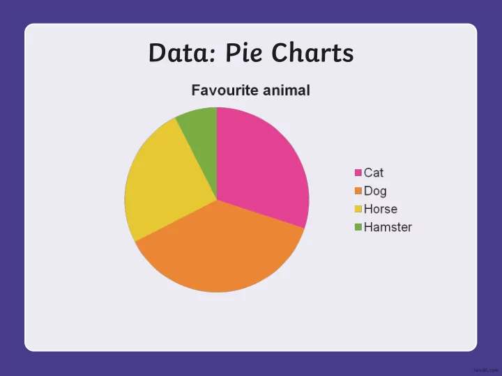
Data: Pie Charts What is a Pie Chart? A pie chart is a type of graph that illustrates how different types of data fit into a whole. It is circular in shape and uses pie slices called vectors to show relative sizes of data.
Read and Interpret Pie Charts
This pie chart shows the holiday destinations for 480 people.
Portugal Greece France Spain
Spain = 480 2 = 240 France = 60 2 = 120 Greece = 60 Portugal = 60 How many people went to France
What fraction of the people chose to go to Spain and Portugal? How many more people went to Spain than Greece? 120
5 8
Spain = 240 people Greece = 60 people 240 - 60 = 180 more people went to Spain than Greece.
Read and Interpret Pie Charts
The next day the total number of insects found was the same. 12 of these insects were grasshoppers. What fraction of the chart would be grasshoppers? How many more woodlice were found than wasps? If the number of bees found in the garden was 6, how many insects were found in the garden altogether? This pie chart shows the numbers of different insects that were found in a back garden.
4 6 = 24 24 - 6 = 18 6 16 = 96 96 2 = 48 48 4 = 12 12 3 = 36
Insects in a garden
Worm Butterfly Woodlouse Wasp Bee Dragonfly 6 2 = 12 or .
2 16 1 8
Some children survey all the children in school to record how they travelled to school on one
Estimate the percentages of children who came to school each way, explaining how you estimated each answer. Draw your own pie chart with 4 segments and ask a partner to estimate the percentages. Bus Car Bus Walk Car Bicycle Bicycle Walk Car 35%, Walk 40%, Bus 20%, Bicycle 5% Bus and Bicycle are ¼ so 25%. Bus looks about 4 times bigger so 20% and 5%. Car and Walk are 75% and walk looks slightly bigger so 40% and 35%. Answers
Pie Charts with Percentages
300 children were asked to choose their favourite ice cream flavour. This pie chart shows the results: How many children chose chocolate as their favourite flavour? How many more children chose strawberry than raspberry as their favourite flavour? How many children in total chose either mint choc chip, vanilla or honeycomb as their favourite flavour? What percentage of children chose raspberry and chocolate altogether? 25% 5% 10% 30% 10% 20% Favourite Ice Cream Flavour 75 60 105 35%
Pie Charts with Percentages
The number of children in year 5 who chose tennis as their favourite sport is equal to the number of children in year 6 who chose netball as their favourite sport. This is incorrect. 35 children in year 5 chose tennis whereas 40 children in year 6 chose netball. 140 Year 5 children and 160 Year 6 children were asked to name their favourite sports. The results are shown in these pie charts:
Favourite Sports in Year 6 Favourite Sports in Year 5
40% 5% 30% 25% 50% 10% 25% 15% Football Netball Tennis Cricket Explain whether or not you agree with each of these statements about the pie charts, giving reasons. Twice as many children in year 5 chose cricket as did in year 6. This is incorrect. 14 children in year 5 chose cricket and 8 children in year 6 chose cricket. 10 more children chose football in year 5 than in year 6. This is incorrect. Only 6 more children chose football in year 5 compared to year 6
Learning Objective
2 = 180
4 = 90
6th class pupils
Colour Frequency Red 17 Green 8 Blue 21 Yellow 3 Other 11 Total 60
chart we need to share 360° between 60 people.
Each person gets 6° of the pie chart.
Working Angle 17 x 6° 102° 8 x 6° 48° 21 x 6° 126° 3 x 6° 18° 11 x 6° 66° 60 x 6° 360°
Colour Angle Red 102° Green 48° Blue 126° Yellow 18° Other 66° Total 360°
6th class pupils
Red Green Blue Other
Colour Angle Red 102° Green 48° Blue 126° Yellow 18° Other 66° Total 360°
6th class pupils
Red Green Blue Other