audiences will love use a template
play

Audiences Will Love Use a Template Use a set font and color scheme. - PowerPoint PPT Presentation

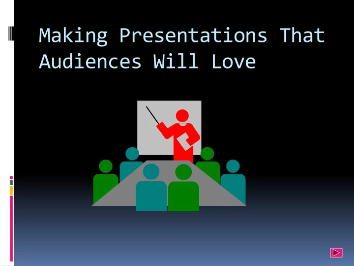
Making Presentations That Audiences Will Love Use a Template Use a set font and color scheme. Different styles are disconcerting to the audience. You want the audience to focus on what you present, not the way you present. Fonts


  1. Making Presentations That Audiences Will Love

  2. Use a Template  Use a set font and color scheme.  Different styles are disconcerting to the audience.  You want the audience to focus on what you present, not the way you present.

  3. Fonts  Choose a clean font that is easy to read.  Roman and Gothic typefaces are easier to read than Script or Old English .  Stick with one or two types of fonts.

  4. Font Size  Bulleted items should be no smaller than 22 points.  The title should be no smaller than 44 points.

  5. Bullets  Keep each bullet to one line, two at the most.  Limit the number of bullets in a screen to six, four if there is a large title, logo, picture, etc.  This is known as “cueing”  You want to “cue” the audience in on what you are going to say.  Cues can be thought of as a brief “preview.”  This gives the audience a “framework” to build upon.

  6. Bullets (cont’d.)  If you crowd too much text, the audience will not read it.  Too much text makes it look busy and is hard to read.  Why should they spend the energy reading it, when you are going to tell them what it says?  Our reading speed does not match our listening speed; hence, they confuse instead of reinforcing each other.

  7. Ten slides, 20 minutes, no font smaller than 30 points

  8. Caps and Italics  Do not use all capital letters  Makes text hard to read  Conceals acronyms  Denies their use for EMPHASIS  Italics  Used for “ quotes ”  Used to highlight thoughts or ideas  Used for book, journal, or magazine titles

  9. Guidelines for your presentation  Use Powerpoint  Be clear on how much time you have  Be very clear about your key message  The first slide should announce the title of the presentation  The second slide should seize the attention of the audience

  10. Guidelines (contd.)  The third slide should set out the structure of your presentation  Each theme should be the subject of a small number of slides  Each slide should have a clear heading  Be very clear about your key message

  11. Guidelines (contd.)  Each slide should normally contain around 25-35 words:  Unless it is a quote  Or contains an illustration  Each bullet point should consist of an intelligible phrase:  “Focus on profitable and growing markets” rather than  Focus

  12. Guidelines  Make appropriate use of pictures  Last slide should set out all appropriate contact details  Make copies of your slides available

  13. CColors  Reds and oranges are high-energy but can be difficult to stay focused on.  Greens, blues, and browns are mellower, but not as attention grabbing.  White on dark background should not be used if the audience is more than 20 feet away.  This set of slides is a good example.  You can easily read the slides up close.  It is harder to read the further away you get.

  14. Backgrounds  A white on a dark background was used for this set of slides as:  The author assumes most users will view the presentation on their own computer.  Having a dark background on a computer screen reduces glare.

  15. The Color Wheel  Colors separated by another color are contrasting colors (also known as complementary)  Adjacent colors (next to each other) harmonize with one another. e.g. Green and Yellow  The color wheel below is simplified for easy use

  16. Clashing Colors  Colors that are directly opposite from one another are said to clash.  These provide readability - e.g. yellow on blue .

  17. TO TO MAKE KE A A SL SLIDE IDE STAND D OUT UT, CHA CHANGE E TH THE E FO FONT T OR BA BACK CKGROUN UND

  18. University of Central Florida University Problem Solver Project Rosida Coowar Temitayo Akinrefon Parikshit Banjan Ala Battikhi Roberto Champney Thitipong Cholvanich

  19. Project Champion Dr. Denise Young Project Sponsors Dr. Diane Chase Dr. Michael Sweeney Master Black Belt Dr. Sandra Furterer CSBB

  20. Project Leader Black Belt Dr. Rosida Coowar CSBB Project Team Temitayo Akinferon CSGB Ala Batthiki CSGB Parik Bhanjan CSGB Roberto Champney CSGB Thitipong Cholvanich CSGB

  21. Agenda  Short Term Objectives  Long Term Objectives  Short term Improvement Plan  Long Term Governance Model  Problem-Solving Management Process  Conclusion  Q & A

  22. Illustrations  Use only when needed, otherwise they become distracters instead of communicators  They should relate to the message and help make a point  Ask yourself if it makes the message clearer  Simple diagrams are great communicators

  23. YOU  Do not use the media to hide you  The audience came to see you  The media should enhance the presentation, not BE the presentation  If all you are going to do is read from the slides or overheads, then just send them the slides  Remember, only you can prevent “ Deat ath h by y Pow owerPoi oint ”

  24. http://www.nwlink.com/~donclark/leader/leadpres.html http://www.nwlink.com/~donclark/hrd/templates/presentation.rtf rcoowar@uncc.edu

Download Presentation
Download Policy: The content available on the website is offered to you 'AS IS' for your personal information and use only. It cannot be commercialized, licensed, or distributed on other websites without prior consent from the author. To download a presentation, simply click this link. If you encounter any difficulties during the download process, it's possible that the publisher has removed the file from their server.

Recommend


More recommend