Fakultät Informatik, Institut für Software- und Multimediatechnik, Lehrstuhl für Softwaretechnologie
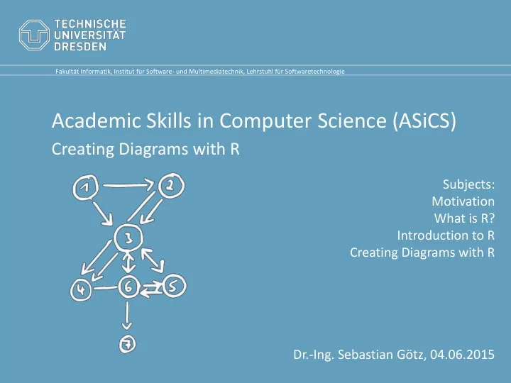
Academic Skills in Computer Science (ASiCS) Creating Diagrams with R - - PowerPoint PPT Presentation
Fakultt Informatik, Institut fr Software- und Multimediatechnik, Lehrstuhl fr Softwaretechnologie Academic Skills in Computer Science (ASiCS) Creating Diagrams with R Subjects: Motivation What is R? Introduction to R Creating Diagrams
Literature
- All material is taken from these two sources:
– https://stat.ethz.ch/R-manual/ – http://www.statmethods.net/graphs/scatterplot.html
- Get R here:
http://www.r-project.org/
Creating Diagrams with R 2
What you‘ll learn
- You‘ll learn
– What R is good for. – How to use R for typical diagrams.
- Data types (arrays, matrices, data frames)
- Im-/Export of data
- Export of diagrams
- Linecharts, Boxplots, Histograms
- Linear Regression
- Heatmaps
- 3D charts
Creating Diagrams with R 3
Motivation
- Why not just use Office?
– Export of diagrams as image files possible (e.g., PNG, JPG, etc.) – But, images do not scale! – Today, most publications will be read using a device instead of being printed – Optimal resolution of image for print becomes secondary – Scalable vector graphics get important
Creating Diagrams with R 4
What is R?
- „R is a language and environment for
statistical computing and graphics.”
- Developed at Bell Laboratories by John
Chambers and colleagues
- With R, you can analyze and visualize your
data.
- R is open source and highly extensible
- R is available for almost all platforms
Creating Diagrams with R 5
Introduction to R
Creating Diagrams with R 6
Introduction to R
- R is used by commands and has it‘s own
language
Creating Diagrams with R 7
participation <- c(25,20,22,30,15,5,15,20,25) participation [1] 25 20 22 30 15 5 15 20 25 class(participation) [1] "numeric"
Introduction to R
Creating Diagrams with R 8
participation <- c(25,20,22,30,15,5,15,20,25) plot(participation)
Introduction to R
Creating Diagrams with R 9
participation <- c(25,20,22,30,15,5,15,20,25) plot(participation, type=„l“)
Introduction to R
Creating Diagrams with R 10
participation <- c(25,20,22,30,15,5,15,20,25) type=„b“ type=„h“
Introduction to R
Creating Diagrams with R 11
participation <- c(25,20,22,30,15,5,15,20,25) ?plot
Introduction to R
Creating Diagrams with R 12
participation <- c(25,20,22,30,15,5,15,20,25) plot(participation, type=„l“, col=„red“, xlab=„Lecture“, ylab=„Participants“) title(„Attendence“)
Introduction to R
Creating Diagrams with R 13
participation <- c(25,20,22,30,15,5,15,20,25) plot(participation, type=„l“, col=„red“, xlab=„Lecture“, ylab=„Participants“) title(„Attendence“)
Introduction to R
Creating Diagrams with R 14
participation <- c(25,20,22,30,15,5,15,20,25) plot(participation, type=„l“, col=„red“, xlab=„Lecture“, ylab=„Participants“) title(„Attendence“) pdf() dev.off()
- Rplots.pdf created in home folder.
- Sometimes important for right scaling.
Introduction to R
Creating Diagrams with R 15
participation <- c(25,20,22,30,15,5,15,20,25) summary(participation)
- All relevant data for a boxplot!
- Min. 1st Qu. Median Mean 3rd Qu. Max.
5.00 15.00 20.00 19.67 25.00 30.00
Introduction to R
Creating Diagrams with R 16
participation <- c(25,20,22,30,15,5,15,20,25) boxplot(participation)
- To draw a boxplot, use boxplot
Introduction to R
Creating Diagrams with R 17
participation <- c(25,20,22,30,15,5,15,20,25) hist(participation)
- To draw a histogram, use hist
Introduction to R
Creating Diagrams with R 18
participation <- c(25,20,22,30,15,5,15,20,25) m <- lm(participation ~ seq(1:9))
- How to estimate future participation? Linear Regression!
m Coefficients: (Intercept) seq(1:9) 22.92 -0.65 f(x) = -0.65x + 22.92
Introduction to R
Creating Diagrams with R 19
seq(1,9)
- Number generating functions
rep(1,9) [1] 1 2 3 4 5 6 7 8 9 [1] 1 1 1 1 1 1 1 1 1 seq(1,9,3) [1] 1 4 7 [1] 1 2 3 4 5 6 7 8 9 1:9 [1] 2 8 14 seq(1,9,3)*2
Introduction to R
Creating Diagrams with R 20
participation <- c(25,20,22,30,15,5,15,20,25) m <- lm(participation ~ seq(1:9)) summary(m)
Residuals: Min 1Q Median 3Q Max
- 14.017 -3.367 1.033 2.733 9.683
Coefficients: Estimate Std. Error t value Pr(>|t|) (Intercept) 22.9167 5.5099 4.159 0.00425 ** seq(1:9) -0.6500 0.9791 -0.664 0.52803
- Signif. codes: 0 ‘***’ 0.001 ‘**’ 0.01 ‘*’ 0.05 ‘.’ 0.1 ‘ ’ 1
Residual standard error: 7.584 on 7 degrees of freedom Multiple R-squared: 0.05923, Adjusted R-squared: -0.07517 F-statistic: 0.4407 on 1 and 7 DF, p-value: 0.528
Introduction to R
Creating Diagrams with R 21
participation <- c(25,20,22,30,15,5,15,20,25) m <- lm(participation ~ seq(1:9)) c <- coef(m) f <- function(x) c[2]*x + c[1] plot(participation,type=„b“) lines(f(seq(1:9)),col=„red“)
Looks more like a 3rd grade polynomial
Introduction to R
Creating Diagrams with R 22
p <- c(25,20,22,30,15,5,15,20,25) m <- lm(p ~ seq(1:9) + I(seq(1:9)^2) + I(seq(1:9)^3)) c <- coef(m) f <- function(x) c[4]*x^3 + … c[1] plot(p,type="l") lines(f(seq(1:9)),col="red") summary(m)
R² still bad (0.1943)
?nls
Other classes of data
- By now, we only worked with a simple
numeric array
- R offers more:
– Data frames – Matrices
Creating Diagrams with R 23
Data Import
- Often, you want to process data collected
somewhere else
- Store it as a comma separated value file
Creating Diagrams with R 24
data <- read.csv(“radix.csv“,sep=“:“,dec=“.“)
Data Import
- Imported data has more structure than a
typical array
Creating Diagrams with R 25
data <- read.csv(“radix.csv“,sep=“:“,dec=“.“) class(data) [1] "data.frame" summary(data)
freq x algo size time ac dc
- Min. :1200 Min. :50 Radix:320 Min. :5e+07 Min. :1880 Min. :526.3 Min. :442.3
1st Qu.:1675 1st Qu.:50 1st Qu.:5e+07 1st Qu.:2302 1st Qu.:538.1 1st Qu.:452.6 Median :2100 Median :50 Median :5e+07 Median :2712 Median :551.3 Median :460.8 Mean :2100 Mean :50 Mean :5e+07 Mean :2902 Mean :564.1 Mean :472.8 3rd Qu.:2550 3rd Qu.:50 3rd Qu.:5e+07 3rd Qu.:3304 3rd Qu.:573.3 3rd Qu.:486.0
- Max. :2901 Max. :50 Max. :5e+07 Max. :4568 Max. :659.2 Max. :572.8
Data Import
Creating Diagrams with R 26
plot(data)
Data Import
Creating Diagrams with R 27
plot(data$dc~data$freq) boxplot(data$dc~data$freq)
Data Import
- Often, prefixing is boilerplate as only one
dataset is in use
Creating Diagrams with R 28
data <- read.csv(“radix.csv“,sep=“:“,dec=“.“) attach(data) boxplot(dc~freq)
More than 2 dimensions
- What if you want to compare more than 2
dimensions?
Creating Diagrams with R 29
library(scatterplot3d) scatterplot3d(data$freq,data$dc,data$time)
More than 2 dimensions
Creating Diagrams with R 30
library(scatterplot3d) s3d <- scatterplot3d(data$freq,data$dc,data$time) fit <- lm(data$time ~ data$freq+data$dc) s3d$plane3d(fit)
More than 2 dimensions
Creating Diagrams with R 31
library(scatterplot3d) s3d <- scatterplot3d(data$freq,data$dc,data$time, highlight.3d=TRUE, type=„h“, pch=16) fit <- lm(data$time ~ data$freq+data$dc) s3d$plane3d(fit, col=„blue“)
More than 2 dimensions
- Are there alternatives?
Creating Diagrams with R 32
library(rgl) plot3d(data$freq,data$dc,data$time,size=10)
More than 2 dimensions
- Are there alternatives?
- Visualization as heatmap
- 2 of 3 dimensions are axis
- The 3rd dimension is
encoded as color
- Heatmaps work on
matrices instead of data frames!
Creating Diagrams with R 33
More than 2 dimensions
Creating Diagrams with R 34
library(lattice) library(RColorBrewer) my_palette <- colorRampPalette( c("green", "yellow", "orange", "brown", "red", "black"))(n = 299) levelplot(mat,col.regions=my_palette, main="XXX", ylab="Frequency [MHz]", xlab="MaxTime", axes=FALSE)
- How to get the matrice mat?
Working with data.frames
Creating Diagrams with R 35
data data[2,]
freq x algo size time ac dc 1 1200 50 Radix 50000000 4543.03 652.674 512.033 2 1200 50 Radix 50000000 4568.21 659.203 509.877 3 1200 50 Radix 50000000 4550.33 651.380 510.229 … freq x algo size time ac dc 2 1200 50 Radix 50000000 4568.21 659.203 509.877
data[,2]
[1] 50 50 50 50 50 50 50 50 50 50 50 50 50 50 [15] 50 50 50 50 50 50 50 50 50 50 50 50 50 50 …
data[3,5]
[1] 4550.33 data$x
Working with matrices
Creating Diagrams with R 36
m <- matrix(c(1,2,3,4,5,6),nrow=2,ncol=3) m
[,1] [,2] [,3] [1,] 1 3 5 [2,] 2 4 6 m <- matrix(nrow=7,ncol=16) ct <- 0 for(nt in c(2000,2500,3000,3500,4000,4500,5000)) { ct <- ct+1 ci <- 0 for(f in c(1200,1300,1400,1600,1700,1800,1900,2000,2200,2300,2400, 2500,2700,2800,2900,2901)) { ci <- ci+1 d <- data[data$freq==f,] x <- nrow(d[d$time<nt,]) m[ct,ci] <- x } }
Working with matrices
Creating Diagrams with R 37
m
1200 1300 1400 1600 1700 1800 1900 2000 2200 2300 2400 2500 2700 2800 2900 3300 <2 0 0 0 0 0 0 0 0 0 0 0 0 0 0 0 20 <2.5 0 0 0 0 0 0 0 0 0 0 20 20 20 20 20 20 <3 0 0 0 0 0 0 20 20 20 20 20 20 20 20 20 20 <3.5 0 0 0 20 20 20 20 20 20 20 20 20 20 20 20 20 <4 0 0 20 20 20 20 20 20 20 20 20 20 20 20 20 20 <4.5 1 20 20 20 20 20 20 20 20 20 20 20 20 20 20 20 <5 20 20 20 20 20 20 20 20 20 20 20 20 20 20 20 20
colnames(m) <- c(1200,1300,1400,1600,1700,1800, 1900,2000,2200,2300,2400,2500,2700,2800,2900,3300) rownames(m) <- c("<2", "<2.5", "<3", "<3.5", "<4", "<4.5", "<5")
Working with matrices
Creating Diagrams with R 38
levelplot(m,main="MaxTime by Freq", ylab="Frequency [MHz]", xlab="MaxTime",axes=FALSE)
Working with matrices
Creating Diagrams with R 39
heatmap(m,Colv=NA,Rowv=NA, xlab="Frequency [MHz]", ylab="MaxTime")
Outlook
- There‘s a lot more you can do with R
– Statistics (e.g., ?anova, ?kruskal.test, …) – More types of diagrams – Many libraries
Creating Diagrams with R 40