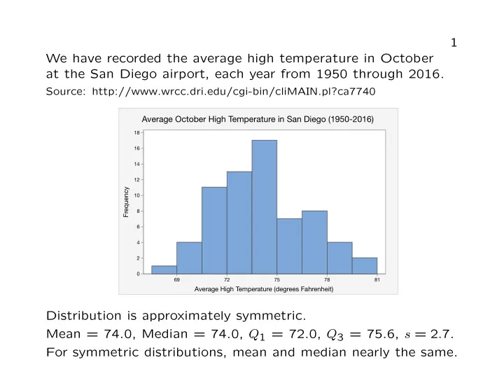
SLIDE 1 1 We have recorded the average high temperature in October at the San Diego airport, each year from 1950 through 2016.
Source: http://www.wrcc.dri.edu/cgi-bin/cliMAIN.pl?ca7740
Average October High Temperature in San Diego (1950-2016)
69 72 75 78 81 2 4 6 8 10 12 14 16 18
Frequency Average High Temperature (degrees Fahrenheit)
Distribution is approximately symmetric. Mean = 74.0, Median = 74.0, Q1 = 72.0, Q3 = 75.6, s = 2.7. For symmetric distributions, mean and median nearly the same.
SLIDE 2 2 We have recorded the amount of precipitation in October at the San Diego airport, each year from 1950 through 2016.
Source: http://www.wrcc.dri.edu/cgi-bin/cliMAIN.pl?ca7740
October Precipitation Totals in San Diego (1950-2016)
0.00 0.75 1.50 2.25 3.00 3.75 4.50 10 20 30 40
Frequency Precipitation (inches)
There is one outlier (4.98 inches of rain in October, 2004). Mean = 0.43, Median = 0.14, Q1 = 0.01, Q3 = 0.58, s = 0.75. For distributions skewed to the right, the mean tends to be larger than the median, and the upper quartile tends to be farther from the median than the lower quartile.
SLIDE 3 3 We have the Shannon Biodiversity Index for 632 soil samples collected from Scripps Coastal Reserve by BILD 4 students.
Source: data provided to the instructor by Professor Stanley Lo
Biodiversity in soil samples from Scripps Coastal Reserve
2.00 2.20 2.40 2.60 2.80 3.00 3.20 3.40 50 100 150 200
Frequency Shannon Biodiversity Index
Mean = 3.08, Median = 3.13, Q1 = 2.96, Q3 = 3.24. For distributions skewed to the left, the mean tends to be smaller than the median, and the upper quartile tends to be closer to the median than the lower quartile.
SLIDE 4 4 Data on eruptions of the Old Faithful geyser in Yellowstone.
Source: http://rweb.stat.umn.edu/R/library/alr3/help/oldfaith
300 270 240 210 180 150 120 90 35 30 25 20 15 10 5 Duration of Eruption (seconds) Frequency
Old Faithful Eruptions (October, 1980)
Distribution is bimodal. Mean = 209.9, Median = 240, Q1 = 129.8, Q3 = 268, s = 68.4. For bimodal distributions, summary statistics do not describe the distribution well. One should always plot the data.
SLIDE 5
Examples of Correlations 5
r = 0.01 r = 0.46 r = 0.76 r = 1
SLIDE 6
Examples of Correlations 6
r = -0.33 r = -0.69 r = -0.98 r = -1
SLIDE 7
7
1.0 0.8 0.6 0.4 0.2 0.0 0.5 0.4 0.3 0.2 0.1 0.0
r = -0.05
Here there is a strong association but no correlation. Correlation measures only linear association and should not be used to describe nonlinear relationships.
SLIDE 8
8
0.9 0.8 0.7 0.6 0.5 0.4 0.3 0.2 0.1 0.0 1.1 1.0 0.9 0.8 0.7 0.6 0.5 0.4 0.3 0.2
r = 0.44
Here there is a weak correlation of 0.44. If the outlier is removed, there is a very strong correlation of 0.99. Outliers can have a large effect on correlation.
SLIDE 9 9 Data on SAT scores, GPAs of 1000 students
Source: http://www.cvgs.k12.va.us/DIGSTATS/main/inferant/a gpas.html
1400 1300 1200 1100 1000 900 800 700 600 500 4 3 2 1 Combined SAT Score College GPA
College GPA and SAT Scores
Correlation between combined SAT score, college GPA is 0.46. Correlation between high school GPA and college GPA is 0.54. High school GPA is a better predictor of college performance than SAT scores.
SLIDE 10 10 Data on student evaluations in 1184 UCSD Math courses (Fall 2010 – Spring 2017)
Source: http://www.cape.ucsd.edu/responses/Results.aspx
Learning and Study Time
2 4 6 8 10 12 14 16 18 2.0 2.5 3.0 3.5 4.0 4.5 5.0
Amount Learned (1-5 scale) Hours of studying per week
Correlation between “Hours” and “Learned”: 0.29 Correlation between “Hours” and “Recommend course”: -0.08 Correlation between “Hours” and “Recommend instructor”: 0.08
SLIDE 11 11 Data on 157 countries with population over 1 million.
Source: https://www.cia.gov/library/publications/the-world-factbook/index.html
8 7 6 5 4 3 2 1 80 70 60 50 40 30 Children per woman Life Expectancy
Life Expectancy and Fertility Rate
There is a moderately strong negative correlation of -0.77. High fertility rates do not cause shorter lifespans. Correlation does not imply causation. Economic conditions are a lurking variable.
SLIDE 12 12 Data on 599 women aged 45-74, Whickham, UK. Women surveyed 1972-1974, again 20 years later.
Source: Appleton, D.R., French, J.M., and Vanderpump, M.V. Ignoring a covariate: An example of Simpson’s paradox. The American Statistician, 50 (1996), 340-341.
Smokers: 107 of 271 (39.5%) died. Non-smokers: 153 of 328 (46.6%) died. Age Smokers Non-Smokers 45-54 27 of 130 (20.8%) died 12 of 78 (15.4%) died 55-64 51 of 105 (48.6%) died 40 of 121 (33.1%) died 65-74 29 of 36 (80.6%) died 101 of 129 (78.3%) died Simpson’s paradox: A higher percentage of non-smokers died
- verall. A higher percentage of smokers died in each age group.
The positive association between smoking and living 20 more years does not mean that smoking causes people to live longer. Age is a lurking variable.
SLIDE 13
13 Data on graduate admissions at U.C. Berkeley.
Source: D. Freedman, R. Pisani, R. Purves. Statistics. 4th ed. Norton, New York.
In the fall of 1973, U.C. Berkeley admitted 44% of 8442 men who applied for graduate school, and 35% of 4321 women. Department Men % Accepted Women % Accepted A 825 62 108 82 B 560 63 25 68 C 325 37 593 34 D 417 33 375 35 E 191 28 393 24 F 373 6 341 7 Most individual departments admitted a similar percentage of male and female applicants. However, male applicants applied more often to departments with a higher acceptance rate.
SLIDE 14 14 Data on GPA and SAT scores of 1000 college students.
Source: http://www.cvgs.k12.va.us/DIGSTATS/main/inferant/a gpas.html
1400 1300 1200 1100 1000 900 800 700 600 500 4 3 2 1 Combined SAT Score College GPA
Predicting College GPA from SAT Scores
Predictor Coefficient Constant .002 ˆ y = .002 + .00239x SAT Score .00239 SAT = 1200, predicted GPA = .002 + (.00239)(1200) = 2.87.
SLIDE 15 15 Data on winning times in the Boston marathon, 1940-1990.
Source: http://www.bostonmarathonmediaguide.com/champions/
Winning times in the Boston marathon (1940-1990)
1940 1950 1960 1970 1980 1990 130 135 140 145 150 155
Winning time (minutes) Year
ˆ y = 1072.77 − .47519x
SLIDE 16 16 Predicted Actual Error 1991 126.7 131.1 4.4 1992 126.2 128.3 2.1 2016 114.8 132.8 18.0 2017 114.3 129.6 15.3
Winning times in the Boston marathon (1940-2017)
1930 1940 1950 1960 1970 1980 1990 2000 2010 2020 120 125 130 135 140 145 150 155
Winning time (minutes) Year
Extrapolation (making predictions outside the range of the data) can be dangerous.
SLIDE 17
17 Outliers in Regression It is important to consider carefully the effect of outliers on the position of the regression line. We say a point has high leverage if it is extreme in the x-direction. We say a point is influential if removing it would greatly change the position of the regression line. A high leverage point is often (not always) influential because the regression line tends to be drawn towards high leverage points. Regression is usually not appropriate when there is an influential point.
SLIDE 18 18
High Leverage, Not Influential
0.0 0.5 1.0 1.5 2.0 0.0 0.5 1.0 1.5 2.0
High Leverage, Influential
0.0 0.5 1.0 1.5 2.0 0.0 0.2 0.4 0.6 0.8 1.0 1.2
Low Leverage, Not Influential
0.0 0.2 0.4 0.6 0.8 1.0 0.0 0.2 0.4 0.6 0.8 1.0 1.2 1.4 1.6
SLIDE 19 19 Data on mortality rates of white males from melanoma in the 48 contiguous states, 1950-1959.
Source: G. van Belle, L. Fisher, P. Heagerty, T. Lumley. (2004) Biostatistics. 2nd ed. Wiley.
50 45 40 35 30 225 200 175 150 125 100 Latitude Mortality rate per 10,000,000
Mortality Rates from Melanoma (1950-1959)
ˆ y = 388.31 − 5.9665x, R2 = .685 The value of R2 means 68.5 percent of the variation in mortality rates from melanoma is explained by the latitude of the state.
SLIDE 20 20
50 45 40 35 30 50 40 30 20 10
Latitude Residual
Residual Plot
The residual plot looks like a random scatter. There are no apparent patterns. In particular, there is no indication of curva- ture and there are no outliers. Consequently, linear regression is appropriate.
SLIDE 21
21 Data on length and weight of 42 Rainbow trout
Source: http://www.seattlecentral.org/qelp/sets/023/023.html
Goal: to predict weight from length so that it is not necessary to weigh fish.
500 450 400 350 300 250 1400 1200 1000 800 600 400 200 Length (millimeters) Weight (grams)
Weights and lengths of rainbow trout
ˆ y = −881.9 + 3.92x, R2 = .939
SLIDE 22 22
500 450 400 350 300 250 250 200 150 100 50
Length (millimeters) Residual
Residual Plot
The residual plot shows some curvature. This suggests that the relationship between the variables is not linear. Try taking the cube root of the weights.
SLIDE 23
23
500 450 400 350 300 250 11 10 9 8 7 6 5 Length (millimeters) Cube root of weight
Cube root of weight vs Length
ˆ y1/3 = .7383 + .01994x, R2 = .971 For a fish of length 400 millimeters, our prediction for the cube root of the weight is .7383 + (.01994)(400) = 8.7143, so our prediction for the weight in grams is 8.71433 = 661.8. Caution: when making predictions, do not forget to convert back to the original units.
SLIDE 24 24
500 450 400 350 300 250 0.5 0.4 0.3 0.2 0.1 0.0
Length (millimeters) Residual
Residual Plot
The residual plot shows a random scatter, and there is no cur-
- vature. Therefore, this re-expression appears to give us a good
method for predicting the weight of the fish. Caution: do not use R2 to compare models with different y variables. Judge the suitability of the re-expression based on whether the scatterplot and residual plot are free of curvature.
SLIDE 25 25 Data on brain and body weights of 62 mammals.
Source: http://www.seattlecentral.org/qelp/sets/017/017.html
7000 6000 5000 4000 3000 2000 1000 7000 6000 5000 4000 3000 2000 1000 Body Weight (kilograms) Brain Weight (grams)
Body and brain weights of 62 mammals
Three outliers: African Elephant, Asian Elephant, Human The point in the upper right (African Elephant) is a high leverage point and an influential point. Regression gives little insight into the smaller mammals.
SLIDE 26
26
600 500 400 300 200 100 700 600 500 400 300 200 100 Body Weight (kilograms) Brain Weight (grams)
Mammals with brain weights less than 1000 grams
Here we have removed three outliers. There is still a cluster of points in the lower-left corresponding to the small mammals. Try taking natural logarithms of both variables.
SLIDE 27 27
6000 4800 3600 2400 1200 60 50 40 30 20 10 Brain Weight (grams) Frequency
Brain weights of 62 mammals
8 6 4 2
10 8 6 4 2 log (Brain weight) Frequency
Logarithms of brain weights of 62 mammals
SLIDE 28 28
10.0 7.5 5.0 2.5 0.0
10 8 6 4 2
log (Body weight) log (Brain weight)
Scatterplot of log (Brain weight) vs log (Body weight)
log(brain weight) = 2.12 + 0.746 log(body weight), R2 = .919 For a mammal of body weight 5 kilograms, our prediction for the log of the brain weight in grams is 2.12 + (0.746)(log 5) = 3.32. Our prediction for the brain weight in grams is e3.32 = 27.66.
SLIDE 29 29
10.0 7.5 5.0 2.5 0.0
2 1
log (Body weight) Residual
Residual Plot
The residual plot shows a random scatter. There is no curvature and there are no outliers. This regression gives us an appropriate way of predicting brain weight from body weight.
SLIDE 30
30 Example 1: Wayne Gretzky’s Scoring
Source: www.stat.ualberta.ca/people/schmu/preprints/poisson.pdf
Wayne Gretzky played 9 seasons with Edmonton, scoring 1669 points (goals + assists) in 696 games. Average number of points per game: 2.398. Compare data to Poisson with λ = 2.398.
SLIDE 31 31 Points Games Expected 69 63.3 1 155 151.2 2 171 181.9 3 143 145.4 4 79 87.1 5 57 41.8 6 14 16.7 7 6 5.7 8 2 1.7 9+ 0.6 Gretzky scored 0 points in 69 games. The Poisson model predicts that he would score 0 points in (696)
0!
games.
SLIDE 32
32 Example 2: Radioactive decay of polonium.
Source: D. J. Hand, F. Daly, A. D. Lunn, K. J. McConway, and E. Ostrowski. A Handbook of Small Data Sets. London, Chapman and Hall, 1994. Original Source: E. Rutherford and M. Geiger (1910). The probability varia- tions in the distribution of alpha-particles. Philosophical Magazine, Series 6, 20, 698-704.
Total of 10,097 particles decayed over 2608 intervals of length 72 seconds, an average of 3.87 per interval. Compare the number that decay in an interval to the Poisson distribution with λ = 3.87.
SLIDE 33
33 Number Observed Expected 57 54.3 1 203 210.3 2 383 407.1 3 525 525.3 4 532 508.4 5 408 393.7 6 273 254.0 7 139 140.5 8 45 68.0 9 27 29.2 10 10 11.3 11 4 4.0 12 1.3 13 1 0.4 14 1 0.1
SLIDE 34
34 Example 3: Police shootings in the United States, 2015-2016.
Source: https://github.com/washingtonpost/data-police-shootings
The Washington Post found records of 1958 people who were shot and killed by police in 2015 or 2016. This was a 731-day period, so we compare numbers of shootings each day to the Poisson distribution with λ = 1958/731 ≈ 2.68. Number Observed Expected 50 50.2 1 149 134.4 2 162 180.0 3 155 160.1 4 115 107.7 5 60 57.7 6 24 25.7 7 12 9.9 8+ 4 4.6
SLIDE 35 35 Data on homicides in the greater San Diego area, 2008-2012.
Source: http://data.sandiegodata.org/dataset/clarinova com-crime-incidents-casnd-7ba4-extract Based on information provided by SANDAG (San Diego Association of Governments)
36 30 24 18 12 6 160 140 120 100 80 60 40 20
Days between homicides Frequency
Mean 4.968 N 367
Times between homicides in San Diego area
Excellent fit to the exponential distribution.
SLIDE 36 36 Data on 256 earthquakes in Southern California from 1932-2012
- f magnitide 5.0 or greater
Source: Southern California Earthquake Data Center: http://www.data.scec.org/eq-catalogs/date mag loc.php
750 600 450 300 150 160 140 120 100 80 60 40 20
Times between earthquakes (days) Frequency
Mean 114.0 N 255
Southern California earthquakes (1932-2012)
Poor fit to exponential distribution.
SLIDE 37 37 Because of aftershocks, more very short intervals (0 or 1 days) than there would be if the times were exponentially distributed. Discard aftershocks from the data by counting only earthquakes that occurred at least 3 days after previous earthquake.
900 720 540 360 180 40 30 20 10
Times between earthquakes (days) Frequency
Mean 204.6 N 142
Earthquakes at least 3 days apart
Good fit to exponential distribution, indicating that earthquakes appear at unpredictable times.
SLIDE 38 38 Survey Sampling (Presidential Polls)
Sources:
- D. Freedman, R. Pisani, R. Purves. Statistics. 3rd ed. Norton, 1998.
http://poll.gallup.com http://www.presidentelect.org/ http://fivethirtyeight.com/
Literary Digest correctly predicted winner of presidential election in 1916, 1920, 1924, 1928, and 1932 by mailing questionnaires. 1936 Literary Digest Poll Questionnaires mailed to 10 million people, 2.4 million responses. Literary Digest Prediction: Landon 57%, Roosevelt 43%. Actual Results: Roosevelt 60.6%, Landon 36.8%. Problem: The sample was not representative. Names to whom surveys were sent came from phone books, club membership
- lists. Poor were undersampled.
SLIDE 39
39 1936 Gallup Poll Gallup Prediction: Roosevelt 55.7%, Landon 44.3%. Actual Results: Roosevelt 60.6%, Landon 36.8%. Quota sampling: Interviewers were assigned to survey a specific number of people in different categories, based on race, gender, age, and income. This gave better results than the Literary Digest survey. 1948 Gallup Poll Gallup Prediction: Dewey 49.5%, Truman 44.5%. Actual: Truman 49.8%, Dewey 45.1%. Problem: Convenience sampling. Interviewers surveyed assigned number of people in certain categories, but within categories could choose arbitrarily.
SLIDE 40
40 1952-2012 Gallup Poll Year Winner Gallup Actual Error 1952 Eisenhower 51.0 54.9 3.9 1956 Eisenhower 59.5 57.6 1.9 1960 Kennedy 49.0 49.7 0.7 1964 Johnson 64.0 60.6 3.4 1968 Nixon 43.0 43.4 0.4 1972 Nixon 62.0 60.3 1.7 1976 Carter 49.0 50.1 1.1 1980 Reagan 47.0 50.8 3.8 1984 Reagan 59.0 59.2 0.2 1988 Bush 56.0 53.4 2.6 1992 Clinton 49.0 43.0 6.0 1996 Clinton 52.0 49.2 2.8 2000 Bush 48.0 47.9 0.1 2004 Bush 49.0 50.7 1.7 2008 Obama 55.0 52.9 2.1 2012 Obama 48.0 51.0 3.0 In 1952, the Gallup poll began choosing people at random, and predicted the winner correctly in 15 consecutive elections from 1952 through 2008. In 2008, the sample size was only 3050.
SLIDE 41 41 2012 election
- Gallup poll predicted Mitt Romney to win by 1 point, but
Barack Obama won the election.
- Nate Silver of FiveThirtyEight correctly predicted the winner
in all 50 states using a model that incorporates information from hundreds of polls. 2016 election
- Nate Silver predicted Hillary Clinton to win the popular vote
by 3.6 percent over Donald Trump. She won the popular vote by 2.1 percent but lost the election.
- The 1.5 percent error was not atypical of past elections, but
there were larger polling errors in Midwestern states.
nonresponse bias. Response rates now typically under 10 percent, creates inaccurate polls if respon- dants differ systematically from nonrespondants.
SLIDE 42
42 Random sampling 1) Simple random sample. Choose n people, every sample of size n equally likely to be chosen. 2) Stratified random sample. Divide the population into groups called strata, then do simple random sampling in each stratum. (Example: sample 500 men and 500 women rather than any 1000 people.) This can reduce variability. 3) Cluster sample. Divide the population into clusters. Select a few clusters at random and sample only from those selected. (Example: exit polling is only done at a few polling stations.) This can reduce cost. 4) Voluntary response sample. Many people are invited to respond, and all who respond are counted. (Example: surveys done through the internet or radio talk shows suffer from volun- tary response bias, have no scientific value.)
SLIDE 43 43
5 4 3 2 1 3500 3000 2500 2000 1500 1000 500 Number of heads Frequency
Number of heads in 5 coin tosses (10,000 simulations)
The distribution is symmetric, but not really bell-shaped, and
- nly 6 values are possible.
SLIDE 44
44
10 8 6 4 2 2500 2000 1500 1000 500 Number of heads Frequency
Number of heads in 10 coin tosses (10,000 simulations)
The distribution of the number of heads is much closer to being bell-shaped with 10 tosses of the coin.
SLIDE 45
45
18 15 12 9 6 3 1800 1600 1400 1200 1000 800 600 400 200 Number of heads Frequency
Number of heads in 20 coin tosses (10,000 simulations)
The distribution of the number of heads in 20 tosses of a coin is well approximated by a normal distribution. In this case, we have np = n(1 − p) = 10, so the conditions for using a normal approximation to the binomial distribution are met.
SLIDE 46 46 Sample of 10,000 values from a Uniform(0,1) distribution.
1.0 0.8 0.6 0.4 0.2 0.0 500 400 300 200 100 Value Frequency
Histogram
2.0 1.5 1.0 0.5 0.0
99.99 99 95 80 50 20 5 1 0.01 Value Percent
Mean 0.4992 StDev 0.2878 N 10000 AD 111.104 P-Value < 0.005
Normal Probability Plot
In addition to examining a histogram to check for normality, we can look at a normal probability plot. If the data follow approximately a normal distribution, the normal probability plot should be approximately a straight line.
SLIDE 47 47 Means of a sample of size 2 from a Uniform(0,1) distribution (10,000 samples)
1.0 0.8 0.6 0.4 0.2 0.0 800 700 600 500 400 300 200 100 Average Frequency
Histogram
1.5 1.0 0.5 0.0
99.99 99 95 80 50 20 5 1 0.01 Average Percent
Mean 0.4989 StDev 0.2033 N 10000 AD 10.437 P-Value < 0.005
Normal Probability Plot
SLIDE 48 48 Means of a sample of size 3 from a Uniform(0,1) distribution (10,000 samples)
1.0 0.8 0.6 0.4 0.2 0.0 900 800 700 600 500 400 300 200 100 Average Frequency
Histogram
1.4 1.2 1.0 0.8 0.6 0.4 0.2 0.0
99.99 99 95 80 50 20 5 1 0.01 Average Percent
Mean 0.4995 StDev 0.1662 N 10000 AD 3.933 P-Value < 0.005
Normal Probability Plot
SLIDE 49 49 Means of a sample of size 6 from a Uniform(0,1) distribution (10,000 samples)
0.82 0.70 0.58 0.46 0.34 0.22 0.10 1400 1200 1000 800 600 400 200 Average Frequency
Histogram
1.0 0.8 0.6 0.4 0.2 0.0 99.99 99 95 80 50 20 5 1 0.01 Average Percent
Mean 0.5002 StDev 0.1174 N 10000 AD 1.106 P-Value 0.007
Normal Probability Plot
SLIDE 50 50 Means of a sample of size 20 from a Uniform(0,1) distribution (10,000 samples)
0.81 0.72 0.63 0.54 0.45 0.36 0.27 2000 1500 1000 500 Average Frequency
Histogram
0.8 0.7 0.6 0.5 0.4 0.3 0.2 99.99 99 95 80 50 20 5 1 0.01 Average Percent
Mean 0.4999 StDev 0.06459 N 10000 AD 0.281 P-Value 0.641
Normal Probability Plot
SLIDE 51
51 Data on 157 countries with population over 1 million.
Source: https://www.cia.gov/library/publications/the-world-factbook/index.html
56000 48000 40000 32000 24000 16000 8000 70 60 50 40 30 20 10 Per Capita GDP Frequency
Per Capita GDP in 157 Countries
Data are highly skewed, not close to normally distributed.
SLIDE 52 52 Sample means of 100 samples of size 2.
40000 32000 24000 16000 8000 35 30 25 20 15 10 5 Average Frequency
Histogram
50000 40000 30000 20000 10000
99.9 99 95 90 80 70 60 50 40 30 20 10 5 1 0.1
Average Percent
Mean 10434 StDev 8985 N 100 AD 4.473 P-Value < 0.005
Normal Probability Plot
SLIDE 53 53 Sample means of 100 samples of size 5.
40000 32000 24000 16000 8000 30 25 20 15 10 5 Average Frequency
Histogram
40000 30000 20000 10000
99.9 99 95 90 80 70 60 50 40 30 20 10 5 1 0.1
Average Percent
Mean 11066 StDev 6574 N 100 AD 1.667 P-Value < 0.005
Normal Probability Plot
SLIDE 54 54 Sample means of 100 samples of size 10.
29000 24000 19000 14000 9000 4000
25 20 15 10 5 Average Frequency
Histogram
25000 20000 15000 10000 5000
99.9 99 95 90 80 70 60 50 40 30 20 10 5 1 0.1
Average Percent
Mean 11386 StDev 4014 N 100 AD 0.261 P-Value 0.701
Normal Probability Plot
SLIDE 55 55 Sample means of 100 samples of size 30.
18000 16000 14000 12000 10000 8000 25 20 15 10 5 Average Frequency
Histogram
20000 17500 15000 12500 10000 7500 5000
99.9 99 95 90 80 70 60 50 40 30 20 10 5 1 0.1
Average Percent
Mean 11677 StDev 2009 N 100 AD 0.176 P-Value 0.921
Normal Probability Plot
SLIDE 56 56 Sample means of 100 samples of size 60.
15800 14200 12600 11000 9400 7800 25 20 15 10 5 Average Frequency
Histogram
16000 14000 12000 10000 8000 6000
99.9 99 95 90 80 70 60 50 40 30 20 10 5 1 0.1
Average Percent
Mean 11894 StDev 1288 N 100 AD 0.425 P-Value 0.311
Normal Probability Plot
The number of samples whose mean is plotted (in this case 100), is not important. The histogram may be smoother with more samples, but the basic shape is unchanged. What matters for the Central Limit Theorem is the number of values being averaged (in this case 60). This number must be approximately 30 or more before we expect a normal distribution.
SLIDE 57 57 Example 1
Source: http://lib.stat.cmu.edu/DASL/Datafiles/differencetestdat.html Original source:
The probable error of a mean. Biometrika, 6, 1-25.
To determine whether regular seed or kiln-dried seed is better for corn growth, corn was planted in 11 adjacent pairs of plots. For each adjacent pair of plots, one of the two plots was picked at random to be planted with regular seed, while the other was planted with kiln-dried seed. The corn yields from the 22 plots were measured in pounds per acre.
SLIDE 58 58 Hypothesis test: Two-sided, paired t-test. Regular Kiln-Dried Difference 1903 2009
1935 1915 20 1910 2011
2496 2463 33 2108 2180
1961 1925 36 2060 2122
1444 1482
1612 1542 70 1316 1443
1511 1535
SLIDE 59 59
200 100
99 95 90 80 70 60 50 40 30 20 10 5 1
Difference between yields from regular and kiln-dried seed (pounds/ acre) Percent
Mean
StDev 66.17 N 11 AD 0.267 P-Value 0.612
Normal probability plot of differences between yields
Because the samples of size 11 are relatively small, we check that the differences are approximately normally distributed. The normal probability plot indicates that they are, so we proceed with the test.
SLIDE 60
60 Solution: Let µd be the true mean difference between the corn yield with regular seed and the corn yield with kiln-dried seed. Let ¯ d = −33.7 and sd = 66.2 be the sample mean and sample standard deviation of the observed differences. We test H0 : µd = 0 HA : µd = 0 The test statistic T = ¯ d sd/√n has approximately a t distribution with n − 1 = 10 degrees of freedom if H0 is true. We observe T = −33.7 66.2/ √ 11 ≈ −1.69. If H0 is true, then P(|T| > 1.69) ≈ .122. Therefore, the p-value is .122, so we fail to reject H0. There is not enough evidence to say that either type of seed is better.
SLIDE 61 61 Example 2
Source: http://lib.stat.cmu.edu/DASL/ Original source: R. Lyle et. al. (1987) Blood pressure and metabolic effects
- f calcium supplementation in normotensive white and black men.
JAMA 257, pp. 1772-1776.
From observational studies, it was believed that calcium intake may reduce blood pressure, especially in African-American men. We have data from an experiment involving 21 African-American men, 11 of whom were randomly assigned to take a calcium supplement for 12 weeks and 10 of whom took a placebo. The blood pressures were measured at the beginning and at the end
- f the 12-week period, and the amount of decrease in blood
pressure was recorded. We want to determine whether calcium reduces blood pressure.
SLIDE 62 62 Hypothesis test: One-sided, two-sample t-test.
Placebo Calcium 20 15 10 5
Decrease in blood pressure
The effect of Calcium on blood pressure
The boxplot suggests that blood pressure was reduced in the men who took the calcium supplement but not in those who took the placebo.
SLIDE 63 63
40 30 20 10
99 95 90 80 70 60 50 40 30 20 10 5 1
Decrease in blood pressure Percent
Mean 5 StDev 8.743 N 10 AD 0.422 P-Value 0.256
Normal Probability Plot for Treatment Group
20 10
99 95 90 80 70 60 50 40 30 20 10 5 1
Decrease in blood pressure Percent
Mean
StDev 5.870 N 11 AD 0.478 P-Value 0.187
Normal Probability Plot for Control Group
We have small samples of sizes 10 and 11, so the t-test is only valid if the data are approximately normally distributed. Although it is difficult to check for normality in such small sam- ples, there are no outliers and the normal probability plots are at least reasonably straight. We will proceed with the test.
SLIDE 64 64 Two-sample T for Difference Treatment N Mean StDev Calcium 10 5.00 8.74 Placebo 11
5.87 Difference = mu (Calcium) - mu (Placebo) Estimate for difference: 5.64 95% lower bound for difference: -0.12 T-Test of difference = 0 (vs > 0): T-Value = 1.72 P-Value = 0.053 DF = 15 Conclusion: We have some evidence that calcium lowers blood pressure in African-American men, but not quite enough to reject
- ur null hypothesis at significance level .05.
SLIDE 65 65 Example 3
Source: http://statmaster.sdu.dk/courses/st111/data/index.html
We want to determine whether either of two forms of iron, Fe2+
- r Fe3+, is retained in the body better than the other. If one were
retained better, then it would make a better dietary supplement. Each of the two forms of iron was given to 18 mice. Because the iron was radioactively labeled, it was possible to measure what percentage of the iron was retained at a later time.
SLIDE 66 66 Hypothesis test: Two-sided, two-sample t-test.
20 16 12 8 4 9 8 7 6 5 4 3 2 1 Percentage of iron retained Frequency
Percentage of iron retained (Fe2+ )
28 24 20 16 12 8 4 12 10 8 6 4 2 Percentage of iron retained Frequency
Percentage of iron retained (Fe3+ )
The histograms show that the distributions of the percentages
- f iron retained by the mice are skewed.
Because the sample size is small, the assumptions for the t-test do not hold.
SLIDE 67 67 Take logarithms of the data.
4 3 2 1
99 95 90 80 70 60 50 40 30 20 10 5 1
Log (percentage of iron retained) Percent
Mean 1.901 StDev 0.6585 N 18 AD 0.288 P-Value 0.577
Normal Probability Plot (Fe2+ )
4 3 2 1
99 95 90 80 70 60 50 40 30 20 10 5 1
Log (percentage of iron retained) Percent
Mean 2.090 StDev 0.5737 N 18 AD 0.582 P-Value 0.112
Normal probability plot (Fe3+ )
The normal probability plots suggest that the distributions of the logarithms of the percentages of iron retained by the mice are ap- proximately normally distributed. We will therefore proceed with the two-sample t-test, using the logarithms of the percentages.
SLIDE 68
68 Two-sample T for Log(retained) Iron N Mean StDev Fe2+ 18 1.901 0.659 Fe3+ 18 2.090 0.574 Difference = mu (Fe2+) - mu (Fe3+) Estimate for difference: -0.189 95% CI for diference: (-0.607, 0.230) T-Test of difference = 0 (vs not =): T-Value = -0.92 P-Value = 0.366 DF = 33 Conclusion: There is no evidence that either type of iron is retained better than the other.
SLIDE 69 69 Example 4
Source: A. Agresti and C. Franklin (2007). Statistics: The Art and Science
- f Learning from Data. Pearson Prentice Hall.
Original source: D. Strayer and W. Johnston (2001). Psych. Science 21, 422-466.
We want to determine whether cell phones slow the reaction time
Thirty-two subjects used a machine that simulated driving situations and were asked to press a break button when they saw a red light. Each subject did this once when talking on a cell phone and once when not talking on the phone, and their reaction times (in milliseconds) were recorded.
SLIDE 70 70 Hypothesis test: One-sided, paired t-test.
150 120 90 60 30
9 8 7 6 5 4 3 2 1 Reaction time difference (milliseconds) Frequency
Difference in reaction times with and without cell phones
There are no outliers, and there is no extreme skewness. Since the sample size is larger than 30, the assumptions required for the t-test are satisfied.
SLIDE 71
71 Paired T for Yes - No N Mean StDev Yes 32 585.2 89.6 No 32 534.6 66.4 Difference 32 50.62 52.49 95% lower bound for mean difference: 34.89 T-Test of mean difference = 0 (vs > 0): T-Value = 5.46 P-Value = 0.000 Conclusion: We have overwhelming evidence that cell phones slow the reaction times of drivers.
SLIDE 72 72 We have data on global temperatures between 1970 and 2016.
Source: https://www.ncdc.noaa.gov/monitoring-references/faq/anomalies.php
Global Temperature Anomalies, 1970-2016
1970 1980 1990 2000 2010 2020 0.0 0.2 0.4 0.6 0.8 1.0
Temperature Anomaly (degrees Celsius) Year
Note: temperatures are global average temperatures in degrees Celsius, departures from 1901-2000 average.
SLIDE 73 73
Residual Plot
1970 1980 1990 2000 2010 2020
0.0 0.1 0.2
Residual Year
The residual plot shows a random scatter. There is no curvature, and there are no outliers. The spread of residuals around the line is roughly constant. Linear regression appears to be appropriate for this problem.
SLIDE 74 74
Normal Probability Plot of Residuals
0.0 0.1 0.2 1 5 10 20 30 40 50 60 70 80 90 95 99
Percent Residual
The normal probability plot of the residuals is approximately a straight line. This indicates that the distribution of the errors is approximately normal, and the assumptions required for regres- sion inference are satisfied.
SLIDE 75 75 The regression equation is Temperature Anomaly = −34.459 + 0.0175 Year Predictor Coef SE Coef T P Constant
1.905
0.000 Year 0.0174850 0.000956 18.30 0.000 S = 0.0888727, R-Sq = 88.15%, R-Sq(adj) = 87.89% Problem 1: Do we have enough evidence to conclude that global temperatures are changing over time? Test H0 : β1 = 0, HA : β1 = 0. Test statistic T = b1 SE(b1) = 0.0174850 0.000956 = 18.30. The p-value is close to zero (1.8 × 10⁻²²), so we reject H0. 2013 Report of Intergovernmental Panel on Climate Change (IPCC): “Warming of the climate system is unequivocal.”
SLIDE 76
76 Report of Intergovernmental Panel on Climate Change (IPCC): “It is extremely likely that human influence has been the domi- nant cause of the observed warming since the mid-20th century.” The data shown previously do not provide information about the cause of global warming. The IPCC conclusion is based on other science, including climate models.
SLIDE 77 77 Predictor Coef SE Coef T P Constant
1.905
0.000 Year 0.0174850 0.000956 18.30 0.000 Problem 2: Find a 95 percent confidence interval for the slope
- f the true regression line.
b1 = 0.0175, SE(b1) = 0.000956. Critical value t∗
45 = 2.014. (Here n = 47, so df = n − 2 = 45.)
Margin of error: ME = t∗
45SE(b1) = (2.014)(0.000956) = 0.0019.
95 percent confidence interval: (0.0175 - 0.0019, 0.0175 + 0.0019) = (0.0156, 0.0194). Interpretation: We are 95 percent confident that global temper- atures are increasing at a rate of between 0.0156 and 0.0194 degrees Celsius per year.
SLIDE 78 78 Article at http://www.townhall.com on February 28, 2008: “Scientists: 100 Years of Global Warming – ERASED!” “Now there is word that all four major global temperature track- ing outlets have released data showing that temperatures have dropped significantly over the last year. California meteorolo- gist Anthony Watts says the amount of cooling ranges from 65-hundredths of a degree Centigrade to 75-hundreds of a de-
- gree. He says that is a value large enough to erase nearly all the
global warming recorded over the past 100 years.”
SLIDE 79 79
Monthly Global Temperature Anomalies (1/1970-10/2017)
1970 1980 1990 2000 2010 2020
0.0 0.2 0.4 0.6 0.8 1.0 1.2 1.4
Temperature Anomaly (degrees Celsius) Year
Group 1 2
Temperature anomaly for January, 2007: 0.89 Temperature anomaly for January, 2008: 0.28 One should avoid “cherry-picking” data points that do not fit the overall pattern.