
SLIDE 1
1
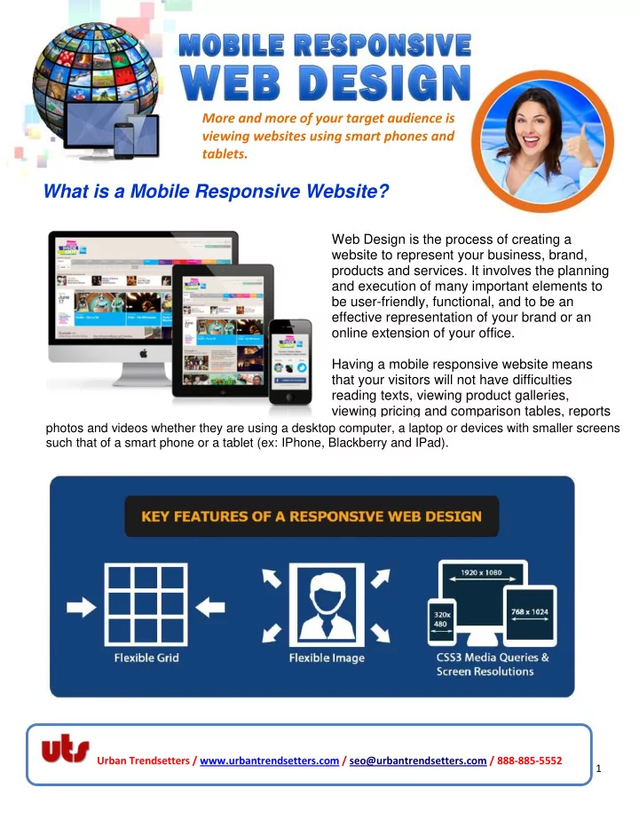
Web Design is the process of creating a website to represent your business, brand, products and services. It involves the planning and execution of many important elements to be user-friendly, functional, and to be an effective representation of your brand or an
- nline extension of your office.
Having a mobile responsive website means that your visitors will not have difficulties reading texts, viewing product galleries, viewing pricing and comparison tables, reports
photos and videos whether they are using a desktop computer, a laptop or devices with smaller screens such that of a smart phone or a tablet (ex: IPhone, Blackberry and IPad).
Urban Trendsetters / www.urbantrendsetters.com / seo@urbantrendsetters.com / 888-885-5552