
SLIDE 1
- R. Kuehl
- p. 1
R I T
Software Engineering
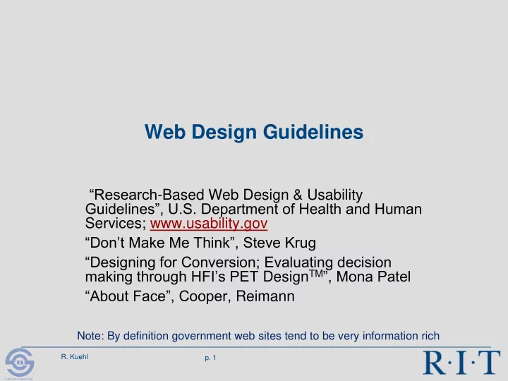
Web Design Guidelines Research -Based Web Design & Usability - - PowerPoint PPT Presentation
Web Design Guidelines Research -Based Web Design & Usability Guidelines, U.S. Department of Health and Human Services; www.usability.gov Dont Make Me Think, Steve Krug Designing for Conversion; Evaluating decision making
R I T
Software Engineering
R I T
Software Engineering
R I T
Software Engineering
R I T
Software Engineering
R I T
Software Engineering
R I T
Software Engineering
R I T
Software Engineering
R I T
Software Engineering
R I T
Software Engineering
R I T
Software Engineering
R I T
Software Engineering
R I T
Software Engineering
R I T
Software Engineering
R I T
Software Engineering
R I T
Software Engineering
R I T
Software Engineering
R I T
Software Engineering
R I T
Software Engineering
R I T
Software Engineering
R I T
Software Engineering