SLIDE 1
Introduction to Web Design Responsive Web Design
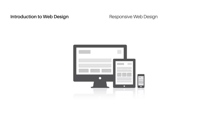
SLIDE 2 Introduction to Web Design Responsive Web Design
“The control which designers know in the print medium, and
A Dao of Web Design
- ften desire in the web medium, is simply a function of the
limitation of the printed page. We should embrace the fact that the web doesn’t have the same constraints, and design for this flexibility. But first, we must ‘accept the ebb and flow of things.’” —John Allsopp, “A Dao of Web Design”
SLIDE 3
Introduction to Web Design Responsive Web Design
Mobile traffic is as (if not more) relevant as desktop traffic now.
Responsive Design
We should build for the type of screens that will be used to access our sites. Responsive web design uses “media queries” to figure out what resolution of device it’s being served on. Flexible images and fluid grids size correctly to fit the screen. Responsive web design is design for flexibility.
SLIDE 4
Introduction to Web Design Responsive Web Design
Flexible grids (fluid layouts)
Foundations of Responsive Design
Media queries Flexible, responsive images
SLIDE 5
Introduction to Web Design Responsive Web Design Media Queries
Features you can include in a media query include : width, height, device-width, device-height, orientation, aspect-ratio, device-aspect-ratio, color, color-index, monochrome, resolution, scan grid Most of the above can be combined with min- and max- prefixes. The most common media queries assess min-width and max-width. Media queries can be used to load an alternate style sheet or, more commonly, to offer alternate styles within an existing style sheet.
SLIDE 6 Introduction to Web Design Responsive Web Design Media Query Syntax
CSS media queries use the @media rule followed by two
- ptional values: “only” or “not”
“only” screens out older browsers from reading the rest of the query. “not” negates the result: “not screen“ means everything except screen-based media. A feature: value pair, enclosed by parentheses, comprises the essence of the media query. Media features that can be assessed are predefined. Multiple feature: value pairs can be combined with “and“.
SLIDE 7
Introduction to Web Design Responsive Web Design CSS Rule Set CSS Rule Set with a Media Query
body { @media only screen and (min-width: 480px) { background-color: orange; body { } background-color: orange; } }