
SLIDE 1
Wayfinder
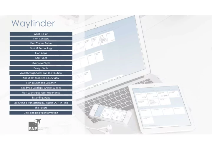
What is Fiori Fiori Concept Fiori Theme Belize Fiori & Technology Fiori Apps App Types Overview Pages Design Tools Walk through Sales and Distribution About KPI Modeler & CDS View Fiori Launchpad Designer Roadmap Catalogs, Groups & Tiles Executing a transaction in „classic SAP“ in Fiori The Future Links and Helpful Information Fiori Launchpad User experience Extending Apps