
SLIDE 1
Usability Brugervenlighed - Its not rocket science, just plain - - PowerPoint PPT Presentation
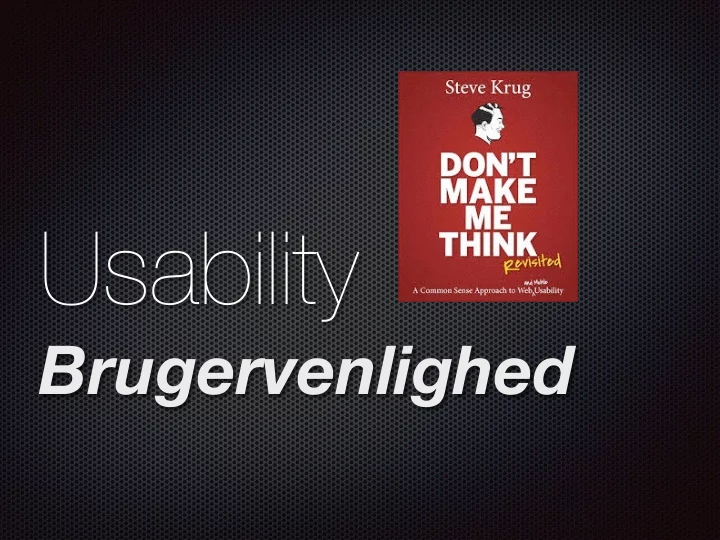
Usability Brugervenlighed - Its not rocket science, just plain common sense Theres a good usability principle right there: if something requires a large investment of time or looks like it willits less likely to be used.
just plain common sense “There’s a good usability principle right there: if something requires a large investment of time —or looks like it will—it’s less likely to be used.” Steve Krug
Brugervenlighed
Think aloud
Why should I have to think about how I want to search? why should I have to think about how the site’s search engine wants me to write the question?
Where am I? Where should I begin? Where did they put _____? What are the most important things on this page? Why did they call it that?
How we think users look at our site
We scan the text We don’t read instructions
Usability Anvendelighed usable information Brugervenlighed
Ludwieg Mies Van der Rohe - theory
1886-1969
Or Keep It Simple and Short KISS
brug Gestalt lovene
Hvordan laver vi brugervenlige websites? How do we make user-friendly websites?
Use Gestalt Laws
Det første indtryk
Scan-bare sider
Overskrifter Små mængder tekst
“Happy talk” skær til minimum Tekster skal give mening Læsbarhed
First impression
Scan-pages
Headlines Small amount of text
“Happy talk” minimise text must have a meaning Legibility
According to the book “Pretty graphic design” ” Smukkere grafisk design” by Henrik Birkvig and Design Basic Index by Jim Krause A C B E
The longest part has to be 61,8 procent
The Golden ratio
http://www.thismanslife.co.uk/projects/phiculator/
The Golden ratio
The sides of the Egyptian pyramids were golden triangles. Additionally, the three-four-five triangle is a golden ratio between the five unit side and the three unit side. The Egyptians considered this kind of right triangle extremely important and used it also in the pyramids.
Det gyldne snit
Det gyldne snit
Rule of thirds
Forudsætninger:
Assumptions:
pålideligt, sikkert og tilgængeligt
Reliable Safe and available
5 gyldne regler: Let at lære Let at huske Effektivt at bruge Forståeligt Tilfredsstillende at bruge 5 Golden rules: Easy to learn Easy to remember Efficient to use Easy to understand Satisfactory Rolf Mölich’s Rolf Mölich
When a user not is able to do what they were aiming for...... Når en bruger ikke er i stand til at udføre det de kom for....
http://www.flickr.com/photos/nofrills/4130450141/
Be in the users shoes! If you think it’s to difficult - it probably is “Get rid of half the words on each page, then get rid of half of what’s left.” But that one gets its own chapter later
Use Gestalt Laws for making proximity - break up pages into clearly defined areas
explain themselves
What is it about - make it clear
Visual Hierarchy is important
Never Horizontal Scroll In the Western world we read from left to right, top to bottom. Because of this, scrolling horizontally is not easy. Take care that your users screen resolution is wide enough for your site.
Links that does’t work... Too much text Design for scanning the text noise
How can we make all this happen
Serifs are far better for print reading than Sans Serifs. This has to do with how your screen displays fonts.
Legibility/Fonts Make it easy to get the message
User Xperience Design Bruger orienteret Design
WHAT IS USER INTERFACE DESIGN? UI UXD =
The level of satisfaction an average user gets from a product
Design that facilitates interaction
WE HAVE THE WEBSITE BECAUSE OF THE USERS
just the stuff they accidentally meet
better about them selves (- and thereby helping world peace)
The typical user in focus
What the typical user needs depends on CONTEXT (diff. user scenarios)
What it does vs. how it works in interaction with the user
Every product that is used by someone has a UX Making people remember
Scrolling sideways... and up and down... very big and mysterious
Common sense
Hierarchy:
Web: All available
Line tabs are global, can be seen from all sides. Drop down are supportive, local Local navigation: Links and scroll down
Local navigation Bread crums….
About Navigation:
Supportive
(second. level - typical drop-down)
Example: http://inkd.com/
Linie sekvens
When do we have this?
Card payment
Wireframing sitemaps
Tag cloud
http://www.illustratorgruppen.dk/
Side and up
http://intothearctic.gp/en/
Where am I?
Site ID - What site is this? Page headlines Bread crumbs Sitemap Consistency in visual look URL Logo links to home “You are here indicators” Search indicators
What can I do here?
Organize content Labels naming Proximity Clear visual hierarchy
What do you want me to do?
Call to action-buttons Process progress Guidelines:
FIND a good website each
and describe it through these to each other
Groups of two 45 minutes incl. break