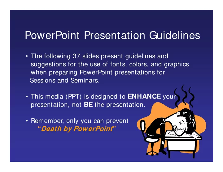
PowerPoint Presentation Guidelines The following 37 slides present - - PowerPoint PPT Presentation

powerpoint presentation guidelines
SMART_READER_LITE
LIVE PREVIEW

PowerPoint Presentation Guidelines The following 37 slides present - - PowerPoint PPT Presentation

PowerPoint Presentation Guidelines The following 37 slides present guidelines and suggestions for the use of fonts, colors, and graphics when preparing PowerPoint presentations for Sessions and Seminars. This media (PPT) is designed to


slide-1
SLIDE 1
  • The following 37 slides present guidelines and

suggestions for the use of fonts, colors, and graphics when preparing PowerPoint presentations for Sessions and Seminars.

  • This media (PPT) is designed to ENHANCE your

presentation, not BE the presentation.

  • Remember, only you can prevent

“Death by PowerPoint”

PowerPoint Presentation Guidelines

slide-2
SLIDE 2
  • Highlight key points or reinforce what the facilitator

is saying

  • Should be short and to the point, include only key

words and phases for visual, reinforcement

  • In order for your presentation to fit on most screens,

text and images should be placed within 95% of the PowerPoint slide. This “action safe” area is seen in the next slide.

PowerPoint Slide

slide-3
SLIDE 3
slide-4
SLIDE 4
  • Layout continuity from frame to frame conveys a

sense of completeness

  • Headings, subheadings, and logos should show up in

the same spot on each frame

  • Margins, fonts, font size, and colors should be

consistent with graphics located in the same general position on each frame

  • Lines, boxes, borders, and open space also should

be consistent throughout

PowerPoint Layout

slide-5
SLIDE 5

Fonts

  • Font Style Should be Readable

– Recommended fonts: Arial, Tahoma,

Veranda

  • Standardize the Font Throughout

– This presentation is in Tahoma Do !

slide-6
SLIDE 6
  • This is a good title size

Verdana 40 point

  • A good subtitle or bullet point size

Verdana 32 point

  • Content text should be no smaller than

Verdana 24 point

  • This font size is not recommended for content. Verdana 12 point.

Font Size

 The larger, the better. Remember, your slides must be readable, even at the back of the room.

slide-7
SLIDE 7

TIPS Presentation: 3/ 8/ 2004 Dawn Thomas, CRM

Don’t !

Font Size

 What does this say? Garamond Font, Italic, Bold 12pt.

  • This is very difficult to read. Times Font, Bold, 12pt.
  • T

his point c ould be lost. Ce ntur y Gothic F

  • nt, Bold, Italic , 14pt.
  • No one will be able to read this. Gill Sans Font, Condensed Bold, 12pt

 Combining small font sizes with bold or italics is

not recommended:

Small fonts are okay for a footer, such as:

slide-8
SLIDE 8

Fonts

  • Don’t Sacrifice Readability for Style

Don’t Sacrifice Readability for Style

  • DON’T SACRIFICE READABILITY

DON’T SACRIFICE READABILITY FOR STYLE FOR STYLE

  • Don’t Sacrifice Readability for Style

Don’t Sacrifice Readability for Style

  • Don’t Sacrifice

Don’t Sacrifice Readability for Readability for Style Style

Don’t !

slide-9
SLIDE 9

Caps and I talics

  • DO NOT USE ALL CAPI TAL LETTERS

– Makes text hard to read – Conceals acronyms – Denies their use for EMPHASIS

  • Italics

– Used for “quotes” – Used to highlight thoughts or ideas – Used for book, journal, or magazine titles

slide-10
SLIDE 10

Use a Tem plate

  • Use a set font and color scheme.
  • Different styles are disconcerting

to the audience.

  • You want the audience to focus on

what you present, not the way you present.

slide-11
SLIDE 11

Use the Same Background

  • n Each Slide

Do !!

slide-12
SLIDE 12

Don’t!

 Don’t use multiple backgrounds in

your presentation

 Changing the style is distracting

slide-13
SLIDE 13

Colors

  • Reds and oranges are high-energy

but can be difficult to stay focused

  • n.
  • Greens, blues, and browns are

mellower, but not as attention grabbing.

  • Reds and Greens can be difficult to

see for those who are color blind.

slide-14
SLIDE 14

Avoid These Combinations

  • Examples:

–Green on Blue –Dark Yellow on Green –Purple on Blue –Orange on Green –Red on Green

Don’t !

slide-15
SLIDE 15

Colors

  • White on dark background should not be

used if audience is more than 20 ft away.

– This set of slides is a good example. – You can read the slides up close. – The further away you get, the harder it is to read. – This is a good color combination if viewed on a computer. – A dark background on a computer screen reduces glare.

slide-16
SLIDE 16

Colors

  • Large Hall Events

–Avoid White Backgrounds –The white screen can be blinding in a dark room –Dark Slides with Light Colored

Text Work Best

Don’t

slide-17
SLIDE 17

The Color W heel

  • Colors separated by another

color are contrasting colors (complementary)

  • Adjacent colors harmonize

with one another (Green and Yellow)

  • Colors directly opposite one

another are said to CLASH

  • Clashing colors provide

readability

– Orange on Blue

Do !

slide-18
SLIDE 18

This is a good mix of

  • colors. Readable!

Background Colors

Remember: Readability! Readability! Readability!

This is a bad mix of

  • colors. Low contrast.

Unreadable! This is a good mix of

  • colors. Readable!

This is a bad mix of

  • colors. Avoid bright

colors on white.

Unreadable!

slide-19
SLIDE 19

Graphs and Charts

Make sure the audience can read them!

slide-20
SLIDE 20

Avoid using graphics that are difficult to read. In this example, the bright colors on a white background and the small font make the graph hard to

  • read. It would be very difficult to see, especially in the back of a room.

8

Don’t !

Graphics and Charts

slide-21
SLIDE 21

This graph contains too much information in an unreadable format.

10

Don’t !

slide-22
SLIDE 22

These are examples of good graphs, with nice line widths and good colors.

Good Graph

Do !

slide-23
SLIDE 23

Charts and Graphs

10 20 30 40 50 60 70 80 North America Europe Austrailia

Mode A Mode B Mode C

Don’t

slide-24
SLIDE 24

Charts and Graphs

10 20 30 40 50 60 70 80

North America

Europe Australia

Mode A Mode B Mode C

Do !

slide-25
SLIDE 25

This is a good, readable table. Tables, especially large ones, should be placed on a separate slide.

4/19 Fri 109

NICMOS restarted, Ne-loop control continues

4/22 Mon 112

Change to mounting cup control

4/23 Tue 134

Return to Ne control, Filter wheel test begins

4/24 Wed 155

Increase control temperature to allow for +2 K variations

4/25 Thur 165

Begin darks every 3rd orbit

4/26 Fri 174

DQE test visit 1; Control temp +0.5 K

Do !

slide-26
SLIDE 26

I llustrations

  • Use only when needed, otherwise they

become distracters instead of communicators

  • They should relate to the message and help

make a point

  • Ask yourself if it makes the message clearer
  • Simple diagrams are great communicators

Do !

slide-27
SLIDE 27

Don’t !

slide-28
SLIDE 28

Limit Each Slide to One I dea

  • Use Bullet Points to Cover

Components of Each Idea

slide-29
SLIDE 29

Bullets

  • Keep each bullet to 1 line, 2 at the most
  • Limit the number of bullets in a screen to 6, 4

if there is a large title, logo, picture, etc.

– This is known as “cueing” – You want to “cue” the audience on what you’re going to say

  • Cues are a a brief “preview”
  • Gives the audience a “framework” to build upon
slide-30
SLIDE 30

Bullets ( con.)

  • If you crowd too much text, the audience

won’t read it

– Too much text looks busy and is hard to read – Why read it, when you’re going to tell them what it says? – Our reading speed does not match our listening speed; hence, they confuse instead

  • f reinforce
slide-31
SLIDE 31

Points to Remember

  • Limit each slide to 1 idea
  • Limit each bullet point to only a few words to

avoid long sentences that go on and on!

  • Limit animation – Too much animation can be
  • distracting. Be consistent with animation and

have all text and photos appear on the screen the same way each time. There are many animation modes to choose from, but it is best to use just

  • ne throughout.

Do not do this!

Limit Bullet Points To a few words

slide-32
SLIDE 32

Points to Remember

  • Keep bullet points brief
  • Use the same background for

each slide

  • Use dark slides with light colored

text in large hall events

Do !

slide-33
SLIDE 33

Avoid the “All Word” Slide

Another thing to avoid is the use of a large block paragraph to introduce your

  • information. Attendees do not like to

have what is on the screen, read to them

  • verbatim. So, please use short, bulleted

statements and avoid typing out your whole presentation on to the slides. Also, it is difficult for some to listen and read a large amount of text at the same time.

Don’t

slide-34
SLIDE 34
  • To make a slide stand out,

change the font, background, or add animation.

slide-35
SLIDE 35

Limit Animation

  • Use the same animation throughout the

entire presentation

  • Using more than one can be very

distracting

– The audience will only see the animation and not the message you’re trying to get across

!

Bam!

Don’t

slide-36
SLIDE 36

Limit Animation

  • Use the same animation throughout the

entire presentation

  • Using more than one can be very

distracting

– The audience will only see the animation and not the message you’re trying to get across

!

Do !

slide-37
SLIDE 37

YOU

  • Do not use the media to hide you
  • The audience came to SEE you
  • The media should ENHANCE the presentation,

not BE the presentation

  • If you’re only going to read from the slides, then

just send them the slides!

  • Remember, only you can prevent

“Death by PowerPoint”