
SLIDE 1
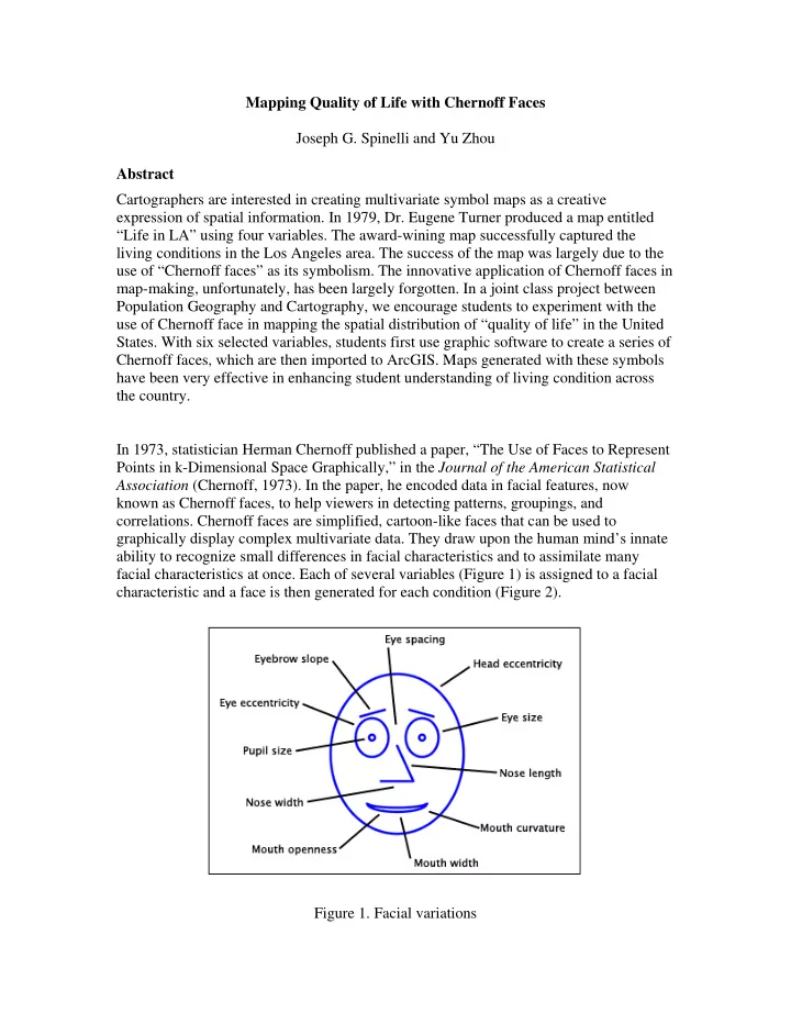
Mapping Quality of Life with Chernoff Faces Joseph G. Spinelli and Yu Zhou Abstract Cartographers are interested in creating multivariate symbol maps as a creative expression of spatial information. In 1979, Dr. Eugene Turner produced a map entitled “Life in LA” using four variables. The award-wining map successfully captured the living conditions in the Los Angeles area. The success of the map was largely due to the use of “Chernoff faces” as its symbolism. The innovative application of Chernoff faces in map-making, unfortunately, has been largely forgotten. In a joint class project between Population Geography and Cartography, we encourage students to experiment with the use of Chernoff face in mapping the spatial distribution of “quality of life” in the United
- States. With six selected variables, students first use graphic software to create a series of
Chernoff faces, which are then imported to ArcGIS. Maps generated with these symbols have been very effective in enhancing student understanding of living condition across the country. In 1973, statistician Herman Chernoff published a paper, “The Use of Faces to Represent Points in k-Dimensional Space Graphically,” in the Journal of the American Statistical Association (Chernoff, 1973). In the paper, he encoded data in facial features, now known as Chernoff faces, to help viewers in detecting patterns, groupings, and
- correlations. Chernoff faces are simplified, cartoon-like faces that can be used to