
SLIDE 1
20 20
Organisation & Presentation of Data
* Key paints :
- rganisation of data refers to the systematic arrangement of
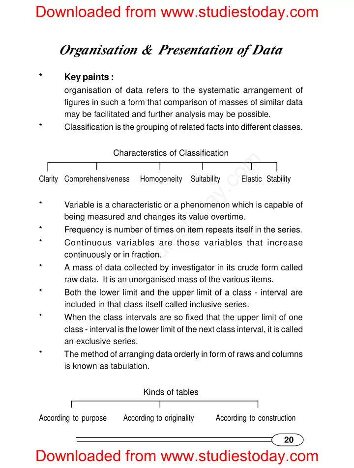
figures in such a form that comparison of masses of similar data may be facilitated and further analysis may be possible. * Classification is the grouping of related facts into different classes. Characterstics of Classification Clarity Comprehensiveness Homogeneity Suitability Elastic Stability * Variable is a characteristic or a phenomenon which is capable of being measured and changes its value overtime. * Frequency is number of times on item repeats itself in the series. * Continuous variables are those variables that increase continuously or in fraction. * A mass of data collected by investigator in its crude form called raw data. It is an unorganised mass of the various items. * Both the lower limit and the upper limit of a class - interval are included in that class itself called inclusive series. * When the class intervals are so fixed that the upper limit of one class - interval is the lower limit of the next class interval, it is called an exclusive series. * The method of arranging data orderly in form of raws and columns is known as tabulation. Kinds of tables According to purpose According to originality According to construction
Downloaded from www.studiestoday.com Downloaded from www.studiestoday.com
w w w . s t u d i e s t
- d
a y . c
- m