
SLIDE 1
IAT100 D100 Fall 2013 Week 3 Introduc7on to Light - - PowerPoint PPT Presentation
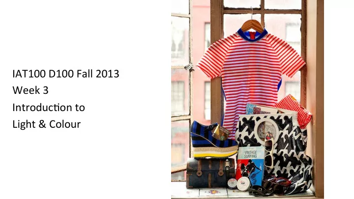
IAT100 D100 Fall 2013 Week 3 Introduc7on to Light & Colour Canvas update Pos7ng to your discussions Sizing your images in Photoshop
before ¡downloading ¡to ¡Canvas ¡
before ¡your ¡lab ¡
with ¡Canvas ¡ ¡
colours, ¡unlike ¡computer ¡screen ¡colours ¡
Soul ¡Tailor ¡Lief ¡Laxman ¡ ¡
(*must ¡be ¡taken ¡during ¡IAT100) ¡
– No ¡blurry ¡photos ¡
– No ¡stretched ¡images, ¡strange ¡filters, ¡ floa7ng ¡objects, ¡wri7ng/scribbling/ swirly ¡curly ¡cues ¡
Photoshop ¡Adapta7on ¡of ¡ ¡Soul ¡Tailor ¡Lief ¡Laxman ¡ ¡ hZp://speckyboy.com/2012/07/22/30-‑stunning-‑examples-‑of-‑s7ll-‑life-‑photography/ ¡
¡
– Composi7on ¡is ¡crea7ng ¡a ¡skeleton ¡or ¡a ¡framework ¡on ¡which ¡to ¡‘hang’ ¡ the ¡individual ¡elements ¡of ¡your ¡work. ¡ – Be ¡cri7cal ¡about ¡the ¡objects ¡you ¡choose ¡to ¡put ¡in ¡your ¡work ¡and ¡where ¡ you ¡place ¡them. ¡
– To ¡create ¡unity ¡between ¡elements ¡to ¡support ¡the ¡conceptual ¡goals ¡of ¡ the ¡work. ¡ – Be ¡cri7cal ¡about ¡where ¡you ¡put ¡your ¡camera. ¡ **For a designer—even chaos or randomness is controlled.
Principles ¡of ¡Design: ¡ ¡
Conceptual ¡framework: ¡ where ¡you ¡hang ¡your ¡ ‘stuff’ ¡ Elements ¡of ¡Design: ¡
Expressive toolbox: what you make your ‘stuff’ with
Designer ¡Kate ¡Mulligan ¡ hZp://weddingphotography.com.ph/6605/s7ll-‑life-‑photography-‑things-‑you-‑cannot-‑ live-‑without/ ¡
¡Through ¡Dominance ¡ ¡or ¡Hierarchy ¡ ¡
Through ¡Movement ¡ ¡
Through ¡Balance ¡ ¡
¡ Through ¡Repe77on ¡ ¡
Bathers ¡at ¡Asnieres, ¡George ¡Seurat ¡1884 ¡ ¡ ¡ Where ¡does ¡the ¡eye ¡go ¡first? ¡
hZp://www.takepart.com/photos/photo-‑day-‑spring-‑2012/october-‑9-‑2012-‑cairos-‑poli7cal-‑gridlock ¡
¡
Photo: ¡Suzanne ¡PlunkeM/Reuters ¡
¡
August ¡17, ¡2012: ¡Tiptoeing ¡Toward ¡A ¡BeZer ¡Future ¡ Photo: ¡Pilar ¡Olivares/Reuters ¡
¡
Thomas ¡Eakins, ¡The ¡Agnew ¡Clinic, ¡1889 ¡
Light ¡and ¡Colour ¡communicate. ¡ ¡ In ¡photography ¡and ¡film ¡both ¡are ¡ highly ¡controlled. ¡
hZp://www.7nysproutphoto.com/blog/info/loca7on/natural-‑ light-‑photography-‑studio-‑4/ ¡ hZp://ligh7ngforphoto.com/2011/06/28/fashion-‑photography-‑ using-‑natural-‑light-‑from-‑a-‑window/ ¡
Florescent ¡Light ¡
hZp://enchan7ngkerala.org/digital-‑photography-‑school/fluorescent-‑ light.php ¡ hZp://kids.britannica.com/comptons/art-‑123027/Interior-‑scenes-‑ are-‑onen-‑photographed-‑with-‑the-‑use-‑of-‑ligh7ng ¡
Incandescent ¡Light ¡
¡a) ¡ ¡Envy ¡
Tia ¡Rambaran, ¡Summer ¡09 ¡ ¡
Red ¡is ¡used ¡to ¡establish ¡character ¡– ¡icon ¡within ¡work. ¡ ¡ *Think ¡about ¡the ¡role ¡colour ¡will ¡play ¡across ¡your ¡two ¡s7ll ¡life ¡composi7ons. ¡ ¡
JiHoon Choi ¡
*Think ¡about ¡the ¡role ¡colour ¡will ¡play ¡across ¡your ¡two ¡s7ll ¡life ¡composi7ons. ¡ ¡
hZp://juliasaZout.com/portrait-‑pain7ngs/colour-‑theory/ ¡
HUE: ¡is ¡name ¡we ¡give ¡to ¡a ¡colour ¡ (red) ¡ ¡ INTENSITY: ¡is ¡the ¡strength ¡and ¡ vividness ¡of ¡a ¡colour ¡ ¡ VALUE: ¡is ¡the ¡lightness ¡or ¡ darkness ¡of ¡a ¡colour ¡ ¡ (pink) ¡
Monochroma7c ¡ ¡ Complementary ¡ ¡ Split-‑ ¡Complementary ¡ ¡ Analogous ¡ Triadic ¡ ¡
¡ ¡
David Hockney Place Firstenberg,, 1985
The ¡split ¡complementary ¡ scheme ¡is ¡a ¡varia7on ¡of ¡the ¡ standard ¡complementary ¡
the ¡two ¡colors ¡adjacent ¡to ¡its ¡
high ¡contrast ¡ ¡
Jean-Luc Godard Contempt, 1967 Stills from film
The ¡triadic ¡color ¡scheme ¡uses ¡three ¡colors ¡ equally ¡spaced ¡around ¡the ¡color ¡wheel. ¡This ¡ scheme ¡is ¡popular ¡among ¡ar7sts ¡because ¡it ¡
harmony ¡and ¡color ¡richness. ¡The ¡triadic ¡ scheme ¡is ¡not ¡as ¡contras7ng ¡as ¡the ¡ complementary ¡scheme, ¡but ¡it ¡looks ¡more ¡ balanced ¡and ¡harmonious. ¡
¡ ¡
Marc Chagall Les Amants Sur Le Toit Oil on Canvas
The ¡monochroma7c ¡color ¡scheme ¡ uses ¡varia9ons ¡in ¡lightness ¡and ¡ satura9on ¡of ¡a ¡single ¡color. ¡This ¡ scheme ¡looks ¡clean ¡and ¡elegant. ¡ Monochroma7c ¡colors ¡go ¡well ¡ together, ¡producing ¡a ¡soothing ¡
Project ¡1: ¡Using ¡a ¡colour ¡scheme ¡
¡
Harmony: ¡
Not ¡in ¡Harmony ¡
Color ¡harmony ¡delivers ¡visual ¡interest ¡and ¡a ¡sense ¡of ¡
sense ¡of ¡order, ¡a ¡balance ¡in ¡the ¡visual ¡experience. ¡ ¡ ¡
Vincent ¡Van ¡Gogh ¡-‑ ¡Starry ¡Night ¡-‑ ¡1889 ¡-‑ ¡
Widescreen ¡Test ¡PaZern ¡(16:9) ¡
Aspect ¡Ra9o ¡Test ¡
¡
(Should ¡appear ¡ circular) ¡
16x9 4x3