
SLIDE 1
1
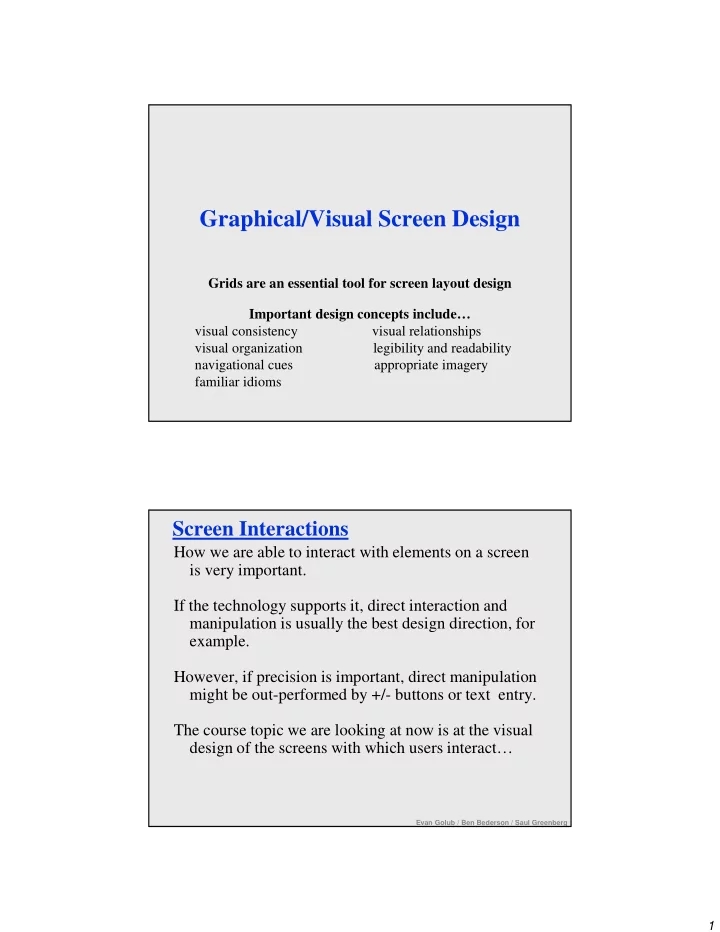
Graphical/Visual Screen Design
Grids are an essential tool for screen layout design Important design concepts include… visual consistency visual relationships visual organization legibility and readability navigational cues appropriate imagery familiar idioms
Screen Interactions
How we are able to interact with elements on a screen is very important. If the technology supports it, direct interaction and manipulation is usually the best design direction, for example. However, if precision is important, direct manipulation might be out-performed by +/- buttons or text entry. The course topic we are looking at now is at the visual design of the screens with which users interact…
Evan Golub / Ben Bederson / Saul Greenberg