
SLIDE 1
1
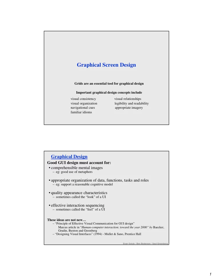
Graphical Screen Design
Grids are an essential tool for graphical design Important graphical design concepts include visual consistency visual relationships visual organization legibility and readability navigational cues appropriate imagery familiar idioms
Graphical Design
Good GUI design must account for:
- comprehensible mental images
– eg: good use of metaphors
- appropriate organization of data, functions, tasks and roles
– eg: support a reasonable cognitive model
- quality appearance characteristics
– sometimes called the “look” of a UI
- effective interaction sequencing
– sometimes called the “feel” of a UI These ideas are not new…
– “Principle of Effective Visual Communication for GUI design” Marcus article in “Human-computer interaction: toward the year 2000” by Baecker, Grudin, Buxton and Greenberg – “Designing Visual Interfaces” (1994) - Mullet & Sano, Prentice Hall
Evan Golub / Ben Bederson / Saul Greenberg