
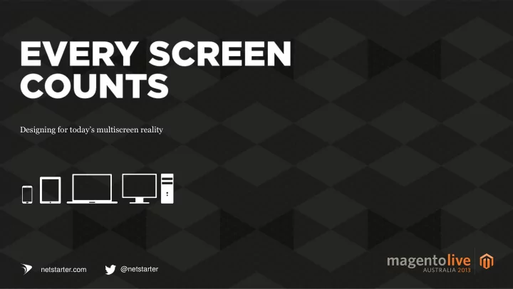
SLIDE 1
Designing for today’s multiscreen reality
@netstarter netstarter.com
Designing for todays multiscreen reality @netstarter netstarter.com - - PowerPoint PPT Presentation
Designing for todays multiscreen reality @netstarter netstarter.com Why we went responsive Our approach The technical challenges What we would differently Head of Strategy & UX Processed Through Our Client Sites Each Year
Designing for today’s multiscreen reality
@netstarter netstarter.com
Head of Strategy & UX
Full-Time Staff Processed Through Our Client Sites Each Year
Ben Wyeth (CEO of Active Skin) Established in 2006 A leading pure play retailer of skin care and beauty products in Australia Built a very successful online store in a very competitive market place
end of 2012
*eBay / PayPal, December 2012plans to create a mobile
The expected value of
the end of 2013
*Experian, November 2012in Australia, only 5% of total retail sales are made
Of the Australian population 18+ own a smartphone
* Nielsen PayPal Mobile Study, October 2012active PayPal users In Australia
*eBay, July 2013Of the Australian population 18+ own a tablet device
* http://stakeholders.ofcom.org.uk/binaries/ research/cmr/cmr12/icmr/ICMR-2012.pdfprocessed through a mobile device
*eBay, July 2013Australians spend 10% less time accessing the internet by desktop or laptops
* Nielsen PayPal Mobile Study, Oct 2012Of Australian households had a tablet by the end of 2012
* Secure Insight Consumer Discovery Report, November 2012Of mobile shoppers make
a shop
* * comScore, “Mobile Shopping Goes Mainstream”stopped an in-shop purchase as a result of using their device, usually because they found a better price elsewhere
* comScore, “Mobile Shopping Goes Mainstream” 0% 10% 20% 30% 40% 50% 60% 70% 80% 90% 100%
2011 2012 2013 2014?
Desktop Mobile Tablet
$5m
2013 it climbed to over 10%
years
traffic – another 160 variations make up the remaining 5%
1.
practical option a couple years back when desktops were the
the available width
accept there are going to be definite usability issues – frequent miss-taps, poor readability, constant need for pinch zoom, difficulty completing forms
with a mobile optimised interface and demand a better experience
2.
does not cover tablets and other emerging devices (screen are getting larger and smaller simultaneously)
device
‘out of the box solution’
3.
experience than a mobile site (but only for the specific device)
platforms and frequent OS upgrades
maintenance costs to different code bases
exposure on market places
A framework that uses media queries, fluid grids and flexible images to create an adaptive site that caters for different devices, screen sizes and user goals
COMMERCIALLY VIABLE | DEVICE AGNOSTIC | USER FOCUSED
Magento Enterprise as the best fit
brief – ‘mobile friendly’ listed as must have
threw it in like a set of steak knives
(6-15 filters for each category)
Desktop 6.75% Mobile 2.41% Tablet 4.39%
Conversion Rate site-wide
Returning Visitors New Visitors
Bounce Rate site-wide
Desktop 37.89% Mobile 44.70% Tablet 38.20% 1600+ 27.00% 1280x800 15.21% 1366x768 11.39% 320x480 9.88% 1280x1024 7.16% 768x1024 7.05% 1440x900 6.76% 1024x768 6.55% Other 9.00%
42% Average page load time
OTHER
31% 14% 10% 3% Average visit duration
Responsive without compromising functionality on smaller break points Leverage all
functionality native to Magento Enterprise Embrace the principles of adaptive device design at key break points Introduce a fresh design that reflects the brands & resonates with loyal customers Enable non- technical staff to manage all aspects of the website within Magento Convert first time buyers into high- value repeat customers
We review our options and go with a more
1 2 3 4 5 6 7
Smartphones portrait Smartphones Landscape | Mini tabs Tablets portrait Tablets landscape | Desktops Tablets landscape | Notebooks | Desktops Notebooks | Desktop | High res screens Notebooks | Desktop | High res screens
A collaborative approach Everyone needs to be involved from the outset of the project Requires an ‘Agile’ approach through each stage Development before design Rapid prototyping Validate ideas and demonstrate proposed behaviour Manage customer expectations Functional wireframes and approved designs for all interfaces at each breakpoint
Search has shifted to the top navigation Navigation is anchored at the top so it is always visible Transition to small logo to minimise vertical real estate
Search bar slide down on click
Simply hide the the 4 column banner (least important promotional message)
Secondary promo banners previously in column 2 of the grid now appear here Presentation of transitioning hero banner has changed
Mobile styled navigation
Lost the description Only display one secondary banner
Search always displayed
and ‘brand’
feature
resulting in a messy grid showing only one product
browser back and forward buttons (very common on mobile devices)
Mouse click Swipe action
It simplifies the checkout and allows us to better handle ‘guest’ abandonments
Validate state and suburb via post code and cut out 2 fields Nice clear validation Make entering CC details a no brainer
During Checkout Post Transaction
FAIL
1
2
3
code stack
you need to be mindful of
4
Sometimes an adaptive interface for popular devices may be more practical…
5
Things change very quickly over a year…
Screen Size June 2012 June 2013 1280px + 46.5% 35.5% Tablet portrait 9.8% 17.2%
6
A Responsive Design can alientate existing customers who are resistant to change – even if it is for the better.
7
transaction emails
certain email clients
8
9
It not just about a sexy interface, its about quality content in a format and structure that works across all devices and screen sizes
10
Are they experienced with Magento and do they have any live examples for you to review?
@netstarter netstarter.com
Win a trip to
Remember to drop answers at registration desk