
SLIDE 1
1 of 3
NT 21/11/16 Version 1.2
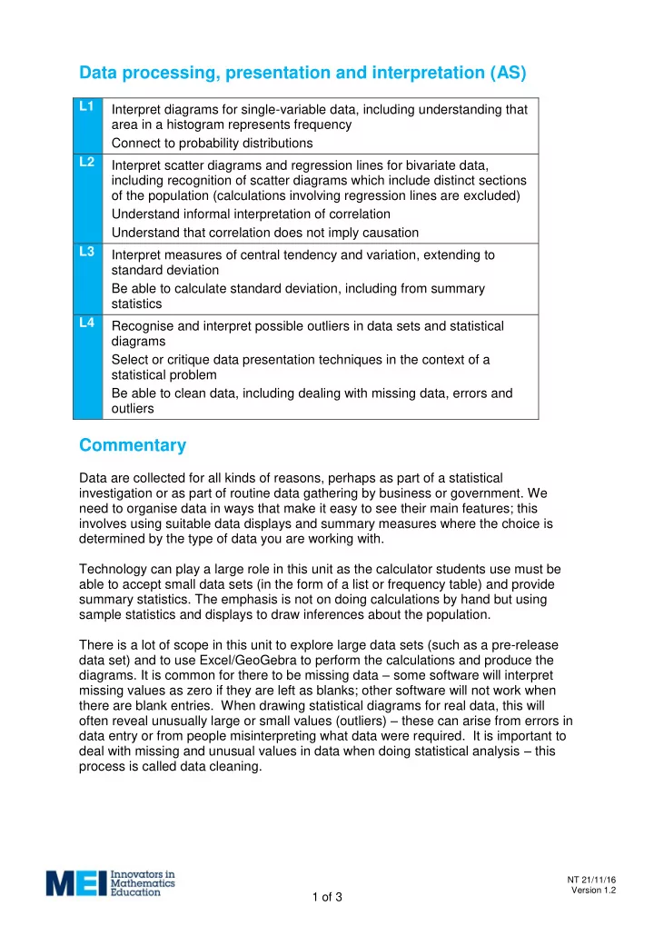
Data processing, presentation and interpretation (AS)
L1 Interpret diagrams for single-variable data, including understanding that area in a histogram represents frequency Connect to probability distributions L2 Interpret scatter diagrams and regression lines for bivariate data, including recognition of scatter diagrams which include distinct sections
- f the population (calculations involving regression lines are excluded)
Understand informal interpretation of correlation Understand that correlation does not imply causation L3 Interpret measures of central tendency and variation, extending to standard deviation Be able to calculate standard deviation, including from summary statistics L4 Recognise and interpret possible outliers in data sets and statistical diagrams Select or critique data presentation techniques in the context of a statistical problem Be able to clean data, including dealing with missing data, errors and
- utliers
Commentary
Data are collected for all kinds of reasons, perhaps as part of a statistical investigation or as part of routine data gathering by business or government. We need to organise data in ways that make it easy to see their main features; this involves using suitable data displays and summary measures where the choice is determined by the type of data you are working with. Technology can play a large role in this unit as the calculator students use must be able to accept small data sets (in the form of a list or frequency table) and provide summary statistics. The emphasis is not on doing calculations by hand but using sample statistics and displays to draw inferences about the population. There is a lot of scope in this unit to explore large data sets (such as a pre-release data set) and to use Excel/GeoGebra to perform the calculations and produce the
- diagrams. It is common for there to be missing data – some software will interpret
missing values as zero if they are left as blanks; other software will not work when there are blank entries. When drawing statistical diagrams for real data, this will
- ften reveal unusually large or small values (outliers) – these can arise from errors in