cs 5630 cs 6630 visualization maps
play

CS-5630 / CS-6630 Visualization Maps Alexander Lex - PowerPoint PPT Presentation

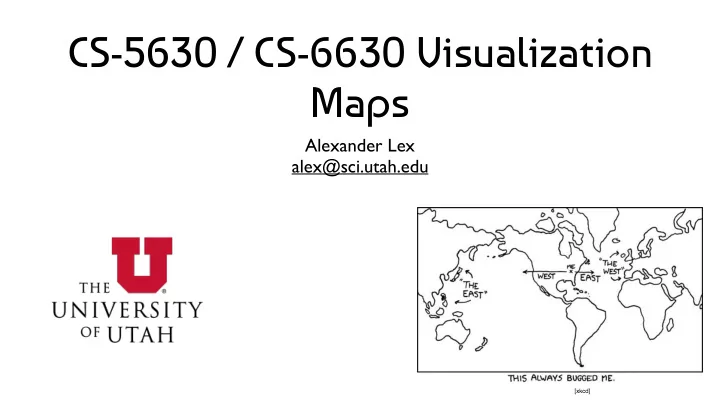
CS-5630 / CS-6630 Visualization Maps Alexander Lex alex@sci.utah.edu [xkcd] Principles Special type of Spatial Data Use maps when spatial relationships are paramount Map Tasks: Find Location / Feature (county, country, city, street) Find


  1. CS-5630 / CS-6630 Visualization Maps Alexander Lex alex@sci.utah.edu [xkcd]

  2. Principles Special type of Spatial Data Use maps when spatial relationships are paramount Map Tasks: Find Location / Feature (county, country, city, street) Find Route Identify attribute associated with location (elevation, land/water, GDP) Compare attributes between Locations/Features

  3. Map Projections

  4. Why projections? Earth is a (flattened) Sphere Need to project or “unfold” the hull of the sphere to fit onto paper/ screens Relevant attributes: Area, Shape, Direction, 
 Bearing, Distance, Scale

  5. Mercartor Projection Gerardus Mercator, 1569 Projection onto a cylinder wrapped around the globe conformal map projection; that is, angles are preserved. All lines of constant bearing are straight lines. Constant bearing means constant compass heading - developed for sailors

  6. Mercator Projection D3 / M. Bostock

  7. Mercator Projection of Mars Circular craters map to circles Based on slide from Hanrahan

  8. Why Mercator is Problematic Traditional map, used to teach geography Massive distortion of area distant from equator “unfair to the Global South, making places that are mostly trees, snow, and better-off white people look huge, and the places where most of the world’s population lives look puny" http://giscollective.org/slippy-map-projections-explained/

  9. Mercartor Projection Mercator works really great if you’re, say, Ferdinand Magellan looking for a compass bearing that will take you around Cape Horn, because all of the latitude and longitude lines and angles in between lay out nice and straight on the map like we experience them in real life. It also works well if you’re Google and you want a map image that you can neatly slice up into little squares that your server sends to a customer’s browser. North is always up, your hometown doesn’t look squished or slanted when you zoom in to it, and everybody’s happy. http://giscollective.org/slippy-map-projections-explained/

  10. Mercartor Puzzle

  11. Latitude-Longitude Does not preserve angles Does not preserve areas Things are squashed 
 at the top and bottom Snyder, “Flattening the Earth” Based on slide from Hanrahan

  12. Azimuthal Projections Radical Cartography Projection onto a plane tangent to the Earth angles are correct around the center point Great circles through the center are straight lines Radii correspond to true distances Sometimes see this in airline magazine centered around the hub

  13. Azimuthal Equidistant D3 / M. Bostock

  14. Winkel Tripel Projection Modified azimuthal map projection averaged to cylindrical projection Minimizing three kinds of distortion: area direction distance Considered good projection for world maps, endorsed by National Geographic Society, used in Textbooks

  15. Albers Equal-Area Shows areas correctly Distorts distances and shapes D3 / M. Bostock

  16. http://strangemaps.wordpress.com/2006/11/20/35-the-size- of-africa/

  17. Composite Projections Bernhard Jenny

  18. Projections in D3 Many projections included: https://github.com/mbostock/d3/wiki/ Geo-Projections https://github.com/d3/d3-geo-projection/

  19. Unfolding The Earth Idea: use small patches flatten them out Jarke van Wijk http://www.win.tue.nl/~vanwijk/ myriahedral/

  20. Map Software / Navigation

  21. Mapping Software Open StreetMap Google Maps

  22. Mashups http://ucrime.com/ma/harvard+university

  23. D3 Maps 1) get TopoJSON / GeoJSON file https://github.com/mbostock/topojson/wiki 2) Map Values to Geolocations contained in JSON file 3) Map Values to Channel

  24. Navigation Specific Abstract

  25. Landmarks & Paths Based on slide from B. Tversky

  26. LineDrive, 2001 Straighten wiggly lines Turn directions to right angles Expand regions with turns Contract long straight roads Label carefully to avoid clutter Maintain overall orientation [Agrawala & Stolte, 2001] Based on slide from Hanrahan

  27. Choropleth Maps

  28. Principle Area are shaded or patterned in proportion to measurement Each spatial unit is filled with a uniform color or pattern

  29. Early Choropleth Map Illiteracy in France Charles Dupin, 1826

  30. Kerry vs. Bush, 2004 Matthew Ericson, NY Times

  31. Matthew Ericson, NY Times

  32. Matthew Ericson, NY Times

  33. Matthew Ericson, NY Times

  34. In 3D! Matthew Ericson, NY Times

  35. Baseball Territories

  36. Lakers Dominate Baskeball

  37. NYT

  38. atrubetskoy on Reddit

  39. http://www.visualisingdata.com/index.php/2014/02/defending-the-incredible-gdp-map/ http://www.thefunctionalart.com/2014/02/the-incredible-gdp-map-that-shows-that.html

  40. http://junkcharts.typepad.com/numbersruleyourworld/2014/02/numbersense-and-true-lies.html

  41. Design Critique

  42. GapMinder https://goo.gl/Fcx28n Tool: http://goo.gl/jWNOUb

  43. Contour (Isopleth) Maps

  44. Early Contour Map Halley’s lines of equal magnetic declination, 1701

  45. Early Weather Map Halley’s wind map, 1686

  46. Wind Map

  47. wikipedia.org

  48. M. Ericson, NY Times

  49. Cartograms

  50. Scale Distance by Data Dent, “Cartography” Based on slide from Hanrahan

  51. Scale Area by Data Dent, “Cartography” Based on slide from Hanrahan

  52. The World Mark Newman, Univ. Michigan

  53. Population Mark Newman, Univ. Michigan

  54. GDP Mark Newman, Univ. Michigan

  55. Child Mortality Mark Newman, Univ. Michigan

  56. Greenhouse Emissions Mark Newman, Univ. Michigan

  57. Kerry vs. Bush 2004 Matthew Ericson, NY Times

  58. Rectangular Cartograms World Population Cartogram Poster Drawn by Hand

  59. Bush vs. Kerry, 2004 Heilman, Keim, Panse, Sips, “RecMap: Rectangular Map Approximations” Based on image from Keim

  60. Heilman, Keim, Panse, Sips, “RecMap: Rectangular Map Approximations” Based on image from Keim

  61. NY Times

  62. Necklace Maps Internet Users in Africa

  63. Illegal Immigrants in the US

  64. Proportional Symbol Maps

  65. Matthew Ericson, NY Times

  66. M. Ericson, NY Times

  67. M. Ericson, NY Times

  68. National Geographic, Jan 2011

  69. FatFonts http://fatfonts.org/

  70. NYT, 2010

  71. Visualizing Addresses of Gun Owners Published after Connecticut school killings What are the ethics of visualization? Data is public: is making it accessible problematic? http://learning.blogs.nytimes.com/2013/01/08/did-a-newspaper-act-irresponsibly-by-publishing-the-addresses-of-gun-owners/

  72. Flow Maps

  73. Early Flow Map Transportation of Passengers in Ireland Henry Drury Harness, 1837

  74. C. Minard, 1869

  75. Effect of US Civil War on Cotton Trade Milestones Project

  76. Non-spatial Representation

  77. Data Driven Maps

  78. Data Driven Maps Idea: don’t use a map to render on top Let the data make up the map

  79. ZipDecode

  80. Brandon Martin-Anderson, 2012

  81. ZipScribble

  82. Amsterdam RealTime

  83. SandDance Arrange Particles 
 to create visualizations http://research.microsoft.com/en-us/projects/sanddance/

  84. Thematic Maps

  85. Strange Maps http://strangemaps.wordpress.com/

  86. 2007 http://xkcd.com/256/

  87. 2010 http://xkcd.com/802/

  88. One hour in front of the TV Map by The Bumblebee http://www.flickr.com/photos/the_bumblebee/2229041742

Download Presentation
Download Policy: The content available on the website is offered to you 'AS IS' for your personal information and use only. It cannot be commercialized, licensed, or distributed on other websites without prior consent from the author. To download a presentation, simply click this link. If you encounter any difficulties during the download process, it's possible that the publisher has removed the file from their server.

Recommend


More recommend