SLIDE 1 CS-5630 / CS-6630 Visualization Maps
Alexander Lex alex@sci.utah.edu
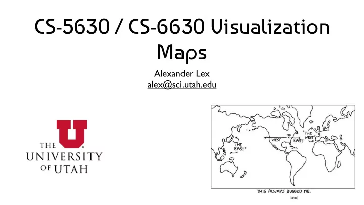
[xkcd]
SLIDE 2 Principles
Special type of Spatial Data Use maps when spatial relationships are paramount Map Tasks:
Find Location / Feature (county, country, city, street) Find Route Identify attribute associated with location (elevation, land/water, GDP) Compare attributes between Locations/Features
SLIDE 3
Do we really need a map?
SLIDE 4
Do we really need a map?
It’s hard to do more complex things with maps Is the spatial context paramount?
SLIDE 5
Map Projections
SLIDE 6 Why projections?
Earth is a (flattened) Sphere Need to project or “unfold” the hull
- f the sphere to fit onto paper/
screens Relevant attributes:
Area, Shape, Direction,
Bearing, Distance, Scale
SLIDE 7 Mercartor Projection
Gerardus Mercator, 1569 Projection onto a cylinder wrapped around the globe conformal map projection; that is, angles are preserved. Lines of constant bearing are straight lines. Constant bearing means constant compass heading - developed for sailors
SLIDE 8 D3 / M. Bostock
Mercator Projection
SLIDE 9 Mercator Projection of Mars
Based on slide from Hanrahan
Circular craters map to circles
SLIDE 10 Why Mercator is Problematic
Traditional map, used to teach geography Massive distortion of area distant from equator “unfair to the Global South, making places that are mostly trees, snow, and better-off white people look huge, and the places where most of the world’s population lives look puny"
http://giscollective.org/slippy-map-projections-explained/
SLIDE 11 Mercartor Projection
Mercator works really great if you’re, say, Ferdinand Magellan looking for a compass bearing that will take you around Cape Horn, because all of the latitude and longitude lines and angles in between lay out nice and straight on the map like we experience them in real life. It also works well if you’re Google and you want a map image that you can neatly slice up into little squares that your server sends to a customer’s browser. North is always up, your hometown doesn’t look squished or slanted when you zoom in to it, and everybody’s happy.
http://giscollective.org/slippy-map-projections-explained/
SLIDE 12 http://strangemaps.wordpress.com/2006/11/20/35-the-size-
SLIDE 13
Mercartor Puzzle
SLIDE 14 Caveat
Only a problem for large areas
Continents World
Distortion is not a problem on a state/city level
SLIDE 15 Latitude-Longitude
Does not preserve angles Does not preserve areas Things are squashed
at the top and bottom
Snyder, “Flattening the Earth” Based on slide from Hanrahan
SLIDE 16 Azimuthal Projections
Projection onto a plane tangent to the Earth angles are correct around the center point Great circles through the center are straight lines Radii correspond to true distances Sometimes see this in airline magazine centered around the hub
Radical Cartography
SLIDE 17 D3 / M. Bostock
Azimuthal Equidistant
SLIDE 18
SLIDE 19 Winkel Tripel Projection
Modified azimuthal map projection averaged to cylindrical projection Minimizing three kinds of distortion:
area direction distance
Considered good projection for world maps, endorsed by National Geographic Society, used in Textbooks
SLIDE 20
SLIDE 21
SLIDE 22 Albers Equal-Area
Shows areas correctly Distorts distances and shapes
D3 / M. Bostock
SLIDE 23 Composite Projections
Bernhard Jenny
SLIDE 24 Projections in D3
Many projections included:
https://github.com/d3/d3-geo/blob/ master/README.md#projections https://github.com/d3/d3-geo-projection/
SLIDE 25 Unfolding The Earth
Idea: use small patches flatten them out Jarke van Wijk
http://www.win.tue.nl/~vanwijk/ myriahedral/
SLIDE 26
Map Software / Navigation
SLIDE 27 Mapping Software
Open StreetMap Google Maps
SLIDE 28 Mashups
http://ucrime.com/ut/university%20of%20utah
SLIDE 29 Navigation
Abstract Specific
SLIDE 30 Landmarks & Paths
Based on slide from B. Tversky
SLIDE 31 LineDrive, 2001
Straighten wiggly lines Turn directions to right angles Expand regions with turns Contract long straight roads Label carefully to avoid clutter Maintain overall orientation
[Agrawala & Stolte, 2001] Based on slide from Hanrahan
SLIDE 32
SLIDE 33
Choropleth Maps
SLIDE 34
Principle
Area are shaded or patterned in proportion to measurement Each spatial unit is filled with a uniform color or pattern
SLIDE 35 Charles Dupin, 1826
Early Choropleth Map
Illiteracy in France
SLIDE 36 Kerry vs. Bush, 2004
Matthew Ericson, NY Times
SLIDE 37 Challenge: Magnitude of Effect vs Perceived Effect
Matthew Ericson, NY Times
SLIDE 38
SLIDE 39
SLIDE 40 Matthew Ericson, NY Times
SLIDE 41 Matthew Ericson, NY Times
SLIDE 42 Approach: Use a Prior, show difference
[Corell 2016]
mischief = property damage such as vandalism in Canada model of population density + accounting for variability when analyzing small numbers
SLIDE 43 Approach: Use a Prior, show difference
[Corell 2016]
SLIDE 44
SLIDE 45
Baseball Territories
SLIDE 46
Lakers Dominate Baskeball
SLIDE 48
Proportional Symbol Maps
SLIDE 49
Alternative to Choropleth
Use a Symbol instead of color Scale symbol according to data
SLIDE 50 Matthew Ericson, NY Times
SLIDE 51
SLIDE 52
SLIDE 55
SLIDE 56 National Geographic, Jan 2011
SLIDE 57 FatFonts
http://fatfonts.org/
SLIDE 59 Visualizing Addresses of Gun Owners
Published after Connecticut school killings What are the ethics of visualization? Data is public: is making it accessible problematic?
http://learning.blogs.nytimes.com/2013/01/08/did-a-newspaper-act-irresponsibly-by-publishing-the-addresses-of-gun-owners/
SLIDE 60
Contour (Isopleth) Maps
SLIDE 61
Early Contour Map
Halley’s lines of equal magnetic declination, 1701
SLIDE 62
Early Weather Map
Halley’s wind map, 1686
SLIDE 63
Wind Map
SLIDE 66
Design Critique: Necklace Maps
SLIDE 67
Illegal Immigrants in the US Migration in the Netherlands
SLIDE 68 Necklace Maps
Internet Users in Africa
SLIDE 69
Cartograms
SLIDE 70 Scale Distance by Data
Dent, “Cartography” Based on slide from Hanrahan
SLIDE 71 Scale Area by Data
Dent, “Cartography” Based on slide from Hanrahan
SLIDE 72 The World
Mark Newman, Univ. Michigan
SLIDE 73 Population
Mark Newman, Univ. Michigan
SLIDE 74 GDP
Mark Newman, Univ. Michigan
SLIDE 75 Child Mortality
Mark Newman, Univ. Michigan
SLIDE 76 Greenhouse Emissions
Mark Newman, Univ. Michigan
SLIDE 77 Kerry vs. Bush 2004
Matthew Ericson, NY Times
SLIDE 78 Rectangular Cartograms
World Population Cartogram Poster Drawn by Hand
SLIDE 79 Bush vs. Kerry, 2004
Heilman, Keim, Panse, Sips, “RecMap: Rectangular Map Approximations” Based on image from Keim
SLIDE 80 Heilman, Keim, Panse, Sips, “RecMap: Rectangular Map Approximations” Based on image from Keim
SLIDE 82
Flow Maps
SLIDE 83 Early Flow Map
Transportation of Passengers in Ireland Henry Drury Harness, 1837
SLIDE 85 Effect of US Civil War
Milestones Project
SLIDE 86
SLIDE 87
Non-spatial Representation
SLIDE 88
SLIDE 89
Aggregation
SLIDE 90
Data Driven Maps
SLIDE 91
Data Driven Maps
Idea: don’t use a map to render on top Let the data make up the map
SLIDE 92
ZipDecode
SLIDE 93 Brandon Martin-Anderson, 2012
SLIDE 94
ZipScribble
SLIDE 95
Amsterdam RealTime
SLIDE 96 SandDance
Arrange Particles
to create visualizations
http://research.microsoft.com/en-us/projects/sanddance/
SLIDE 97
Thematic Maps
SLIDE 98 Strange Maps http://strangemaps.wordpress.com/
SLIDE 99 http://xkcd.com/256/
2007
SLIDE 100 http://xkcd.com/802/
2010
SLIDE 101 One hour in front of the TV
Map by The Bumblebee http://www.flickr.com/photos/the_bumblebee/2229041742
SLIDE 102 From Memory (was: Maps from Memory) http://www.flickr.com/groups/46079190@N00/