SLIDE 1
Introduction to Statistics
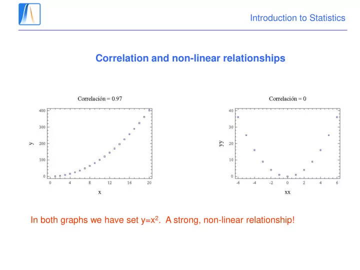
Correlation and non-linear relationships
In both graphs we have set y=x2. A strong, non-linear relationship!
SLIDE 2
Introduction to Statistics
Correlation and causation I
SLIDE 3
Introduction to Statistics
Correlation and causation II
Homer: Not a bear in sight. The Bear Patrol must be working like a charm! Lisa: That’s specious reasoning, dad. Homer: Why thank you, honey. Lisa: By your logic, I could claim that this rock keeps tigers away. Homer: Hmm. How does it work? Lisa: It doesn’t work; it’s just a stupid rock! Homer: Uh-huh. Lisa: But I don’t see any tigers around, do you? Homer: Hmm... Lisa, I want to buy your rock.
SLIDE 4
Introduction to Statistics
Correlation and causation III
To find more on this in the International Relations context, this video is interesting. What could be the real underlying cause?
SLIDE 5
Introduction to Statistics
Exercise
A survey of 474 employees was carried out by an multinational company. Among the data gathered were data on salary and years of education. Supposing that Y = Salary and X = years of education Mark the correct value of the correlation: a) -0,53 b) 0,066 c) -0,662 d) 0,662 Variance X = 8,305 Variance Y = 290,963 Covariance = 32,471
SLIDE 6
Introduction to Statistics
Exercise
The Hoven study concluded that "[v]oting Democrat is associated with cancer mortality." This is similar to the conclusion of the study "Health Insurance and Mortality in US Adults," cited by Democrats in support of their version of health care reform. That latter study concluded that "[u]ninsurance is associated with mortality.“ http://www.americanthinker.com/articles/2010/01/voting_democrat_causes_cancer. html#ixzz3S5qL6pdo What do you think?
SLIDE 7
Introduction to Statistics
Exercise
The following diagrams show the levels of satisfaction with the party leader and the two party preferred vote in Australia. The diagram on the left hand side is for the opposition party and the diagram on the right hand side is for the government. Which of the following statements is correct? a) In both cases, the correlation is negative. b) The correlation with the two party preferred vote is higher for the opposition party. c) The correlation with the two party preferred vote is higher for the government. d) None of the above.
SLIDE 8
Introduction to Statistics
The regression line
(x1, y1), (x2, y2),...,(xN, yN) : N pairs of observed points We have to find a line: y = α + β x which fits our data in “the best possible way”
SLIDE 9 Introduction to Statistics
- We want to predict y given x.
- If we use a line y = a + bx, then the residuals or prediction errors
are ri = yi - a - b xi for i = 1,…,N.
- Let’s try to minimise the total error.
- Use the least squares criterion: choose the line that minimizes S ri
2
where b is the slope of the line and a is the intercept: How do we fit the line?
SLIDE 10
Introduction to Statistics
Proof (aagh)
SLIDE 11
Introduction to Statistics 20 40 60 80 2000000 4000000 6000000 8000000 10000000 Población Escaños
Seats and population: The fitted regression line
SLIDE 12
Introduction to Statistics
Estadísticas de la regresión Coeficiente de correlación múltiple 0,96372808 Coeficiente de determinación R^2 0,928771813 R^2 ajustado 0,92458192 Error típico 4,544275594 Observaciones 19
Coeficientes Intercepción 2,692069443 Variable X 1 6,68437E-06
The fitted line is y = 2,69+0,0000069x
Excel Output
How do we predict the seats is a community of 1000000 people? And in a community with no people? Does this prediction make sense?
SLIDE 13
Introduction to Statistics
Residual analysis I: residual mean and variance
The mean of the residuals is 0.
SLIDE 14
Introduction to Statistics And the variance can be calculated as How do we interpret this?
SLIDE 15
Introduction to Statistics
10 20 30 40 50 60 70 5000000 10000000 Y X
Curva de regresión ajustada
Y Pronóstico para Y
y
SLIDE 16 Introduction to Statistics
Residual analysis II: graphs
If the regression line fits the data well, the residuals should look like “random noise” with no relation to x or y.
Gráfico de los residuos frente a x
5 10 15 2000000 4000000 6000000 8000000 10000000 X Residuos
Does this fit look good?
SLIDE 17 Introduction to Statistics
Example
The table shows the Gross National Product per head in US dollars in 2008 and 2009 for the G8 countries.
Country GNP 2008 x GNP 2009 y Canada 42030 39217 France 45981 42091 Germany 44471 39442 Italy 38309 34955 Japan 38443 39573 Russia 11339 8874 UK 43088 35728 USA 46716 46443
The covariance between the two variables is 116000000 and the correlation is 0,974. The Libyans prefer to measure GNP in Libyan
- dinars. The dollar dinar Exchange rate is
(approximately) 1 dollar = 2 dinars. Measuring the GNP per head in Libyan dinars, which of the following options is correct? a) Both the covariance and the correlation do not change. b) The correlation is 0.2475 and the covariance does not change. c) The covariance is 464000000 and the correlation doesn’t change. d) Both the covariance and the correlation change to a quarter of their previous values.
SLIDE 18 Introduction to Statistics
Example
The following table shows information about the daily sales of newspapers for each 1000 inhabitants of 8 Spanish Communities and the economic production of the community based on the PIB (Producto Interiór Bruto) per resident .
PIB 8.3 9.7 10.7 11.7 12.4 15.4 16.3 17.2 Sales 57’4 106’8 104’4 131’9 144’6 146’4 177’4 186’9
Suppose a linear relation between these variables, we obtain the following regression line which explains the number of papers sold per 1000 inhabitants in terms of the PIB per resident in 1000’s of euros: y= −23.55 + 12.23x What would be the predicted sales in a community with PIB per resident equal to 15.000 euros? a) 159.9 examples b) 159.9 examples for each 1000 inhabitants c) 183.430 examples d) 183.430 examples for each 1000 residents
SLIDE 19
Introduction to Statistics
Example
A US newspaper is carrying out a study on racism in the US army. They have calculated the following scatterplot shows the percentages of coloured military recruits (y) against the general population size (x) for various US states. Which one of the following regression lines is correct? a) y = 1.08x b) y=9.55-1,08x c) y=9.55+1,08x d) y=-9.55-1,08x
SLIDE 20
Introduction to Statistics
Example
The diagram shows the level of US debt as a function of the gold price. The linear regression formula (without the error term) is: GOLD PRICE (nominal) = -522.86 + (0.1334 * US-debt-in-billions) If the US debt is $19000 billions, what would you predict the gold price to be? a) 2011.74 b) 3057,46 c) 2933,14 d) -520.3254 Do you think it is reasonable to use the regression line to make your prediction in this case? If not, why not?