Where Are We? Feedback So far? Collection RottenTomatoes API, SQL - - PowerPoint PPT Presentation

where are we feedback so far
SMART_READER_LITE
LIVE PREVIEW

Where Are We? Feedback So far? Collection RottenTomatoes API, SQL - - PowerPoint PPT Presentation

Where Are We? Feedback So far? Collection RottenTomatoes API, SQL refresher OpenRefine Cleaning Integration Dimensionality reduction: Analysis PCA, MDS, LDA, Isomap, t-SNE Visualization Vis 101, D3, Tableau [HW2] Presentation


slide-1
SLIDE 1

Where Are We? Feedback So far?

1

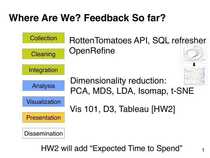
Collection Cleaning Integration Visualization Analysis Presentation Dissemination

Dimensionality reduction: 
 PCA, MDS, LDA, Isomap, t-SNE RottenTomatoes API, SQL refresher
 OpenRefine Vis 101, D3, Tableau [HW2]

HW2 will add “Expected Time to Spend”

slide-2
SLIDE 2
  • 1. How to Fix Vis Issues?
  • 2. Class Project

CSE 6242 / CX 4242 Duen Horng (Polo) Chau
 Georgia Tech

Partly based on materials by 
 Professors Guy Lebanon, Jeffrey Heer, John Stasko, Christos Faloutsos

slide-3
SLIDE 3

3

Student of 
 Edward Tufte

slide-4
SLIDE 4

4

Edward Tufte

An American statistician and professor emeritus of political science, statistics, and computer science at Yale University. He is noted for his writings

  • n information design and

as a pioneer in the field of data visualization.

  • Wikipedia
slide-5
SLIDE 5

Also Highly Recommended:

slide-6
SLIDE 6

Good charts? How would you improve them?

slide-7
SLIDE 7

7

How about this one?

slide-8
SLIDE 8

8

Which is better?

slide-9
SLIDE 9

9

Can you improve this table’s design?

Tables

What are they good for?

slide-10
SLIDE 10

“When everyone is special, no one is special”

10

http://www.youtube.com/watch?v=A8I9pYCl9AQ

slide-11
SLIDE 11

11

A lot of “chart junk”. 
 Low “data to ink” ratio (Edward Tufte)

slide-12
SLIDE 12

12

Better? High “data to ink” ratio

slide-13
SLIDE 13

13

Aligning Numbers Look good?

slide-14
SLIDE 14

14

slide-15
SLIDE 15

15

This reminds you of what?

Bar Charts

slide-16
SLIDE 16

16

Better than Christmas.

slide-17
SLIDE 17

17

Showing profits in red!!

slide-18
SLIDE 18

18

slide-19
SLIDE 19

19

Line Charts

Does this look alright to you?

slide-20
SLIDE 20

20

Use “ticks” at regular intervals (e.g., 2, 5, 10, etc.)

slide-21
SLIDE 21

21

Note y-axis doesn’t start at 0. 
 Why not as bad as in the case of bar chart?

Fever Line

slide-22
SLIDE 22

22

Fever Line

slide-23
SLIDE 23

23

Multiple Lines in one chart

We see this often in academic papers. Better ways?

slide-24
SLIDE 24

24

Which one is more effective? Why? 
 What if you have many lines you want to show?

slide-25
SLIDE 25

25

“Small Multiple” - Edward Tufte
 Better than overlapping (sometimes)

“a series or grid of small similar graphics or charts, allowing them to be easily compared”

slide-26
SLIDE 26

26

Misleading Bar Charts

slide-27
SLIDE 27

27

Vertical axis of bar charts start at “0” if possible

slide-28
SLIDE 28

28

Disorienting color bars

slide-29
SLIDE 29

29

Better?

slide-30
SLIDE 30

30

Exercise For Your Necks

slide-31
SLIDE 31

31

Bars Can be Horizontal

slide-32
SLIDE 32

32

The Dreaded Pie Charts

Why people like to use pie charts?

slide-33
SLIDE 33

33

http://www.guardian.co.uk/technology/blog/2008/jan/21/liesdamnliesandstevejobs

slide-34
SLIDE 34

34

slide-35
SLIDE 35

Log scale instead of linear scale

Include numbers from different orders of magnitude

35

slide-36
SLIDE 36

36

Example

log-log

slide-37
SLIDE 37

37

Example “log” also works well for time

slide-38
SLIDE 38

38

OK for outliers that are *really* different

slide-39
SLIDE 39

Destroying your great results with poor powerpoint

Bad color schemes Bad fonts Too much animation Too much data

39

100 times faster!

http://www.youtube.com/watch?v=lpvgfmEU2Ck&feature=player_embedded

Don McMillan: Life After Death by PowerPoint

can you read this?

slide-40
SLIDE 40

Destroying your great results with poor powerpoint

How to fix?

  • Color schemes: start with black & white, add colors if needed
  • Fonts: sans-serif font looks nicer
  • On Mac: Helvetica is always good
  • On Windows: Arial?
  • Too much animation: start with no animation, then add if

appropriate

  • Too much data: don’t just copy figures from paper and past

them on the slides!

40

http://www.youtube.com/watch?v=lpvgfmEU2Ck&feature=player_embedded

Don McMillan: Life After Death by PowerPoint

slide-41
SLIDE 41

Suggestions: use pictures whenever appropriate

“Pictures” include most non-text elements: 
 tables, diagrams, charts, etc. Why?

  • “A picture is worth a thousand words”
  • People like pictures and love movies.
  • Picture is often more succinct, memorable

41

slide-42
SLIDE 42

Figures should be self-contained

Why?

  • Don’t make people go back and forth between text and

figure

  • People skim; look at “interesting” things first
  • Especially academia, many busy reviewers look at figures

first

  • Bad figures -> bad first impression 


(lower chance of paper acceptance) How to fix?

  • Succinctly describe your main messages 


(what you want the readers to learn)

42

slide-43
SLIDE 43

43

http://www.cs.cmu.edu/~dchau/polonium_sdm2011.pdf

Example

slide-44
SLIDE 44

44

Example

slide-45
SLIDE 45

Crown-jewel figure on first page

(nice to have)

Why?

  • Give an overview of what readers is going to

get -- cut to the chase

  • Again, people like to see interesting things

How to do it?

  • Use your most impressive figure
  • Can be similar to another shown later

45

slide-46
SLIDE 46

46

Example

slide-47
SLIDE 47

Suggestion: Design in grayscale first

Then add color If it doesn’t look good in black and white, it’s not gonna look good with color (Why iPhone comes in black or white first?)

47

slide-48
SLIDE 48

Suggestion: Use legible fonts

If people can’t see it, they won’t appreciate it

For printed materials, print them out and check! For slides, rule of thumb is about 7 lines of text per slide.

48

slide-49
SLIDE 49

Suggestion: you probably need to redo your figure for slides

Designing for print is different from designing for the screen

  • Resolution (which is higher?)
  • Levels of details (people mostly want a few

“take-away” messages from your talk)

49

slide-50
SLIDE 50

50

Example

slide-51
SLIDE 51

Higher is better. Apolo wins.

* Statistically significant, by two-tailed t test, p <0.05

Judges’ Scores

8 16

Model- based *Prototyping *Average

Apolo Scholar

Score

Example

slide-52
SLIDE 52

Good tools for creating data visualization

(beyond Excel)

slide-53
SLIDE 53

R

Free!

  • Powerful. Can create any kinds of visualization available.

But results may not be pretty (need editing). Need to program.

53

http://www.r-project.org

http://www.cc.gatech.edu/~lebanon/notes/quickIntroToR.pdf

slide-54
SLIDE 54

D3

Also free! Create web-based visualization. Robust. Can create many kinds of visualization. Need to learn javascript, CSS (+SVG) “Future-proof” (likely to stay for many years)

54

http://d3js.org Great interactive tutorial http://vogievetsky.github.com/IntroD3/#1

slide-55
SLIDE 55

Processing

“Java for designers”. Simplified Java. Can create interactive visualization, images, and more. Can be used as a library in normal Java app. Many tutorials, examples.

55

http://processing.org

slide-56
SLIDE 56

Illustrator / Inkscape / Xara

The ultimate way to create visualization. Or to edit / perfect visualization. Inkscape is free! Illustrator is powerful but expensive Xara is the best alternative for Illustrator, on windows (less expensive, faster, easy to use)

56

http://inkscape.org

slide-57
SLIDE 57

Design Principles

Bar chart’s vertical axis should start at “0”! (Don’t lie) Follow conventions (e.g., red for negative values) Data is the king

  • minimize distraction (bold appropriately)
  • Visual encodings should be meaningful

Design for legibility

  • font choices, don’t rotate vertical axis label

57

slide-58
SLIDE 58

Design Principles

Design for ease of comparison

  • Use “small multiple” / panel chart
  • E.g., use line thickness instead of patterns

(dot, dash, etc.)

  • E.g., align numbers by decimal points

Maximize data-ink ratio

58

slide-59
SLIDE 59

Design Principles 


(what not to do)

3D pie chart (or 3D anything) Bar chart not starting at 0

  • Why not OK? 


People compare using bars’ heights Wrong aspect ratio

  • Flatten or steepen trends

59

slide-60
SLIDE 60

Project

Description is out High-level schedule

  • Proposal (writeup + short presentation)
  • Progress report
  • Final report (writeup + poster presentation)

60

slide-61
SLIDE 61

George Heilmeier

Former Director of DARPA 


slide-62
SLIDE 62

Heilmeier Questions

1.What are you trying to do? 


Articulate your objectives using absolutely no jargon.

2.How is it done today, and what are the limits of current practice? 3.What's new in your approach and why do you think it will be successful? 4.Who cares? 5.If you're successful, what difference will it make? 6.What are the risks and payoffs? 7.How much will it cost? 8.How long will it take? 9.What are the midterm and final "exams" to check for success?

62

Preflight checklist for successful projects

http://en.wikipedia.org/wiki/George_H._Heilmeier http://smlv.cc.gatech.edu/2010/10/17/heilmeiers-questions/